
Expand Your Maui Paradise with the .NET MAUI TreeView

Summarize with AI:
Are you in search of a convenient way to present information in flat or hierarchical format, ensuring fast item rendering, flexible customization and the ability to expand or collapse data nodes as needed? Be it complex file structures or even a way to facilitate navigation within mobile apps, .NET MAUI TreeView can save you quite some time.
It has been a while since I dismantled my Christmas tree, but while doing so, I thought I ought to introduce you to a new species that hit the .NET MAUI market last summer. Ready to meet the .NET MAUI TreeView? Believe me, getting started with this tree view is a lot easier than taking down all the bits of the other tree’s decorations. 😅 Follow me.
Expectations
What to expect from the TreeView from Progress Telerik UI for .NET MAUI? To put it in only two words—feature richness. Data binding, UI virtualization, load on demand, expanding/collapsing nodes, single/multiple selection, checkbox support, commands, styling API, custom item templates, etc.
What to expect from this blog post? To examine the .NET MAUI TreeView together but take it one step at a time. So, let’s pick a simple starting point and build up from there.
Starting Point
Assuming you already have a fresh .NET MAUI app and the Telerik.UI.for.Maui NuGet, bringing the TreeView component to this app is as brief as the following.
XAML:
<telerik:RadTreeView x:Name="treeView" />
C#:
RadTreeView treeView = new RadTreeView();Easy-treesy! However, this is just the roots—no branches, no leaves. 😅
And it is all because I promised to take things one step at a time. Let’s jump into the next section where we will slowly build up to achieve this result:
After all, this is one of the most common scenarios that we are used to in our everyday lives—your favorite mail client’s inbox, your favorite IDE’s project files or any other kind of a file explorer.
Capability Unveiling
Just like I mentioned in the previous section, a tree without branches or leaves does not make much sense. So, I suggest we bring some data to ours and make it bloom.
Data Binding & UI Virtualization
The TreeView component in Telerik UI for .NET MAUI is specifically crafted to simplify data binding, whether the data structure is linear or a hierarchical one.
In addition, its UI Virtualization enables faster data visualization and effortless display of TreeView items while scrolling, regardless of the dataset size.
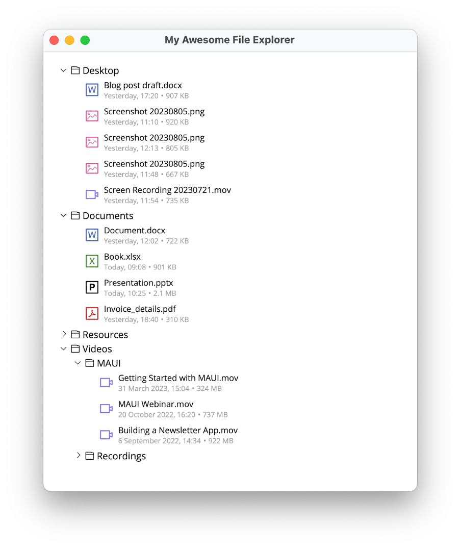
Looking at the above screenshot (our aim 🎯), you may notice that I have chosen a hierarchical data structure. I also created two models describing the File and Folder nodes of our tree and the ViewModel that will contain the collection of folders. Check them out below.
File node model:
public class FileNode : NotifyPropertyChangedBase
{
    private string name;
    private string icon;
    private string dateModified;
    private string size;

    public string Name
    {
        get => this.name;
        set => this.UpdateValue(ref this.name, value);
    }

    public string Icon
    {
        get => this.icon;
        set => this.UpdateValue(ref this.icon, value);
    }

    public string DateModified
    {
        get => this.dateModified;
        set => this.UpdateValue(ref this.dateModified, value);
    }

    public string Size
    {
        get => this.size;
        set => this.UpdateValue(ref this.size, value);
    }

    internal FolderNode Parent { get; set; }
}
Folder node model:
public class FolderNode : FileNode
{
    public FolderNode()
    {
        this.Children = new ObservableCollection<FileNode>();
    }

    public ObservableCollection<FileNode> Children { get; private set; }
}
And the ViewModel:
public class MainPageViewModel : NotifyPropertyChangedBase
{
    private ObservableCollection<FolderNode> folders;

    public MainPageViewModel()
    {
        this.folders = this.GetFolderSource();
    }

    public ObservableCollection<FolderNode> Folders
    {
        get { return this.folders; }
        set { this.UpdateValue(ref this.folders, value); }
    }

    private ObservableCollection<FolderNode> GetFolderSource()
    {
        FolderNode desktopFolder = new FolderNode() { Name = "Desktop", Icon = "\ue82a" };
        desktopFolder.Children.Add(new FileNode() { Name = "Blog post draft.docx", Icon = "\ue898", DateModified = "Yesterday, 17:20", Size = "907 KB", Parent = desktopFolder });
        desktopFolder.Children.Add(new FileNode() { Name = "Screenshot 20230805.png", Icon = "\ue852", DateModified = "Yesterday, 11:10", Size = "920 KB", Parent = desktopFolder });
        desktopFolder.Children.Add(new FileNode() { Name = "Screenshot 20230806.png", Icon = "\ue852", DateModified = "Yesterday, 12:13", Size = "805 KB", Parent = desktopFolder });
        desktopFolder.Children.Add(new FileNode() { Name = "Screenshot 20230807.png", Icon = "\ue852", DateModified = "Yesterday, 11:48", Size = "667 KB", Parent = desktopFolder });
        desktopFolder.Children.Add(new FileNode() { Name = "Screen Recording 20230721.mov", Icon = "\ue874", DateModified = "Yesterday, 11:54", Size = "735 KB", Parent = desktopFolder });

        FolderNode documentsFolder = new FolderNode() { Name = "Documents", Icon = "\ue82a" };
        documentsFolder.Children.Add(new FileNode() { Name = "Document.docx", Icon = "\ue898", DateModified = "Yesterday, 12:02", Size = "722 KB", Parent = documentsFolder });
        documentsFolder.Children.Add(new FileNode() { Name = "Book.xlsx", Icon = "\ue896", DateModified = "Today, 09:08", Size = "901 KB", Parent = documentsFolder });
        documentsFolder.Children.Add(new FileNode() { Name = "Presentation.pptx", Icon = "\ue897", DateModified = "Today, 10:25", Size = "2.1 MB", Parent = documentsFolder });
        documentsFolder.Children.Add(new FileNode() { Name = "Invoice_details.pdf", Icon = "\ue899", DateModified = "Yesterday, 18:40", Size = "310 KB", Parent = documentsFolder });

        FolderNode resourcesFolder = new FolderNode() { Name = "Resources", Icon = "\ue82a" };
        resourcesFolder.Children.Add(new FolderNode() { Name = "Fonts", Icon = "\ue82a", Parent = resourcesFolder });

        FolderNode imagesFolder = new FolderNode() { Name = "Images", Icon = "\ue82a", Parent = resourcesFolder };
        imagesFolder.Children.Add(new FileNode() { Name = "american_pancakes.png", Icon = "\ue852", DateModified = "Today, 09:01", Size = "20 KB", Parent = imagesFolder });
        imagesFolder.Children.Add(new FileNode() { Name = "belgian_chocolate.png", Icon = "\ue852", DateModified = "Today, 09:02", Size = "20 bytes", Parent = imagesFolder });
        imagesFolder.Children.Add(new FileNode() { Name = "blueberry_waffle.png", Icon = "\ue852", DateModified = "Today, 09:03", Size = "20 KB", Parent = imagesFolder });
        imagesFolder.Children.Add(new FileNode() { Name = "tiramisu.png", Icon = "\ue852", DateModified = "Today, 09:04", Size = "20 KB", Parent = imagesFolder });
        resourcesFolder.Children.Add(imagesFolder);

        resourcesFolder.Children.Add(new FileNode() { Name = "appicon.svg", Icon = "\ue852", DateModified = "Yesterday, 10:32", Size = "513 bytes", Parent = resourcesFolder });
        resourcesFolder.Children.Add(new FileNode() { Name = "logo.svg", Icon = "\ue852", DateModified = "Yesterday, 10:38", Size = "790 bytes", Parent = resourcesFolder });

        FolderNode videosFolder = new FolderNode() { Name = "Videos", Icon = "\ue82a", Parent = resourcesFolder };

        FolderNode mauiFolder = new FolderNode() { Name = "MAUI", Icon = "\ue82a", Parent = videosFolder };
        mauiFolder.Children.Add(new FileNode() { Name = "Getting Started with MAUI.mov", Icon = "\ue874", DateModified = "31 March 2023, 15:04", Size = "324 MB", Parent = mauiFolder });
        mauiFolder.Children.Add(new FileNode() { Name = "MAUI Webinar.mov", Icon = "\ue874", DateModified = "20 October 2022, 16:20", Size = "737 MB", Parent = mauiFolder });
        mauiFolder.Children.Add(new FileNode() { Name = "Building a Newsletter App.mov", Icon = "\ue874", DateModified = "6 September 2022, 14:34", Size = "922 MB", Parent = mauiFolder });
        videosFolder.Children.Add(mauiFolder);

        FolderNode recordingsFolder = new FolderNode() { Name = "Recordings", Icon = "\ue82a", Parent = videosFolder };
        recordingsFolder.Children.Add(new FileNode() { Name = "Screen Recording 20220721.mov", Icon = "\ue874", DateModified = "21 July 2022, 17:20", Size = "24,8 MB", Parent = recordingsFolder });
        recordingsFolder.Children.Add(new FileNode() { Name = "Screen Recording 20220807.mov", Icon = "\ue874", DateModified = "7 August 2022, 14:34", Size = "19,3 MB", Parent = recordingsFolder });
        videosFolder.Children.Add(recordingsFolder);

        return new ObservableCollection<FolderNode>()
        {
            desktopFolder,
            documentsFolder,
            resourcesFolder,
            videosFolder
        };
    }
}
Since I decided working with hierarchical data structure, there is one more thing I need to do. I need to apply a TreeViewDescriptor which simply provides a description of a hierarchical items source. In our case, I must define two descriptors for each data item type (file and folder) through the descriptor’s TargetType and specify the name of the property that will be displayed for the respective data item through the descriptor’s DisplayMemberPath.
What is left for our tree to grow some branches and leaves is to bind the Folders collection to it:
<telerik:RadTreeView x:Name="treeView" ItemsSource="{Binding Folders}">
    <telerik:TreeViewDescriptor TargetType="{x:Type local:FolderNode}"
                                ItemsSourcePath="Children"
                                DisplayMemberPath="Name" />
    <telerik:TreeViewDescriptor TargetType="{x:Type local:FileNode}"
                                DisplayMemberPath="Name" />
</telerik:RadTreeView>
Shall we check our progress?
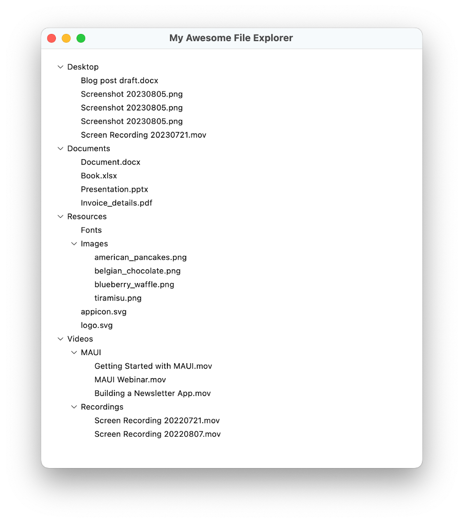
I know, I know—this file explorer is not that awesome yet, but we will change that in the next section.
Styles & Templates
The .NET MAUI TreeView introduces a conditional styling feature that empowers users to apply distinct Styles to individual items based on specific conditions. This feature enables dynamic customization, allowing each item to have its own unique appearance based on predefined criteria. There is an awesome runnable example demonstrating the ItemStyleSelector of the TreeView in the SDK Browser Demo Application. Don’t miss out—make sure you check it.
The tree view component also exposes an ItemTemplate property with the help of which the appearance of each TreeView node can be personalized. This enables you to effortlessly insert specific icons within the nodes for example, enhancing the customization options for your specific scenario.
Let’s add one ItemTemplate for our files, and one for our folders.
<DataTemplate x:Key="FileTemplate">
<Grid ColumnDefinitions="Auto, *"
ColumnSpacing="8"
RowDefinitions="Auto, Auto"
Padding="0, 4">
<Label Grid.RowSpan="2"
Text="{Binding Icon}"
TextColor="{Binding Name, Converter={StaticResource FileTypeToIconColorConverter}}"
FontFamily="TelerikFontExamples"
FontSize="24"
VerticalOptions="Center"
VerticalTextAlignment="Center" />
<Label Grid.Column="1"
Text="{Binding Name}"
FontSize="14"
VerticalOptions="Center" />
<HorizontalStackLayout Grid.Row="1"
Grid.Column="1"
VerticalOptions="Center"
Opacity="0.38">
<Label Text="{Binding DateModified}"
FontSize="12" />
<Label Text=""
FontFamily="TelerikFontExamples"
FontSize="12"
VerticalTextAlignment="Center" />
<Label Text="{Binding Size}"
FontSize="12" />
</HorizontalStackLayout>
</Grid>
</DataTemplate>
<DataTemplate x:Key="FolderTemplate">
<Grid ColumnDefinitions="Auto, *"
ColumnSpacing="4">
<Label Text="{Binding Icon}"
TextColor="{Binding TextColor, Source={x:RelativeSource AncestorType={x:Type telerik:TreeViewItemView}}}"
FontFamily="TelerikFontExamples"
FontSize="16"
VerticalTextAlignment="Center" />
<Label Grid.Column="1"
FontSize="16"
Text="{Binding Name}"
VerticalTextAlignment="Center"
Margin="{OnPlatform Default=0, MacCatalyst='0, 2, 0, 0', WinUI='0, -4, 0, 0'}" />
</Grid>
</DataTemplate>Now, let’s use these in our TreeViewDescriptors:
<telerik:RadTreeView x:Name="treeView" ItemsSource="{Binding Folders}">
<telerik:TreeViewDescriptor TargetType="{x:Type local:FolderNode}"
ItemsSourcePath="Children"
ItemTemplate="{StaticResource FolderTemplate}" />
<telerik:TreeViewDescriptor TargetType="{x:Type local:FileNode}"
ItemTemplate="{StaticResource FileTemplate}" />
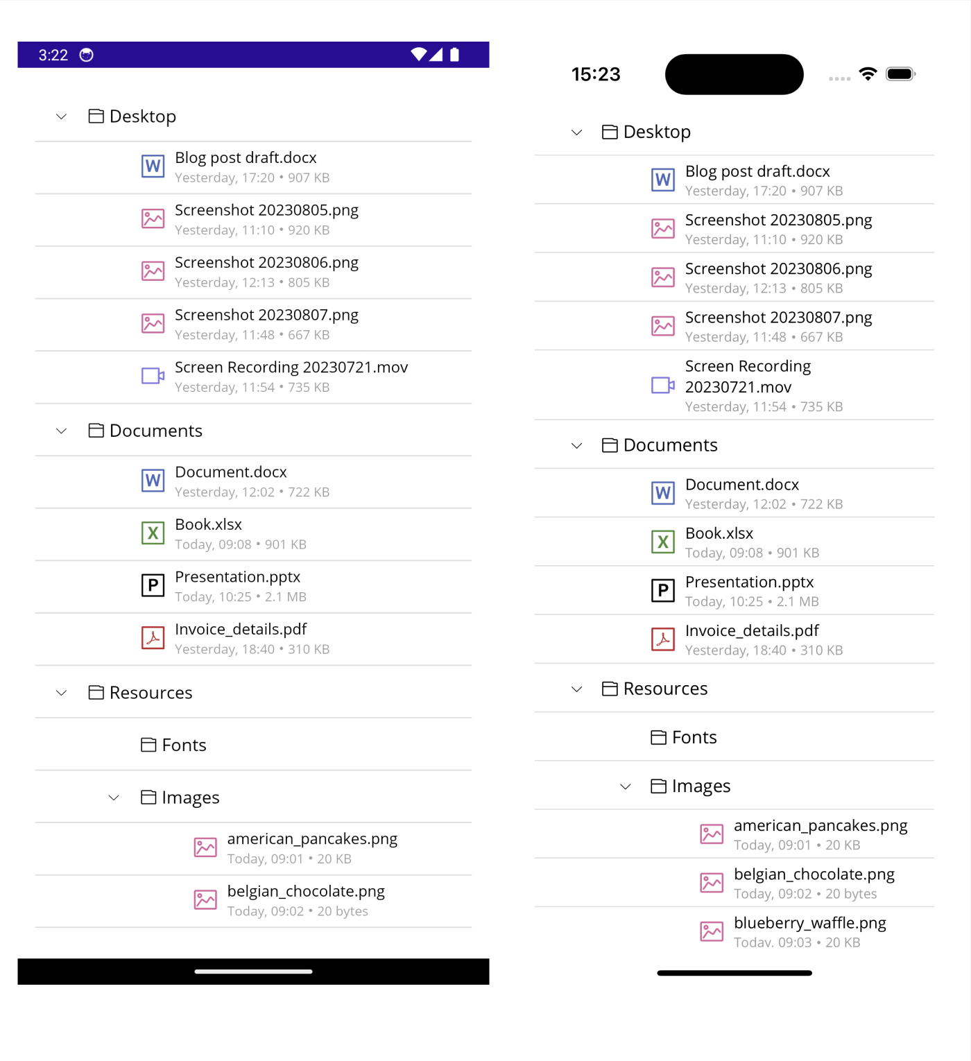
</telerik:RadTreeView>I can guarantee you we achieved the result from the very first image in this blog post, but let me prove that to you by running our example on a mobile device as well (Android on the left, iOS on the right):
Lovely. Let’s level up a little more.
Selection & Checkboxes
Based on your business scenario, single or multiple node selection can be allowed. Ours is simple and does not necessarily need to allow multiple selection, yet we can turn it on simply by setting the SelectionMode property of our TreeView to Multiple. Or we can also turn the selection off by setting the same property to None.
You can also display CheckBox elements and enable the selection of specific items from the ItemsSource. This is particularly cool, as the selected items are automatically added to the CheckedItems collection, granting the freedom to perform various actions, such as selecting or manipulating these items as desired.
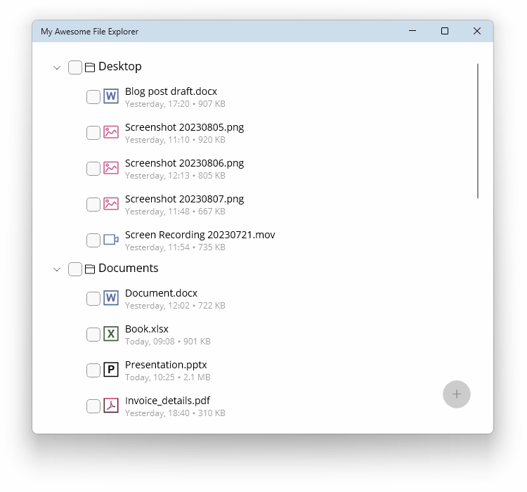
Curious to try out something with me? I say we display these checkboxes and make new folder with the checked items on the click of a button. For the checkboxes to show, we need to set the CheckBoxMode property:
<telerik:RadTreeView x:Name="treeView"
                     ItemsSource="{Binding Folders}"
                     CheckBoxMode="Recursive">
    <telerik:TreeViewDescriptor TargetType="{x:Type local:FolderNode}"
                                ItemsSourcePath="Children"
                                ItemTemplate="{StaticResource FolderTemplate}" />
    <telerik:TreeViewDescriptor TargetType="{x:Type local:FileNode}"
                                ItemTemplate="{StaticResource FileTemplate}" />
</telerik:RadTreeView>
I set it to recursive as I want my parent folder node to propagate its checked state to the children file nodes. Next thing I want is a button that will be responsible for creating a folder with the checked items (be it files or entire folders).
<Grid>
    <telerik:RadTreeView x:Name="treeView"
                         ItemsSource="{Binding Folders}"
                         CheckBoxMode="Recursive">
        <telerik:TreeViewDescriptor TargetType="{x:Type local:FolderNode}"
                                    ItemsSourcePath="Children"
                                    ItemTemplate="{StaticResource FolderTemplate}" />
        <telerik:TreeViewDescriptor TargetType="{x:Type local:FileNode}"
                                    ItemTemplate="{StaticResource FileTemplate}" />
    </telerik:RadTreeView>
    <telerik:RadButton x:Name="createFolderWithSelectionBtn"
                       Style="{StaticResource FABStyle}"
                       Command="{Binding CreateFolderWithSelectionCommand}"
                       VerticalOptions="End"
                       HorizontalOptions="End"
                       Margin="0, 0, 16, 16" />
</Grid>
So far, so good, but we need a little more than that. Take a short breath and jump to next section, where we will make it all work.
Commands
As you may guess, we need to add some custom options for our button to create new folders with the checked tree view items. Gladly, we can do this by leveraging the commands support of the Telerik UI for .NET MAUI TreeView. The list of such includes expanding, collapsing, checking, unchecking and scrolling.
In our example, we will take advantage of the ItemCheckedCommand, ItemUncheckedCommand and, of course, a custom command for creating a folder with the nodes selection. Let’s upgrade the MainPageViewModel (the GetFoldersSource method will be skipped as there are no changes):
public class MainPageViewModel : NotifyPropertyChangedBase
{
    private ObservableCollection<FolderNode> folders;
    private FolderNode newFolderItem;
    private int counter = 1;
    private readonly Command createFolderWithSelectionCommand;
    private readonly Command itemCheckedCommand;
    private readonly Command itemUncheckedCommand;

    public MainPageViewModel()
    {
        this.folders = this.GetFolderSource();
        this.newFolderItem = new FolderNode() { Name = "New folder", Icon = "\ue829" };
        this.createFolderWithSelectionCommand = new Command(this.CreateFolderWithSelection, this.CanCreateFolderWithSelection);
        this.itemCheckedCommand = new Command(this.ItemChecked);
        this.itemUncheckedCommand = new Command(this.ItemUnchecked);
    }

    public ObservableCollection<FolderNode> Folders
    {
        get { return this.folders; }
        set { this.UpdateValue(ref this.folders, value); }
    }

    public ICommand CreateFolderWithSelectionCommand => this.createFolderWithSelectionCommand;

    public ICommand ItemCheckedCommand => this.itemCheckedCommand;

    public ICommand ItemUncheckedCommand => this.itemUncheckedCommand;

    private ObservableCollection<FolderNode> GetFolderSource()
    {
        //Skipped this part as there is no change
    }

    private void CreateFolderWithSelection(object obj)
    {
        foreach (var item in this.newFolderItem.Children)
        {
            if (item is FolderNode folderNode)
            {
                if (folderNode.Parent != null)
                {
                    int parentFolderIndex = this.Folders.IndexOf(folderNode.Parent);
                    this.Folders[parentFolderIndex]?.Children.Remove(folderNode);
                }
                else
                {
                    this.Folders.Remove(folderNode);
                }
            }
            else if (item is FileNode fileNode)
            {
                int parentFolderIndex = this.Folders.IndexOf(fileNode.Parent);
                this.Folders[parentFolderIndex]?.Children.Remove(fileNode);
            }
        }

        this.Folders.Insert(0, this.newFolderItem);
        this.counter++;
        this.newFolderItem = new FolderNode() { Name = $"New folder ({this.counter})", Icon = "\ue829" };
        ((Command)this.CreateFolderWithSelectionCommand).ChangeCanExecute();
    }

    private bool CanCreateFolderWithSelection(object arg)
    {
        return this.newFolderItem.Children.Count > 0;
    }

    private void ItemChecked(object obj)
    {
        if (obj is FolderNode folderNode)
        {
            newFolderItem.Children.Add(folderNode);
        }
        else if (obj is FileNode fildeNode)
        {
            newFolderItem.Children.Add(fildeNode);
        }

        ((Command)this.CreateFolderWithSelectionCommand).ChangeCanExecute();
    }

    private void ItemUnchecked(object obj)
    {
        if (obj is FolderNode folderNode)
        {
            newFolderItem.Children.Remove(folderNode);
        }
        else if (obj is FileNode fileNode)
        {
            newFolderItem.Children.Remove(fileNode);
        }

        ((Command)this.CreateFolderWithSelectionCommand).ChangeCanExecute();
    }
}
Ready to see it in action? I am! And this time I am going to show you WinUI. 🤘
I am happy with our example and hope you are, too. 😊
And since this is just one of the many possible scenarios that can be achieved with the help of the .NET MAUI TreeView, do not forget to pay proper attention to its online documentation, too.
Take the Wheel
If you reached this point of my blog, a huge thanks from me to you for reading it! And with that, I think it is your turn to take the wheel and take the TreeView to even higher levels.
Plug the .NET MAUI TreeView in your MAUI app and let us know what impression it made. And when you do, make sure to share your opinion and ideas either in the comment section below or by visiting the Telerik UI for .NET MAUI Feedback Portal.
If you are already actively developing outstanding MAUI applications with Telerik UI for MAUI, you already know how to get the latest bits. If by some chance you are a new explorer—you just need to sign up for our free 30-day trial, which gives you access to the components as well as our legendary technical support at zero cost. Just head to the Telerik UI for .NET MAUI overview page or click the button below to sign up for a trial today!

Viktoria Grozdancheva
Viktoria is a Senior Front-end Developer with 5+ years of experience designing and building modern UI for desktop and mobile platforms on Microsoft/Telerik technology stacks. Her spare time is dedicated to friends and family and discovering new pieces of the world. Find her on Twitter and LinkedIn.
Related Posts
Comments
All articles
Topics
Web MobileMobile
Desktop
Design
Productivity
People
