
Theme UI Frameworks in Angular Part 3: Theming with Kendo UI and ThemeBuilder

Building on our previous two parts, we continue our series on Angular theming—this time with Kendo UI for Angular and ThemeBuilder.
In our previous articles, we explored custom theming with Sass and Angular Material in an existing Angular app. During this journey, we built a theme from scratch using Sass with variables and mixins. Then, we took a step forward by moving to Angular Material, which brought us a set of components and theme mixins to customize and adapt our pony theme.
But, while using Angular Material, I felt that it required a lot of manual work. Every time I needed to test a new color, I had to change the code, recompile and check it manually. Also, remember that creating the palettes required manual steps to define palettes, set up Sass variables and override styles. Any change required rebuilding the app, making our experiment hard to maintain and not the best developer experience.
💡 But what if we could get the same result with less effort?
With Progress Kendo UI for Angular and ThemeBuilder both working together, we can customize our apps quickly and without pain!
Why Choose Kendo UI for Theming?
Kendo UI for Angular comes with a huge list of accessible components, ready to use, with a lot of UI elements. And, working in combination with ThemeBuilder, we can customize any Kendo UI component with a live preview, saving time and effort.
One of the amazing things I have found about Kendo UI is its enterprise support with fast responses from dedicated experts, thorough documentation and guides with practical examples.
While Angular Material gave us a lot of flexibility, it required more manual Sass configuration and rebuilds. Kendo UI and ThemeBuilder streamline that process beautifully, and come with several useful resources, such as:
- The Kendo UI for Angular Button docs
- ThemeBuilder docs
- ThemeBuilder course on YouTube
I think we want to customize, so let’s move to Kendo UI!
Moving to Kendo UI
First, clone our existing project ponies-world pointing our the branch move-to-kendo-ui-start, on this branch is where we’ll do our changes.
git clone --branch move-to-kendo-ui-start --single-branch https://github.com/danywalls/ponies-world.git
Next, install Kendo UI for Angular using a schematic. Instead of installing all components like in Angular Material, we only need the buttons package. Run the command ng add @progress/kendo-angular-buttons in the terminal. Progress Kendo UI provides a schematic for each component, which helps us create light applications, because we only need to install those components that our app actually uses.
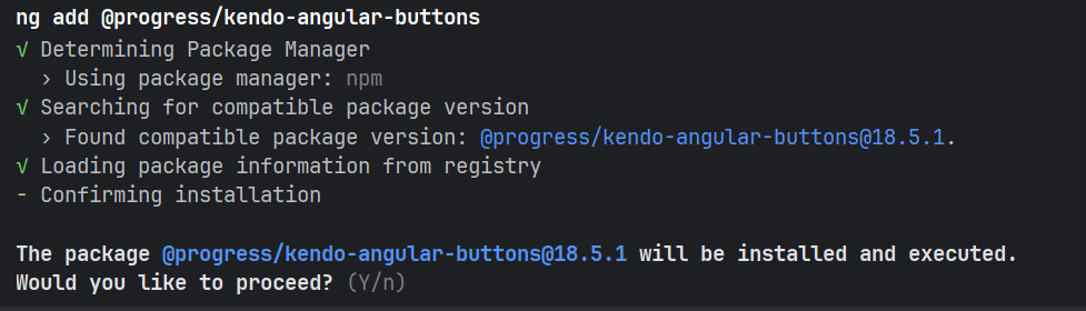
After we answer yes, it installs Kendo UI and registers global styles and themes automatically. Once that’s complete, we are ready to start to use the nice Angular buttons component with the KendoButton directive in our app!
KendoButton is an incredible directive that grants us a lot of power to work with buttons and tailor them to our app. We can set properties for our buttons like primary, nice animations, theme and more.
Let’s move to the code. First, open pony-button.component.ts and import the KENDO_BUTTONin the imports section. Mmmm … I think it’s time to improve our code. Remove darkMode and themeClassinput signal properties, because using the power of KendoButton, we can simplify this.
Import the KENDO_BUTTON and ButtonThemeColor from @progress/kendo-angular-buttons. Add the KENDO_BUTTON to the imports section to get access to the kendoButton directive in the template. Declare a new input property theme of type ButtonThemeColor to make the input accept only valid theme button colors.
The final code looks like this:
import {Component, input} from '@angular/core';
import {ButtonThemeColor, KENDO_BUTTON} from '@progress/kendo-angular-buttons';
@Component({
  selector: 'app-pony-button',
  imports: [KENDO_BUTTON],
  templateUrl: './pony-button.component.html',
  styleUrl: './pony-button.component.scss',
})
export class PonyButtonComponent {
  label = input<string>('Accept');
  theme = input<ButtonThemeColor>('base');
}
Our next step is to update the template. Open pony-button.component.html, add the kendoButton directive to the button and bind themeColor with theme property.
The final code looks like:
<button kendoButton [themeColor]="theme()"  >
 {{label()}}
</button>
Now it’s time to make small changes to the app.component.html by setting the property theme and adding other examples, like an app-pony-button with theme primary, default and dark. Feel free to copy the following markup into the app.component.html:
<div class="welcome">
<h1>Welcome to Pony</h1>
 <p>It is the amazing pony world, where you can dance and draw!</p>
 <div class="welcome__actions">
   <app-pony-button label="Login" theme="primary" />
   <app-pony-button label="Continue" />
   <app-pony-button label="Darkness 🦇" [theme]="'dark'"></app-pony-button>
 </div>
</div>
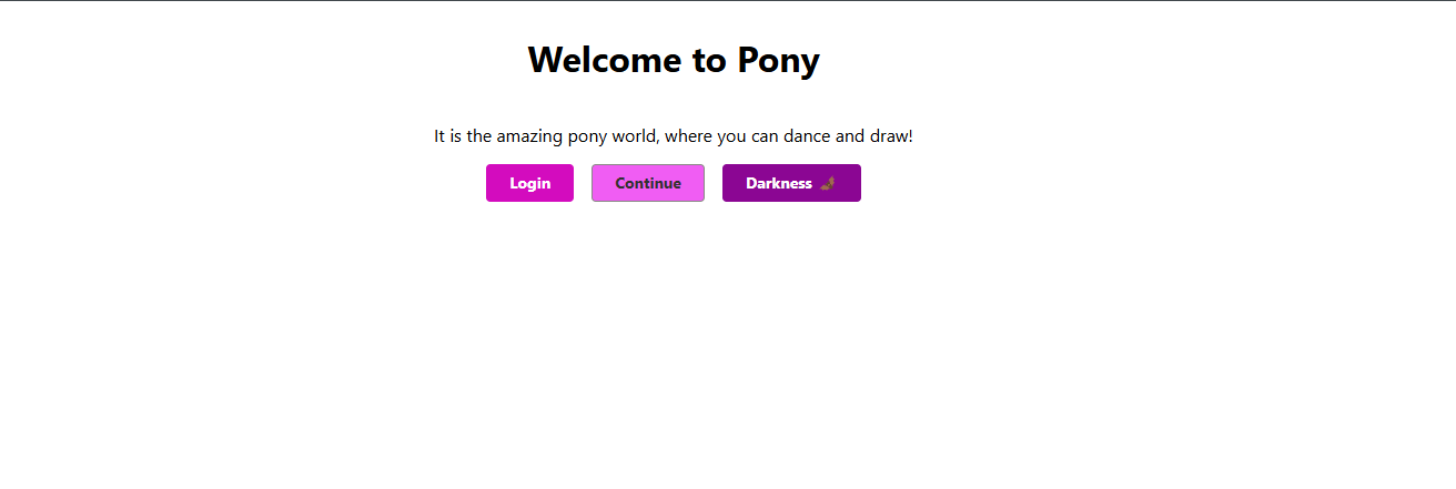
Save changes and see our app by running ng serve and navigate to http://localhost:4200, and we get:
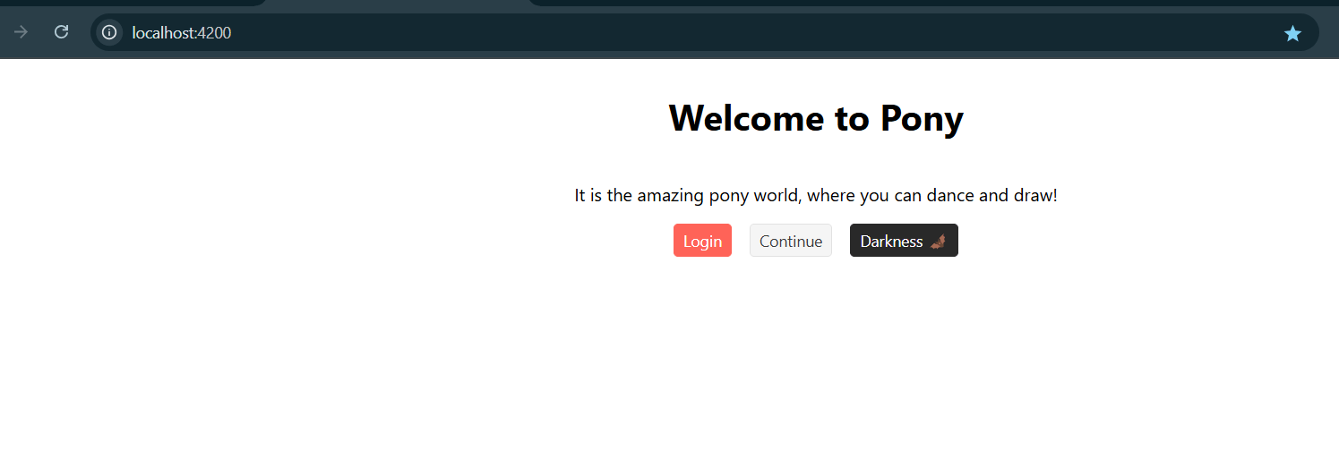
Mmm … it works. We have the look of primary, default and dark, but we’re missing our pony theme colors. Now, instead of writing Sass, loading mixins, generating a palette and reloading to test colors, we’re going to use the powerful ThemeBuilder!!!
It looks easier than Angular Material, which required manual Sass and theme setup. 😁
Let’s move to ThemeBuilder!!!
ThemeBuilder Time!
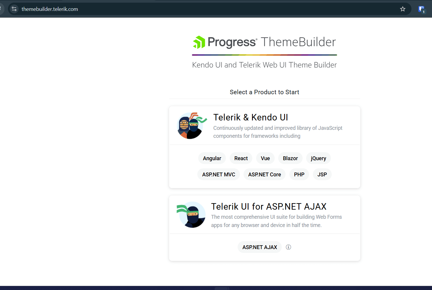
First, let’s talk about ThemeBuilder. It is the easiest way to customize Kendo UI components. It doesn’t matter if we have a small or big app; ThemeBuilder makes it easy to make our changes or work with designers. And it works smoothly with Figma!
ThemeBuilder comes with free and flexible plans; you can pick based on what your company needs (and can update at any time). And it comes with useful documentation, courses and great support. If you want to learn more, I highly recommend checking out YouTube videos. But for now let’s start to use it!
In your browser go to https://themebuilder.telerik.com/. Because we are using Kendo UI for Angular, pick Telerik & Kendo UI.
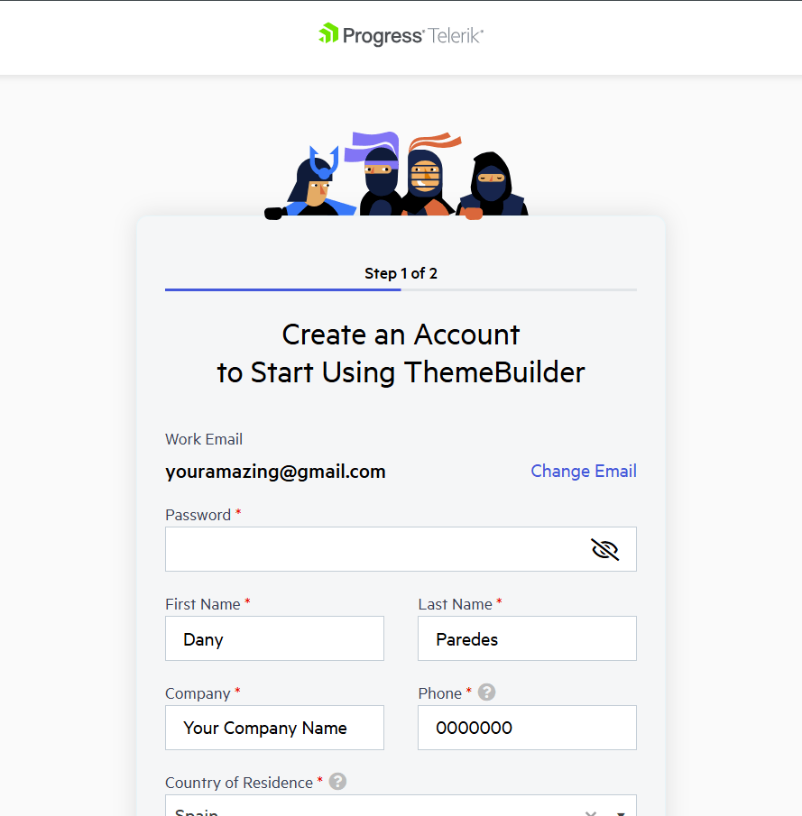
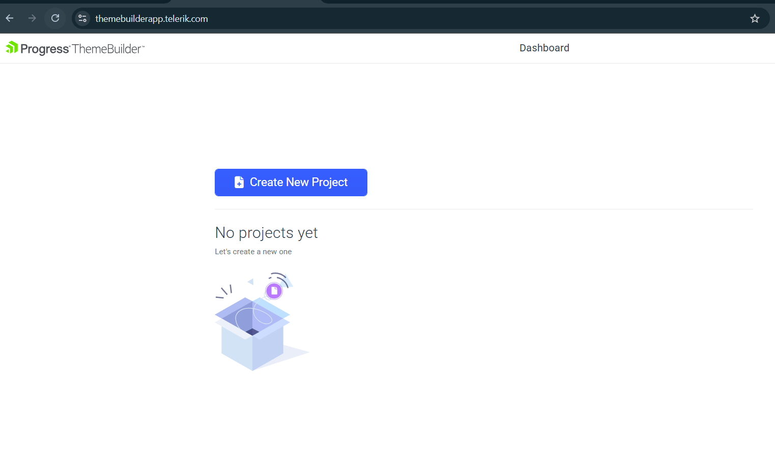
Create a free account to keep your project, save it in the cloud and use ThemeBuilder.
You don’t need a credit card! I love it! Feel free to create your account knowing it really is free.
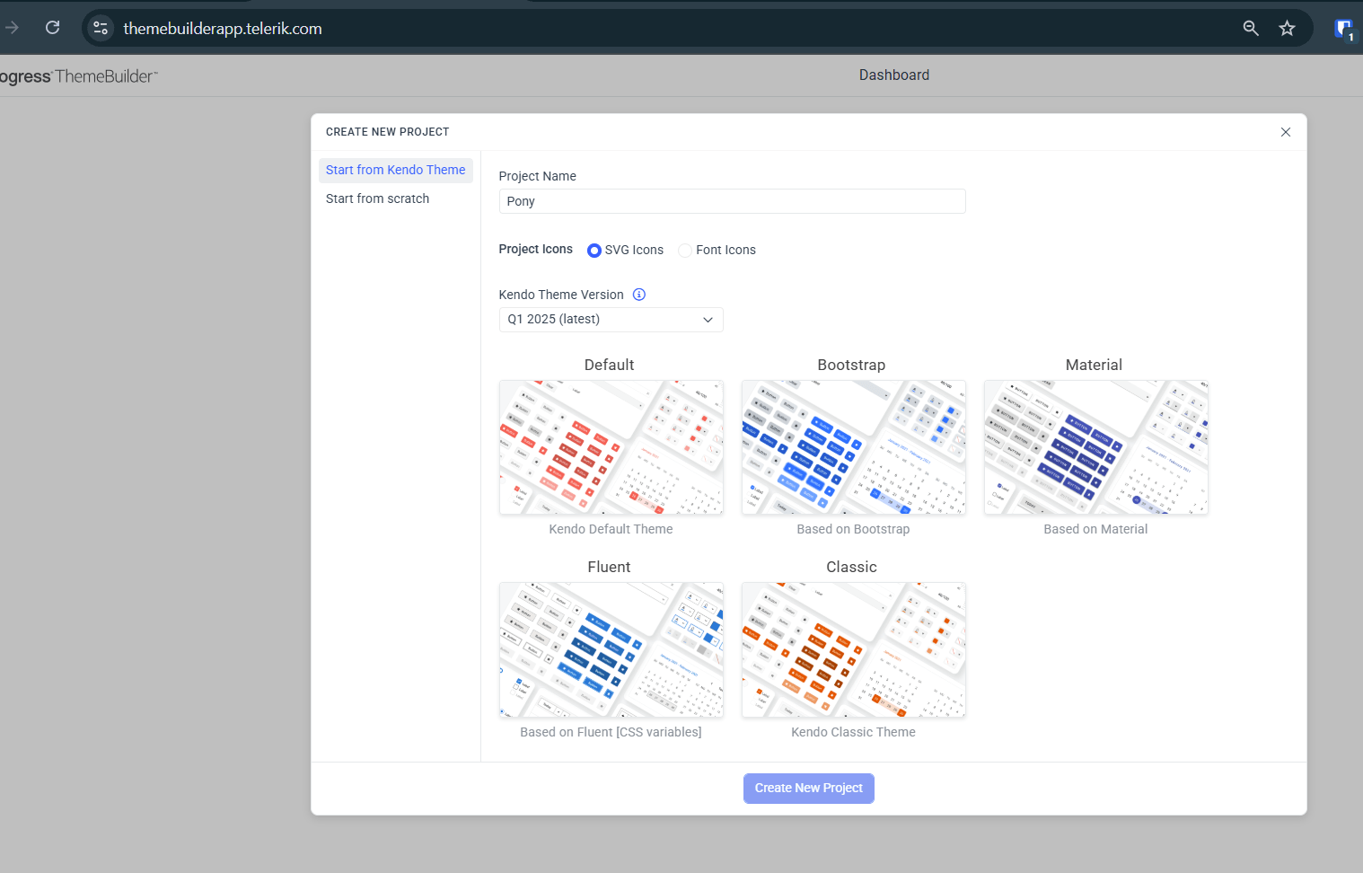
After that we are ready to create our project. Click the create project button.
Here we have a lot of flavors like Default, Bootstrap, Fluent, Classic Kendo UI style and also Material! 😁 Pick whatever you want. In my case, I picked Fluent.
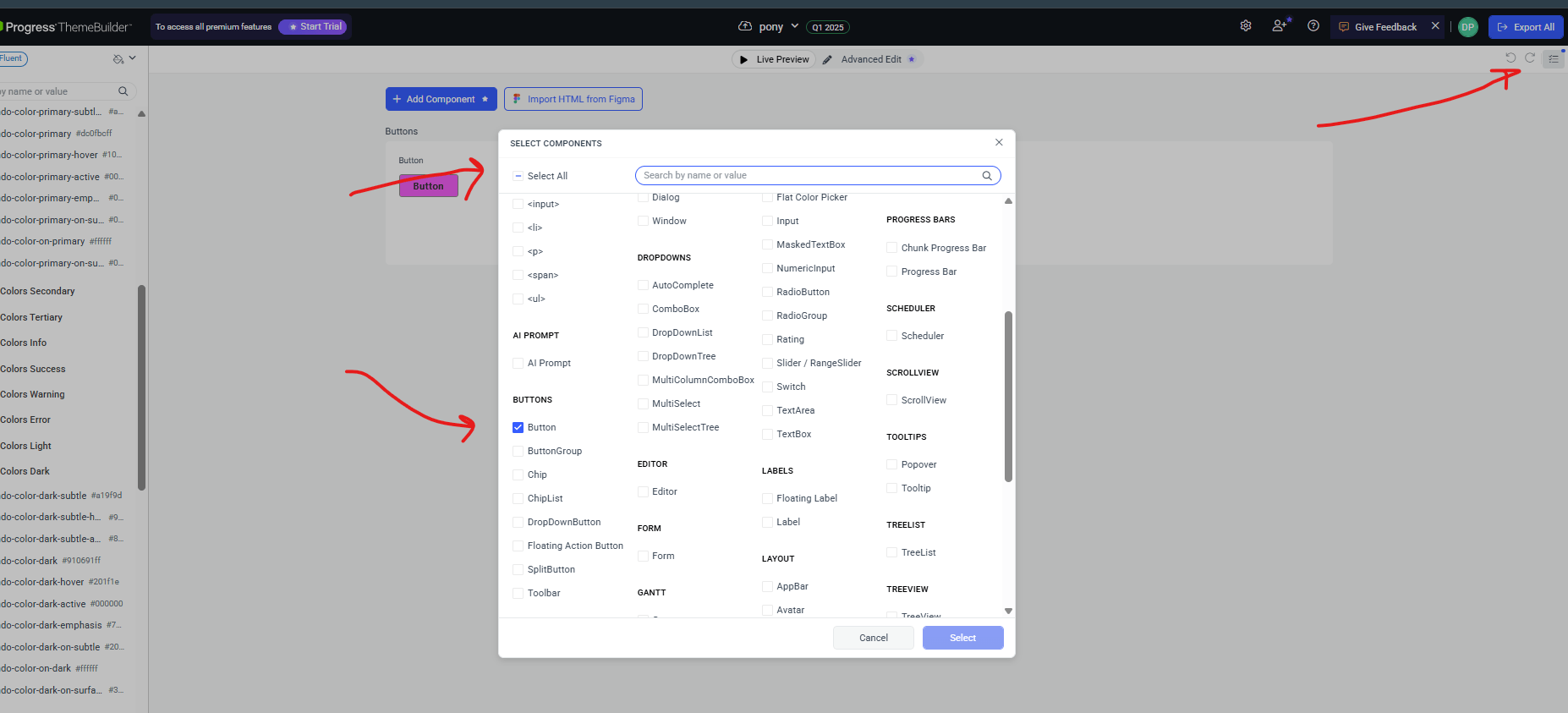
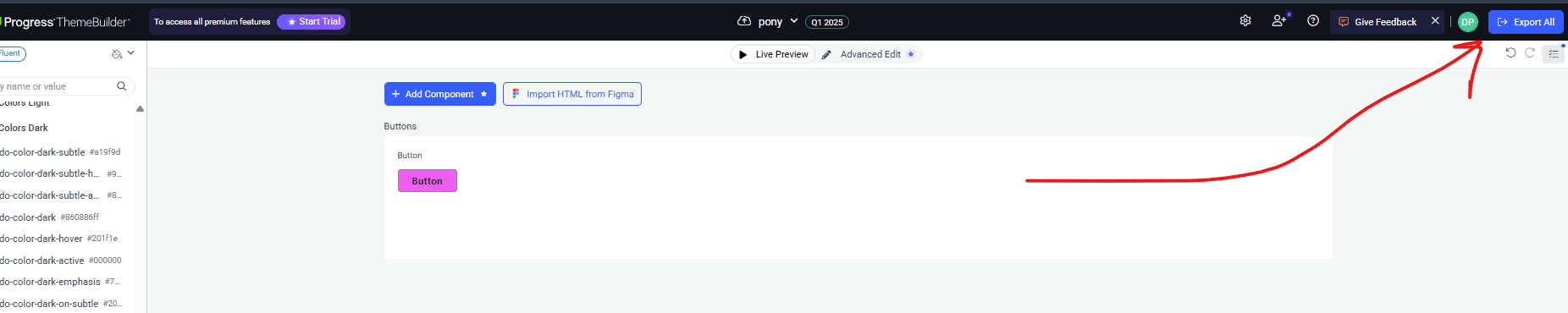
After that, we have opportunity to change a lot of components. But, in our case, we only need to customize the button, so click in the filter and select the button.
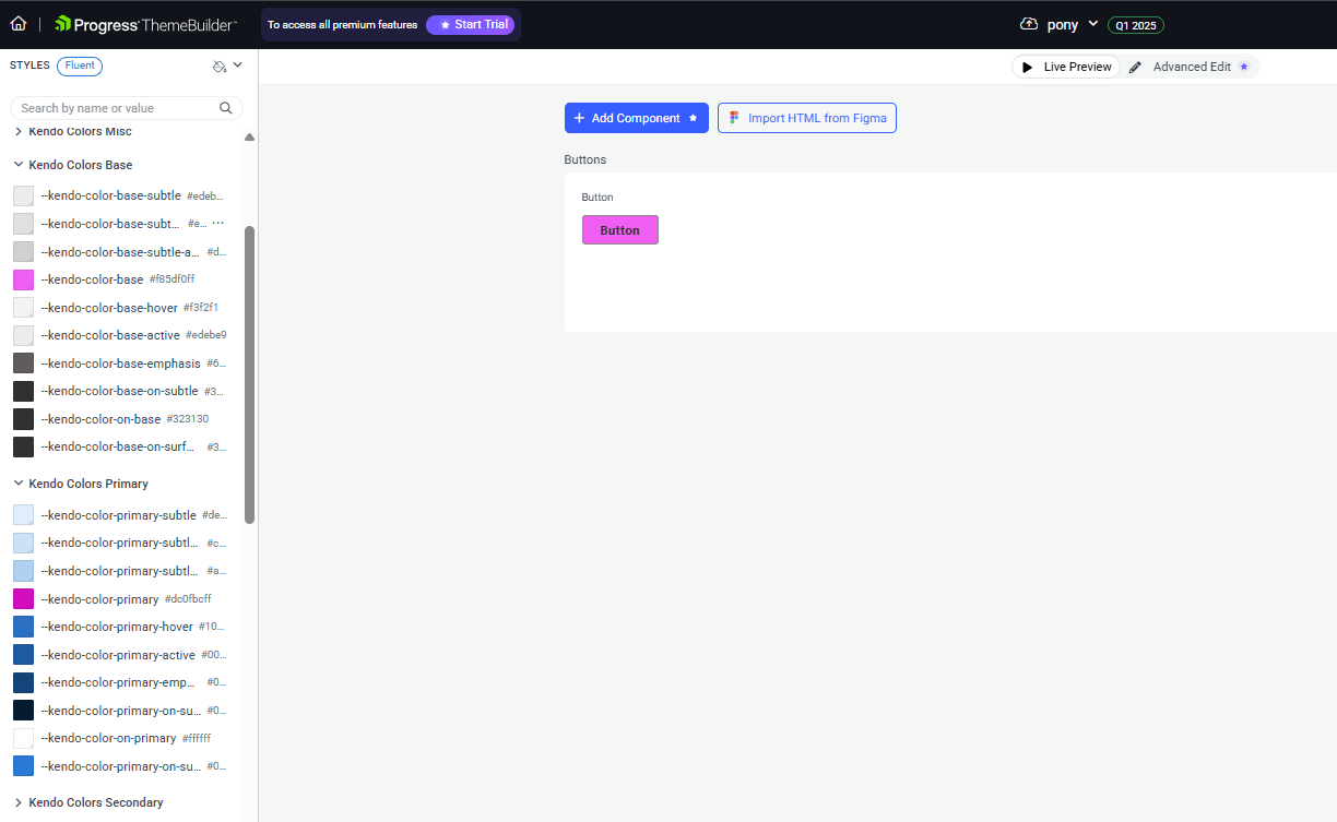
Next, to customize the styles, in each section we have to change the variables --kendo-color-base, --kendo-color-primary and --kendo-color-dark to match to our pony colors. After every change, we can see a preview of how they’ll look instantly.
We will have a config like this:
DONE!! Yes, we already made our changes! We only need to export CSS variables, so click the Export All button.
Perfect! We have our Kendo UI customized theme. It’s time to move our theme to Angular!
Using Our Theme with Angular
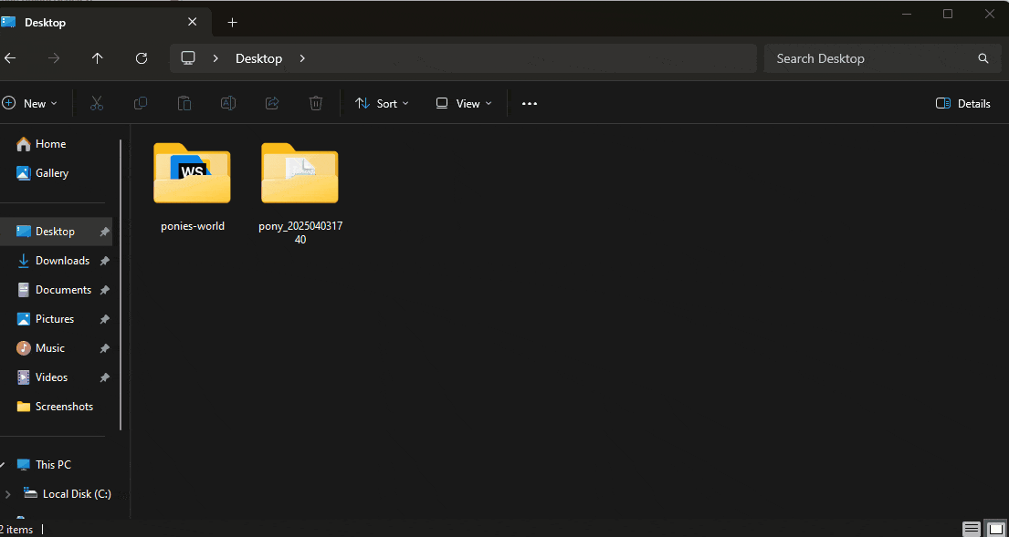
This is the final step! We have our theme downloaded in a zip file, so we need to extract the files. It provides two versions, sass and css. Go to the dist directory and css to copy the pony.css file.
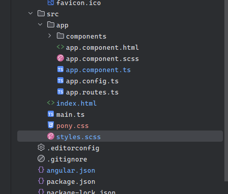
Next, we copy the pony.css into the project at the same level as the styles.scss file.
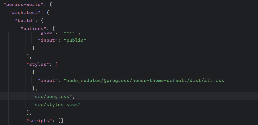
Finally, we need to tell Angular to pick up our pony.css. Open the angular.json file, which helps us with the administration and configures the projects for building, serving, testing and localization.
Open Angular.json and move to section architect > build > options. Focus on styles and scripts to add our styles and CSS.
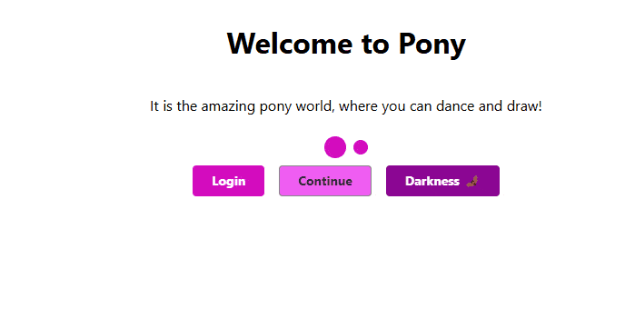
After that, stop the Angular CLI and run it again to apply the new configuration. Then, go to http://localhost:4200 and tada! We have our pony colors in the Kendo UI buttons!!!
One More Thing!
It’s nice we have the buttons ready with the pink colors, but what happens if I need another Kendo UI component, like a loader?
Let’s try with kendo-loader. First, open the terminal and install it by running the following command:
ng add @progress/kendo-angular-indicators
Open the app.component.ts, import the KENDO_INDICATORS from @progress/kendo-angular-indicators, and add it to the imports section in the app.component.ts to get access to the kendo-loader component.
Finally, open app.component.html, add the kendo-loader component and set the property size to large.
The code looks like this:
<div class="welcome">
 <h1>Welcome to Pony</h1>
 <p>It is the amazing pony world, where you can dance and draw!</p>

 <div class="welcome__actions">

   <app-pony-button label="Login" theme="primary" />
   <app-pony-button label="Continue" />
   <app-pony-button label="Darkness 🦇" [theme]="'dark'"></app-pony-button>
 </div>
</div>
After saving the changes, the loader now also displays the pony colors. This means that all of the Kendo UI components are now easily styled to match our design!
Recap
This journey was so fun. We started theming our Angular apps using just Sass. Later we moved to Material, getting some benefits but experiencing some pain points that made us move forward to a better and powerful alternative of Kendo UI for Angular with ThemeBuilder. We learned how to work with Kendo UI and ThemeBuilder for faster, effortless theming and customized and applied our custom colors with just a few clicks.
ThemeBuilder allows us to change the CSS variables with real-time previews, so we can test changes before applying them, making our development fast. And, of course, we can learn fast with the excellent documentation, and if we need more, it has enterprise support with a dedicated support team for quick responses and expert guidance.
Remember you can learn theming step-by-step with this free course on YouTube. 👉 Watch Now
Source Code: https://github.com/danywalls/ponies-world/tree/move-to-kendo-ui
Now that our UI is fully themed and scalable, we have time to work with other important points for our app like accessibility. No worries!! Kendo UI is ready with accessibility! So, take time to watch some NBA games or Netflix. ;)
And don’t forget that you can try Kendo UI for Angular for free (for real!).

Dany Paredes
Dany Paredes is a Google Developer Expert on Angular and Progress Champion. He loves sharing content and writing articles about Angular, TypeScript and testing on his blog and on Twitter (@danywalls).
Related Posts
Comments
All articles
Topics
Web Mobile DesktopDesktop
Design
Productivity
People

Latest Stories
in Your Inbox
Subscribe to be the first to get our expert-written articles and tutorials for developers!
All fields are required