
Creating a Music Player Application Using Kendo UI and Vue

Summarize with AI:
In this tutorial, we see how easy it is to create applications when you combine the power of Kendo UI’s component set and Vue.js.
Kendo UI is a library used for developing applications at a relatively quicker pace with precision; it provides UI components for libraries like jQuery, Angular, React and Vue, and comes packed with over 20 components for creating charts, data tables and drag-and-drop pages.
Vue is a front-end development framework for developing a range of applications on different platforms. Alongside its simple integration, detailed documentation and flexibility, Vue lets you extend the template language with your components. Vue also provides libraries for routing and state management, and we’ll be utilizing the latter in this article.
In this tutorial, we’ll create a music player application using Vue and Kendo UI; the application fetches and displays the latest albums and tracks from Spotify’s API.
To follow this tutorial, a basic understanding of Vue and Node.js is required. Please ensure that you have Node and npm installed before you begin.
If you have no prior knowledge of Vue, kindly follow the official documentation here. Come back and finish the article after going through the documentation.
We'll be building the application using the following tools:
Here’s a screenshot of the application we’ll be building:


Creating an Application and Obtaining Spotify Keys
To get access to the Spotify API, you’ll need to create an application in the developer dashboard. Head over to the developer dashboard, log in using your Spotify credentials. After logging in, you should see the screenshot below:
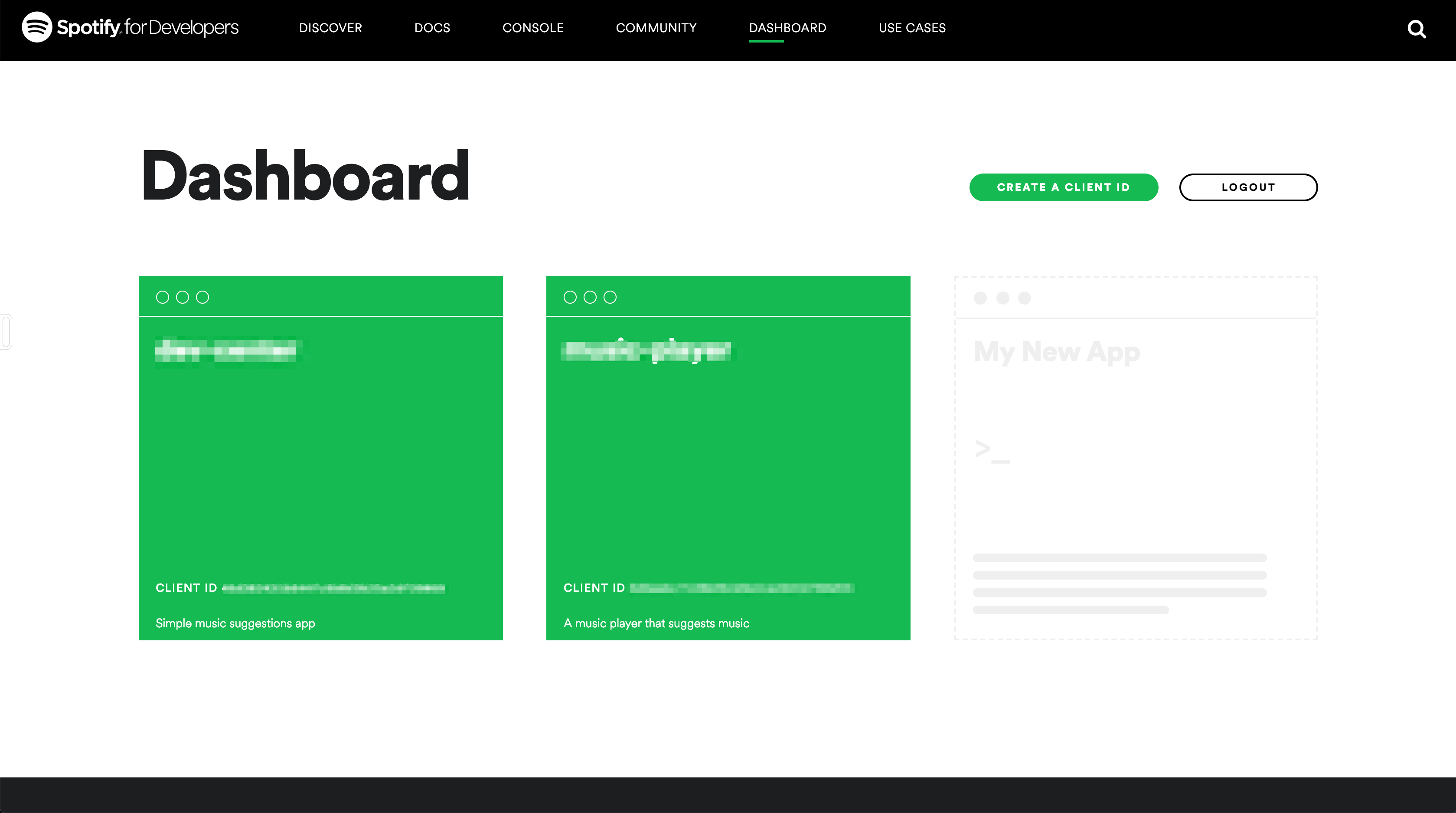
You can see that I have existing applications. If you don’t, click the empty card to create a new application, fill in the required details to get started.
Since we won’t be setting up OAuth for users of the application, we’ll have to get access tokens from the Spotify developer console. The tokens expire after a couple of requests, but you can always extend the application to get access tokens from logged in users.
To get a token, head over to the console, select the endpoint you wish to explore, and at the bottom of the page you should see a button titled Get Token. Click the button to get a new token and test the endpoint to view sample responses.
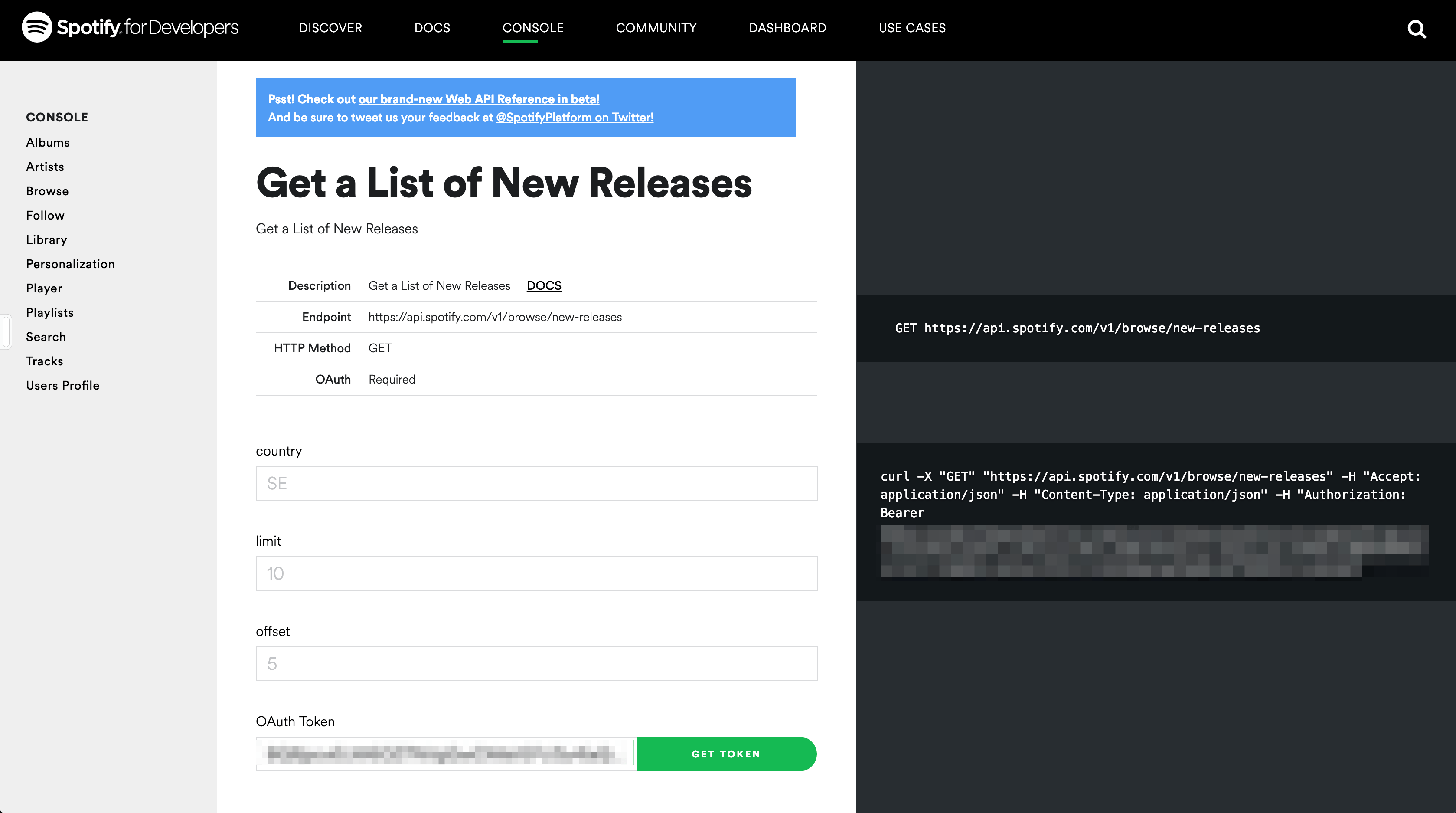
Copy the generated token; we’ll be using this later in the article.
Initializing the Application and Installing Project Dependencies
To get started, we use the vue-cli to bootstrap our application. First, we’ll install the CLI by running npm install -g @vue/cli in a terminal.
To create a Vue project using the CLI, we’ll run the following command:
vue create vue-music-player
After running this command, rather than selecting the default configuration, we’ll opt for the manual setup. We do this because we want to add a CSS pre-processor in our application. Follow the screenshot below:

Next, run the following commands in the root folder of the project to install dependencies.
npm install @progress/kendo-ui @progress/kendo-theme-default @progress/kendo-layout-vue-wrapper
Start the app dev server by running npm run serve in a terminal within the root folder of your project.
A browser tab should open on http://localhost:8080. The screenshot below should be similar to what you see in your browser:


Home View
To get started, we’ll define the views for the application, starting from the home page. The home page houses the grid displaying tracks and albums and the header. The default App component houses the home page of the application.
Open the App.vue file and update the file to get started. We’ll update the template section of the component first:
    <template>
      <main>
        <!-- header component will come here -->
          <section>
            <kendo-splitter style="width: 100%; height: 100%; padding: 40px 0" :orientation="'horizontal'">
              <div class="albumPane">
                <!-- album list here -->
              </div>
              <div class="songPane">
                <!-- songlist component here -->
              </div>
            </kendo-splitter>
          </section>
      </main>
    </template>


    <script>
    import { Splitter } from "@progress/kendo-layout-vue-wrapper";

    export default {
      name: "app",
      data() {
        return {
          albums: [],
          currentAlbum: {},
          tracks: []
        };
      },
    };
    </script>

    <style lang="scss">
    #app {
      font-family: "Muli", sans-serif;
      -webkit-font-smoothing: antialiased;
      -moz-osx-font-smoothing: grayscale;
      text-align: center;
      color: #2c3e50;
      margin-top: 60px;

    }

    .k-pane {
      height: unset !important;
    }
    .albumPane {
      width: 60% !important;
    }
    .songPane{
      width: 40% !important
    }
    </style>
First, we define the structure of our application using Kendo UI’s layout component. The layout package provides a splitter component that can be used to split the webpage into different sections. The splitter component allows the user to control the size of each section by dragging and resizing.
You can display the kendo-splitter in two orientations: vertical and horizontal. Simply provide an orientation directive on the component. Within the kendo-splitter component, there are two div elements representing the splitter panes, these are useful for creating columns similar to the .col elements in Bootstrap.
Next, we update the script section with the variables we’ll use in the template; we also import the Splitter component from Kendo UI’s Vue wrapper library.
Then, we’ll include the external assets to use in the application. We’ll be using the Montserrat and Muli fonts.
Open the public/index.html file and include the link to the external fonts:
    <!DOCTYPE html>
    <html lang="en">
      <head>
        <meta charset="utf-8">
        <meta http-equiv="X-UA-Compatible" content="IE=edge">
        <meta name="viewport" content="width=device-width,initial-scale=1.0">
        <link rel="icon" href="<%= BASE_URL %>favicon.ico">
        <link href="https://fonts.googleapis.com/css?family=Muli:400,700|Montserrat:700" rel="stylesheet">
        <title>vue-music-player</title>
      </head>
      <body>
        <noscript>
          <strong>We're sorry but vue-music-player doesn't work properly without JavaScript enabled. Please enable it to continue.</strong>
        </noscript>
        <div id="app"></div>
        <!-- built files will be auto injected -->
      </body>
    </html>
Also, we’ll be creating SCSS variables for use throughout our application. The first step is to create a partials file called _variables.scss within the src/assets folder. Open the file and update it with the following variables:
    // src/assets/_variables.scss

    $accent: #7B84FF;
    $accent-light: #DBDDFF;
    $border-radius: 5px;
    $base-text: #525F7F;
To make use of Kendo UI’s splitter component, we need to import the base files and the plugin installer, open the src/main.js file and update it like the snippet below:
    // src/main.js
    import Vue from 'vue'
    import App from './App.vue'
    import '@progress/kendo-ui'
    import '@progress/kendo-theme-default/dist/all.css'
    import { LayoutInstaller } from '@progress/kendo-layout-vue-wrapper';

    Vue.use(LayoutInstaller);
    Vue.config.productionTip = false
    new Vue({
      render: h => h(App),
    }).$mount('#app')
Header Component
The header component displays the application logo and very little information. This component is mostly a display component.
Create a file Header.vue within the src/components folder. Open the file and follow the three-step process of creating the component below:
First, we’ll create the template section:
    // src/components/Header.vue
    <template>
        <header>
        <div class="brand">
          <img src="../assets/images/logo.png">
          <h5>Just Music</h5>
        </div>
        <div class="nav-items">
          <ul class="nav-items">
            <li class="nav-item">
              <span>Music</span>
            </li>
          </ul>
        </div>
      </header>
    </template>
Next, we’ll style the header within the style section. Update the file using the snippet below:
    <!-- src/components/Header.vue -->
    <template>
      ...
    </template>


    <style lang="scss" scoped>
    @import "../assets/variables";
    header {
      display: flex;
      background-color: #f7f7f7;
      align-items: center;
      font-family: "Montserrat", sans-serif;
      margin: 0;
      padding: 20px 5%;
      color: whitesmoke;
      box-shadow: 0 1px 2px 0 rgba(0, 0, 0, 0.1);
      .brand {
        flex: 1;
        display: flex;
        align-items: center;
        img {
          height: 35px;
          border-radius: 50%;
          margin-right: 17px;
        }
        h5 {
          font-size: 15px;
          margin: 0;
          text-transform: uppercase;
          letter-spacing: 0.5px;
          font-weight: 600;
          color: $base-text;
        }
      }
      .nav-items {
        margin: 0;
        .nav-item {
          span {
            text-transform: uppercase;
            font-size: 13px;
            font-weight: bold;
            letter-spacing: 0.7px;
            padding: 10px 17px;
            border-radius: 4px;
            background-color: $accent-light;
            color: $accent;
            border: none;
            margin: 0;
          }
        }
      }
    }
    </style>
Finally, we’ll include the script section. Within the script section, we’ll create a cart property within the props array; with this, and the component can receive props from the parent component:
    <template>
      ...
    </template>

    <style lang="scss" scoped>
      ...
    </style>

    <script>
     export default {
      name: "Header"
    };
    </script>
Next, we’ll create a service to fetch the latest releases and tracks from Spotify.
Fetching Tracks and Albums
To handle fetching of the latest releases and tracks, we’ll be using utility functions. Create a file called utils.js in the src/ directory.
Open the file and copy the code below into it:
// src/utils.js

    const SPOTIFY_SECRET = '<YOUR_SPOTIFY_ACCESS_TOKEN>';
    const headers = {
      'Content-Type': 'application/json',
      Authorization: `Bearer ${SPOTIFY_SECRET}`,
    };

    export const getAlbums = () => {
      return fetch(
        'https://api.spotify.com/v1/browse/new-releases?limit=10&country=GB',
        {
          headers,
        }
      );
    };

    export const getAlbumTracks = (id) => {
      return fetch(`https://api.spotify.com/v1/albums/${id}/tracks`, {
        headers,
      });
    };
The headers object is attached to requests as the Spotify endpoints require Authorization headers.
The next function is the getAlbums method that returns a Fetch request made to the new-releases endpoint. This endpoint returns the latest albums and tracks released on Spotify. You can view the responses from this endpoint in the console here.
Finally, the getAlbumTracks method takes an id parameter and calls the album/${id}/tracks endpoint. This endpoint returns the tracks contained in an album.
Replace the placeholder string <SPOTIFY_SECRET> with your actual access token obtained from the console. If your token has expired, you can get a fresh one here.
Next, we’ll create the components to display the latest albums from the new releases endpoint.
Creating the Album List View
Create the following files within the src/components directory: Album.vue for rendering individual album cards and AlbumList.vue for rendering a list of album cards.
Open the Album.vue file in the src/components directory and follow the three-step process of creating the component below:
    <template>
      <div class="album" @click="onAlbumClick">
        <div :style="albumCover">
          <div class="details">
            <h3>{{album.name}}</h3>
            <h4>{{getArtiste(album).name}}</h4>
          </div>
        </div>
      </div>
    </template>
The album has a click event listener to load the tracks of the selected album. Next, let’s add some styles to the component to give it some life. Add the style section in the file and add the following styles to it:
    <template>
      ...
    </template>

    <style>
    .album div {
      width: 100%;
      height: 300px;
      border-radius: 6px;
      margin: 10px 0;
      background-blend-mode: multiply, normal;
      background-size: contain;
      display: flex;
      align-items: flex-start;
      overflow: hidden;
      cursor: pointer;
      &:hover {
        h3 {
          transition: 0.3s ease-in;
          transform: translateY(0);
        }
        h4 {
          transition: 0.3s ease-in;
          transform: translateY(0);
        }
      }
      .details{
        display: flex;
        flex-direction: column;
      }
      h3 {
        font-size: 17px;
        font-family: 'Montserrat', sans-serif;
        text-transform: uppercase;
        letter-spacing: 0.7px;
        font-weight: 600;
        text-align: left;
        color: white;
        opacity: 0.9;
        margin-left: 15px;
        margin-top: 30px;
        transform: translateY(-50px);
      }
      h4 {
        font-size: 14px;
        text-transform: uppercase;
        letter-spacing: 0.7px;
        font-weight: 500;
        text-align: left;
        color: whitesmoke;
        opacity: 0.6;
        margin-left: 15px;
        margin-top: 6px;
        transform: translateY(-70px);
      }
    }
    </style>
Next, we’ll update the file to add a script section and register the handler for the click event. Open the file and update it with the variables and methods used in the HTML file:
    <template>
      ...
    </template>

    <style>
      ...
    <style>

    <script>
      export default {
      name: "Album",
      props: ["album"],
      data() {
        return {
          albumCover: {}
        };
      },
      methods: {
        getArtiste(album) {
          const { artists } = album;
          const [artist] = artists;
          return artist;
        },
        onAlbumClick(e) {
          this.$emit("albumSelected", this.album);
        }
      },
      mounted() {
        const { images } = this.album;
        const [, image] = images;
        this.albumCover = {
          background: `linear-gradient(0deg, #989494, #aba6a6), url(${
            image.url
          }), no-repeat`
        };
      }
    };
    <script>
The component takes a prop named album, the AlbumList component sends this.
We created two methods. The getArtiste method gets the album’s artist off the album input object. The next method is the event handler onAlbumClick, which emits the album clicked to the parent component.
Finally, there’s the mounted lifecycle. In here, we retrieve the album image from the album object, then using the image, we generate a background image using the linear-gradient function.
After setting up the album component, we’ll head over to the AlbumList component, open the AlbumList.vue file and update it with the code below:
    <template>
      <section class="album-section">
        <section class="album-section">
          <div>
            <h4>Latest Albums</h4>
          </div>
          <div class="album-list">
            <Album
              v-for="album in albums"
              :key="album.id"
              :album="album"
              @albumSelected="onAlbumSelected($event)"
            />
          </div>
        </section>
      </section>
    </template>
Here, we loop through the array of albums using the v-for directive and rendering them using the Album component. You’ll also notice the (albumselected) event emitted from the Album component.
Next, add the style section and update it with the styles below:
    <template>
      ...
    </template>

    <style lang="scss" scoped>
    @import "../assets/_variables.scss";
    .album-section {
      padding: 30px 45px;
      h4 {
        font-size: 15px;
        color: $base-text;
        text-transform: uppercase;
        font-family: "Montserrat", sans-serif;
        font-weight: 600;
        margin: 0 0 20px;
      }
    }
    .album-list {
      line-height: 0;
      column-count: 3;
      column-gap: 10px;
    }
    @media (max-width: 1200px) {
      .album-list {
        column-count: 4;
      }
    }
    @media (max-width: 1000px) {
      .album-list {
        column-count: 3;
      }
    }
    @media (max-width: 800px) {
      .album-list {
        column-count: 2;
      }
    }
    @media (max-width: 400px) {
      .album-list {
        column-count: 1;
      }
    }
    </style>
The following styles are used to define a simple grid that presents the images in a random order within the grid.
Next, update the file to add the script section; here we create the event handler for the events emitted from the Album component.
    <template>
      ...
    </template>

    <style lang="scss" scoped>
      ...
    </style>

    <script>
    import Album from './Album';
    export default {
      name: "AlbumList",
      props: ["albums"],
      components: {
        Album
      },
      methods: {
        onAlbumSelected(album) {
          this.$emit("albumselected", album);
        }
      }
    };
    </script>
The component receives data (albums) from the home component using props. The onAlbumSelected is the event handler for receiving data from the album component.
Next, we’ll render the AlbumList component in the App.vue and also fetch the latest albums using the utility functions we created.
Open the file and update it to be similar to the snippet below:
    <template>
      <main>
        <Header/>
        <section>
          <kendo-splitter
            style="width: 100%; height: 100%; padding: 40px 0"
            :orientation="'horizontal'"
          >
            <div class="albumPane">
              <AlbumList :albums="albums" @albumselected="onAlbumChange($event)"/>
            </div>
            <div class="songPane">
              <! -- song list component here -->
            </div>
          </kendo-splitter>
        </section>
      </main>
    </template>

    <style lang="scss" scoped>
      ...
    </style>

    <script>
      ...
    <script>
After rendering the album list, update the App component to fetch albums and assign them to a variable. Also, we’ll create an event handler to receive the clicked album.
Update the script section of the component to be similar to the snippet below:
    <template>
      ...
    </template>

    <style lang="scss" scoped>
      ...
    </style>

    <script>
    import { Splitter } from "@progress/kendo-layout-vue-wrapper";
    import { getAlbumTracks, getAlbums } from "./utils.js";
    import AlbumList from "./components/AlbumList";
    import Header from "./components/Header";

    export default {
      name: "app",
      data() {
        return {
          albums: [],
          currentAlbum: {},
          tracks: []
        };
      },
      components: {
        AlbumList,
        Header,
      },
      methods: {
        async currentAlbumTracks(id) {
          const res = await getAlbumTracks(id);
          const { items } = await res.json();
          this.tracks = items;
        },
        onAlbumChange(album) {
          const { id } = album;
          this.currentAlbum = album;
          this.currentAlbumTracks(id);
        }
      },
      async mounted() {
        const response = await getAlbums();
        const { albums } = await response.json();
        const { items } = albums;
        this.currentAlbum = items[0];
        this.albums = items;
        this.currentAlbumTracks(this.currentAlbum.id);
      }
    };
    </script>
First, we import the utility functions from the src/utils.js file; then in the mounted component lifecycle, we fetch the albums using the getAlbums function. When the request is complete, we get the items from the response using object restructuring; then we set the first album in the list as the currentAlbum.
The currentAlbumTracks method is for fetching the tracks within an album. The method takes a single parameter id and uses the getAlbumTracks function to fetch the data.
The onAlbumChange method is an event handler called when you click an album. The method gets the id of the selected and calls the currentAlbumTracks method to fetch the tracks of the album. We then assign the selected album to the currentAlbum property.
After these updates, if we visit the application on the browser on http://localhost:8080, we should see the albums listed, and it should be similar to the screenshot below:


Next, we’ll create the tracklist and track components. Stay tuned.
Creating the Tracks List View
Create the following files within the src/components directory: Song.vue for rendering individual album cards and SongList.vue for rendering a list of album cards.
Open the Song.vue file in the src/components directory and follow the three-step process of creating the component below:
    <template>
      <div class="track">
        <div class="track-info">
          <div class="track-info__name">
            <h4>{{track.name}}</h4>
          </div>
          <div class="track-info__meta">
            <span class="track-info__meta-duration">{{songDuration}}</span>
            <div class="track-info__meta-tags">
              <span v-if="track.explicit" class>Explicit</span>
            </div>
          </div>
        </div>
        <div class="track-playing__indicator">
          <img src="../assets/images/short-waves.png" class="bland" alt>
          <img src="../assets/images/player-waves-colored.png" class="colored">
        </div>
        <div class="track-actions">
          <button class="track-actions__play">
            <span class="k-icon k-i-video-external"></span>
          </button>
        </div>
      </div>
    </template>
In this component, we’ll display, the track name, and we’ll display a tag if the track is explicit. We also used Kendo UI’s icon set to define the play button. Kendo UI has a rich set of icons that are available here. They are easy to configure and customize.
Let’s apply some styles to the component. Update the component with a style section and update it with the styles below:
    <template>
      ...
    </template>

    <style lang="scss" scoped>
    @import "../assets/_variables.scss";
    .track {
      padding: 15px 20px;
      display: flex;
      justify-content: space-between;
      background: #f7f7f7;
      border: 1px solid rgba(0, 0, 0, 0.08);
      border-radius: 10px;
      margin: 10px 0;
      &:hover {
        background: white;
        transform: scale(1.06);
        box-shadow: 0 2px 4px 0 rgba(0, 0, 0, 0.09);
        .track {
          &-playing__indicator {
            .colored {
              display: block;
            }
            .bland {
              display: none;
            }
          }
          &-actions {
            &__play {
              background: $accent;
              .k-icon {
                color: white;
              }
            }
          }
        }
      }
      &-info {
        flex-grow: 1;
        flex-basis: 0;
        &__name {
          margin-bottom: 8px;
          h4 {
            font-family: "Montserrat", sans-serif;
            opacity: 0.8;
            font-size: 14px;
            font-weight: 400;
            margin: 5px 0;
          }
        }
        &__meta {
          display: flex;
          align-items: center;
          &-duration {
            font-size: 13px;
            font-weight: 600;
            opacity: 0.7;
          }
          &-tags {
            margin-left: 7px;
            span {
              background: #ffdde2;
              color: indianred;
              border-radius: 4px;
              font-size: 10px;
              text-transform: uppercase;
              font-weight: 600;
              padding: 5px 6px;
              letter-spacing: 0.6px;
            }
          }
        }
      }
      &-playing__indicator {
        flex-grow: 1;
        flex-basis: 0;
        .colored {
          display: none;
        }
      }
      &-actions {
        &__play {
          height: 50px;
          width: 50px;
          border-radius: 50%;
          border: none;
          background: #f0f0f0;
          display: flex;
          justify-content: center;
          align-items: center;
          box-shadow: 1px 2px 4px 0 rgba(0, 0, 0, 0.09);
          cursor: pointer;
          .k-icon {
            font-size: 22px;
            color: #d4d4d4;
          }
        }
      }
    }
    </style>
After applying the styles, the next step is to update the component file to declare the variables used in the view template. Update the file with a script section and update it like the snippet below:
    <template>
      ...
    </template>

    <style lang="scss" scoped>
      ...
    <style>

    <script>
    export default {
      name: "Song",
      props: ["track"],
      computed: {
        songDuration() {
          const { duration_ms } = this.track;
          const songInSeconds = Math.ceil(duration_ms / 1000);
          const getMinutes = Math.floor(songInSeconds / 60);
          const getSecondsRemainder = songInSeconds % 60;
          return `${getMinutes}:${getSecondsRemainder}`;
        }
      }
    };
    </script>
First, we declare a track prop to receive the track data from the parent component; then we declare a computed value songDuration. This method takes the duration_ms property which contains the length of the track in milliseconds and converts it to a minutes:seconds format seen in most music player applications.
After setting up the Song component, we’ll head over to the SongList component, open the SongList.vue file and update it with the code below:
    <template>
      <div class="song-list">
        <div>
          <h3>Current Album</h3>
          <hr>
          <div class="album-info">
            <div class="album-info__image">
              <img :src="albumCover.url" :alt="currentAlbum.name">
            </div>
            <div class="album-info__name">
              <h4>{{currentAlbum.name}}</h4>
              <p>{{albumArtiste.name}}</p>
            </div>
          </div>
        </div>
        <Song v-for="track of tracks" :key="track.id" :track="track"/>
      </div>
    </template>
Here we loop through the array of tracks using the v-for directive and render them using the Song component. Also, we display the name of the album and the album cover above the track list. The tracks displayed are songs within the selected album.
Next, update the file with a style section copy the following styles into it:
    <template>
      ...
    </template>

    <style lang="scss" scoped>
    .song-list {
      padding: 30px 50px;
      h3 {
        font-size: 14px;
        font-weight: 600;
        opacity: 0.7;
        text-transform: uppercase;
        font-family: "Montserrat", sans-serif;
        margin: 0 0 15px;
      }
      hr {
        border-color: rgba(0, 0, 0, 0.07);
        margin-bottom: 15px;
      }
      .album-info {
        display: flex;
        align-items: flex-end;
        &__image {
          img {
            width: 50px;
            height: 50px;
            border-radius: 6px;
          }
        }
        &__name {
          h4 {
            font-family: "Montserrat", sans-serif;
            text-transform: uppercase;
            font-size: 14px;
            color: #7b84ff;
            font-weight: 600;
            opacity: 0.8;
            margin: 0 0 0 10px;
          }
          p {
            text-transform: uppercase;
            font-size: 12px;
            font-weight: 500;
            opacity: 0.6;
            margin: 0 0 5px 10px;
          }
        }
      }
    }
    </style>
The following styles are used to define the list of tracks to be displayed.
The SongList component receives an array of tracks from the App component, so update the component to declare the props and other variables used in the view template:
    <template>
      ...
    </template>

    <style lang="scss" scoped>
      ...
    </style>

    <script>
    import Song from "./Song";

    export default {
      name: "SongList",
      props: ["tracks", "currentAlbum"],
      components: {
        Song
      },
      computed: {
        albumCover() {
          const { images } = this.currentAlbum;
          if (images && images.length) {
            const [image] = images;
            return image;
          }
          return {};
        },
        albumArtiste() {
          const { artists } = this.currentAlbum;
          if (artists && artists.length) {
            const [artist] = artists;
            return artist;
          }
          return {};
        }
      }
    };
    </script>
In the component, we define the bindings to be received by the component. Also, we declare two computed methods albumCover and albumArtiste. The method names are pretty self-explanatory, but we’ll still walk through it. The albumCover method retrieves the image from the currentAlbum object, and the albumArtiste method retrieves the album’s artist.
Like we did with the AlbumList component, we’ll render the component in the App.vue file.
Open the App.vue file and update it to be similar to the snippet below:
<template>
<main>
<header>
<section>
<kendo-splitter style="width: 100%; height: 100%; padding: 40px 0" :orientation="'horizontal'">
<div style="width: 60%" class="albumPane">
<albumlist :albums="albums" @albumselected="onAlbumChange($event)">
</div>
<div style="width: 40%" class="songPane">
<songlist :tracks="tracks" :currentalbum="currentAlbum">
</div>
</kendo-splitter>
</section>
</header>
</main>
</template></p>
<pre><code><style lang="scss" scoped>
...
<style>
<script>
import { Splitter } from "@progress/kendo-layout-vue-wrapper";
//...
import SongList from "./components/SongList";
export default {
name: "app",
data() {
// ...
},
components: {
// ...
SongList,
},
methods: {
// ...
},
async mounted() {
// ...
}
};
<script>
After rendering the list of tracks, if we visit the application on the browser on http://localhost:8080, we should see both the albums listed and the tracks. After clicking an album, it gets the tracks within the tracklist section. Check it out below:

Conclusion
In this tutorial, we’ve seen how easy it is to get started using Kendo UI components for Vue, and then how easy it is to define the structure of your application using the Splitter component from Kendo UI. The components were easy to use and configure. You can extend this demo application to play each track listed. The Spotify API provides a preview_url for their tracks, and an audio element can be used to play these tracks. Happy coding.

Christian Nwamba
Chris Nwamba is a Senior Developer Advocate at AWS focusing on AWS Amplify. He is also a teacher with years of experience building products and communities.