
Creating Dynamic and Flexible Components with Angular Content Projection

Summarize with AI:
Angular offers content projection, a more flexible option than using inputs and having to modify the template if we need to update a component. Let’s take a look!
When building applications, presenting data and information to users in an appealing and consistent way is important.
For example, picture a blog page with cards in the style of Netflix. Each card is different, but the card container remains the same. The card container is an HTML template, and we don’t want to repeat the HTML markup or to need to modify each card when we want a change because this is prone to errors or might break the UI.
To solve this kind of situation, we use libraries like Progress Kendo UI for Angular, whose Card component is flexible enough to add and modify the information or to add custom content. We can add custom items like images or text inside of the <kendo-card> component or render content and other components in a specific place like <kendo-actions>, making it easy for us to build great cards with our custom content.
These kinds of components are very useful for our applications. They help speed up development, simplify our codebase, reuse code and reduce errors.
When the Kendo UI team sets out to create a component like the Card, they start with a few Angular features to make it flexible for wide use cases, just like we would if we were building the component from scratch. What if I told you we can learn to build one component with the same flexibility in a real scenario with just a few lines like the Kendo UI team?
Today, we’re going to learn a few ways to make our components flexible using Angular features, and each way allows us to deliver more flexibility with fewer lines of code.
Let’s do it!
Scenario
Let’s say we have been hired to show a list of Progress Virtual Classroom courses with an HTML template. Each course will include title, thumbnail, time and ratings.
How can we create a page to show the courses without duplicating the HTML? If we can succeed at this, we’ll end up with a very nice and flexible component.
Btw, the Virtual Classroom is a great way to learn about Kendo UI!
Set Up the Project
First, we get the code from the repo. In your terminal, run the following command to clone the project:
git clone https://github.com/danywalls/angular-content-projection
Cloning into 'angular-content-projection'...
remote: Enumerating objects: 66, done.
remote: Counting objects: 100% (66/66), done.
remote: Compressing objects: 100% (39/39), done.
Receiving objects: 100% (66/66), 123.72 KiB | 1.49 MiB/s, done.
Resolving deltas:   0% (0/21)
Resolving deltas: 100% (21/21), done.
Navigate to the angular-content-projection folder and execute the npm install command in the terminal to install all the required dependencies, so that we’re prepared for our next step.
After that’s finished, go to the directory and run ng serve -o to see your project ready!
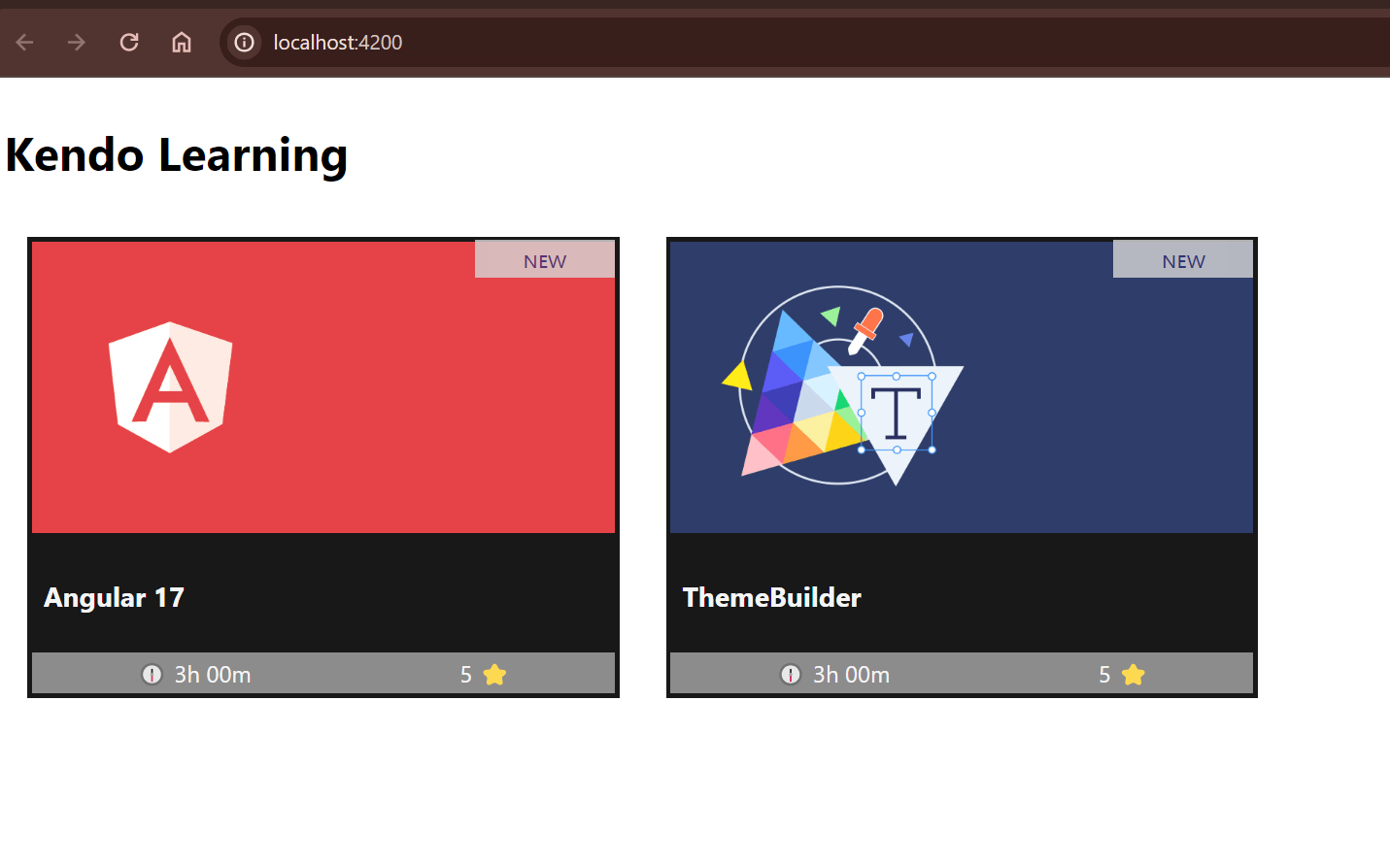
If you open app.component.html, you’ll find the following duplicate HTML template to show two courses. This is not the best way. Why not move it into a component as our first approach toward reducing duplicate code?
Create the Component
In the root directory, use the Angular CLI to generate the new course-card component:
ng g c components/course-card
CREATE src/app/components/course-card/course-card.component.html (27 bytes)
CREATE src/app/components/course-card/course-card.component.spec.ts (648 bytes)
CREATE src/app/components/course-card/course-card.component.ts (265 bytes)
CREATE src/app/components/course-card/course-card.component.css (0 bytes)
>
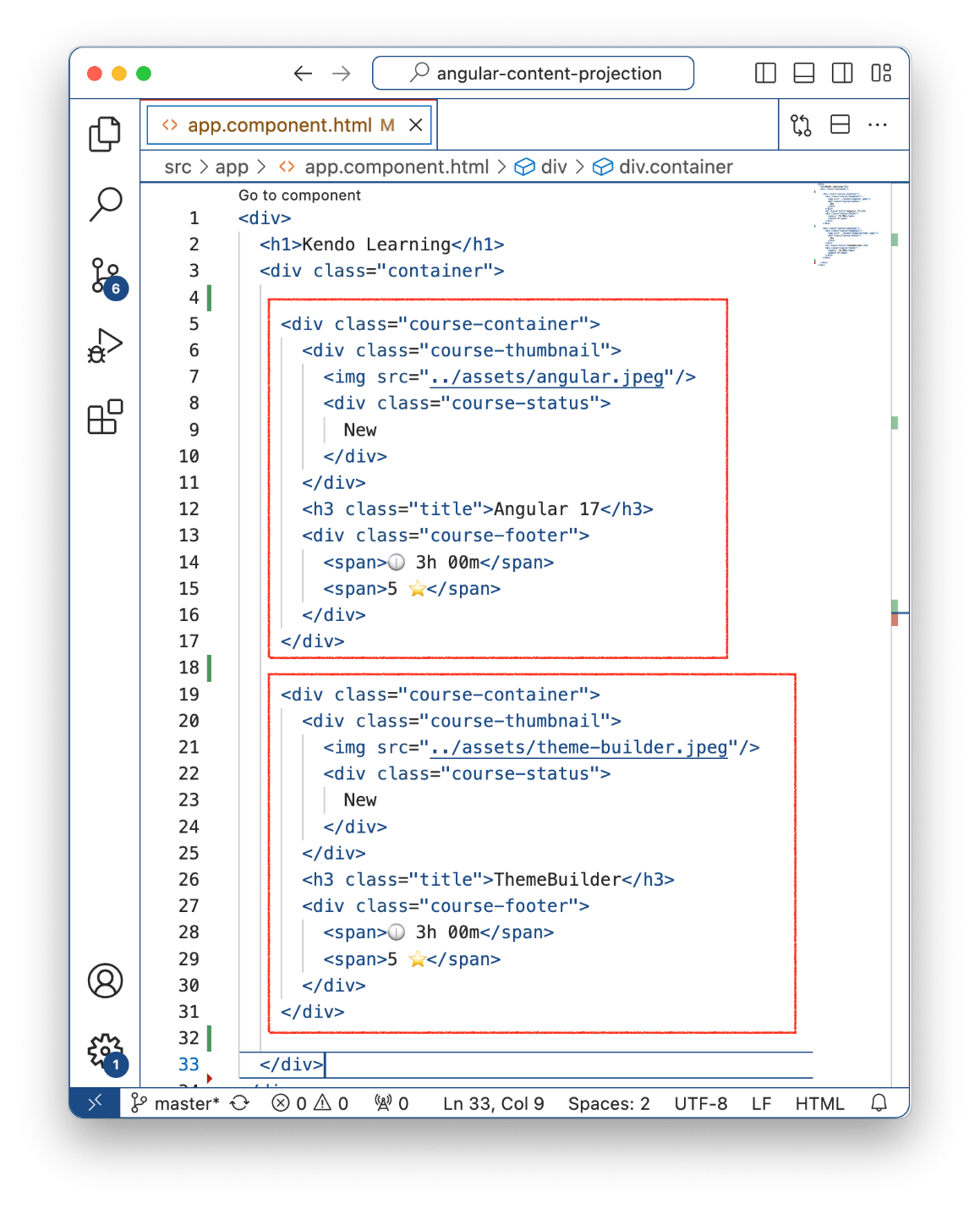
Next, copy one course’s HTML markup from app.component.html to course-card.component.html.
  <div class="course-container">
      <div class="course-thumbnail">
        <img src="../assets/angular.jpeg"/>
        <div class="course-status">
          New
        </div>
      </div>
      <h3 class="title">Angular 17</h3>
      <div class="course-footer">
        <span>🕧 3h 00m</span>
        <span>5 ⭐</span>
      </div>
    </div>
Then, import CourseCardComponent into the app.component.ts
import { Component } from '@angular/core';
import { RouterOutlet } from '@angular/router';
import { CourseCardComponent} from "./components/course-card/course-card.component";

@Component({
  selector: 'app-root',
  standalone: true,
  imports: [RouterOutlet, CourseCardComponent],
  templateUrl: './app.component.html',
  styleUrl: './app.component.css'
})
export class AppComponent {
}
And use it in the app.component.html markup.
<div>
  <h1>Kendo Learning</h1>
  <div class="container">
    <app-course-card/>
  </div>
</div>
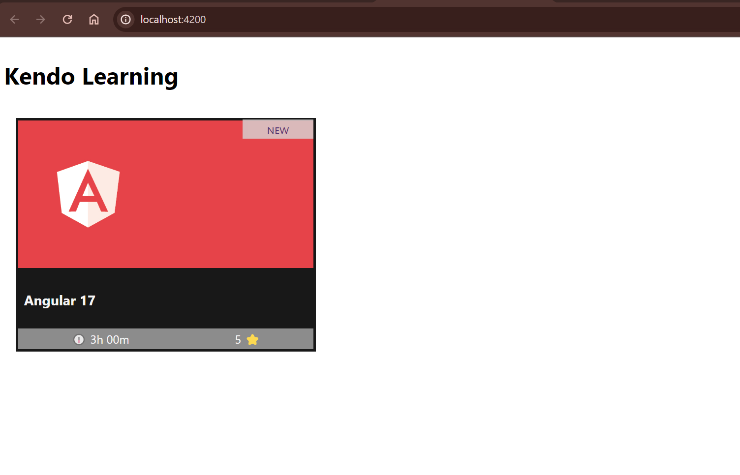
Save changes, and our course component works with the HTML markup! Our first goal to encapsulate the code from the HTML into our course component is achieved!
Our next challenge is how to change the title, image and other information to make our course component flexible to changes. We can use the input signals in Angular. Let’s do it!
If you’ve never played with Angular Input, I highly recommend checking out Build Reactive Apps with Signals, RxJS and Angular 17.
Passing Data Using Inputs
We need to do a small refactor of the course component to allow changing the content dynamically using inputs. First, above our app-course-card component, declare a type course to match the course properties.
export type Course = {
  title: string;
  image: string;
  rank: number;
  timeSpan: string;
}
Next, declare a required input property of type Course in our new card component. It will allow us to send a dynamic course from app.component.ts and change the content dynamically instead of with hardcoded values.
export class CourseCardComponent {
  course = input.required<Course>()
}
The final code in course.component.ts should look like this:
import {Component, input} from '@angular/core';

export type Course = {
  title: string;
  image: string;
  rank: number;
  timeSpan: string;
}
@Component({
  selector: 'app-course-card',
  standalone: true,
  imports: [],
  templateUrl: './course-card.component.html',
  styleUrl: './course-card.component.css'
})
export class CourseCardComponent {
  course = input.required<Course>()
}
Finally, bind the course properties into the course.component.html template, using interpolation: {{course().title}}. Because input is a signal,we must call course() and the property, for example, course().image. Swap out the hardcoded text with the course input property.
The final code should look like this:
<div class="course-container">
  <div class="course-thumbnail">
    <img [src]="course().image"/>
    <div class="course-status">
      New
    </div>
  </div>
  <h3 class="title">{{ course().title }}</h3>
  <div class="course-footer">
    <span>🕧 {{ course().timeSpan }}</span>
    <span>{{course().rank}} ⭐</span>
  </div>
</div>
Perfect, but how can we conduct a real test to check if our component binds multiple courses dynamically? First, open the app.component.ts file and create an array of courses with random values.
import { Component } from '@angular/core';
import { RouterOutlet } from '@angular/router';
import {Course, CourseCardComponent} from "./components/course-card/course-card.component";

@Component({
  selector: 'app-root',
  standalone: true,
  imports: [RouterOutlet, CourseCardComponent],
  templateUrl: './app.component.html',
  styleUrl: './app.component.css'
})
export class AppComponent {
  title = 'play-with-content-projection';
  courses : Array<Course> = [
    {
      title: 'Angular 17 soon 18!',
      image: '../../../assets/angular.jpeg',
      rank: 5,
      timeSpan: "2h"
    },
    {
      title: 'Theme Builder!',
      image: '../../../assets/theme-builder.jpeg',
      rank: 5,
      timeSpan: "2h"
    }
  ]
}
Next, open the template, and use @for to iterate over the courses array, binding the input property to each course.
The final code looks like this:
<div>
  <h1>Kendo Learning</h1>
  <div class="container">
    @for (course of courses; track course) {
      <app-course-card [course]="course" />
    }
  </div>
</div>
Note: Yes, we are using the new Angular 17 render block @for feature
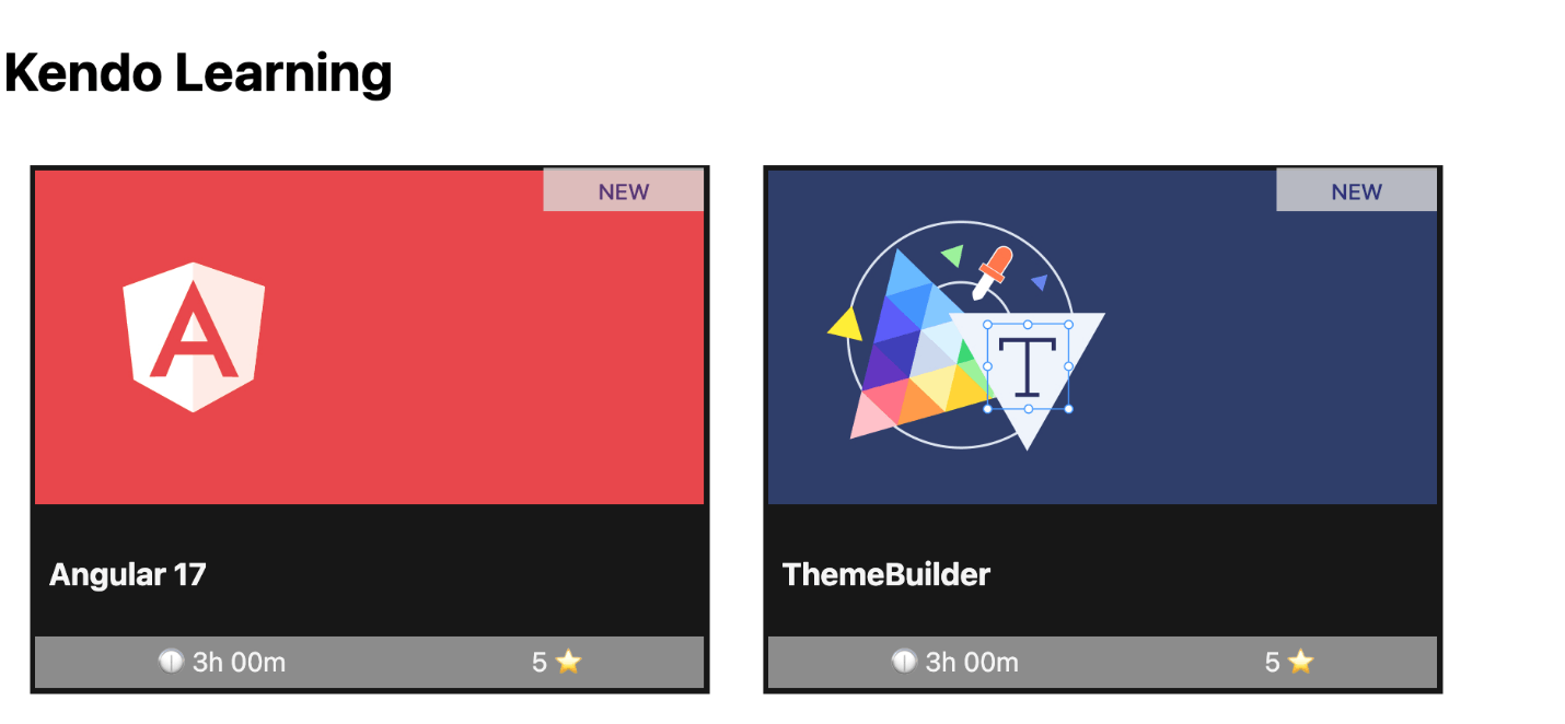
Save the changes and reload the page. Yeah! Our list of courses is now rendered with dynamic data from the array!
Perfect, we’ve reduced duplicate code, and our component dynamically fetches new data. But wait a minute—how flexible is it really? What happens if we want to add a new section under the title, like a description, author or discount banner, or even a new section altogether? We would need to change the course type and also modify the template again. This doesn’t seem very flexible for future changes.
How can we make our component more adaptable to layout changes? It’s simple! Angular enables us to utilize <ng-content> within our components, functioning as placeholders that can dynamically be filled with HTML or other components. This approach is known in the Angular ecosystem as “content projection.” Let’s dive into it.
<ng-content>works similarly to HTML<slot>. Read more about slots.
What Is Content Projection?
Before we proceed, what exactly is content projection? The <ng-content> directive transforms our component into a container that can dynamically include HTML or other components, functioning similarly to the native slot element in web components. <ng-content> projects any child elements into the specified area within the component.
Content projection also offers additional features, such as the ability to work with multiple slots and use aliases to specify where content should be projected. Instead of just talking about it, let’s put this powerful feature into action by refactoring our course template to utilize content projection!
Read more about content projection.
Using Content Projection
Open the course.component.html file. To incorporate content projection for the course title, replace the existing code for the course title with the <ng-content> tag. This will allow you to dynamically insert custom content, including a title or any other elements, at the place where <ng-content> is used within the component’s template.
<div class="course-container">
  <div class="course-thumbnail">
    <img [src]="course().image"/>
    <div class="course-status">
      New
    </div>
  </div>
  <ng-content></ng-content>
  <div class="course-footer">
    <span>🕧 {{ course().timeSpan }}</span>
    <span>{{course().rank}} ⭐</span>
  </div>
</div>
To use content projection in the app.component.html we provide the content we would like to project inside the opening and closing tags of your <course> component.
Example:
<div>
  <h1>Kendo Learning</h1>
  <div class="container">
    @for (course of courses; track course) {
      <app-course-card [course]="course">
        <h3 class="title">{{ course.title }}</h3>
        <span>Author: Telerik</span>
      </app-course-card>
    }
  </div>
</div>
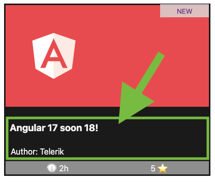
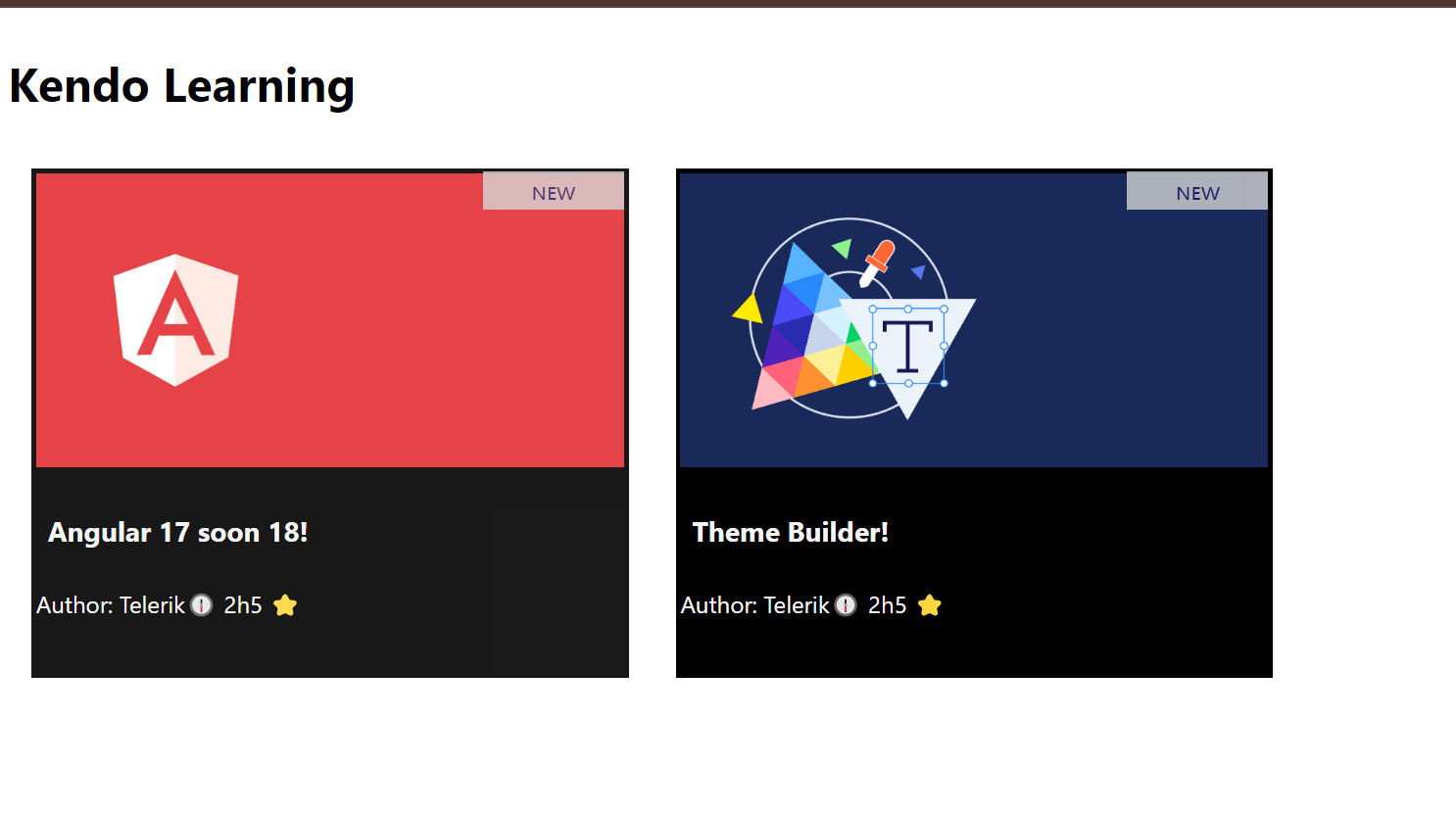
Save changes and reload! Tada!!! We added a new element to the course component without needing to modify it!! Yeah!! 🚀
Ok, I think we can improve a bit more by adding multiple slots for each area. Let’s refactor and use multiple slots!!
Use Multiple Slots
First, we need to clean up the course-card.component.ts by removing the input property because we don’t need it anymore. Then in course-card.component.html we need to replace the bindings with <ng-content> for the image, title and course footer.
<div class="course-container">
  <div class="course-thumbnail">
    <ng-content></ng-content>
    <div class="course-status">
      New
    </div>
  </div>
  <ng-content></ng-content>
  <div class="course-footer">
   <ng-content></ng-content>
  </div>
</div>
Next, open the app.component.html and project the image, timespan and rank.
<div>
  <h1>Kendo Learning</h1>
  <div class="container">
    @for (course of courses; track course) {
      <app-course-card>
        <img [src]="course.image"/>
        <h3 class="title">{{ course.title }}</h3>
        <span>Author: Telerik</span>
        <span>🕧 {{ course.timeSpan }}</span>
        <span>{{course.rank}} ⭐</span>
      </app-course-card>
    }
  </div>
</div>
Save changes, and tada!!! 😭 Everything is broken!!!

Wait a minute!! If I’m not mistaken, I added an ng-content in each section and projected the content from the app. Why is Angular projecting all content into a single ng-container?
Well, by default, Angular projects all elements into the first ng-content. So, we must find a way to tell Angular which piece of content belongs in which ng-content slot.
Angular provides the select attribute to indicate which content to project based on a CSS selector, allowing you to declare a name for specific areas. Example:
<ng-content select="my-nice-area"></ng-content>
But I think we can be a bit more specific and avoid errors. Instead of using a string, we can provide a directive for each area to make it easier to project content based on the directive!
Learn more about multiple content placeholders.
First, generate one directive for each section: thumbnail-area, title-area and footer-area, using the CLI.
ng g d /directives/thumbnail-area
CREATE src/app/directives/thumbnail-area.directive.ts (186 bytes)

ng g d /directives/title-area
CREATE src/app/directives/title-area.directive.ts (178 bytes)

ng g d /directives/footer-area
CREATE src/app/directives/title-area.directive.ts (178 bytes)
Next, import the directives ThumbnailAreaDirective, FooterAreaDirective, TitleAreaDirective into the CourseCardComponent:
@Component({
  selector: 'app-course-card',
  standalone: true,
  imports: [ThumbnailAreaDirective, FooterAreaDirective, TitleAreaDirective],
  templateUrl: './course-card.component.html',
  styleUrl: './course-card.component.css'
})
export class CourseCardComponent {

}
Next, using the select attribute, add the directive to instruct my ng-content to take the element that matches with the directive. Update the HTML layout in our course card component to use the directives:
The final code looks like this:
<div class="course-container">
  <div class="course-thumbnail">
    <ng-content select="appThumbnailArea"></ng-content>
  <ng-content></ng-content>
    <div class="course-status">
      New
    </div>
  </div>
  <ng-content select="appTitleArea"></ng-content>
  <div>
   <ng-content select="appFooterArea"></ng-content>
  </div>
</div>
Full source code course-card.component.ts.
Read more about Multiple Content Placeholder.
Finally, update the HTML in app.component.html to use the ng-container with the specific directive.
<div>
  <h1>Kendo Learning</h1>
  <div class="container">
    @for (course of courses; track course) {
      <app-course-card>
        <ng-container appThumbnailArea>
          <img [src]="course.image" [alt]="course.title" />
        </ng-container>

        <ng-container appTitleArea>
          <h3 class="title">{{ course.title }}</h3>
          <span>Author: Telerik</span>
        </ng-container>

        <ng-container appFooterArea>
          <span>🕧 {{ course.timeSpan }}</span>
          <span>{{ course.rank }} ⭐</span>
        </ng-container>
      </app-course-card>
    }
  </div>
</div>
Full source code for app.component.html.
Save the changes, and, tada! Yes! We’ve projected the content exactly where we wanted it! 🥰
Recap
We started our journey with discussing how to build a highly flexible components in Angular. We started with the basics, using inputs, then moved to content projection and how using the <ng-content> directive can transform our components into versatile containers.
We did a next step using the power of the select attribute, which enhances content projection by directing specific content to designated slots, based on CSS selectors or directives.
I hope this post helps you build flexible components and understand how components like the kendo-card were built! 🚀 (I like to understand how to build something from scratch, even though I prefer using a component library to make my work easier!)

Dany Paredes
Dany Paredes is a Google Developer Expert on Angular and Progress Champion. He loves sharing content and writing articles about Angular, TypeScript and testing on his blog and on Twitter (@danywalls).
Related Posts
Comments
All articles
Topics
Web MobileMobile
Desktop
Design
Productivity
People
