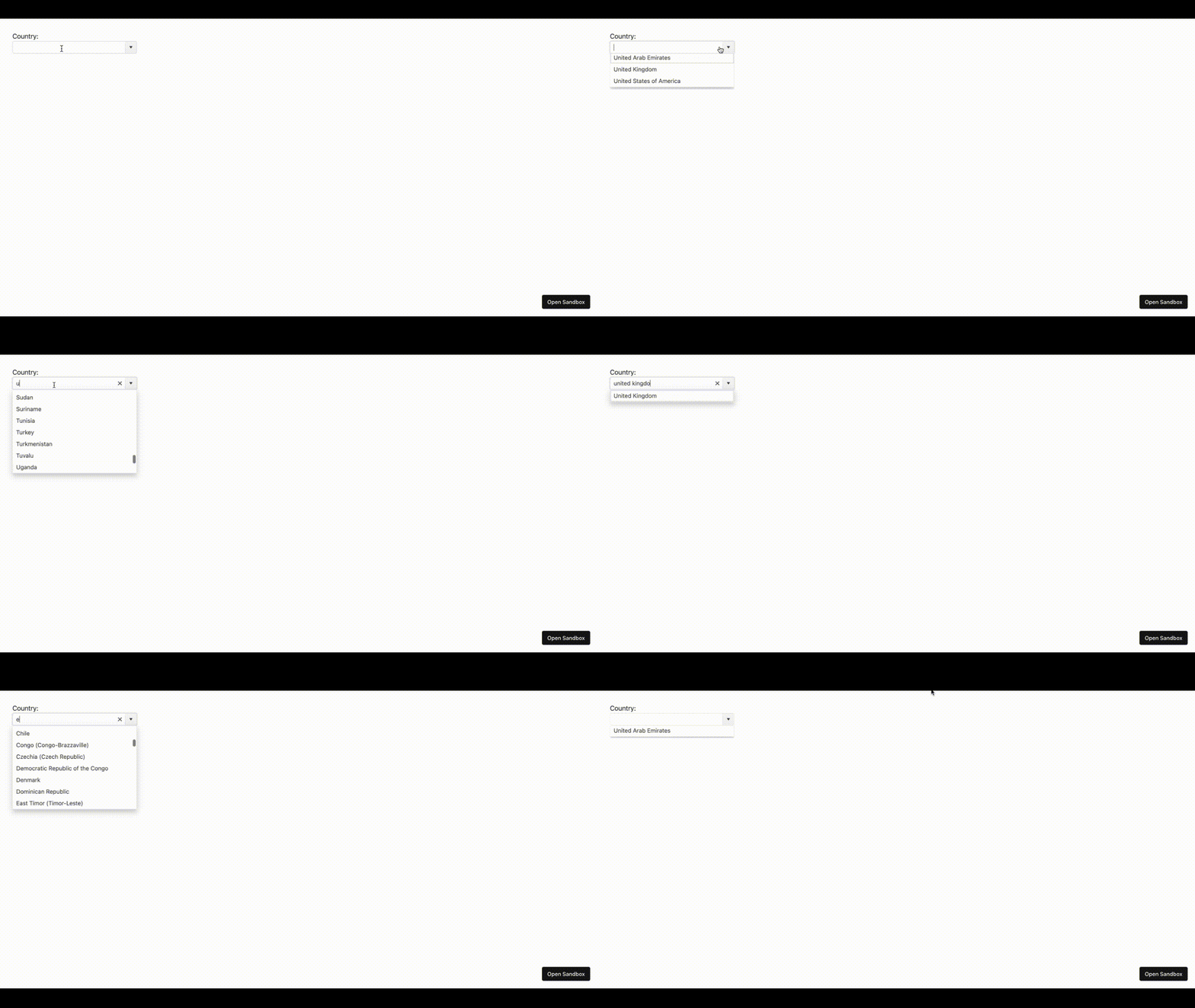
Creating a Country List with Kendo UI for Vue ComboBox

Summarize with AI:
Learn about adaptive rendering in the Kendo UI for Vue ComboBox. We’ll add a country list to a dropdown.
Have you ever encountered a scenario where you had to complete a form that required you to specify your region or country? Today, I’m here to guide you through building such a feature.
We will achieve this by retrieving a list of countries from an API and displaying this data using the Progress Kendo UI for Vue ComboBox and adaptive rendering for responsiveness. The adaptive rendering is a recent addition to the ComboBox component in the Kendo UI for Vue library, and it’s the ideal tool for creating dynamic and user-friendly selections in our forms.
This article aims to introduce the ComboBox and explore its valuable adaptive rendering feature. We will demonstrate how to create a simple application that displays a list of countries using this powerful feature. Adaptive rendering, a standout capability of the ComboBox, enables our dropdown to function seamlessly across various screen sizes by offering different renderings of the popup element based on the screen dimensions.
What Is Kendo UI ComboBox?
The Kendo UI for Vue ComboBox is a form component that lets you pick a single value from a list of options. Think of it as a more advanced version of the standard HTML <select> element. What’s cool about it is that it offers various functionalities like filtering, virtualization (handling large lists efficiently), making it accessible for everyone, adapting to different languages and regions (globalization), and even letting users input custom values.
Setting Up the Development Environment
Now that we’ve grasped what the ComboBox does and its purpose, the next step is to set up our development environment and install the Kendo UI ComboBox component.
1. Create a New Project Directory
Firstly, we will navigate to the directory where we would like to create a new project and run the command below:
npm init vue@latest
2. Install the Kendo UI ComboBox
The Kendo UI for Vue ComboBox is a component in the Kendo UI for Vue library. We can access it by installing the kendo-vue-dropdowns package via NPM.
npm i @progress/kendo-vue-dropdowns
Now that we have set up our development environment, the subsequent step involves importing the package module.
import { ComboBox } from '@progress/kendo-vue-dropdowns';
Building a Sample Application
In this example, we will create a form element that shows a list of countries. To do this, we will use a JSON file created on GitHub Gist. To proceed, we must create a JSON file in the src folder and import the list of countries from GitHub Gist.
<template>
<div>
<label>Select Country:</label>
<ComboBox
:data-items="countries"
:text-field="'name'"
:style="{ width: '300px' }"
/>
</div>
</template>
We start by importing the dropdown component and JSON file. Then, we fetch a list of countries from the JSON file. If something goes wrong during this process, we catch and handle the error. But if everything goes smoothly, the received list of countries from the API is stored in the component’s countries property.
<script>
import { ComboBox } from "@progress/kendo-vue-dropdowns";
import countriesData from "./countries.json";

export default {
  components: {
    ComboBox,
  },
  data() {
    return {
      countries: [], // To store the list of countries
    };
  },
  created() {
    this.fetchCountries();
  },
  methods: {
    fetchCountries() {
      this.countries = countriesData.countries.map((country, index) => ({
        id: index,
        name: country,
      }));
    },
  },
};
</script>
Check out the complete code example and output.

Customizing the ComboBox Element
In the past, if we wanted our form to adjust and look good on different screens, we created styles for each screen size. But with Kendo UI for Vue Adaptive Rendering, we don’t need to do that anymore. This cool feature helps the form components adapt automatically to different screen sizes, saving us time and effort!
Replace the previous HTML code with the code below:
<template>
<div>
<div>Country:</div>
<ComboBox
:data-items="countries"
:text-field="'name'"
:data-item-key="'id'"
:filterable="true"
:adaptive="true"
:style="{ width: '300px' }"
/>
</div>
</template>
Check out the code example and live code output of customizing comboBox
Filtering Data on ComboBox
The Kendo UI for Vue ComboBox offers a unique function that helps us filter specific data that we need. To enable the filtering functionality of the ComboBox, set the filterable property to true and include the @filterchange="filterChange" event listener in the ComboBox element.
<template>
  <div>
    <div>Country:</div>
    <ComboBox
      :data-items="countries"
      :text-field="'name'"
      :data-item-key="'id'"
      :filterable="true"
      @filterchange="filterChange"
      :adaptive="true"
      :style="{ width: '300px' }"
    />
  </div>
</template>
By setting the filterable property to true and including the @filterchange event listener, we enable the ComboBox’s filtering functionality. We can then implement the filterChange method in our Vue.js component to handle filtering logic based on user input.
<script>
import { ComboBox } from "@progress/kendo-vue-dropdowns";
import { filterBy } from "@progress/kendo-data-query";
import countriesData from "./countries.json";

export default {
  components: {
    ComboBox,
  },
  data() {
    return {
      countries: [], // To store the list of countries
    };
  },
  created() {
    this.fetchCountries();
  },
  methods: {
    fetchCountries() {
      this.countries = countriesData.countries.map((country, index) => ({
        id: index,
        name: country,
      }));
    },
    filterChange(event) {
      this.countries = filterBy(
        countriesData.countries.map((country, index) => ({
          id: index,
          name: country,
        })),
        {
          field: "name",
          operator: "contains",
          value: event.filter.value,
        }
      );
    },
  },
};
</script>
Checkout the full live code example and code output.

Conclusion
In this article, we have dived into the ComboBox within Kendo UI for Vue Dropdowns. It’s similar to the HTML select form element, making it a breeze to generate lists of values. But that’s not all! We’ve also discovered how to tweak this component using adaptive rendering. This feature is handy for crafting responsive form elements that adapt to different screen sizes.
Want to play around yourself? Kendo UI for Vue comes with a free 30-day trial.

Ezekiel Lawson
Ezekiel Lawson is a technical writer and software developer. Aside from building web tools and applications, he enjoys educating people and simplifying complicated issues for their easy understanding by sharing resources that will guide developers through technical writing.

