Blazor Components: The Definitive Guide

Summarize with AI:
In this guide, learn the fundamentals of Blazor Component construction and see how to build an example Blazor app that puts it all together.
In this article we’ll learn about Blazor's component model, Razor Components. Using Razor Components we'll build a component to display a weekly weather forecast. Through this process we’ll learn the fundamentals of component construction, including directives, parameters, child content/templates, routing and event handling. For simplicity we’ll use the resources given to us by the new Blazor Server app template.
Directives
Compiler directives are used to give Razor instructions that typically change the way a component is parsed or enables different functionality. Let’s create a new page to display a weekly weather forecast. In the Blazor framework pages are components which are decorated with the @page directive. The @page directive is followed by a string value which defines the component’s page route, giving it a URL which can be navigated to in the browser, ex: @page “/my-url.” Even though the @page directive enables routing, it does not remove our ability to use the component as a basic building block for other components or “pages.”
Let’s begin by adding a new Razor Component to our application called WeeklyForecast. In the project, choose the Pages folder and right click, choose Add > New Item, then select Razor Component as shown in Figure 1. Name the component WeeklyForecast.razor, then click create to finish.

Figure 1: Creating a new Razor Component with the Add New Item dialog.
Our component is created with a very basic boilerplate. We’ll leave this boilerplate in place and add our @page directive with the value “/weeklyforecast” to the very top of the file. It is best practice to place all directives at the top of the file unless there is a special use case where it should to be placed elsewhere. For example, the @code block is a directive which is normally located at the bottom of the component, however moving it will not cause an error.
@page "/weeklyforecast"
<h3>WeeklyForecast</h3>

@code {

}
Routing
We can run our application and view the changes in the browser. Once the app is running append /weeklyforecast to navigate to the newly-created page. The results should resemble Figure 2.
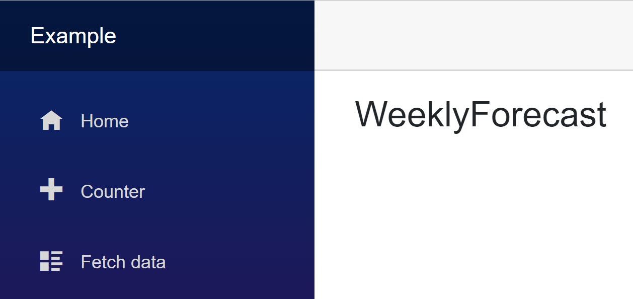
Figure 2: The WeeklyForecast component using the @page directive to specify routing.
Let’s use this page to build a prototype of what our final product should look like. This will help us decide where components can be abstracted into reusable bits. We’ll display weather information to the user using HTML and CSS classes from Bootstrap and Iconic.
Inside the WeeklyForecast page, we’ll append our first prototype UI element, a day of weather forecast data. We’ll use hard coded values, which will eventually be replaced with data. The markup is contained within a div element which uses the Bootstrap card class to give it a nice appearance. Inside the card’s body, we’re using a span element with the Open Iconic classes io io-rain, which will render an icon that represents weather status.
@page "/weeklyforecast"
<h3>WeeklyForecast</h3>
<div class="card bg-light" style="width: 18rem;">
<div class="card-body text-center">
<span class="h1 oi oi-rain"></span>
<h1 class="card-title">17 C°</h1>
<p class="card-text">
Rainy weather expected Monday
</p>
</div>
</div>
…
We’ll save these changes and reload the WeeklyForecast page which now shows the weather card. The rendered page should look like Figure 3.
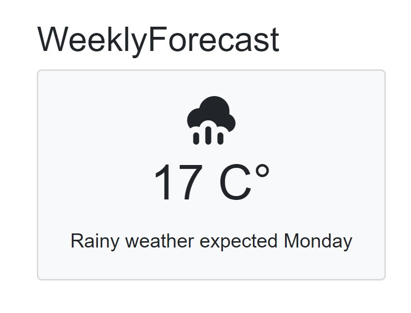
Figure 3: A prototype of the weekly forecast page displaying a single weather forecast.
Our page is taking shape; however, we’re building a weekly forecast and we currently have a single day. Let’s modify the page so it can display five days of forecast data. Since we’ll be repeating the cards, we’ll wrap the display in a flex-box container. Since we’re using Bootstrap we can use the convenient class d-flex. Inside the d-flex container we need to repeat our weather display. We’ll rely on Razor to help us repeat the display with a foreach loop. To create a simple loop without any real data we’ll use the Enumerable.Range method to generate a sequence for us. With multiple cards being displayed, let’s remove the static width style attribute style="width: 18rem;" and let the element expand as needed. To create some whitespace between each card the m-2, or margin 2 CSS class is added.
…
<div class="d-flex">
@foreach (var item in Enumerable.Range(1, 5))
{
<div class="card bg-light m-2">
<div class="card-body text-center">
<span class="h1 oi oi-rain"></span>
<h1 class="card-title">17 C°</h1>
<p class="card-text">
Rainy weather expected Monday
</p>
</div>
</div>
}
</div>
…
The result is a five-day forecast that repeats across the page as shown in Figure 4.
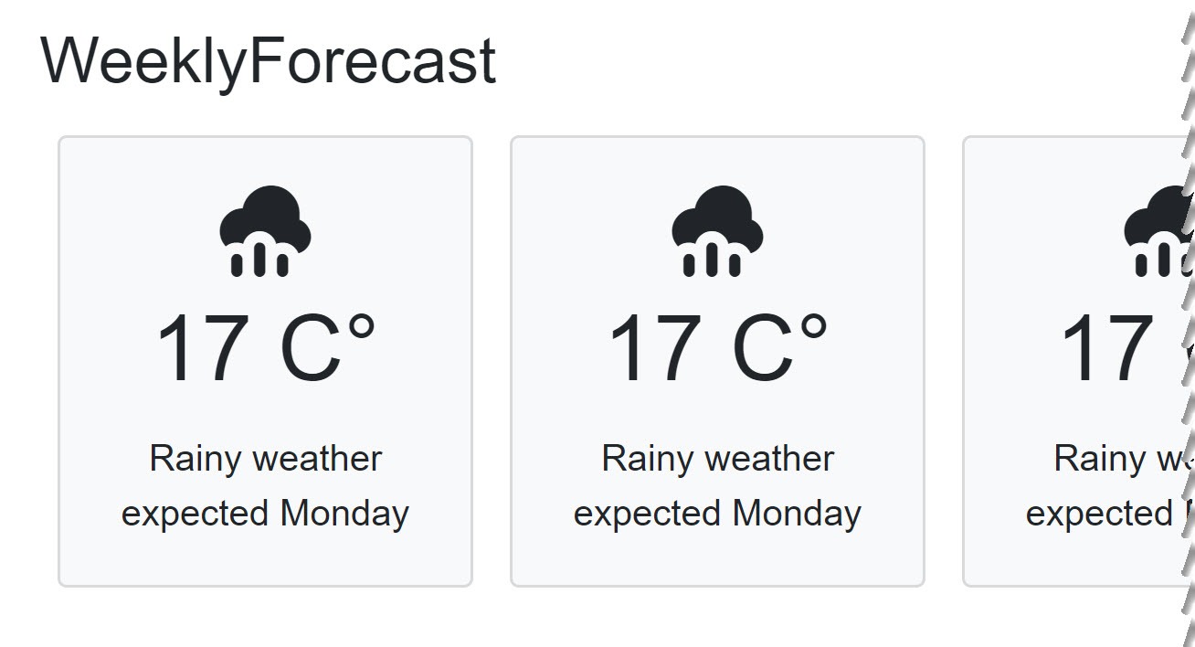
Figure 4: The weekly weather page shows a repeated weather forecast card with five static elements across the page.
By now you can probably see a pattern emerge where the individual day of weather is repeated. This repeated section could easily be a reusable component that encapsulates a day of weather. Let’s abstract our component out of the WeeklyForecast page into its own component file.
In the project’s /Shared folder we’ll create a new component called WeatherDay. We’ll remove the boilerplate content from the newly created component and move the HTML from inside of the foreach loop of the WeeklyForecast component to the WeatherDay component. This quick copy/paste job is all we need to create a basic Razor Component. With the markup moved to the WeatherDay component, we can make use of it by name in WeeklyForecast. We’ll add a WeatherDay component to body of the foreach loop.
/Shared/ WeatherDay.razor
<div class="card bg-light m-2">
<div class="card-body text-center">
<span class="h1 oi oi-rain"></span>
<h1 class="card-title">17 C°</h1>
<p class="card-text">
Rainy weather expected Monday
</p>
</div>
</div>
/Pages/WeeklyForecast.razor
…html
<div class="d-flex">
    @foreach (var item in Enumerable.Range(1, 5))
    {
        <WeatherDay></WeatherDay>
    }
</div>
…
When we re-run the app, it should be identical to the previous run as seen in Figure 4. There were no changes to the result as we simply moved the responsibility for rendering the card from WeeklyForecast to WeatherDay.
Parameters
Let’s replace some of the static values with component parameters. The easy way to understand component parameters in the Razor Component model is to see them as public properties that are decorated with a special [Parameter] attribute. We’ll discuss additional parameter attributes as we go, however the standard [Parameter] attribute will fit most scenarios.
Now that our component’s HTML is isolated inside the WeatherDay component we can make our component more dynamic by allowing it to accept data using parameters. For our weather component we need to show the weather summary, i.e. is it rainy, sunny, or cloudy with a corresponding icon. We’ll also display the temperature and day of the week. Let’s create a few parameters to get started and implement more detailed features as we work through each challenge. We’ll begin with an @code block, add our three properties and decorate them using the [Parameter] attribute.
@code {

    [Parameter]
    public string Summary { get; set; }

    [Parameter]
    public int TemperatureC { get; set; }

    [Parameter]
    public DayOfWeek DayOfWeek { get; set; }

}
One-Way Data Binding
To display the parameter’s value, we’ll use one-way databinding. This will simply write the value inline where the value appears in the markup. In Razor we just prefix the properties name with an @ symbol, ex: @Summary. For each parameter we’ll update the markup by replacing the static text with a data bound value. When Razor generates the final output, all values are automatically converted to a string. There is no need to manually covert a value like TemperatureC even though it is an int, however we do have the option of customizing the formatting if we wish.
<div class="card bg-light m-2">
<div class="card-body text-center">
<span class="h1 oi oi-rain"></span>
<h1 class="card-title">@TemperatureC C°</h1>
<p class="card-text">
@Summary weather expected @DayOfWeek
</p>
</div>
</div>
Now that our component has parameters that are data bound, we can return to the WeeklyForecast page and update our component instance to make use of the new feature. We’ll locate the WeatherDay component on the page and set some static values for our parameters.
@foreach (var item in Enumerable.Range(1, 5))
{
    <WeatherDay
        TemperatureC="20"
        Summary="Cloudy"
        DayOfWeek="DayOfWeek.Friday">
    </WeatherDay>
}
Let’s continue by adding some dynamic data to our WeeklyForecast page. We’ll inject a WeatherForecastService on the page and use it to generate data. The WeatherForecastService is included in the new project template and is located under the /Data folder in the project. Open the WeatherForecastService.cs file and examine how it works. We can see there is a collection of Summaries that are used to fill the Summary property. The method, GetForecastAsync, generates 5 random WeatherForecast values based on a start date.
Let’s simplify the Summaries list to only include the values: Cloudy, Rainy and Sunny. This will correspond to three icons available in our project.
private static readonly string[] Summaries = new[]
{
 //"Freezing", "Bracing", "Chilly", "Cool", "Mild",
 //"Warm", "Balmy", "Hot", "Sweltering", "Scorching"
 "Cloudy", "Rainy", "Sunny"
};
In WeatherDay we’ll use a read-only property to determine which icon to show based on the Summary field. A quick ternary statement converts the Summary string to the corresponding icon name.
string IconCssClass =>
        Summary == "Cloudy" ? "cloud" :
        Summary == "Rainy" ? "rain" :
        "sun";
Now we can use the IconCssClass property to modify the CSS value of the component’s icon.
<span class="h1 oi oi-@IconCssClass"></span>
Injecting a Service
The WeatherDay component can now be bound to dynamic data. We’ll inject the WeatherForecastService on the page using the @inject directive. The dependency is available because the WeatherForecastService was already registered in Startup.cs by the template. We can see how dependency injection (DI) is configured by looking in the ConfigureServices method.
services.AddSingleton<WeatherForecastService>();
On the WeeklyForecast page, beneath the @page directive we add @inject and specify both the Type (T) that will be resolved and the variable name an instance of that type will be assigned, ex: @inject T myTInstance. An @using directive will bring the WeatherForecastService into scope.
@page "/weeklyforecast"
@using Data;
@inject WeatherForecastService WeatherService
OnInitializedAsync Lifecycle Method
With the WeatherForecastService available we can now call the GetForecastAsync method which generates an array of WeatherForecast objects. The data should be loaded when the component is first initialized. Razor Components handle initialization through the OnInitializedAsync and OnInitialized lifecycle methods. The component lifecycle methods are automatically inherited from the ComponentBase class that makes up all Razor Components.
It’s best practice to use asynchronous code whenever possible as it leads to an overall better user experience. In addition, our WeatherForecastService provides async functionality, so we’ll be using OnInitializedAsync to fetch data as the component initializes.
Let’s add a field to capture the data that will be displayed on the page. We’ll create an empty array of WeatherForecast called forecasts. Following the forecasts field, we’ll override the OnInitializedAsync method and populate the forecast field by awaiting the call to GetForecastAsync.
WeatherForecast[] forecasts;

protected override async Task OnInitializedAsync()
{
    forecasts = await WeatherService
                .GetForecastAsync(DateTime.Now);
}
Now that we’re using data from our WeatherService we’ll need to replace the static loop in our view with one that uses the forecasts array. Inside the new loop we reference the current item and apply the corresponding property value to the parameter of the component. The .NET compiler is smart, so we’ll only need to use the @ symbol on string values to identify string literals from property values.
@*foreach (var item in Enumerable.Range(1, 5))*@
@foreach (var forecast in forecasts)
{
     <WeatherDay
         TemperatureC="forecast.TemperatureC"
         Summary="@forecast.Summary"
         DayOfWeek="forecast.Date.DayOfWeek">
     </WeatherDay>
}
Since we’re no longer working with static data, we should consider the possibility of null values. Currently if the component renders while the forecasts array is null, a NullReferenceException will be thrown when entering the foreach loop. To safeguard against this, we use an if/then statement to provide a display when no data is present.
@if (forecasts == null)
{
    <span>No Data</span>
}
else
{
    foreach (var forecast in forecasts)
    {
        <WeatherDay TemperatureC="forecast.TemperatureC"
         Summary="@forecast.Summary"
        DayOfWeek="forecast.Date.DayOfWeek">
        </WeatherDay>
    }
}
We can now render data dynamically by visiting the weeklyforecast route as shown in Figure 5.
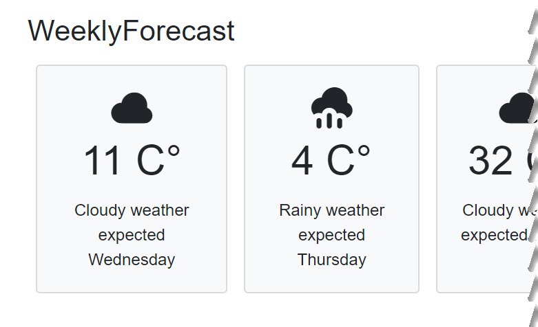
Figure 5: The weekly weather page shows a repeated weather forecast card with five static elements across the page.
Our WeeklyForecast and WeatherDay components are starting to come together. We’re able to dynamically populate components based on a collection of data which is loaded as the component initializes. The data flows from the WeeklyForecast directly to each WeatherDay component through one-way data binding. This is a common way of displaying data and works well when we have a consistent UI we’re creating.
Let’s expand on our WeatherDay component and allow its UI to be extended further by providing a template region.
Child Content/Templates
Templated components are components that accept one or more UI templates as parameters. Templates can be used customize a portion of the components rendered output. We’ll continue with our WeatherDay component as an example of how to implement a template.
To make our WeatherDay component more flexible we’ll be adding a template region shown as a red block in Figure 6. This area will allow developers to insert any HTML, Razor, or Component as child content.
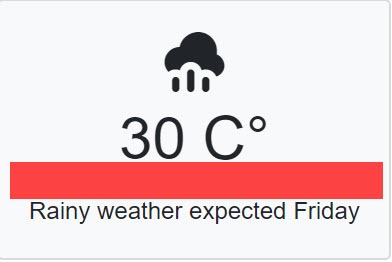
Figure 6: A red box outlines where the template region of the component will be created.
To add a template to our WeatherDay component we’ll make use of the RenderFragment class. A RenderFragment represents a segment of UI content, implemented as a delegate that writes the content to a RenderTreeBuilder (the Blazor virtual DOM). On the surface one might assume the child content is written as raw HTML, however the RenderFragment conforms to the component architecture of Blazor.
On the surface one might assume the child content is written as raw HTML, however the RenderFragment conforms to the component architecture of Blazor.
Let’s add a RenderFragment to our WeatherDay component. The RenderFragment is added exactly like any other component parameter using a property and [Parameter] attribute. For this example, we’ll call the property CustomMessage.
@code {

    [Parameter]
    public RenderFragment CustomMessage { get; set; }

    [Parameter]
    public string Summary { get; set; }
…

}
To make use of the parameter, we reference the RenderFragment when we would like it to appear in our component markup. In between the h1 and p elements of our component the @CustomMessage is placed, this is where the template will be rendered.
<div class="card bg-light m-2">
<div class="card-body text-center">
<span class="h1 oi oi-@IconCssClass"></span>
<h1 class="card-title">@TemperatureC C°</h1>
@CustomMessage
<p class="card-text">
@Summary weather expected @DayOfWeek</p>
</div>
</div>
When using the WeatherDay component the template is applied by specifying the template by name using an HTML tag <CustomMessage>. Inside this tag we can use Razor markup, HTML, other components, or any combination of these things. Let’s apply this to our example by adding a simple if statement to check for a Rainy forecast and then display a special alert on those items. Inside the CustomMessage we’ll add some Razor code and basic element styled with a Bootstrap alert alert-danger CSS class.
<WeatherDay TemperatureC="forecast.TemperatureC"
        Summary="@forecast.Summary"
        DayOfWeek="forecast.Date.DayOfWeek">
    <CustomMessage>
        @if (forecast.Summary == "Rainy")
        {
            <div class="alert alert-danger">
                Tornado Warning!
            </div>
        }
    </CustomMessage>
</WeatherDay>
When we run the application and view the weekyforecast page, it now displays a “Tornado Warning!” alert box inside of the WeatherDay component as seen in Figure 7.
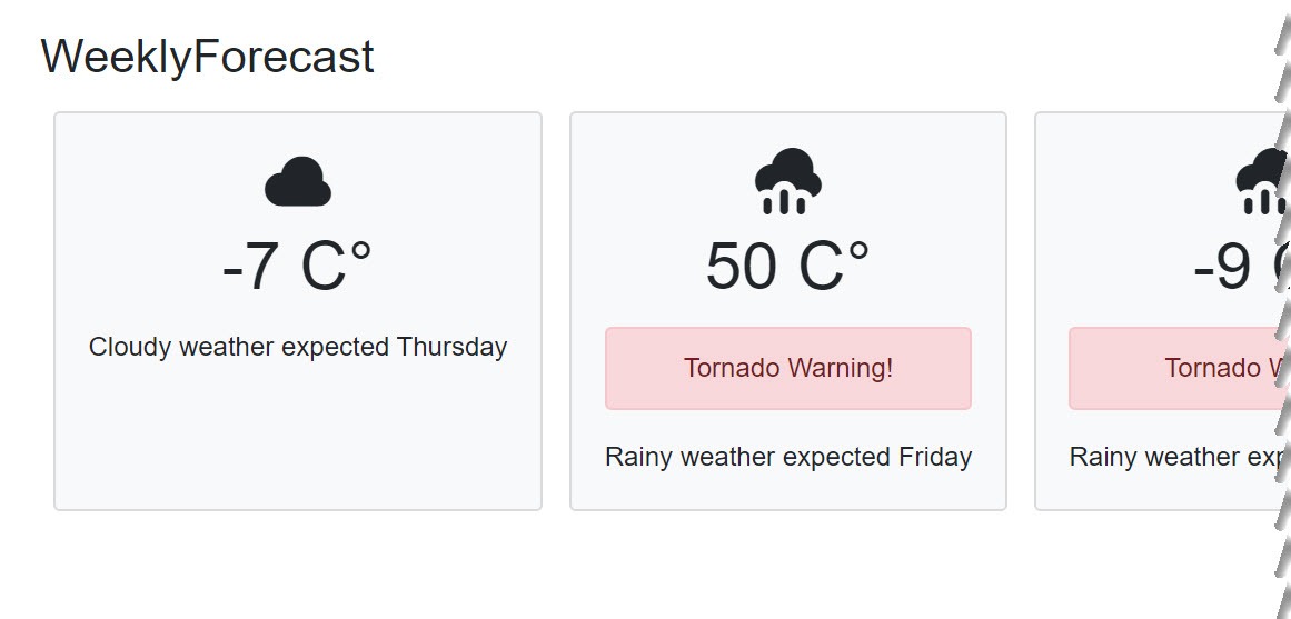
Figure 7: The weekly forecast is rendered with a Tornado warning displayed in the template region of the WeatherDay component.
Thus far, the WeeklyForecast and WeatherDay components have most of the features we commonly find in component architecture. However, one important aspect of UI development hasn’t been discussed yet, interactivity. Next, we’ll look at how to handle events with Blazor by giving users the ability to select an item shown in the weekly forecast.
Event Handling
When we think about events and delegates in C#, it’s likely that we’ll consider the: event and delegate keywords, or the Action and Func delegate-types. These are technically valid options when working with standard C# assemblies. Working with the UI in a Blazor application using Razor Components introduces a different architecture pattern and a special delegate called the EventCallback.
The EventCallback is a delegate-type used to expose events across components. A parent component can assign a callback method to a child component's EventCallback. When using the EventCallback in this manner, the parent and child components are automatically re-rendered when events are raised. Using event, delegate, Action, or Func, may result in the UI not updating as expected. For this reason, the EventCallback should always be used in Razor Components.
The EventCallback is a delegate-type used to expose events across components.
To demonstrate how EventCallback is used, we’ll continue with the WeeklyForecast and WeatherDay components. We’ll add the ability for a WeatherDay to be selected from the weekly forecast when the user clicks on a given day.
We’ll begin by adding a new parameter to our WeatherDay component named OnSelected. The OnSelected parameter should be an EventCallback of DayOfWeek. This means the event will return a type of DayOfWeek as an argument. The DayOfWeek is a value we can use to identify which item triggered OnSelected.
[Parameter]
public EventCallback<DayOfWeek> OnSelected { get; set; }
Beneath the OnSelected parameter an event handler is created, and this handler is responsible for raising the OnSelected event delegate on the parent component. To invoke OnSelected we call InvokeAsync and pass the current DayOfWeek as an argument.
void HandleOnSelected()
{
    OnSelected.InvokeAsync(this.DayOfWeek);
}
Continuing with the WeatherDay logic, a Selected property is added to indicate if the component is in a selected state. We’ll use this property not only to bind the selected value to the component, but to also set the corresponding CSS for the UI. Using a private property SelectedCss we determine which CSS class to apply based on the value of the Selected property. If the item is selected, the bg-primary text-white class is used to highlight the component and invert the text color, otherwise the value will default to bg-light.
[Parameter]
public bool Selected { get; set; }

private string SelectedCss => Selected ?
        "bg-primary text-white" : "bg-light";
In our component markup we can now trigger the HandleOnSelected event delegate when the user clicks the UI. On the outermost div element we’ll attach an onclick event handler and assign it to the HandleOnSelected method. We’ll also modify the div to use the SelectedCss value, effectively toggling the UI’s appearance.
<div class="card m-2 @SelectedCss"
        @onclick="HandleOnSelected">
    <div class="card-body text-center">
        …
    </div>
</div>
The WeatherDay component can now be selected and we can apply the new feature with a few modifications to the WeatherForecast class and WeeklyForecast component. Since the WeatherForecast provides the data and state for our view, we’ll add a Selected property which we can then bind to our components.
public class WeatherForecast
{
    public bool Selected { get; set; }
     …
In the WeeklyForecast component an event handler is added for the OnSelected event. The method HandleItemSelected will accept the argument DayOfWeek which we can then use to set identify which item was selected. In the method a quick loop over each forecast is used to clear the selected value. Once cleared we can use a LINQ statement to find the matching DayOfWeek and toggle set the selected value to true.
void HandleItemSelected(DayOfWeek selectedValue)
{
    // Clear selections
    foreach (var item in forecasts)
        item.Selected = false;

    forecasts.First(f =>
    f.Date.DayOfWeek == selectedValue).Selected = true;
}
In the WeeklyForecast the markup receives a few updates to tie everything together. Where the WeatherDay component is used, the new properties are applied. The OnSelected method is given the HandleItemSelected delegate and the Selected value is bound to the forecast item’s Selected property.
<WeatherDay TemperatureC="forecast.TemperatureC"
            Summary="@forecast.Summary"
            DayOfWeek="forecast.Date.DayOfWeek"
            OnSelected="HandleItemSelected"
            Selected="forecast.Selected">
With the updates complete we can now run the application and navigate to the weeklyforecast page and select items from the view as shown in Figure 8.
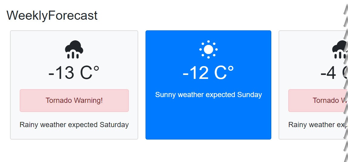
Figure 8: The second item in the list is selected when clicked by the user.
We could explain this concept further by adding any custom logic to the HandleItemSelected method. Imagine what features you might add when selecting an item. Some examples include: displaying the hourly weather forecast, listing closed businesses or suggesting activities for the given forecast. This concept can be applied to many business applications where data includes parent-child relationships.
Conclusion
Throughout this article we learned the fundamentals of component construction, including directives, parameters, child content/templates, routing and event handling. Each example guided us through the process of creating a component while introducing topics necessary for understanding the Blazor architecture. The intention of this article was to provide information that will immediately make us productive when using the Blazor framework.

Ed Charbeneau
Ed
