Best Practices for Creating User-Friendly Data Grids

Summarize with AI:
When incorporating data grids into your application, usability is paramount. Even if the data is read-only, your users should be able to see it clearly, customize the layout, etc. If you’re looking for a better way to develop data grids that your users can read, edit and use, keep reading.
So you want to build a data grid into your app. The only problem is, you’ve seen how clunky they are in other apps. They look messy, they take forever to load, and they’re a nightmare for your users to manipulate. (Not to mention how terrible they look on mobile devices.)
These interactive tables often play an important role in apps. From aggregating financial data to enabling sales teams to manage leads, it’s absolutely crucial that your users have an easy time reading and using these data sets.
In this post, we’re going to discuss four best practices for designing user-friendly data grids. I’ll also include some data grid resources and examples for Blazor, ASP.NET Core and .NET MAUI with Progress Telerik UI libraries to demonstrate how to achieve these results.
4 Tips for Building User-Friendly Data Grids
When creating data grids, you have to consider the possible use cases for them.
Will your users strictly be reviewing the data? If so, is the data set so large they’ll need the means to manipulate what data is shown?
Or will your users be adding, deleting and modifying the data? If so, what kinds of data editing tools will they want?
The following best practices should be able to help you answer these questions and find the best resources for implementing them.
1. Start with a Minimalist View
We know that people have a limited capacity for managing too many items at once. This can make it challenging to develop apps that contain an enormous cache of information.
What we can do, however, is to design data grids that minimize the amount of data that users see at any given time.
Let’s say you’re building an app for retail shop owners to manage their inventory. Within it is a table that allows them to track the various products they sell.
Based on user research you gathered during development, shop owners feel as though a grid containing products alone would be too time-consuming to handle. They sell hundreds of products and it’s easier to manage their inventory when the products are grouped into categories.
As such, you’ve built the inventory tracking system around categories.
To keep users from being overwhelmed by seeing all their categories and products at once, the default state of the data grid has categories minimized. This gives the table a more manageable appearance and improves its usability.
Here’s an example of how this Hierarchy feature might look in Blazor:
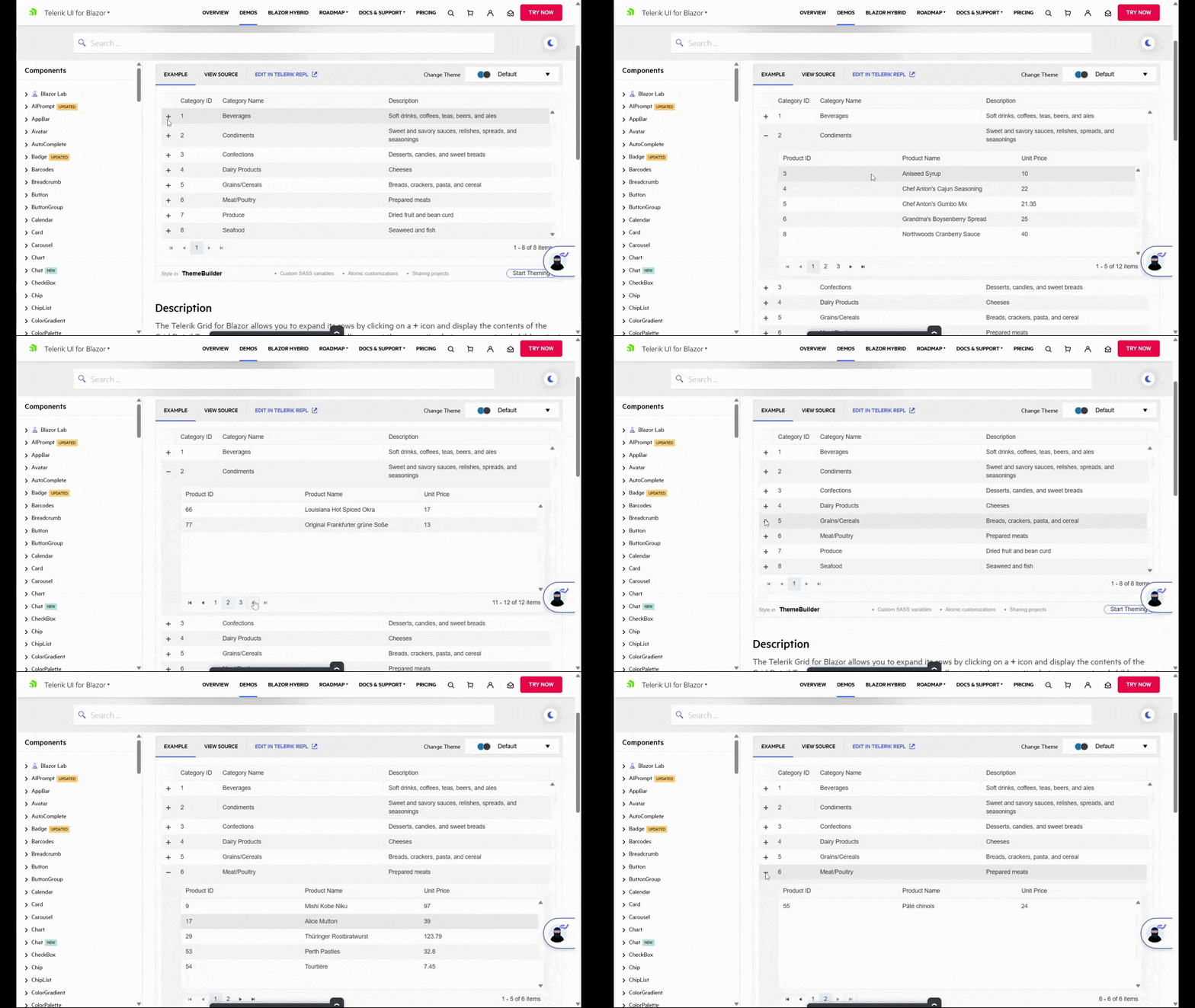
Notice also how the list of category products is limited. Instead of opening up the product dropdown to reveal all corresponding products, only five are visible at a time. Handy navigation tools are available at the bottom of the sub-table that allows users to move ahead by five products or to go to the very start or end of the list.
Now, this particular example works well for hierarchical product grids that contain parent and child items. But this won’t work for every app or use case.
Another way to minimize your data grid is by taking what would otherwise be column data and adding it as details within an item. This way, you minimize how much horizontal space the table takes up. And you give users the ability to expand the items that they’re interested in and to ignore the rest.
Here’s an example of how that works with the .NET MAUI Row Details feature:
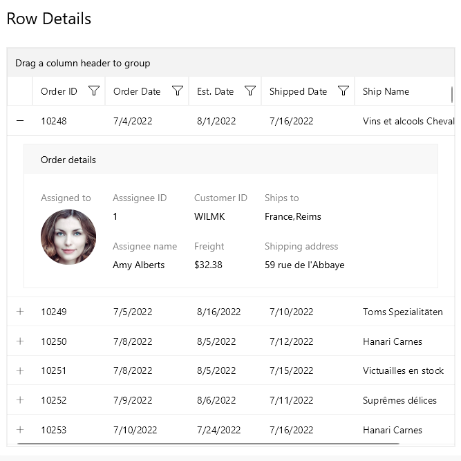
Each row is broken up into five columns of data: Order ID, Order Date, Est. Date, Shipped Date and Ship Name. However, users are able to get more information by opening the row. Everything from the assignee’s name to where the order was sent is stored here.
When planning out your data grids, take into consideration the typical amount of items that will appear in the table. Not only that, but also the number of columns and details. If it looks or feels unwieldy, find ways to minimize the grid, so that users see the most pertinent details to start and can reveal more as needed.
2. Enable Them to Control What Data Is Visible
Data grids are valuable components because they can hold a ton of data. While you can do what you can to minimize the layout and appearance of the grid, that doesn’t address the issue of one that holds thousands of bits of data.
For that, you’ll need to give your users certain controls. They’ll be similar to the ones you add to blogs with hundreds or thousands of topics or ecommerce stores with massive inventory.
To start, let’s talk about what you may want users to do at a column level.
Sorting is a must, though you’ll have to decide how many and which columns you want them to be able to sort. In some cases, it might only make sense to allow for sorting a single column. In other cases, you can leave it open, allowing users to sort as many columns as possible.
Now, one fundamental difference between this type of data sorting and ecommerce sorting, for instance, is that you’ll want to add the functionality directly to the columns (as opposed to, say, a “Sort By” dropdown above the data).
Here’s an example of how that can be done with the Blazor Column Menu feature:
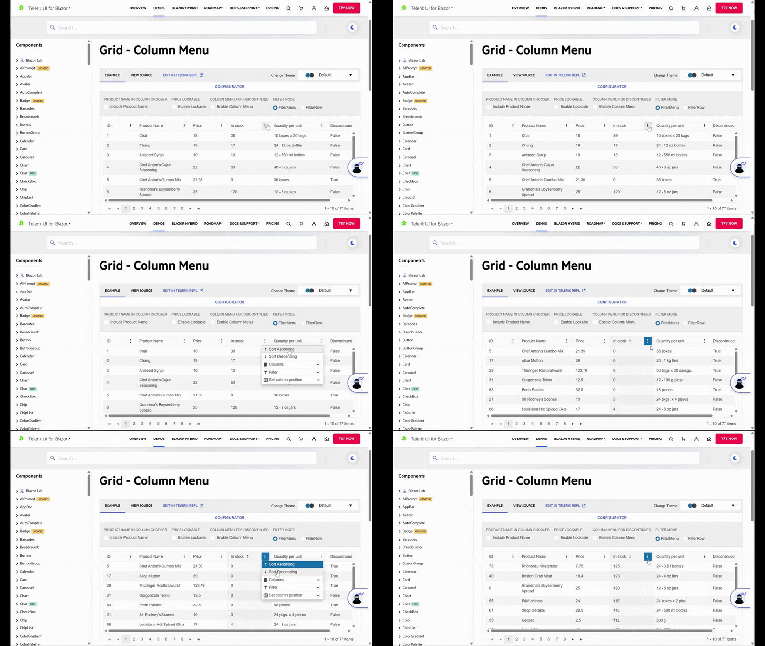
The Sort Ascending and Sort Descending functionality works as you’d expect it to. And in this example, you can see how users can do this on a column-by-column basis and not just table-wide.
Filtering is another must-have feature. But instead of using filters for characteristics as you would in ecommerce, your filters will show results based on numerical values or words.
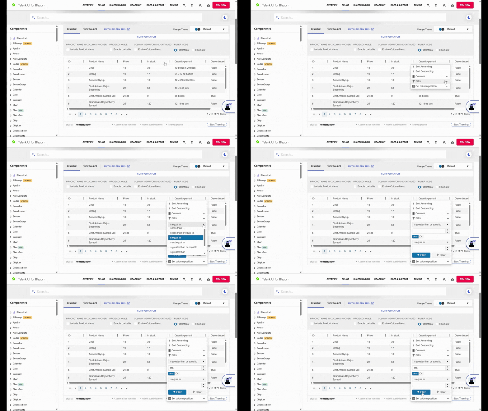
In this example, we see the user filter out any “In stock” products with fewer than 115 items. This takes the table down from 77 items to 4.
What’s nice about using a resource like Blazor DataGrid is that users can export their filtered and sorted data sets as they are. If you’ve ever tried to do this in other applications, the export process doesn’t always allow for that. Instead, you get a CSV or PDF containing all items in their original order.
One other feature we should talk about is the search box. This is necessary any time your users are working with large sets of data. Filters and sorting can be useful in controlling what they see and in what order. However, some users have more specific search parameters they’d benefit from using.
With .NET MAUI, for instance, you can add a search-as-you-type feature to your data grid.
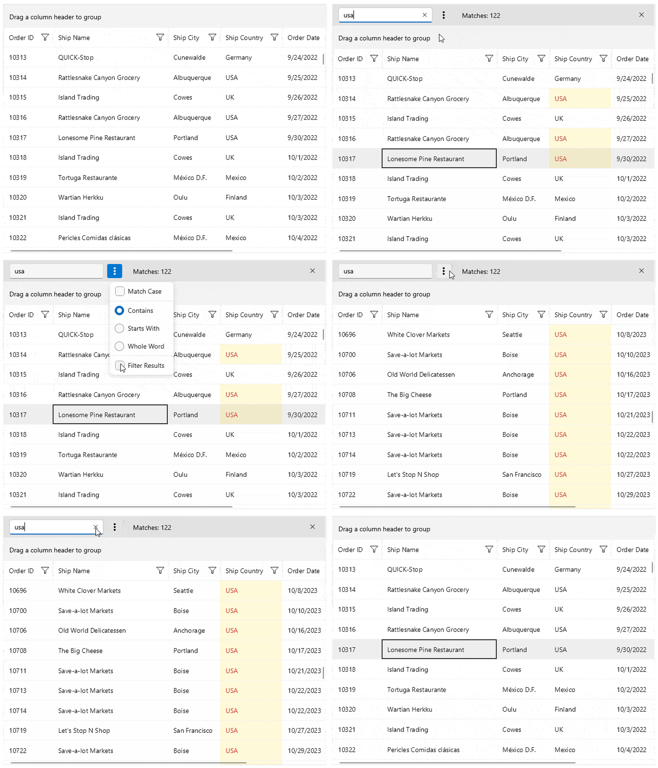
Users will see in real time how many matching results there are, with matches highlighted directly in the table. They can also open more options to choose how exact the results are based on case, included words and so on.
3. Include Excel-like Settings
Jakob’s Law is a UX law that states:
“By leveraging existing mental models, we can create superior user experiences in which the users can focus on their tasks rather than on learning new models.”
In other words, it would be beneficial to give users the ability to edit their data as easily as they would if it were inside an Excel spreadsheet or Google Sheet. The less time they have to spend figuring out your app’s unique functionality, the quicker they’ll get to actually using it.
So, what kinds of functionality will they be looking for?
To start, allow for simple inline editing. Users expect to insert their cursor into an empty field and to begin typing away. So, allow them to stay where they are while editing, whether they’re adding new rows or modifying data in existing ones.
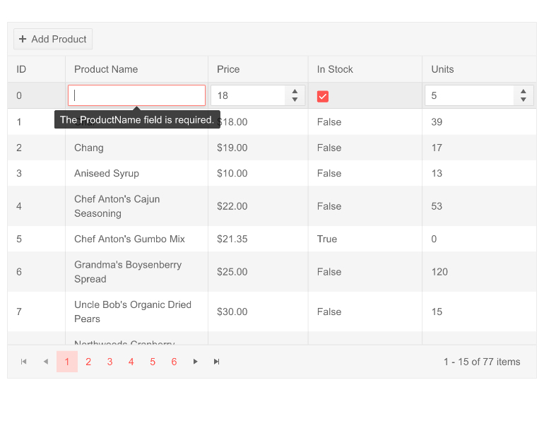
You can also offer enhancements to the editing process. As we see in the Blazor data grid example here, a tooltip appears over the empty Product Name cell, reminding the user that the field is required.
Another thing that can level up the editing experience is to provide smarter inline editing tools. For instance, let’s say there’s a field for “Delivery Time” in your table. If this were Excel or Google Sheets, the user would manually type out the time.
However, you could add a custom filter that provides a clickable and scrollable Date and Time selector.
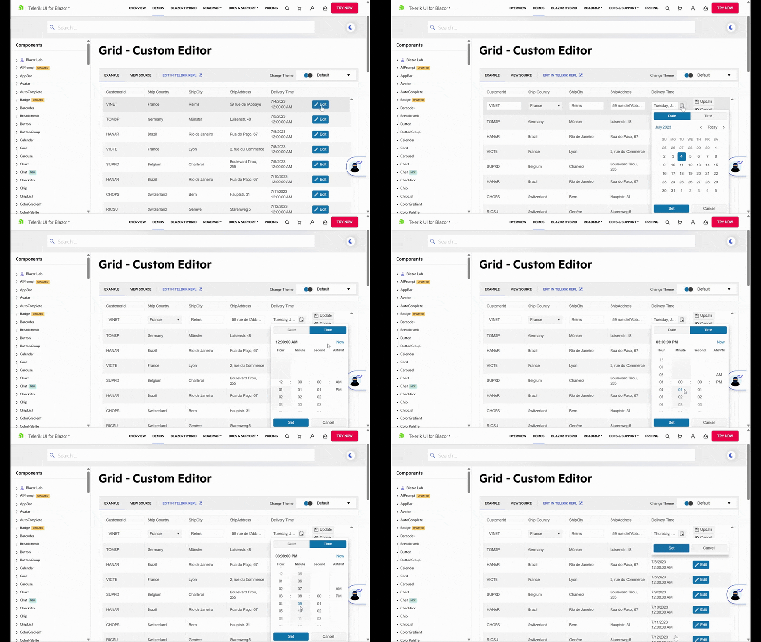
Even though this functionality might not be inherent to software like Excel, users have encountered it in other cloud-based applications. So, this kind of functionality should feel as natural as manually inputting data into the table. (It would also help with syncing this data to your other applications as the date and time will always be in the same format.)
Another kind of functionality your users might expect (and appreciate) is the ability to manipulate columns. More specifically, to resize column width and to freeze columns.
Resizing columns can be helpful for a couple reasons. For starters, users might prefer to minimize columns instead of outright hide them so they can focus on more pertinent details. On the flipside, users might also need this functionality to expand column width if it doesn’t reveal everything within the cells they’re looking at.
Column freezing might not be a feature that every user needs. However, if they’re going to be working with large data sets horizontally, this is a feature they’ll greatly appreciate.
In Telerik UI for ASP.NET Core, this is a feature called Sticky Columns.
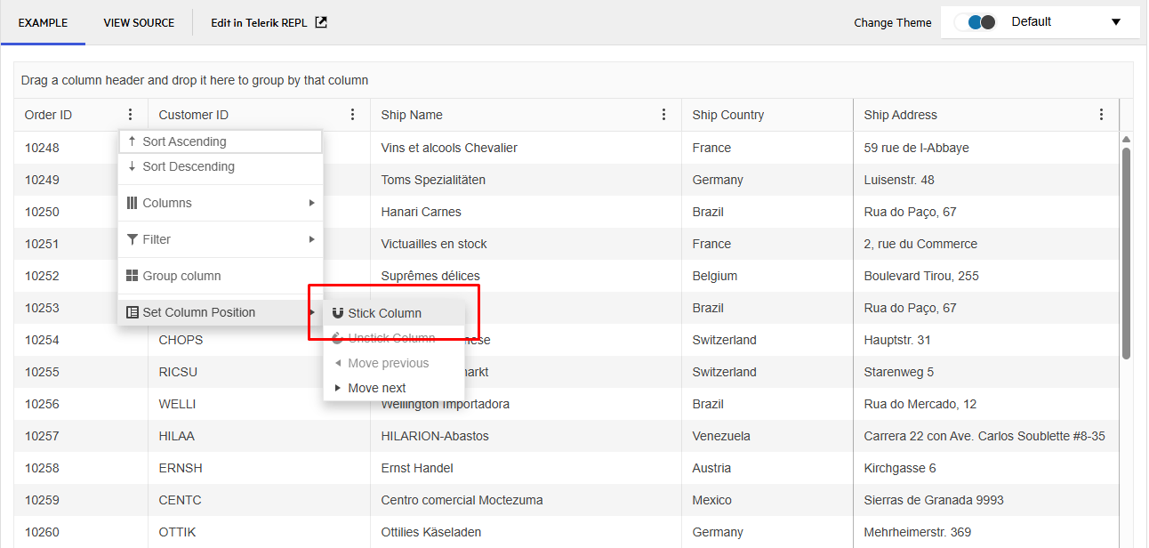
Once the user has chosen to “Stick Column,” the selected column will be frozen in place. Even if they have 30 columns of data to pore over, the most relevant bit (or bits) will stay in place so they don’t have to keep scrolling back and forth to reference which one they’re looking at.
It’s attention to detail like this that will help make your data grids easier and faster to use. Like I said, you can add enhancements along the way. However, the basic functionality that users expect when editing a spreadsheet should be there from the get-go.
4. Make Your Data Grids Load Fast
When your app aggregates massive data sets and you’re enabling users to manipulate them, performance is going to be a concern. The good news is that if you’re using Blazor or any of the other Telerik datagrid resources, you’ll have substantial help in this department.
To start, users won’t be stuck waiting around with a blank screen while their data loads. Blazor comes with a loading animation effect to keep them occupied.
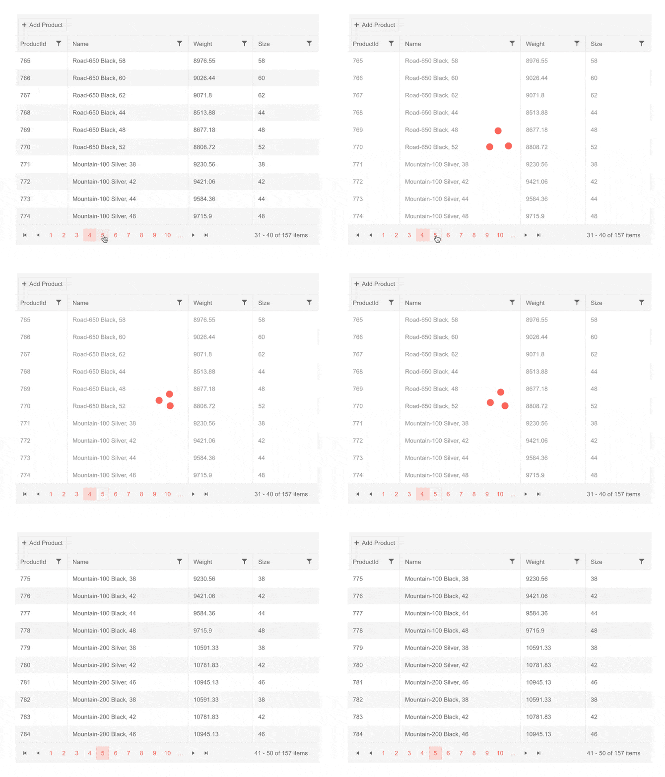
Of course, the ideal situation is for users not to have to wait. For that, you’ll have various performance-enhancement tools to use.
To start, take advantage of grid paging. This way, large datasets get broken up into pages. By showing only a limited part of the data set at a time, you’ll improve app performance.
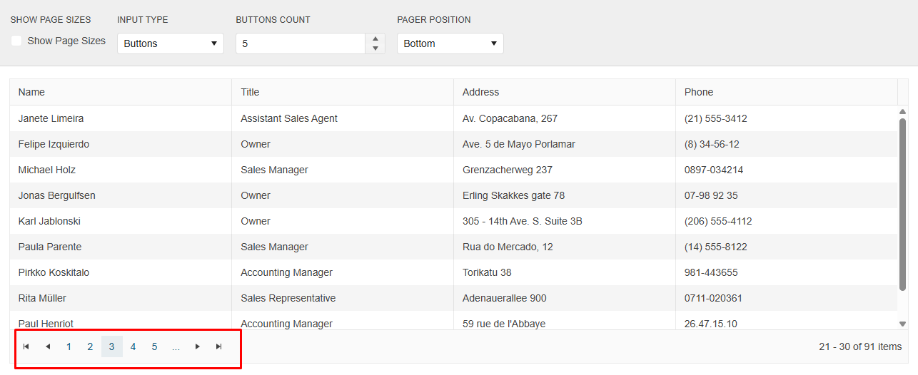
How many items you include on each page by default is up to you to decide. For instance, the example from earlier with the categories and products may warrant showing only 10 items per page. But if there are no additional details to reveal, then you might try to show 20 or even 30. It depends on how much data is available and how significant the difference in performance is.
Another feature to use is like lazy loading for data grids. To do this, you’ll use IQueriable collection, which is powered by Entity Framework. When enabled, only the data on the current screen will load. By saving your processing power for what users are viewing at the present moment, you’ll greatly improve your app’s performance.
Choosing Telerik Grid for Blazor is also a smart choice when it comes to performance. It will leverage virtualization, incremental loading and other performance optimizations that will allow your large data sets to load quickly and smoothly.
Wrapping Up
When adding data grids and tables to your app, there are a lot of things to think about. For starters, how will you fit all that data neatly on the users’ screens? Also, what kinds of features should you include so that it’s easy for users to get what they need from the grid? Lastly, if you do manage to add all of these features and functionality in, how do you make it load fast?
As we’ve seen here, a lot of tactics you use when designing other components for the web and applications are useful here. What’s more, there’s an abundance of resources you can use to build great-looking, user-friendly data grids.
For your reference, here are the resources Progress offers:
Explore Them All: Telerik DevCraft
The Telerik DevCraft bundle lets you check out all your favorite UI libraries plus productivity tools free for 30 days. This is the best option if your team is deciding between frameworks.

Suzanne Scacca
A former project manager and web design agency manager, Suzanne Scacca now writes about the changing landscape of design, development and software.

