7 New Web Design Trends & Predictions for 2024

Summarize with AI:
2024 will be the year of revolutionary and reactionary design. In this post, we’ll look at seven new web design trends: sci-fi inspired design, textured design, hyper-minimalism, adaptive headers, multiplanar scrolling, hand-drawn logo elements and teleprompter typography.
With 2023 coming to a close, it’s time to look ahead and see what the realm of web design has in store for us. Or, rather, what sorts of changes we’ll be bringing to the web as we design and redesign our digital products.
Some of 2024’s web design trends will evolve from current design trends. Others, though, will be reactionary. As opposed to building on what’s been popular in recent years, some of these trends will take us in a different or opposing direction. But that’s the way it goes. When consumers (and designers) get enough of a trend, it’s not uncommon to see a drastic change in the following year.
So with that said, let’s have a look at what’s on the horizon for 2024 in web design.
1. Sci-Fi-Inspired Design
We are living in interesting times right now. While we don’t have flying cars or robot maids as some movies and TV shows predicted we would, we do have things like:
- Generative AI like ChatGPT
- Robot-manned restaurants
- High-powered, pocket-sized computers (i.e., smartphones)
- Biometric authentication
- VR headsets
There’s definitely a demand for high-tech solutions in both the consumer and professional spaces. As such, I think we’re going to see brands in these big tech spaces (like fintech and healthtech) design their websites and apps so that they feel more futuristic.
Examples:
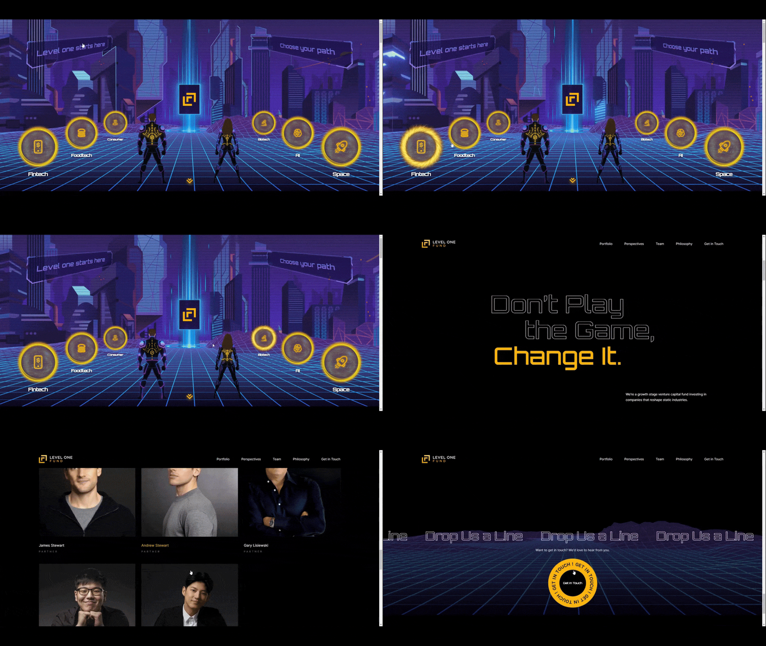
Level One Fund is a venture capital fund looking for companies to invest in over the long term. Their dark themed website contains graphics that look like something out of a video game or the movie Tron. The whole website isn’t designed this way, though, which makes it more impactful and memorable when users encounter them.
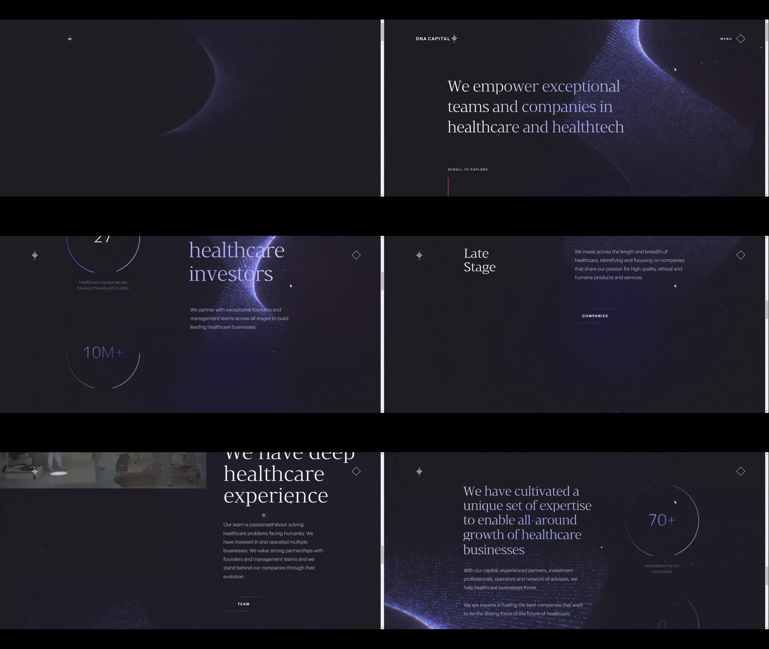
DNA Capital is an investment company for healthcare and healthtech. This website also uses a dark theme. The space-inspired background and the shape resembling the DNA double helix stand out nicely against it. It also suggests to users that this company isn’t focused on the traditional healthcare space as much as it is the future-proof solutions being developed now.
2. Textured Design
Even though AI and Big Tech are taking over a ton of businesses, many people long for some sense of realism and humanity when they’re browsing the web.
So while we’ll see tech companies adopting more futuristic looking designs, we’re going to see other brands go in the opposite direction. Rather than have websites full of flat graphics, neon colors and animations, they’ll bring some texture and depth to theirs.
Brands that make physical products or provide real world services are most likely going to be the ones to adopt this approach.
Example:
Bellroy is an ecommerce company that sells durable and sustainable leather and fabric products like wallets and phone cases. The video in the hero section doesn’t just show off various products, it gives shoppers a close-up look at the tactility of them. It also demonstrates how durable the products are. For example, we see one of the products with water on it.
3. Hyper-Minimalism
Here’s another web design trend that I think is reactionary in nature. Rather than embrace the bold, boundary-pushing styles that the age of AI has inspired, I think some brands are going to say “enough is enough” and go way back to the basics.
Hyper-minimalism won’t be about creating websites that are devoid of color, imagery or attractiveness though. It’ll be more about embracing white space and allowing it to give visitors the space and time to breathe and let everything soak in.
Not every brand will be able to put this trend to use. However, I think we’ll see it quite a bit on websites for local businesses as well as individuals and entrepreneurs.
Examples:
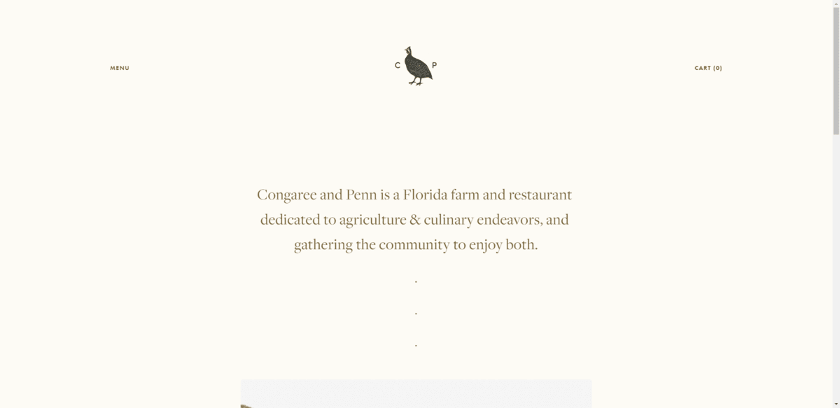
Congaree and Penn is a farm located outside of Jacksonville. In addition to welcoming people to visit and dine on the farm, they host various events throughout the year. They also provide a serene backdrop for weddings, small gatherings and other occasions. The ultra-minimalist website does a good job of reflecting the general vibe of the place.
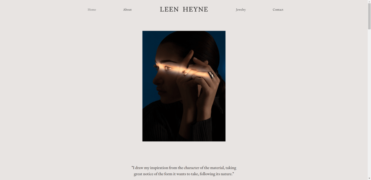
Leen Heyne is a jewelry designer. The homepage includes the occasional sentence or two to explain her work along with minimalist images of her jewelry. The overall design does a great job of embodying the concept of hyper-minimalism and gives the website a feeling of elegance and purposefulness.
4. Adaptive Headers
Although transparent header design can look really cool, how realistic is it that the logo, text and button will stand out clearly against every section background they pass over? One solution is to do away with the sticky header. But then you risk decreasing the usability of the website by forcing users to scroll to the top whenever they want to peruse other pages.
Another solution is to turn the transparent header solid once the visitor passes the hero section. However, that can cause a break in the seamlessness of the web design, which is part of the reason for the transparency in the first place. It can also turn the header into an eyesore if the color contrasts too much with the rest of the design.
I’ve started to notice a new trend that fixes this issue. These adaptive headers take on the appearance of whatever background they pass over. While it might not be ideal for websites with lots of backgrounds containing busy images and videos, it works great on ones full of color.
Examples:
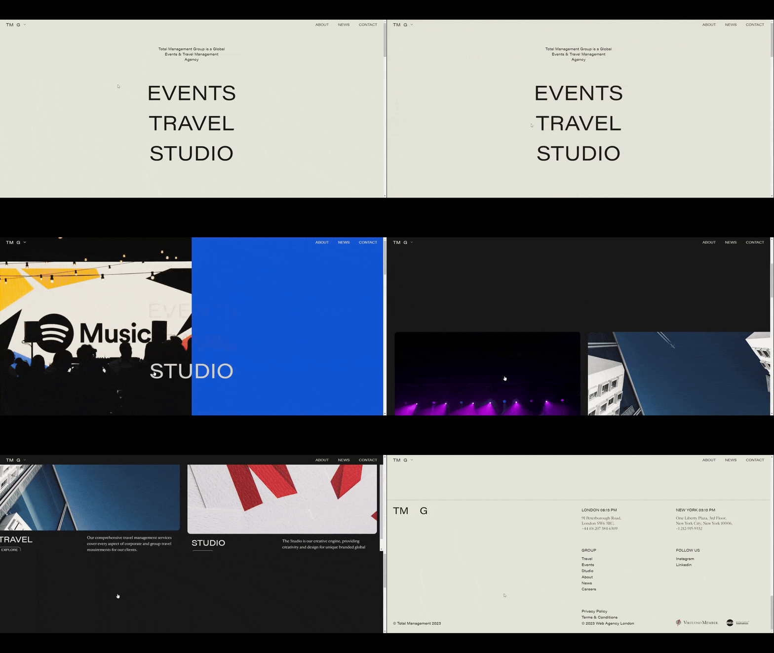
Total Management Group is an events and travel management agency. All throughout the website, visitors will find that the background of the header changes any time it passes over a new section and color. The same thing happens when colorful overlays appear.
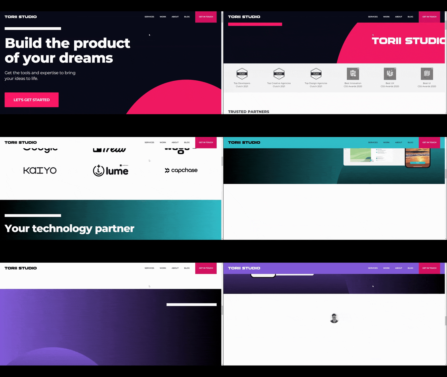
Torii Studio is a digital studio dealing in design and development. Their website is another example of what an adaptive header can do. This one, however, doesn’t always take on the color (or gradient) of the section it appears over nor is it transparent. Many times, it transforms into a complementary color.
5. Multiplanar Scrolling
Typically when a user scrolls down a page, content keeps moving in the same direction from top to bottom. There may be some moments where the page seems to stop moving as animations play out, but it all stays within that y-axis.
Biplanar and multiplanar scrolling is going to change that. As users scroll down webpages, they may now start to encounter content that moves across the x-axis as well. It looks like what you’d see in an old-school Mario game—moving up and down, left and right.
Multiplanar scrolling is where the content moves backwards along the z-axis. It’s not as common. However, I could see it catching on in the coming years. Imagine content being pushed backward as new content slides into its place in the foreground. Or the reverse—content sliding offscreen while new content emerges from the back.
Examples:
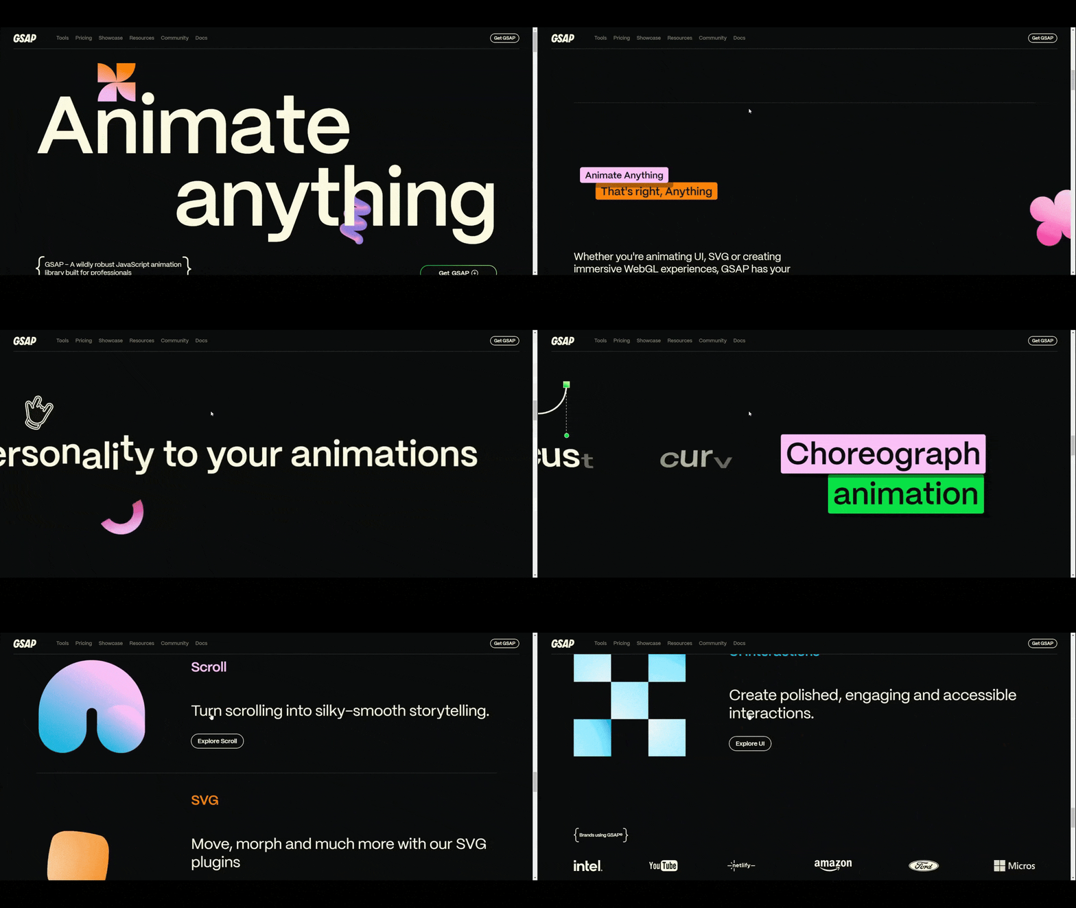
GSAP is a JavaScript animation library. The website for it demonstrates the vast variety of animations included within that library. This includes the silky-smooth horizontal scrolling that takes place about midway down the page.
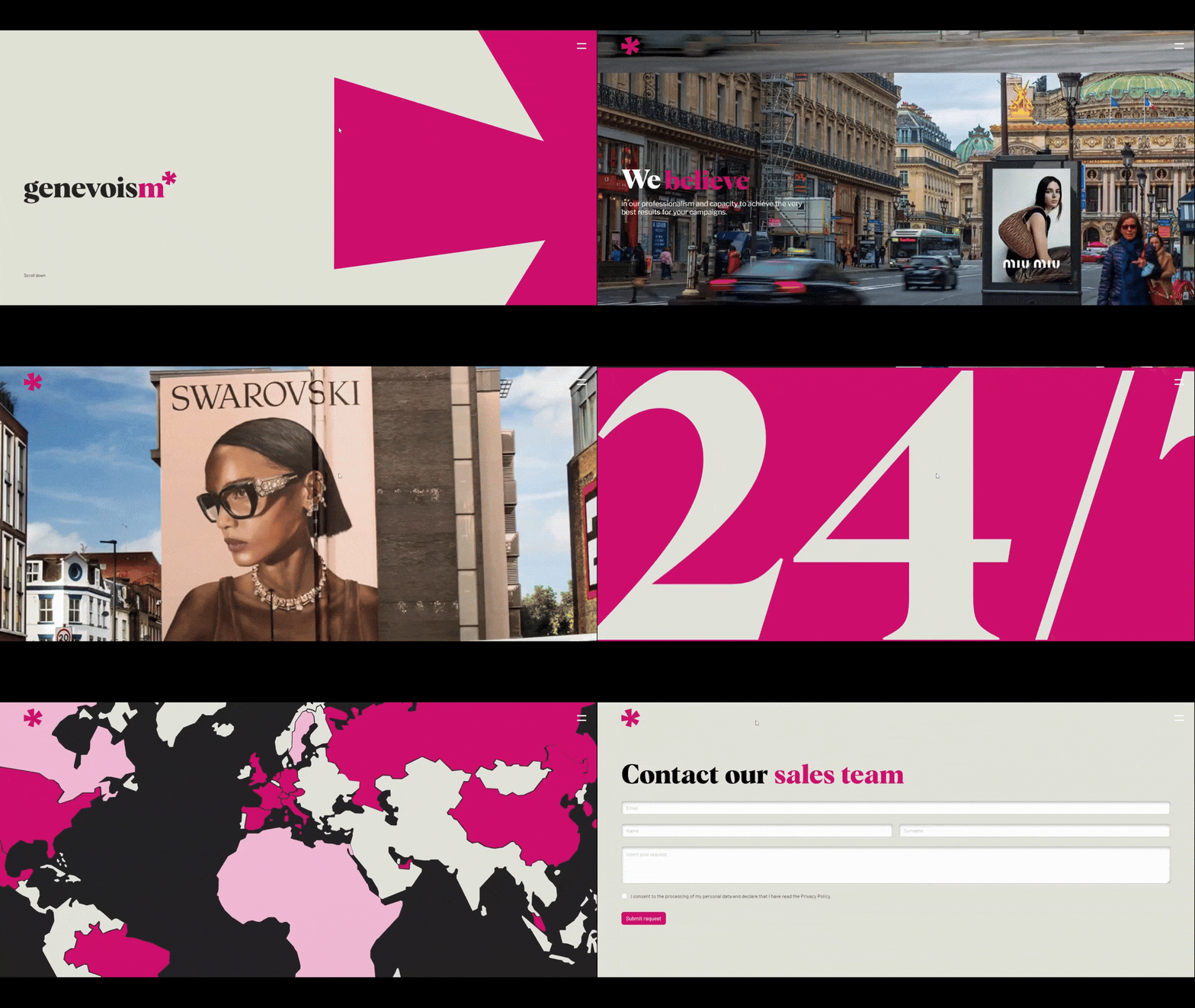
Genevoism is a consultancy that deals in out-of-home (OOH) media planning and buying. The homepage scroll is an adventurous one and fits well with their brand. While it’s not completely multiplanar, the zoom-out you see with some of the images simulates the feeling that content is being moved forward or backward in space.
6. Hand-Drawn Logo Elements
For a while there, it felt as though many logos were being overly digitized and given the flat, simplified treatment. We saw this a lot initially with big tech companies and then everyone else seemed to follow suit.
In 2024 and beyond, we’re going to see brands breaking away from the digital flat logo and embracing something that feels more raw and relatable. In some cases, the hand-drawn component will be a letter or shape within the logo. In other cases, the entire logo will appear hand-drawn.
Examples:
Arrais Ballet is a ballet and pilates studio outside of Boston. The logo contains two hand-drawn elements: the “i” in Arrais and the “t” in Ballet. You might not recognize what those shapes are just by looking at the small logo on the site. However, you’ll find larger versions of them throughout the design and will quickly notice that they’re very rough sketches of a dancer in motion.

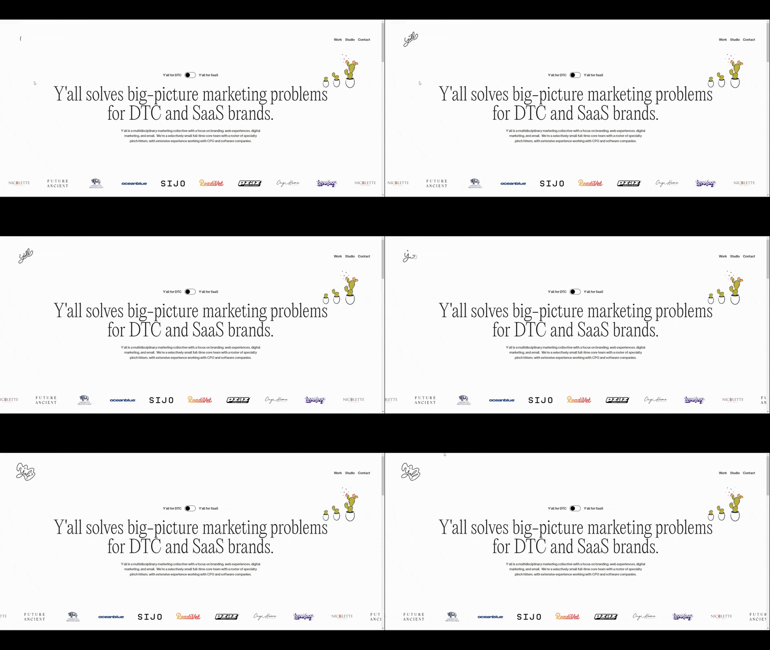
Y’all is a digital marketing agency that works in the DTC and SaaS spaces. The logo in the top-left corner of the site isn’t just hand-drawn, it’s animated and interactive. If someone wanted to return home from one of the internal pages, they’d see the logo come to life once again after hovering over it.
7. Teleprompter Typography
One of the issues we face when creating content for websites is to not write so much that people don’t want to read it all. It’s not that users don’t want to learn about what a website is selling—that’s why they’re there. It’s just that people have short attention spans and can easily feel overwhelmed when you give them too much at once.
In some cases, though, it’s not possible to write short, snappy snippets. Some designers have figured out a solution for this problem and I suspect we’re going to see a lot of this in 2024.
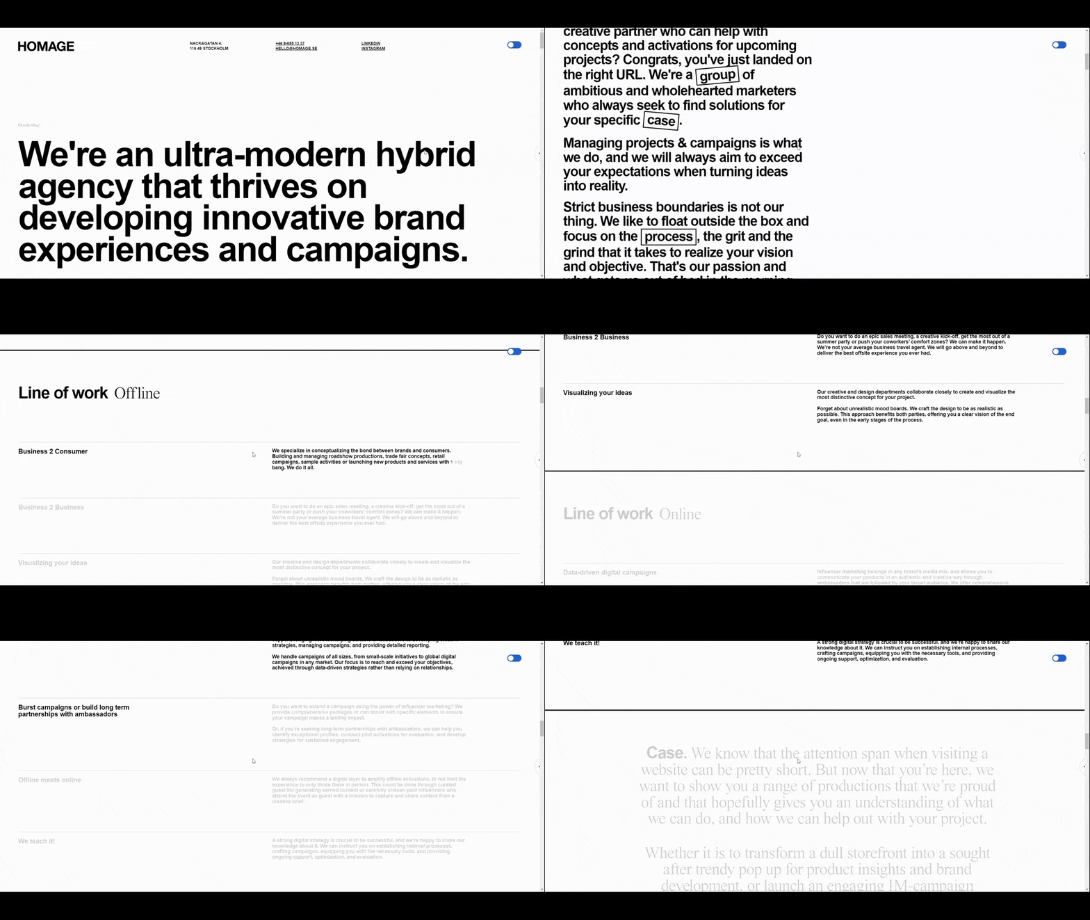
It doesn’t work exactly like a teleprompter, but the end result is similar. With a teleprompter, text is slowly fed to a screen while someone speaks. This allows them to speak to the audience as if the words were coming off the top of their heads. With teleprompter typography, the text goes from a not-so-readable light or semi-transparent to a very readable black and opaque as the user scrolls down the page.
Examples:
Homage is a brand agency with a typography-based homepage. Save for a video at the bottom of the page, it’s all text. That’s why the teleprompter typography is so useful here. It allows users to focus on one section at a time before moving onto the next.
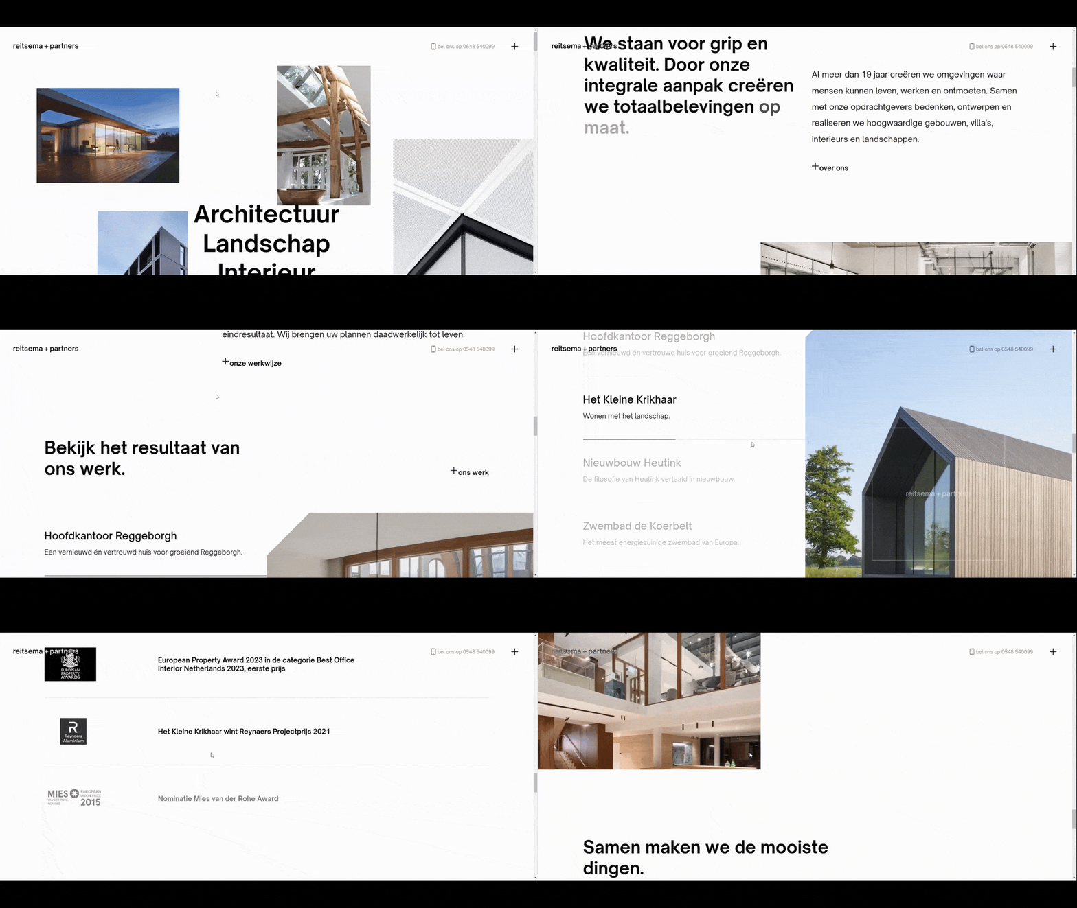
Reitsema + Partners is an architecture and interior design firm. Although it’s important to show off their work through imagery, it’s just as valuable to provide context for their architectural work and mission. The teleprompter typography effect first allows visitors’ eyes to focus on the impressive imagery. It then draws them over to the surrounding text as bit by bit of it gets revealed.
Wrap-up
These aren’t the only trends we’ll see in web design 2024. However, if you’re looking for new trends to shake up your designs, this is a good collection to start with. You have revolutionary trends like teleprompter typography which solves a common problem with the user experience. You also have evolutionary trends like sci-fi-inspired design, which will enable high-tech brands to give their websites a futuristic and wow-inducing gloss.
Suzanne Scacca
A former project manager and web design agency manager, Suzanne Scacca now writes about the changing landscape of design, development and software.

