How to Prioritize Digital Well-Being in Mobile App Design

Summarize with AI:
Here are five features to include in your mobile application to support users’ digital well-being and help support their efforts to reduce screen time.
Digital well-being isn’t a new concept. People have been talking about it for at least the last decade as the average amount of screen time increases. However, as the harms of excessive screen time come to light, we have an urgent need to discuss who is responsible for the digital well-being of our users.
We could leave it up to users to configure screen time settings on their smartphones. We could also leave it up to them to install digital well-being apps—ones designed to put limits on apps and decrease screen time—if the device’s settings aren’t enough.
But should the burden solely be on the users to police their use of smartphones? And should they be left with screen time controls or are there bigger issues that can be addressed? We’ll explore some solutions in this post.
Digital Well-Being Features You Can Add to Your Mobile Apps
Do a Google search for “reduce screen time” and you’ll find lots and lots of articles that cover this subject.
But why are people so concerned with screen time? Well, too much of it can cause mental, emotional and even physical issues, like vision problems, insomnia, loss of productivity, social disconnection and depression. Taken to the extreme, it could lead to addiction.
Clearly, something more needs to be done if users continue to struggle with these issues. While you can’t force them to turn off your apps (nor would you really want to), you can incorporate various digital well-being features to empower users to more intentionally use your products.
1. Let Users Turn off Extra Features
This feature is especially pertinent when it comes to productivity apps since a lot of time can get wasted sifting through tabs and options that the user doesn’t need. These features can also get in the way in the UI and lead users to unintentionally click and activate or open them.
Whenever it makes sense to do so, give your users the ability to disable extra features. This way, they save that little bit of time with each session and won’t be slowed down or frustrated by the extra steps to dodge or dismiss them.
In the Gmail mobile app, for instance, users can disable the Chat and Meet apps.
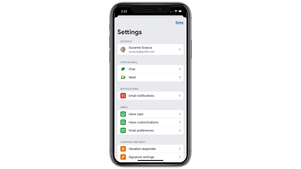
This keeps email users focused on messages coming in and going out of their inbox—and not on texting or conferencing apps they might not ever need.
Another way to empower users to move more quickly within productivity apps is to allow them to customize which features or tabs they see. So disabling extra features is good, but so too is allowing them to choose which ones appear in their menu and in what order.
Gmail’s settings allow for various inbox customizations. For instance, users can disable categories like Social, Promotions, Forums and Updates. They can also add, remove and rename folder labels so it’s easier to sort through and keep messages organized.
2. Let Users Add App Time Limits
When it comes to apps that contain an endless supply of content and distractions, users would benefit from more transparency about the time they spend in them. This feature would also come in handy in productivity apps, especially if you could show a breakdown of not only how much time they are in the app, but what activities they do when they’re there.
Time tracking might not be enough to help users reduce screen time though. Some users might see that they’ve spent a few hours inside of Instagram, for instance, and then tell themselves that they won’t do the same the rest of the week.
What would help is to allow them to configure custom limits for the app.
![]()
In Instagram, specifically, users are able to do a number of things to help them better manage their time.
For starters, they’re able to set reminders to take a break every 10, 20 or 30 minutes. This way, when they reach their threshold, the app gently reminds them to put the phone down and do something else.
There’s also an area where they can set a daily time limit, starting at 15 minutes up to 2 hours. When they hit that limit, Instagram locks them out of the app. They have to enter their phone’s PIN in order to unlock it. But the extra effort on top of the notice from Instagram may dissuade some users from doing so.
Another thing that Instagram does is to include a snooze feature and notification settings. I’ll cover why these features are helpful in the next sections.
3. Add a Snooze Feature
When we talk about snoozing an app, there are different ways to handle this based on the type of app it is.
The most common snooze feature is one that silences an app and its notifications for a certain amount of time. It’s commonly encouraged for nighttime hours so that users can sleep in peace.
The Rover mobile app includes this feature under its notification settings.
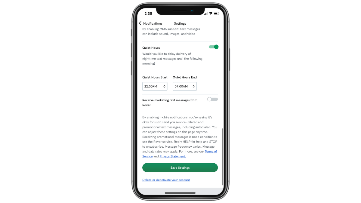
Users choose custom start and end times for this snooze mode. When enabled, they won’t receive any notifications until the end time has elapsed.
This type of snooze feature would be useful for most app types, but especially for productivity and other work-related apps. When people have grown so used to checking work email and being on call—simply because of how convenient smartphones have made it to do so—snooze and quiet hours encourage them to practice some highly beneficial self restraint.
There’s another type of snooze feature you may want to incorporate into your app. This type would be best for apps geared more towards entertainment. For instance, gaming, social media and dating apps.
The Hinge dating app, for instance, has a setting that allows users to pause their profiles.
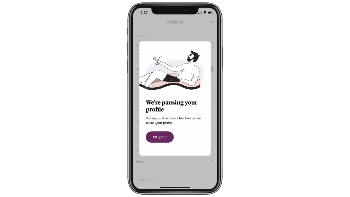
Some other dating apps enable users to set a time limit for the pause—anywhere from a couple hours to indefinitely.
Regardless of how this type of snooze feature is handled, the goal is to give the user some breathing room. While they can keep the app installed on their phones, activity will stop. They won’t be able to peruse through potential mates anymore and their profile will be hidden from others.
This type of snooze is useful because it enables users to hit the pause button instead of doing a complete deletion or uninstallation of the app. It also encourages more mindful use of these apps, whether they need to take a mental break or want to remove the distractions while they focus on the matches/results they’ve gotten thus far.
4. Give Users Total Control Over Notifications
There tend to be a number of problems with app notifications.
First is that some mobile app companies will exploit every possible channel their users give them access to—email, text and push. Second is that notifications often arrive at the most inconvenient of times. And, lastly, mobile app companies may use notifications to lure users back to the app for their own selfish (i.e., engagement and conversion boosting) reasons.
Because of this, you’ll need to seriously evaluate how to set up your notification system to benefit your users first and foremost. And then how to implement various user-side controls so that they keep notifications enabled instead of dismissing them outright.
We can use Rover once more for this example.
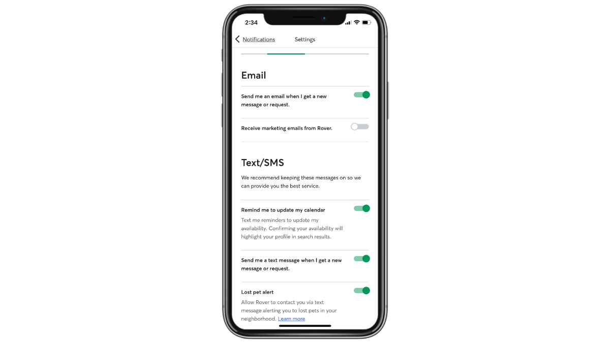
Users are able to set granular controls for their notifications—on the device level as well as the content level. This allows them to receive the most relevant and timely communications via the channel that makes the most sense for them. They’re also given the option to disable marketing notifications so they can focus on alerts that are relevant to their primary purpose in the app.
The Substack app has an interesting feature called “Smart notifications.”
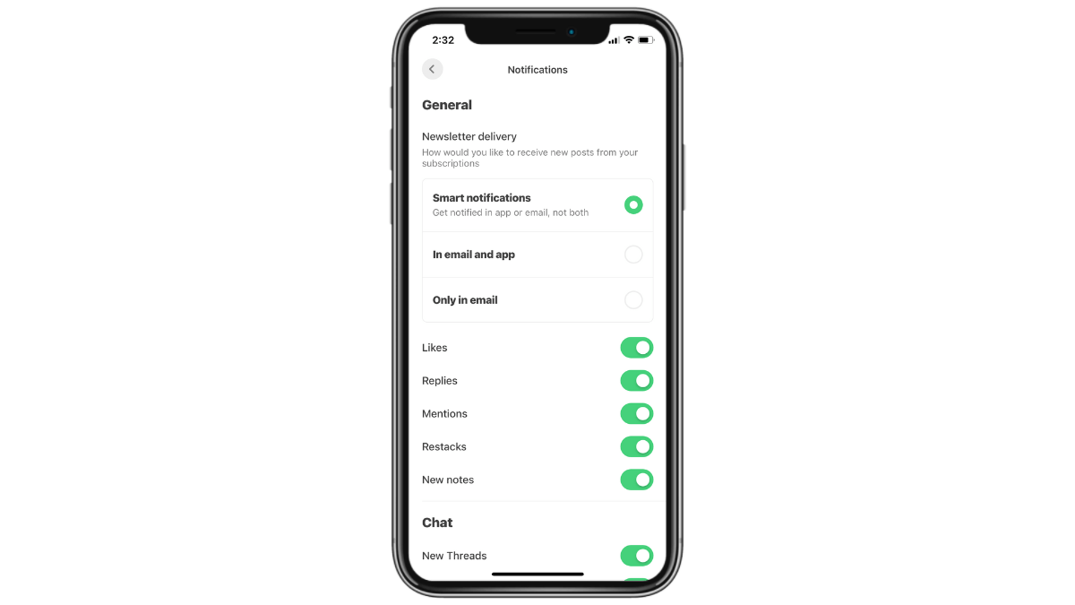
These settings are much easier for users to configure as they don’t have to go through each device to custom select the notifications to send. At the top, they have a choice:
- Send the newsletter only via email
- Send the newsletter in both the app and via email
- Enable smart notifications so the newsletter is delivered to just one, not both
This feature is helpful as users won’t have to reduplicate their efforts if they encounter a new newsletter notification in the app and then again in their email inbox. They could very well have already read the newsletter, so smart notifications reduce how much time they spend revisiting the app and newsletters they already read.
Another option for notification customization is to allow users to sync and schedule them with their goals. So if you’re building an app where it’s common for users to set goals—be they productivity or general activity goals—this would be a good feature to incorporate.
Here’s how the FitOn fitness app does it:
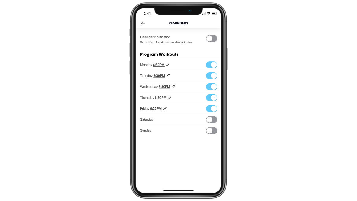
Users are invited to create two types of reminders.
They can set them based on their workout schedule. They can enable certain days and set custom times for each. They can even add those workout reminders to their calendar (on top of push notifications).
Another option is to set up multiple ones throughout the day—one when they “Rise & Shine,” one to “Get Up & Move” and one to “Relax & Unwind.” They can enable as many or as few of these as they want as well as to designate a custom time for each.
By setting up the system this way, users receive notifications that are always relevant and timely. What’s more, because they align with their goals, they’ll be entering the app with a purpose. When they enter it feeling directionless, that’s when time gets wasted and screen time increases.
5. Do Away with Endless Content
When you have a mobile app that serves up endless content, you’re going to have to decide if designing the app to feel neverending is the right move. While an extra step (like hitting a “Next” button) might add some friction to the user experience, is that a bad thing when users are getting burned out and harmed by excessive screen time? Not to mention the problems caused by having too many options to choose from?
So one thing you can do is to design your app without an endless feed of content. Another is to give users the choice to stop the endless stream of content.
Let’s look at different ways this might play out in mobile apps.
You could do as the Brave browser app does and give users a choice. Do they want to reach an end to the search results page and have to hit “Next” to see more? Or do they want to pull-to-refresh their endless scroll?
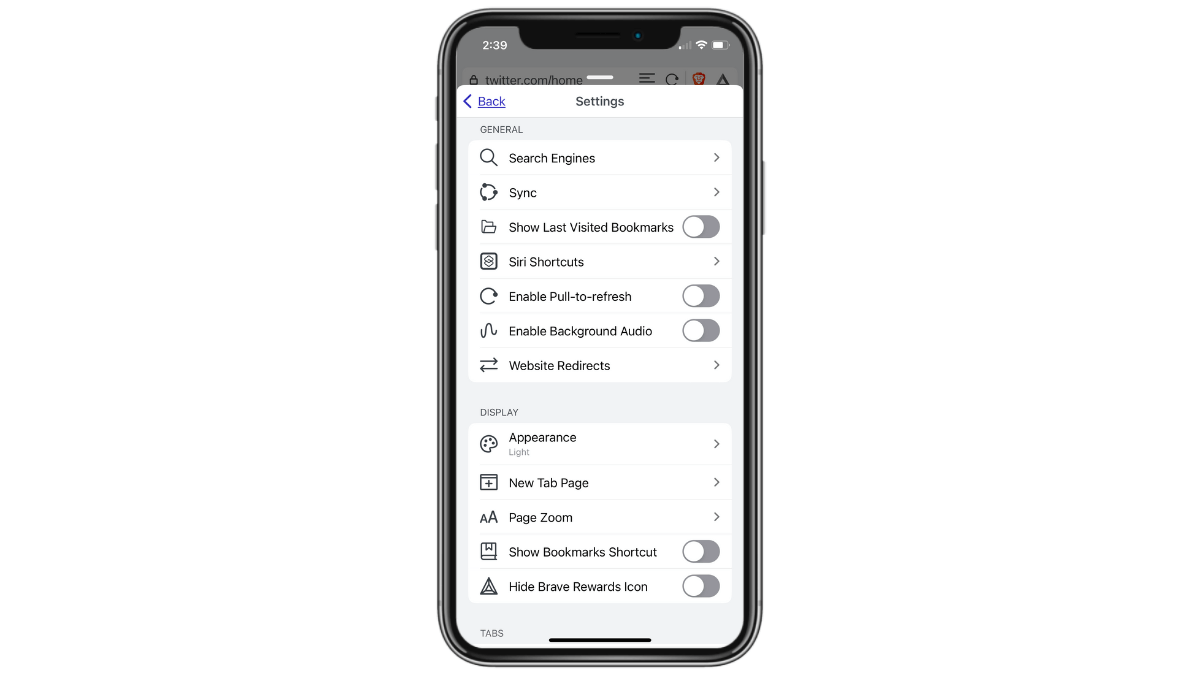
The majority of users give most of their focus to the first search engine results page anyway. So creating a clear end to those top 10 or so results could be beneficial. Otherwise, an endless scroll enabled by a pull-to-refresh feature might encourage them to act like 50 search results are all worth perusing.
When thinking about endless content, don’t get caught up in the scroll aspect of it. There are other ways to present a seamless stream of content—like swiping left and right on dating apps.
This is another area in which Hinge does things right.
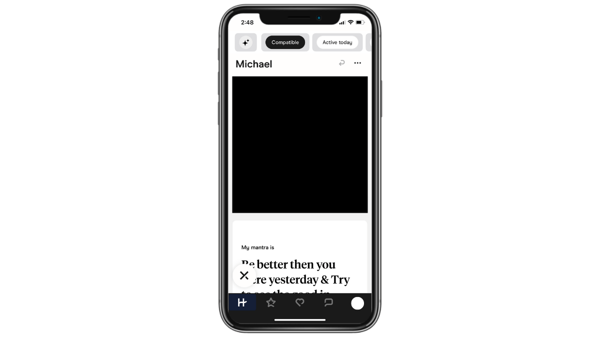
On other popular dating apps, users can dismiss or embrace a potential mate with a quick swipe. It’s an effortless action and can quickly become thoughtless and addictive.
Hinge doesn’t make it that easy. Users have two options. They can hit the “X” button in the bottom-left corner of a profile to dismiss them. The other option is to scroll through the person’s profile, find a photo or response that they like, and hit the heart button in the bottom-right corner to like them.
It slows down the process of matching since there are no split-second decisions being made. However, it makes the whole process more intentional. With limits on how many likes a user can send a day, too, Hinge users won’t end up spending an inordinate amount of time in the app each day.
The other way to keep users from falling down the rabbit hole of endless content is to disable autoplay, or at least give users the option to disable it. This applies to any app that serves up video or audio content.
The Podbean podcasting app has this feature in the Settings panel.
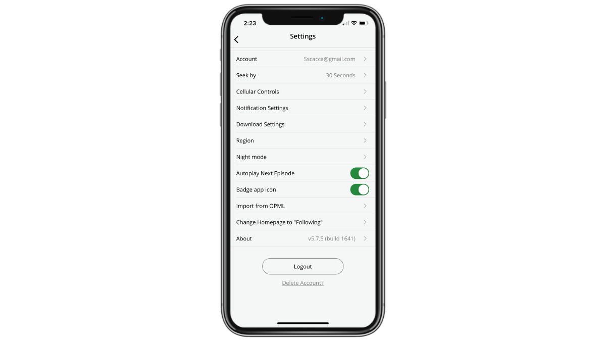
Users have the ability to enable or disable the “Autoplay Next Episode” setting. With podcasts, it might not be as big of a deal as users aren’t staring at their screens. However, if there’s a video component like there is on a platform like YouTube, then this is a must-have feature.
By allowing users to consider if they want to listen to or watch something else, some of them might make the conscious decision to put the phone down and give themselves a rest. Whereas autoplay makes it all too convenient to keep going.
Wrap-up
Screen time can’t always be avoided when it comes to work. As a designer, you know this all too well. When designing apps for work, though, there are ways to create a more streamlined experience so users can get in and out as quickly as possible, and only when it’s necessary to do so.
When it comes to our personal lives, screen time is a bit trickier. While we’d all probably like to spend less time in front of screens, the way apps are designed don’t always lead us to make the best choices. But, as you can see above, there are various things you can do to help your users reduce their screen time if that’s what they want.

Suzanne Scacca
A former project manager and web design agency manager, Suzanne Scacca now writes about the changing landscape of design, development and software.

