5 Tips for Making Fintech Solutions More Gen Z–Friendly

Summarize with AI:
Generation Z is entering the ranks of the consumer class more with each passing year. In order to prepare your fintech clients for the changing attitudes and preferences of Gen Z, start designing your fintech websites and apps for them.
Generation Z refers to anyone born between the years 1997 and 2012. The youngest end of the generation is too young for us to worry about right now. That said, those who have reached adulthood and are now contributing members of society are ones we have to pay very close attention to in UX design and marketing. Their spending power is only going to grow stronger in the coming decade.
Unlike any generation before them, Gen Zers are digital natives. Whereas my generation of millennials can remember a time before the internet and smartphones, that’s not so for this newest generation of consumers. So designing for them will require some adjustments.
In the following post, I’ll unpack some of what we know about Gen Z users and how this will impact fintech web design.
Tips for Making Fintech More Gen Z–Friendly
As the spending power of Gen Z goes up, you’ll want to ensure that the fintech solutions you’ve designed are ready for them. Here are some things to consider if you want to make fintech more Gen Z–friendly in the years to come:
1. Infuse Your Design With Trendy Features
Fintech design can be tricky as many products need to be age-agnostic in order to appeal to the broadest range of users. For instance, how do you handle the inherent differences in digital fluency between Baby Boomers and Generation Z?
Minimalist design is crucial for a good user experience, regardless of who the user is. Accessible design is also useful as it ensures that everyone can use your product fully, regardless of limitation or situation.
But will an oversimplified UX appeal to Gen Z? It depends.
Unlike those of us who lived through decades of ugly and clunky interfaces, Gen Z isn’t likely to understand that pain or to be appreciative of the amazing design we have access to today. In addition, they might view a website or app that’s devoid of trends as being outdated and maybe even a little condescending.
So, how do you strike a good balance?
If you’ve determined that your fintech solution needs to be age-agnostic, then you’ll have to find a balance between usability and trendiness. Check out the Atom Bank website for an example of how it’s done:
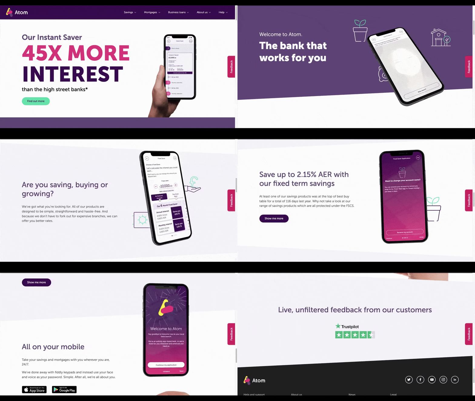
The text on the page is large, high-contrast and easy to read. There isn’t a lot of it to read either. The design itself is pretty tame—hints of bold colors and icons are scattered throughout the page.
The tradeoff here is the animated smartphone graphic. As the user scrolls down the page, the smartphone moves along with them, showing off features from inside Atom Bank’s app.
For older users, this shouldn’t pose a problem in terms of usability. It’s not as though the animation requires them to engage with it. And for younger users, the surprising animation should liven up their experience and get them thinking about the fintech brand as an innovative creator.
2. Deliver Info in Bite-Sized Chunks
If you thought Millennials’ attention span of 12 seconds was hard to create content for, just think about what Gen Z’s attention span of 8 seconds is going to do to web design.
It’s no surprise really that this generation can’t focus for very long on one thing. With platforms like TikTok, Snapchat and Instagram coming into prominence over the last decade, Gen Zers have been conditioned to prefer short-form content. They’ve also learned that there’s always something else ready and willing to capture their attention, so you can’t afford to waste their time.
When it comes to designing fintech apps, that shouldn’t present much of a challenge. Apps tend to be concisely designed by their very nature. However, fintech websites are a different story.
In order to market to and connect with this generation, content needs to be delivered in bite-sized chunks—think of punchy headlines and short descriptive paragraphs. Not only that, website content needs to be visually attractive, so lots of imagery is needed to balance out the text.
Mint’s home page is a good example to follow:
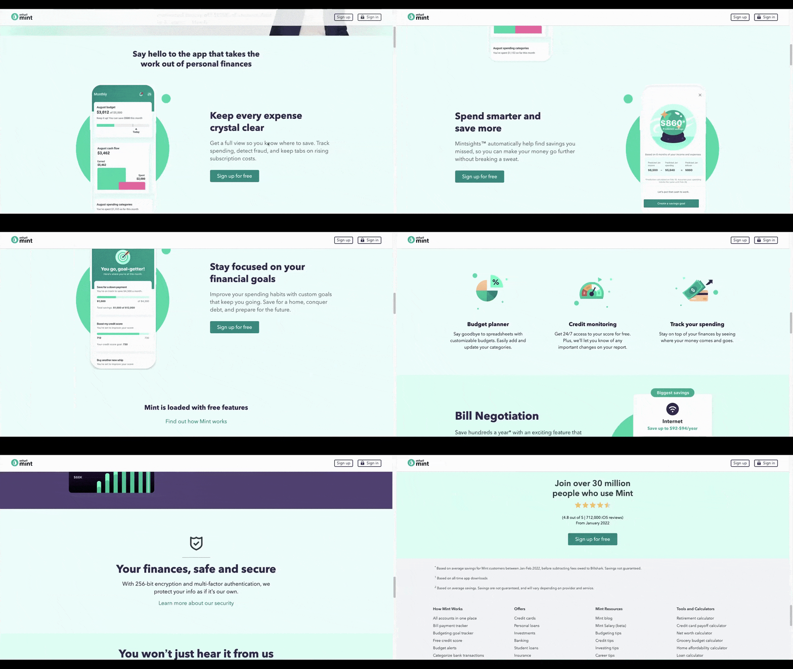
The page doesn’t take long to scroll down, headers are short and use simple language, and the paragraphs contain no more than two sentences apiece. Everything is designed to be concise and clear.
You can always skip the descriptions and just use header text as Square mostly does on its home page:
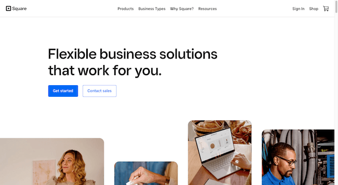
That said, not every fintech brand can so concisely convey what they do or the benefits of their solution in less than 10 words.
When your fintech client has more to say, what do you do?
One option is to present the information in a compact space using an accordion or tabs to hide content until the user engages with it. Another option is to embed a video or animated explainer on the page to deliver the message in a quick and painless format.
3. Provide Instant Gratification
Generation Z has high expectations for technology. I blame this on the fact that they grew up with the likes of Amazon and Apple. When you have access to high-tech products and then they enable you to get whatever you want within a day (if that), why would you ever settle for less?
Now, this is going to date me a bit, but I remember having to go to my local bank to deposit my paycheck every week. There was no other option at the time. Gen Z, on the other hand, likely wouldn’t even consider that to be an option. Instead, they’d expect their banking solution to allow them to either take a photo of their check and digitally deposit it or provide their employer with account details so they can deposit it on their behalf.
As a designer, you’ll have to anticipate the various ways in which Gen Z users expect your solution to be fast and convenient. Keep in mind that it’s not just the inclusion of multiple digitized or automated features that will provide Gen Z users with the instant gratification they seek.
Let’s use the example of Affirm:
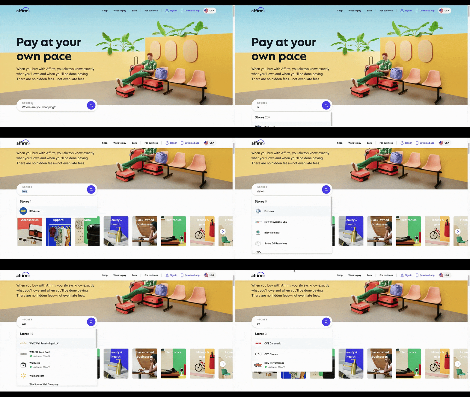
The search form in the homepage hero image is fast and smart and immediately reacts to the user’s input. As the user types, matching results appear in a dropdown beneath the form field. If the user had any doubts about 1) where they could shop with Affirm, or 2) how easy the app would be to use, this website form will put those doubts to rest.
Of course, you won’t have the opportunity to include components like these in every site you build for a fintech company. That’s okay. Just keep the idea of instant gratification in mind whenever you design any part of the interface the user needs to engage with.
There should be no guesswork about which parts of the page are interactive and what will happen when they do engage with them. For instance, Venmo’s button design screams “Click me!”:
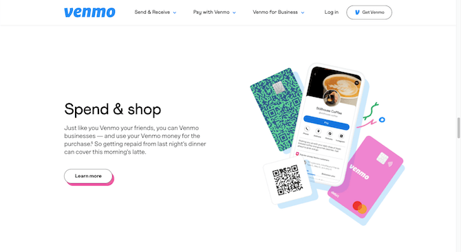
In addition to the button looking like something that can be clicked, it responds to the user’s touch via hover, transforming into a flat blue button.
Venmo’s navigation also begs for user engagement:
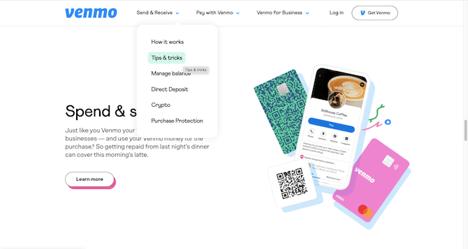
Each top-level link is followed by a Venmo-blue down-arrow icon. As users hover over the page links, different color highlights appear.
4. Promote Your Values
A fintech company isn’t going to gain Gen Z customers’ loyalty simply by having a well-known brand name. That’s not what drives their purchasing decisions.
For Gen Z, what matters most is having shared values with a brand. In many cases, that means demonstrating that you support sustainability or social causes.
That said, this isn’t the kind of thing you can force. Especially in fintech.
For instance, an ecommerce company that builds products from natural materials can tout a sustainability mission because it’s obvious and authentic. However, unless your client’s identity is wrapped up in something like green banking, it might not feel as natural to promote sustainability.
So, what do you do about this?
Talk to your client and find out what sort of external causes the company supports. They might have one already, like Acorns:
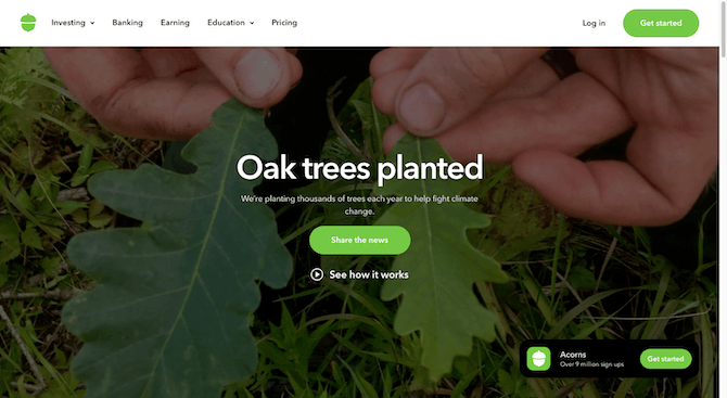
There is no mention of this on the homepage nor does it exist in the main navigation in the header. Instead, it’s tucked into a section called “Who We Are” in the footer. That’s a good idea. While the page allows Acorns to show off its do-good cause, it doesn’t make it the primary focus of the website (or app). So, they’re not doing this for social clout. It’s just something they share with people who actively go looking for it.
Now, if your fintech client doesn’t have any sort of sustainability or social cause they can promote, that’s fine. That doesn’t mean you should just forget about Gen Z values when designing the site or app though.
One way to reflect shared values would be to include more diverse and inclusive imagery and features. For instance, ethereum.org includes a couple of user controls in the header of the website:
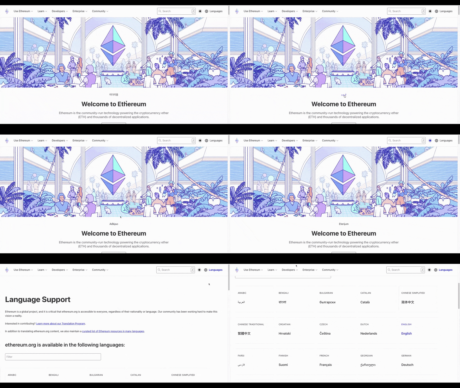
There’s a light/dark mode switcher along with a link to all the languages the website can be translated into. Its illustrative design is also reflective of the company’s open and welcoming approach to all users.
It’s not a blatant attempt at getting younger users to notice the website or company for its righteous causes. That matters to Gen Z, too. Shared values and authenticity go hand in hand. So even if you can’t build out an entire page to a cause, consider ways of making your design more ethical and inclusive to demonstrate the company’s values.
5. Add Trust Marks
Despite being raised with technology, Gen Z is just as fearful of it as many of us are when it comes to privacy and security. And in a space like fintech, those concerns are heightened.
It makes sense when you think about it. Generation Z is digitally fluent. They not only recognize how powerful technologies like the internet are, but also the risks of letting their guard down around them.
Security risks like getting hacked and privacy issues like companies abusing the information users give them are top of mind. As a fintech designer, your creations need to do what they can to assuage any fears or concerns they have.
I’ve already written about the kinds of things you can do to build trust when designing financial services apps. So there’s no sense in repeating myself. That said, when it comes to Generation Z, it’s also a good idea to think about what you can do on the website to start gaining their trust and to show them that you’ve developed a secure product.
Wealthfront has some good ideas on what to do:
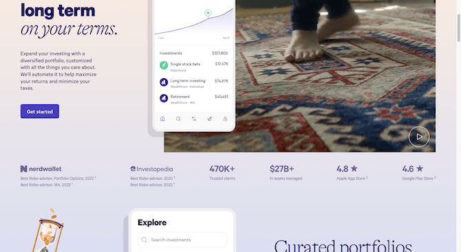
Just below the fold on the home page is a strip of statistics:
- NerdWallet awards won in 2022
- Investopedia awards won in 2022
- 470,000+ trusted clients
- $27 billion+ assets managed
- 4.8 stars on Apple
- 4.6 stars on Google Play
This is one way to show prospective Gen Z users that they can trust the company with their money and information. Customer testimonials are another way to go:
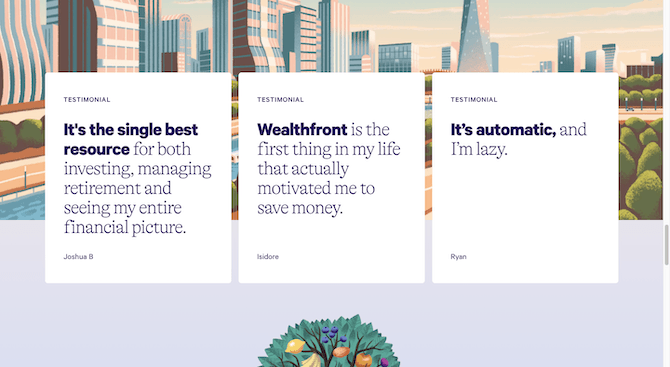
That said, while the testimonials sound authentic, the lack of details about the user might make it hard for some users to put much stock in these quotes. This might be better for websites and apps targeting B2B users instead. That way, you can include identifying details about the person’s name, the company they work for and their role.
One other option for website trust marks would be to show where the product has been mentioned or featured:
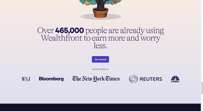
This section is effective as it includes high-profile logos for organizations like Wall Street Journal, Bloomberg, The New York Times, Reuters and CNBC.
Wrap-up
Gen Z’s spending power is only going to grow in the decade to come. As more and more of these consumers reach maturity and are able to earn and spend their own money, they’re going to look to online financial services solutions for help.
If you and your fintech clients want to attract the coveted Gen Z user and hold onto their business, designing a website or app that appeals to them is crucial.

Suzanne Scacca
A former project manager and web design agency manager, Suzanne Scacca now writes about the changing landscape of design, development and software.

