4 Design Best Practices for Better Contact Forms

Summarize with AI:
High-performing contact forms should be concise and intuitive to use while simultaneously making things easier for the brand representatives on the other end of the form.
Many people prefer not to pick up the phone to call a vendor or company these days. Instead, they opt for digital modes of communication like email, SMS and contact forms.
There’s not a whole lot you can do to control the experience a user has while emailing or texting your company. But you do have control over the contact form experience.
In this post, we’ll look at four things you can do to create a contact form that encourages users to fill it out in full and get in touch.
Best Practices for Contact Form Design
Depending on your business model or niche, your contact form may be basic, asking visitors for their name and contact info and giving them space to comment or leave a question. For others, the contact form may ask more specific questions about who the visitor is and their reasons for reaching out.
Contact forms are an essential tool in lead generation. But if your forms are failing to connect you with visitors, then something needs to change.
Let’s look at some best practices for designing and adding contact forms to your website:
1. Create an Intuitive Layout
Regardless of how basic or complex your contact form is, visitors should be able to take one look at it and think, “This is easy enough.”
To start, clearly label each field. Also, make the size of the fields commensurate with how much information you’re asking for (or that some visitors may want to give). For instance, the “Message” or “Comments” field should never be a small field. A larger field encourages visitors to provide detail that may be helpful when you get back to them.
These two steps will allow them to eyeball the form and get a sense for how complicated or time-consuming it’s going to be to fill out.
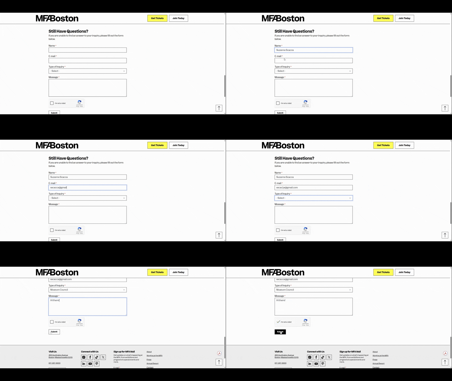
Another thing you can do to improve the usability of the form is to line up all the fields vertically.
Our eyes naturally follow an F-shaped pattern when scanning pages and content. Although our eyes might go from margin to margin at the top of a section, we mostly focus on what we see along the left margin.
By designing your form fields all in one column, visitors won’t miss fields that appear on the same line with others.
Here is an example of how this should look, from the Museum of Fine Arts Boston website:
Now, a single-line contact form might make it appear longer. However, there are ways to address this if you’re concerned the length will turn visitors off.
For example, you could organize your form into sections. If there are clear ways to group the questions—like contact questions, demographic info, needs/preferences, etc.—this is a good option. You could even design your form with collapsible accordions so that your visitors only see the section they’re working on. We see this a lot in ecommerce checkout forms.
Another option is to create a multi-step form. It’s a similar concept as grouping. However, you’ll pull the groups of questions out into separate screens and steps.
The only thing to be careful of with this type of form is including too many steps and not showing the user’s progress. With a grouped accordion form, they can at least peek ahead. With the multistep form, they can’t. So, minimize steps and provide assurances with a progress bar when possible.
2. Gather the Info You Need
One of the ways to keep your contact form length reasonable is by only asking for the information you need.
A shorter form makes the act of filling out the form more appealing, especially if someone is on the fence about reaching out. Also, creating concise forms means leaving out questions that might lead visitors to wonder why you need that information. If there’s no need to pry for those details, then leave it out.
At the same time, you want to ensure that you’re asking for enough information. While basic contact forms (e.g., Name, Email, Message) may work in some cases, they don’t work for all of them.
For example, this is the contact form on the Landmark Theatres website:
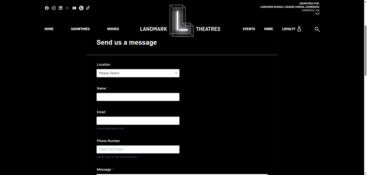
This form includes the following fields:
- Location
- Name
- Phone Number
- Message
The Location dropdown field will be helpful for directing the query to the correct theater. However, the form is perhaps a little too basic for this website.
Think about the kinds of things people might reach out about:
- Requesting a ticket refund
- Reporting an incident
- Asking about reserving a theater
- Reporting technical issues with the site or mobile app
- Asking about open jobs
Depending on how many people actually use this contact form, managing the responses could end up being a huge job for a team.
Firstly, if the form isn’t automated, they’d need to forward the response to the appropriate manager at the location. Then, they’d have to read through the message to determine what they need. Finally, they’d need to forward it to the appropriate person if they’re not able to manage the request or question on their own.
While we never want to burden visitors by asking for too much information, asking more questions in the contact form could help everyone’s experience in the end. You’d just have to design it so the form doesn’t feel cumbersome or intrusive.
For example, you could include non-required fields that ask about their reason for reaching out. You could then redirect the form to the appropriate team member or display additional fields using conditional logic to gather more relevant details.
It’s a balancing act. You want your contact form to appear friendly and unintimidating. At the same time, you don’t want it to be too basic or to provide too little direction.
3. Reduce the Likelihood of Errors
The initial impressions of your contact form will help people get started with it. To encourage them to complete it, it needs to be easy to fill out.
Errors, in particular, can make form filling an annoying process. When configuring your form, though, there are certain safeguards that’ll reduce the likelihood of your visitors encountering errors along the way.
The first thing to do is add clear labels to each field—and outside of the fields, too. This way, visitors can see at all times what info is required.
You might also want to consider adding helper text to some fields.
For example, in the Email field, you could add helper text inside or below the field that reads xyz@email.com. The Phone and URL/Website fields are others that would benefit from showing users what format you want the response to be in.
Reducing the amount of text that needs to be written out can be helpful as well. For instance, instead of giving an open-ended field for State or Country, give users dropdown options to choose from.
Also, clearly marking which fields are required will help more users get through a form on the first go-round.
Now, errors may happen regardless of the help or hints you give your visitors along the way. To help them successfully send their message through, real-time error indicators and messages should be present.
Let’s take a look at how Mendix handles this:
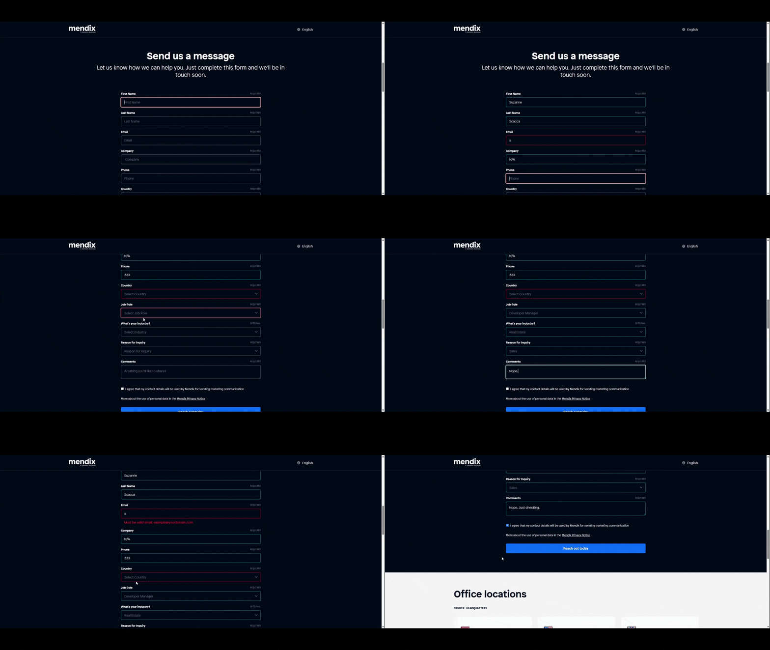
As the visitor tabs through each field, they turn green or red after the interaction.
Green signifies that something has been entered into a required field and that it was correctly done based on the parameters.
Red signifies that a required field was left empty or that the entry was incorrect.
This is a good start, but it’s not enough. The colors alone can’t signal to everyone that something is right or wrong as some people can’t distinguish between the colors.
What’s more, no detail is given after they enter something incorrectly. It’s only when the visitor returns to the red field and clicks on it that they see the reason for the error. For instance, I didn’t enter an email address into the Email field. This is the message I saw later:
Must be valid email. example@yourdomain.com
Ideally, this error would appear immediately after filling in the field or tabbing to the next one. Waiting until the visitor hits “Send” or revisits the error-marked field is too late.
4. Make the Form Accessible
A lot of the points I’ve made already tie into this idea that forms must be accessible. For example, using color alone (especially red or green) to signal an error could make your form difficult and frustrating to use for some users.
There are other things to keep in mind when designing your form for accessibility. Let’s look at the contact form on the website for the Perkins School for the Blind for our example.
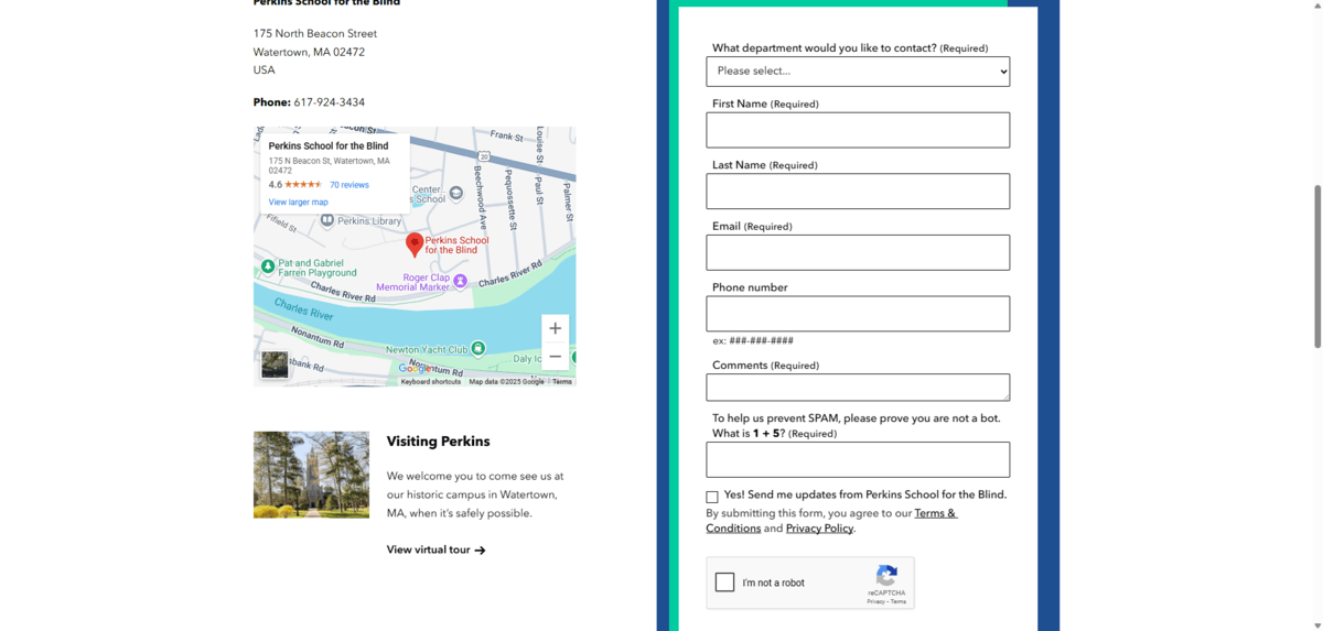
This form is nicely done. For starters, it’s keyboard accessible, so users can tab through the fields. This includes the dropdown at the top, the two checkboxes at the bottom, as well as the links for Terms & Conditions and Privacy Policy.
From an initial usability standpoint, it looks and works well:
- The fields and the button at the bottom are large enough to prevent click errors.
- Each field has a clear border that strongly contrasts against the background of the form.
- Labels appear above and outside of each field.
- Supplemental information is included below fields as needed (e.g., Phone number ex: ###-###-####).
- Required fields are marked as such.
- Selected fields have a prominent focus around them.
The only problem is that it’s not set up for error handling very well. In this example, I intentionally left two required fields blank. The form does not inform me of these errors until I submit it.
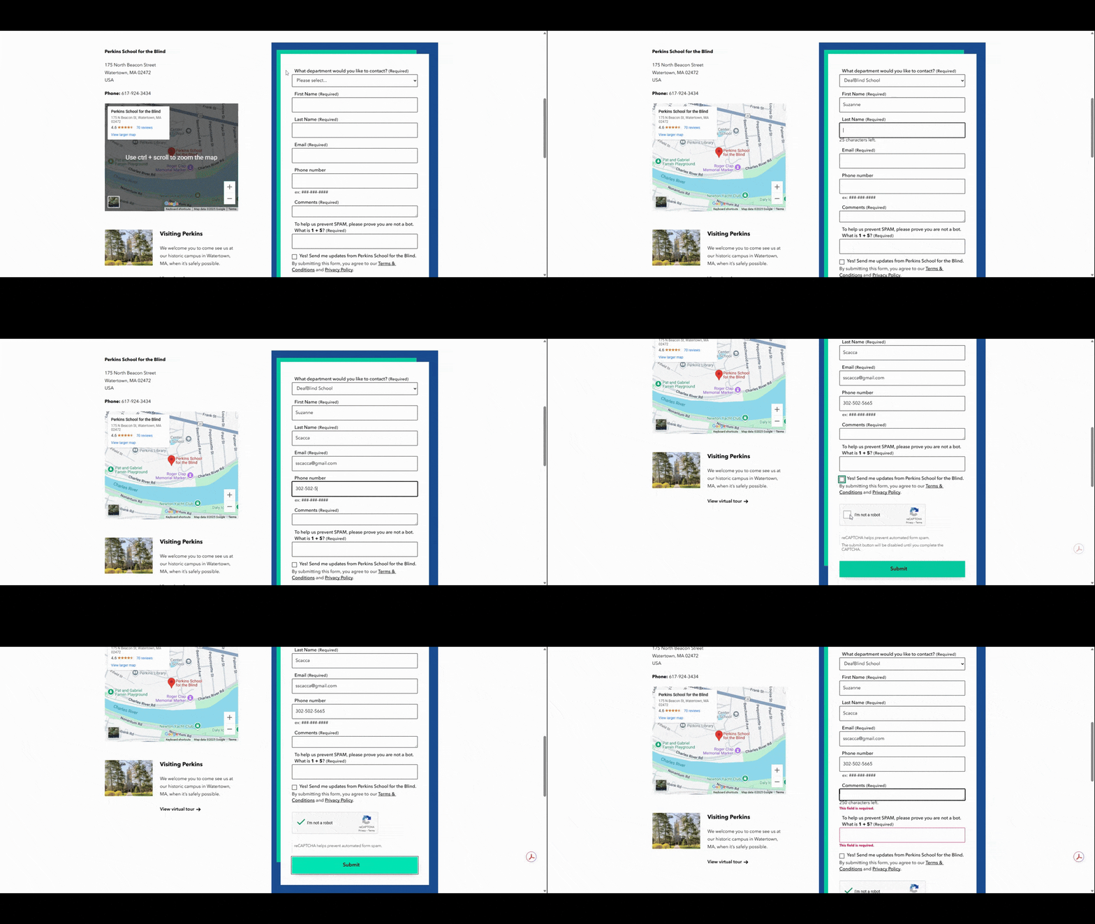
The first thing that happens (which you can’t see in the video) is that a popup appears at the top of the screen. It reads:
The form is not complete and has not been submitted yet. There are 2 problems with your submission.
After the popup disappears, I’m able to see the errors marked in bold red font below each field. The good news is that the errors appear within context, so visitors won’t have to play a guessing game and try to figure out what they did wrong. In an ideal situation, though, these messages would appear while filling out the form.
For users with impairments, disabilities or who are in limiting situations, filling out a form the first time may be challenging enough. Asking them to do it a second time could make them decide not to go through with it. Or to do it anyway, but they’ll feel pretty negatively toward the brand as they do it (even if they weren’t that frustrated or angry before).
Either way, a poor error handling experience can hurt your brand in the end. That’s why it’s critical to pay attention to these kinds of details when you’re making the rest of the experience accessible.
Wrapping Up
There are many ways in which people can get in touch with brands these days. Email. SMS. Social media. Third-party listings or pages. And, of course, the contact form on your website or app.
If you want to encourage as many visitors as possible to complete your form, then it needs to look good, work well and collect only what’s needed from the user. The guidelines above will give you some ways to do this along with some common mistakes to avoid in the process.

Suzanne Scacca
A former project manager and web design agency manager, Suzanne Scacca now writes about the changing landscape of design, development and software.

