Tips for Designing Clickable Components on Your Website

Summarize with AI:
To improve the click-through rates, consider these tips when designing buttons and links that move visitors through your site.
Interaction design is a huge discipline that prioritizes how users engage with digital interfaces.
One goal of interaction design is to capture and direct visitor attention. We can achieve this with animations, transition effects, as well as motion-based designs and media.
Another goal of interaction design is to engage users to get them to click and convert. There are a multitude of components we might want users to click on throughout their experience. For example:
- Buttons
- Links
- Menus
- Videos
- Forms
- Popups
- Chatbots
- Search forms
What we want to specifically focus on today are the buttons and links that drive our users deeper into their journey and closer to conversion. We’ll look at five best practices when designing these key interaction points.
5 Best Practices When Adding Buttons and Links to Your Site
Links and buttons do a lot of work for us, strategically guiding users from one page in the user journey to the next. So that we don’t waste their time or ours, we need to be intentional with how we design these click interactions.
Here are some tips that will help with this:
1. Put Thought into the Design
Here are some questions to consider when designing your clickable components:
Do your buttons look like buttons? This could be in terms of shape, shading/fill or depth.
For example, here’s a screenshot from the Forward Financing homepage:
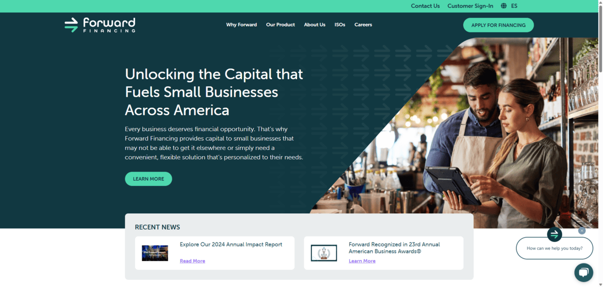
There are three buttons visible:
- “Apply for Financing” in the header
- “Learn More” in the hero section
- “How can we help you today?” in the bottom-right corner
The two solid buttons in green stick out the most and are clearly buttons. The ghost button in the bottom-right corner isn’t as prominent, but it does have a button-like shape, which may convince visitors to click it.
Are your links easy to spot among non-linked text? Don’t just think about this from a color-contrast perspective. For instance, will readers with vision impairments struggle to make them out?
Here’s a close-up on a blog post from Ramsey Solutions:
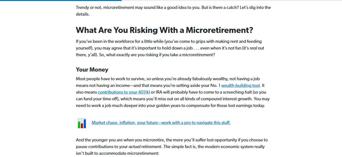
There are three hyperlinks that stick out from the surrounding text. It’s not just because they’re in blue font as opposed to black like the rest of the blog. It’s because they’re underlined.
The underline is key as it allows users with visual impairments to be able to detect the links visually without having to notice the color change.
Do these clickable elements fit with your color palette? This goes for both the active and hover state.
Does the click feedback fit with the overall vibe of your site? For instance, do some animations or transition effects feel disruptive or do they flow with the rest of your brand vibe?
For these last two questions, I’m going to use Making Sense of Cents as my example.
To start, they’ve done a good job of committing to a uniform style for the link color transformation. Upon hover, the black text turns to orange.
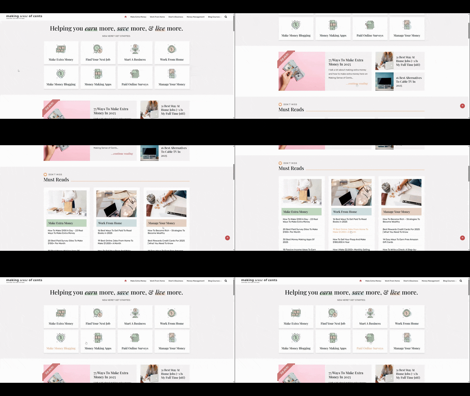
The main problem I see is with the blocks at the top of the homepage and how they react to hover/touch. The wiggle animation feels out of place when compared to the other interactions on the page. For the most part, their other button and link interactions feel very calm. However, these blocks create tension.
So, this is the kind of thing to think about if you decide to imbue your buttons with animated effects.
2. Provide Hover Feedback
Designing buttons and links to look like clickable elements is crucial. But so is the follow through (more so for buttons than text links).
There are a couple of things we’d want to see happen when someone hovers over a button.
First, the cursor should change from an arrow to pointer icon.
Second, the button’s appearance should change. If it’s a color change, the contrast needs to be significant enough where someone who can’t interpret the colors can still tell that something changed.
On the Chase homepage, for example, we only see one button change in its hover state—the “See details” button in the hero section. The only thing that changes is the background color from light blue to dark blue.
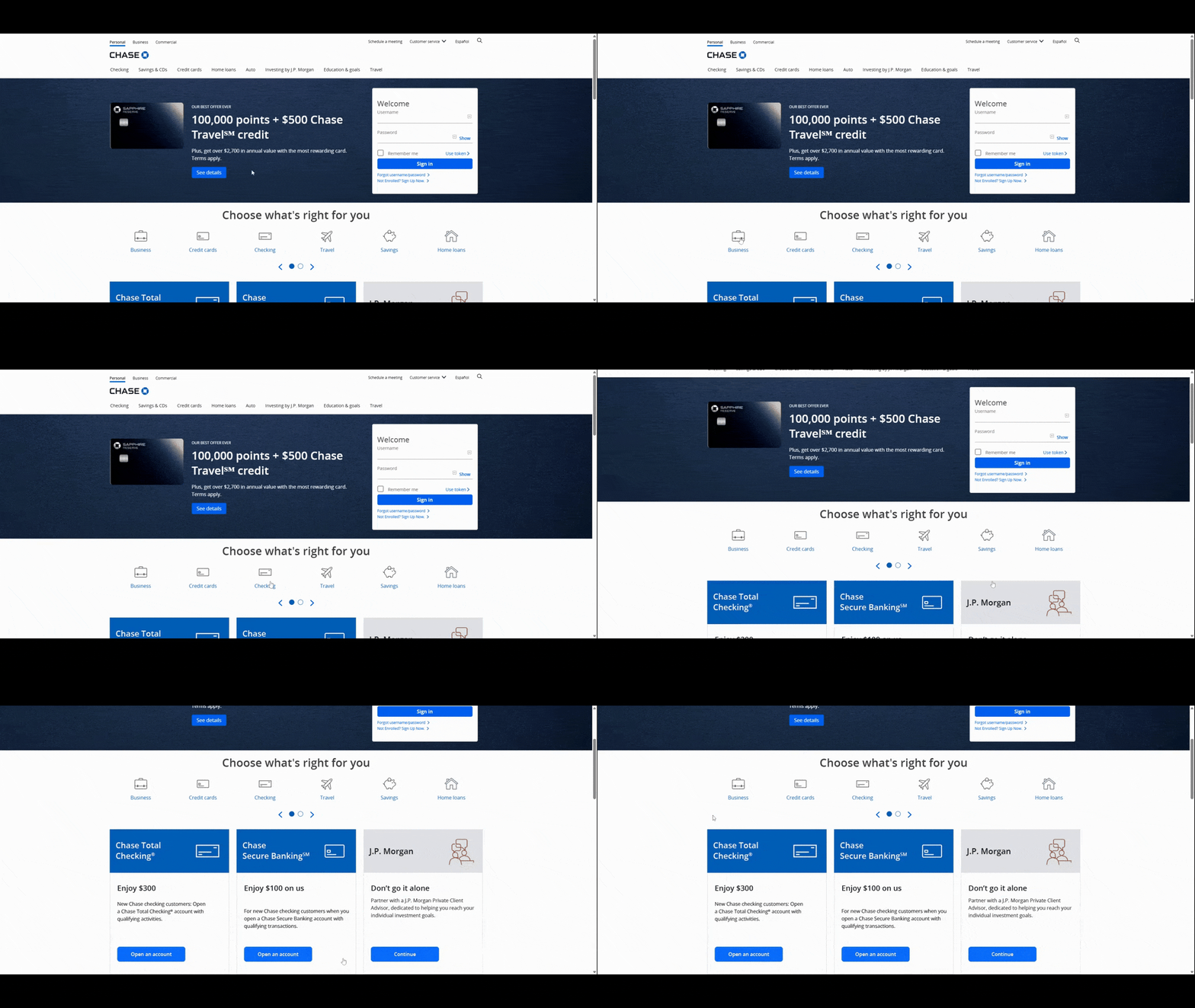
This isn’t going to provide users with an accessible interactive experience. Ideally, we want every button to provide clear feedback when someone hovers over it.
Let’s contrast this with what we see on the Pennie website:
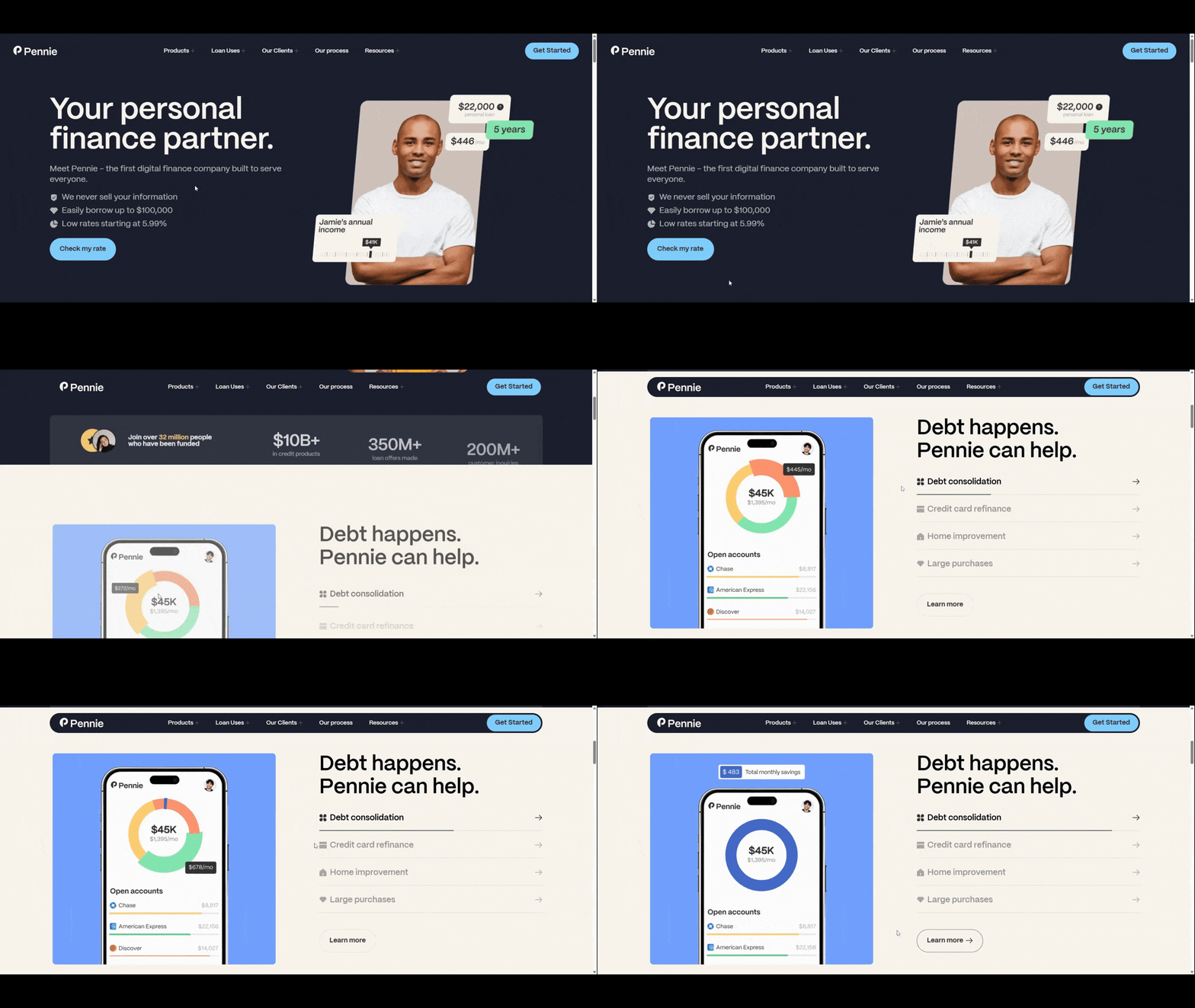
This website’s first button does a similar color change effect, from a lighter blue to a dark blue. However, the buttons also elongate and an arrow appears when someone hovers over them. We see a similar effect happen over the accordion tabs in the section just below the fold.
Not every button needs to offer feedback in the form of an icon. However, subtle animation effects like expanding and shrinking can help give users extra confidence that the buttons are indeed buttons and will respond to their touch.
3. Be Specific and Clear with Labeling
The appearance of our buttons and links will certainly help visitors recognize where clickable components are in our interfaces. In order to give them an extra boost of confidence that a click will be worth their time, take care with how you label the buttons.
In general, we want to avoid vague wording like “click this,” “go here” and “this page.” “Read more” and “learn more” are in a bit of a gray area.
Here’s an example from the PEAK6 website where we see some “learn more” links:
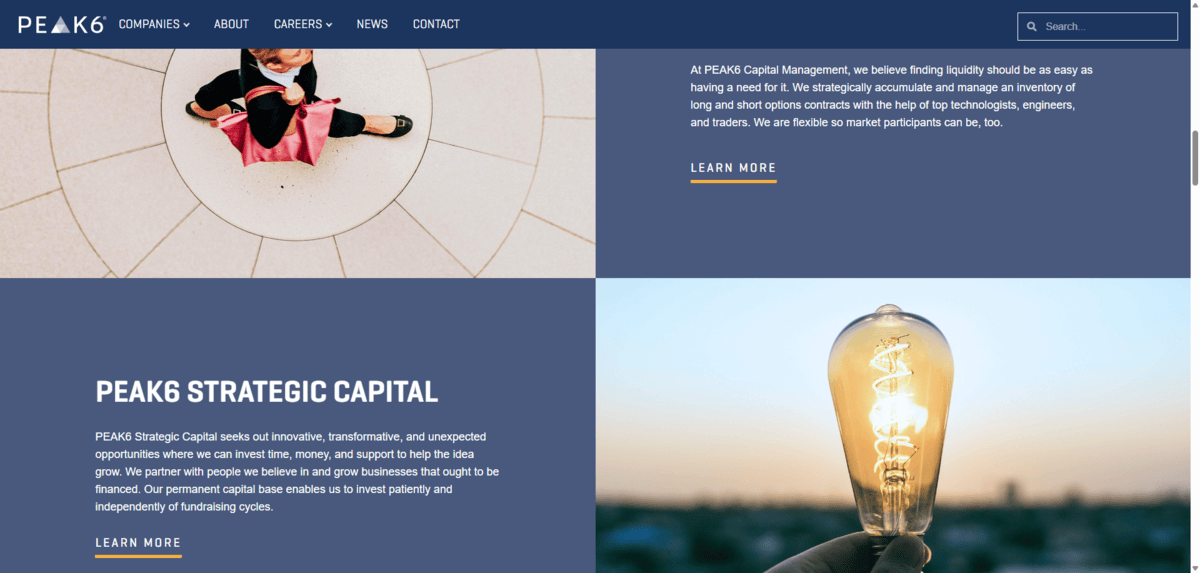
Of the 12 primary links on this homepage, nine of them say “learn more.” Most of them follow a description of one of PEAK6’s companies.
Now, given the context of these particular buttons in the screenshot, “learn more” makes sense. However, there are ways to get around labeling your buttons with vague and repetitive phrases like these—especially when you have so many of them on a single page.
Here’s a look at how Octus handles a similar type of content on its homepage:
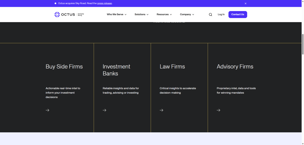
In this section, we see four side-by-side blocks describing who the company serves. The “learn more” button would probably be a natural fit for these, even though it’s not an ideal label.
Instead, what the designer has done is this:
- Replace the button shape or text link with a small right-facing arrow.
- Make the entire block clickable instead of a small component below the text.
- Animate the block so it turns from black to blue.
- Elongate the arrow.
This is a great way to signal to visitors that a component is clickable without having to resort to repeating the same vague label over and over again. So long as you mark the heading as an H2 or H3, it should also be clear to people using screen readers where the link will take them to next.
By the way, that’s one of the reasons why we try to avoid vague labels: accessibility. The user experience is another. Also, these labels are useful for SEO purposes. By using a descriptive label for buttons and links, search engines can better determine what the purpose and value of a linked page is.
4. Be Purposeful About Adding Links to a Page
Information overload is a real problem on the web these days. It’s not just because of how much content we throw at someone on a page. It also happens when we give them too many rabbit holes (i.e., buttons and links) to go down at the same time.
Let me show you what I mean.
This is the Start Here page on the Get Rich Slowly website:
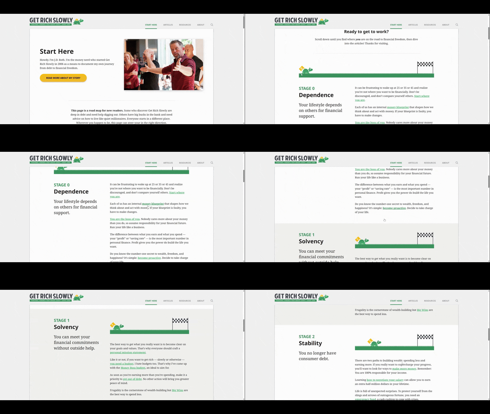
There are 29 links on this page (not including the 10 in the header and five in the footer). This is way too much for a page of this size. It’s also too much for a page that’s supposed to be an introduction to the website.
While it’s great that there are so many resources on this site and that it all seems to connect together, shoving this many links at visitors all at once can be hugely problematic. In addition to making the content look cluttered, it could distract first-time visitors from reading through the page in its entirety before getting lost down a rabbit hole.
It’s our job as designers and writers to use discernment when creating pages. We need to decide which content is absolutely necessary and when it makes sense to divert visitor attention to another page. The homepage is one thing. But a critical part of the user journey like this one is another.
Let’s look at another example of a web page with plentiful links. This is the Personal Checking page for Cadence Bank:
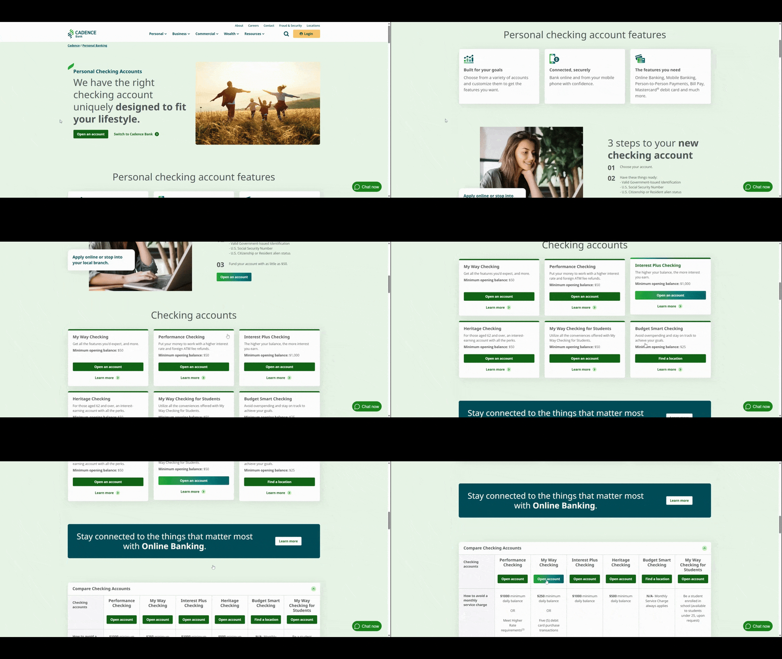
There are a total of 32 links on this page. 12 of them point visitors to “Open account.” Here’s why I think this example works:
There’s a cohesive message that these buttons are telling us. Yes, there are buttons that provide supporting information about personal banking services. And there are some extraneous links at the very bottom of the page which should probably be done away with.
However, the top portion of this page is devoted to one goal: Getting visitors to open an account. So while there are lots of buttons to choose from, there’s a good chance visitors will end up in the same place as they choose their next step.
Bottom line: There’s nothing wrong with including a link in each section or block—so long as it keeps the focus on the primary goal and doesn’t overwhelm the visitor’s decision-making faculties.
5. Minimize Links Along the User Journey
Websites contain loads of information for visitors at every stage of their journey. But behind the scenes, we know there’s an ideal pathway that we want them to journey down. If we design it right, they’ll naturally take those steps to conversion.
That said, the amount of options and distractions we put in their way along that path may slow things down. And that’s not what we want.
So, the first thing to do is determine what the key pages are for your conversion pathway. For some brands, it might be as simple as TransUnion’s
This is the hero section on the TransUnion website:
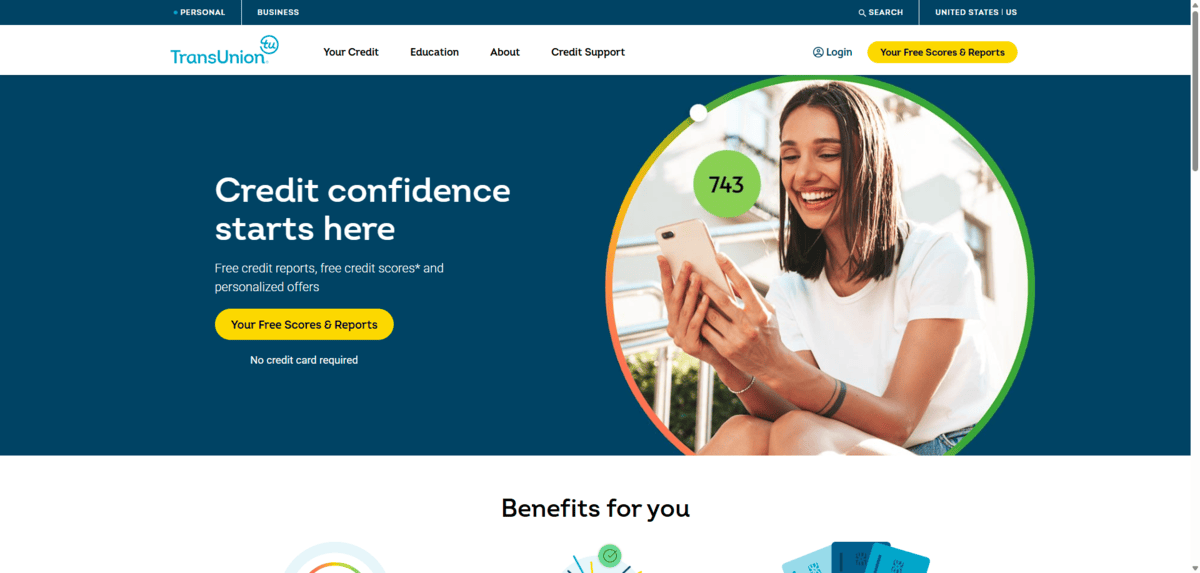
There are only two buttons on the entirety of this page and they both say: “Your Free Scores & Reports.” So does the big yellow button in the header.
There’s lots of info available on the website about the service as well as educational resources related to managing one’s credit. However, the homepage doesn’t bother with any of that. Visitors are actively encouraged to take the next step in the process and to see their free credit score.
This is a great example of how you minimize distractions and click options to help most of your visitors take the right journey early on.
Not every brand can do this though. TransUnion has a very narrow solution, which is why it works. For something like Trumid, however, it would be pretty difficult to build pages with singular calls-to-action.
That said, what you can do is make the first button and call-to-action on each page take users along the path to conversion. Here’s how that looks on the Trumid website:
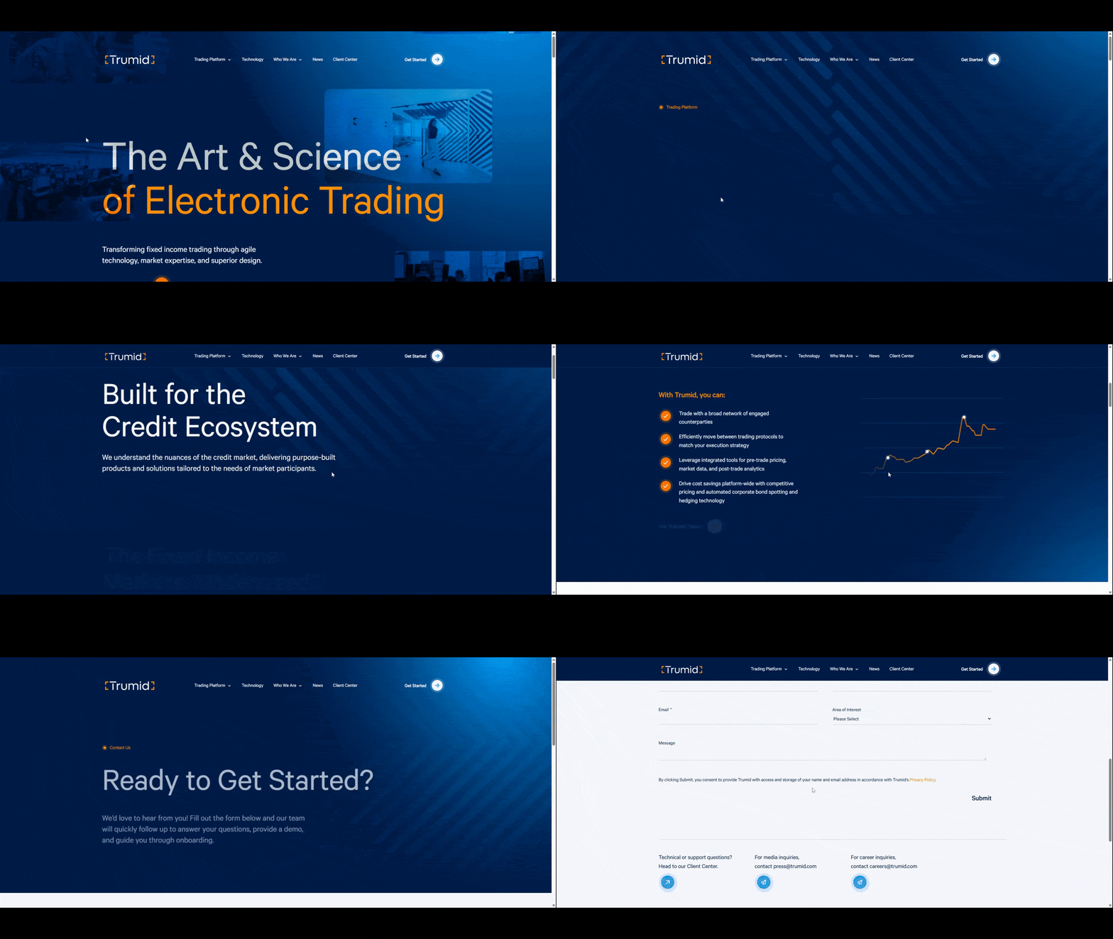
We know that users lose interest the more they scroll down a page. So, if you feel like it would be beneficial to include other buttons and links on the page, just make sure to do so after the primary call to action has been presented.
This is what Trumid has done.
- On the homepage, the first button invites users to “Explore Platform.”
- This takes them to the Trading Platform Overview page.
- The first button on this page appears just below the fold and says “Get Started Today.”
- This takes them to the Get Started page and contact form.
Users who are ready to convert earlier can always use the “Get Started” button in the header. Those who aren’t ready have other avenues they can go down on these pages. But at least the designer has presented them with the ideal pathway without having to work much for it—when they’re ready to do so.
Wrapping Up
To help our visitors go where we want them to go, we need to leave a trail of breadcrumbs for them to follow.
For some visitors, that trail is in the header. For others that want more information and context, they’ll hopefully follow the trail we’ve created for them on the pages of the site.
This is why we need to pay close attention to these key interactive components. From how they’re designed to their placement and usage on pages, all of these factors matter if you want to improve click-through and conversion rates.

Suzanne Scacca
A former project manager and web design agency manager, Suzanne Scacca now writes about the changing landscape of design, development and software.

