When (and Why) to Roll Back Features on Apps

Summarize with AI:
What happens if your users don’t like a feature or, worse, there’s major public backlash? Let’s look at why feature rollbacks happen, some recent examples from Google, Facebook and Instagram, and how to keep them from happening so much in the future.
Have you ever opened a website or app you’ve visited a ton of times before, only to realize a feature or tab you once used is now gone? How did it make you feel?
You might’ve felt annoyed that your experience was disrupted and that you had to figure out where the feature went or if it even existed anymore. Or perhaps you were glad it was gone as the feature always got in the way or just never made much sense to begin with.
From the users’ standpoint, you can see how removing or rolling back features or updates could end up being a good or bad thing. But what is it that makes a developer decide it’s worth it to ditch a prominent feature or functionality? Isn’t the goal in developing a popular app to constantly innovate, not to go backward?
If you’re struggling with the thought of removing a key feature or functionality from your product, keep reading. We’ll look at some reasons why developers choose to do this, examples of big brands that have done this recently and tips to keep you from having to do so many rollbacks in the future.
Reasons Why You Might Roll Back a Feature
Removing or replacing a key component of your website or app is not a simple task. Not only does it mean a ton of work for you, you may have team members who depend on that functionality in some way. You also have to consider the impact it could have on your company’s support team and other points of contact as call/ticket volume related to the missing feature will likely increase.
In some cases, though, it’s absolutely necessary to remove a feature that people have gotten used to using. Here are some reasons why many developers decide it’s worth the trouble:
A Faulty Update
Even if you’re thoroughly testing each new update of your app, things happen. Perhaps a bug slips through the cracks, something in the code opens up the app to a major vulnerability or a third-party integration throws things out of whack.
Whatever it is, you decide you have no time to waste. Rather than leave users with a broken or compromised app while you fix the feature or code, you choose to roll the whole thing back to the last version.
User Backlash
It’s not uncommon to try new things out. So long as you keep your users’ experience and satisfaction in mind (versus focusing strictly on profitability), you may be able to avoid this sort of trouble.
That said, even if your users were fully on board with the concept you introduced to them prior to launch, the execution may have left something to be desired. If the backlash is significant—like an endless slew of negative reviews and a mass exodus of users from the app—you may decide it’s best to remove the new feature or function entirely.
Poor UX
User feedback is a good way to gauge how well received your product, experience and its features are. But unless the feedback is nearly unanimous, it can be difficult to make a big decision like undoing a feature.
Another key indicator that a feature needs to go comes from a passive form of user feedback—your analytics. Whether you’re looking at in-app activity or at something like a heatmap, it’ll be pretty easy to spot when features are ignored, confusing or adding friction to the UX.
Feature Creep
Feature creep happens when many new features (oftentimes an excessive amount) have been added to a digital product. The result could be that you have:
- Tons of features your users don’t use
- “Cool” features that don’t really add to the product and are distracting
- Features that have made your product or the UI too complex to use
- So many features that require too much time, effort and money to maintain
If your feature set is getting in the way of your company achieving its goals or they’re truly hindering the user experience, it’s perfectly acceptable to cut back.
Examples of Big Brands That Rolled Back Features
Here are some high profile cases that demonstrate how complex the matter is when it comes to removing features:
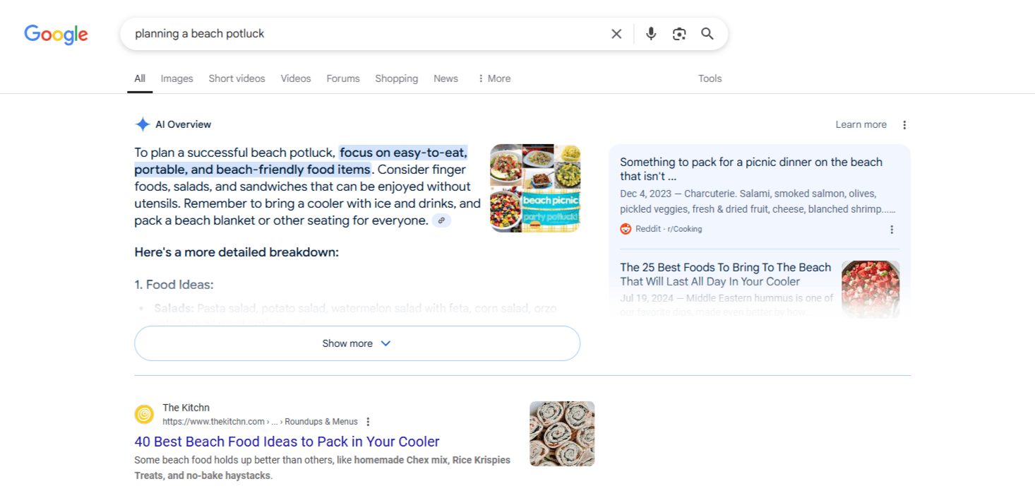
Google Limits AI Overviews
By now, I think most of us have encountered the AI overviews that appear at the top of most Google searches.

This new AI feature was added to U.S.-based search results pages in May 2024. However, the company had to quickly scramble to limit the feature.
Liz Reid, the Head of Google Search, explained that the AI-generated search results were indeed reliable and the system had undergone extensive testing before the rollout.
“In addition to designing AI Overviews to optimize for accuracy, we tested the feature extensively before launch. This included robust red-teaming efforts, evaluations with samples of typical user queries and tests on a proportion of search traffic to see how it performed. But there’s nothing quite like having millions of people using the feature with many novel searches. We’ve also seen nonsensical new searches, seemingly aimed at producing erroneous results.”
Instead of disabling the feature until the kinks could be worked out, the team in charge of AI Overviews went into overtime to limit where AI Overviews appeared. For instance, one of the searches that made headlines last year was “How many rocks should I eat?” Today, that question no longer has an AI Overview result.
But as Reid admits, it wasn’t just silly questions that were showing erroneous information:
“But some odd, inaccurate or unhelpful AI Overviews certainly did show up. And while these were generally for queries that people don’t commonly do, it highlighted some specific areas that we needed to improve.”
Also:
“In a small number of cases, we have seen AI Overviews misinterpret language on webpages and present inaccurate information. We worked quickly to address these issues, either through improvements to our algorithms or through established processes to remove responses that don’t comply with our policies.”
If you’re on the fence about rolling back a new major feature, this is an approach you might consider. In Google’s case, it knows it needs an AI search feature in order to compete with the rest of the big tech space. However, it realistically couldn’t afford to say it failed in the feature rollout or to even temporarily suspend the feature altogether.
So, finding an in-between solution might be what you and your team choose to do as well if there’s a lot at stake.
Instagram Undoes New Changes After Backlash
Whenever disruptive competition hits the market, it’s common for users to notice when something is amiss with their existing apps. In the case of Instagram, this occurred back in 2022 when the app started to take on more features and functionality akin to TikTok.
Instagram chief Adam Mosseri went to Instagram to address the three most common complaints from users. They were:
- Fullscreen mode for posts—which he claimed was just a test and also admitted that it was “not yet good.”
- The prioritization of video features over images—which he said was going to keep happening as the future is video.
- In-stream posts from unrelated, unfollowed accounts—which he agreed was happening in an effort to show more relevant content to users.
You can see his full response here:

There’s a big difference between what went on here and what happened with Google.
With Google, users can easily scroll past AI Overviews if they don’t want to see them and they could ignore nonsensical responses. On Instagram, though, the features interfered with the actual user experience. And it didn’t go over too well with users, including high-profile ones like Kim Kardashian and Kylie Jenner who called Instagram out for trying to be TikTok.
In response, Instagram removed the “test” version of the app that showed fullscreen posts to users. While it didn’t undo the algorithm changes that resulted in loads of unrelated videos showing up in users’ feeds, it did tone down these “recommendations.”
As Mosseri explained in an interview at the time:
“For the new feed designs, people are frustrated and the usage data isn’t great. So there I think that we need to take a big step back, regroup, and figure out how we want to move forward.”
This just goes to show you how critical it is to listen to your users. And when the feedback is overwhelmingly negative and your usage data backs up this reaction, you have no time to waste.
It doesn’t matter how much you invested in new features. When they disrupt the user experience or even conflict with your app’s value, they need to be put on the backburner until you can come up with a new plan.
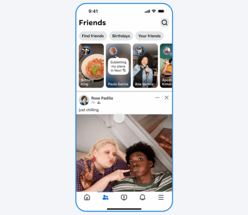
Facebook Replaces the Friends Tab
Facebook recently announced that it was “bringing the magic of friends back.”
In other words, the old “Friends” tab is getting added back to the app. Or, rather, the old “Friends” functionality is replacing the most recent version of the “Friends” tab where users found friend requests and “People You May Know” connections.

At first glance, this looks like an example of a brand taking something old and breathing new life into it. As Facebook explained:
“Over the years, Facebook evolved to meet changing needs and created best-in-class experiences across Groups, Video, Marketplace and more, but the magic of friends has fallen away. We’ll be adding several ‘OG’ Facebook experiences throughout the year, beginning with the revamped Friends tab.”
This might seem like a poor example since Facebook is (sort of) replacing the recent version of the “Friends” tab with the older functionality. However, this is likely being done because many new features and algorithm changes have made the social media platform less than joyful to use.
John Battelle does a pretty good job of explaining what’s going on:
“Facebook realized it’s lost a big chunk of its original users (like me), and like any good media company hoping to grow, it wants us to come back. I’m going to guess that those of us who grew up on early versions of the app but are tired of the noise inherent in Facebook’s engagement-baited feeds might prove a profitable new market for the company.”
In an ideal world, Facebook would do away with the in-stream content and algorithmic changes that users don’t enjoy. But this is all part of the feature rollback decision-making process. Facebook has to decide what’s more important to the company.
They could remove features that bring in revenue to Facebook (but that users don’t like) in order to make their users happy. Or they could revamp the existing “Friends” feature (with an older concept) without altering those revenue-generating features.
You’ll have to find a way to strike your own balance if multiple options are available to you.
Tips for Decreasing the Number of Rollbacks You Have to Do
While it’s simple enough for me to list out reasons why feature rollbacks are necessary, the act of removing a feature is often not a simple one as we’ve seen with these big tech examples.
So, let’s have a look at some things your development team can do to decrease the need for them in the first place:
1. Create an MVP
Always start with a minimum viable product (MVP), even when adding new features. When you build only what’s needed, user feedback is easier to manage. It’s also a more effective way to get user buy-in when you change things a little bit at a time.
2. Do User Research
Test everything you build before releasing it to the public. This doesn’t just mean testing the integrity of the product or feature internally. It means conducting real user research and testing. Never assume your users will want or love a feature. Validate your hypothesis.
3. Review Your Data
Monitor your app data before and after you implement new features. Not every app will receive widespread public backlash, but that doesn’t mean users are happy with the changes. If you’re not doing active social listening, your data will let you know if the update isn’t well-received.
4. Do It for the Right Reasons
Never add something because it seems “cool” or because you want to copy what another app is doing. Users love brands that are authentic and that put their users’ needs first. If you’re not making a change to enhance usability or the overall experience, consider tabling it until it can align with that goal.
5. Calculate the Costs
Come up with a budget for your new feature before you even start working on it. Factor in how much it will cost to develop, launch, get users onboard with it and then maintain it. Will those costs outweigh the estimated profits? Then it might not be the right time for it.
6. Get Internal Input
Discuss new features with other teams first. They may have additional insights into how a feature like the one you’re proposing will affect the app or your users, and can help you come up with a more effective game plan or alternative.
7. Announce the Feature Early
Create a policy of honesty and transparency. Publishing a changelog or announcing a new feature on the blog can be helpful after the fact, but it’s a little late to inform users that a change is coming. Stay ahead of things and gauge their overall sentiment by announcing new features and changes early on. Their reaction could save you wasted time and effort.
8. Run A/B Tests
A/B test different versions instead of hard launching a new feature if you’re on the fence about it. Like with Instagram’s fullscreen test, you’ll hear loud and clear how your users feel about the new feature you want to implement before it permanently alters their experience.
9. Make the Feature Optional
Unexpected changes can sometimes lead users to overreact, especially when a much-loved app changes without notice. It might not even be the new feature they hate, just the fact they weren’t prepared for the change. To test this out, consider bringing back the original feature and allow users to enable the new one if they want. This’ll give you a chance to see if the harsh feedback you received was justified or if it was just an instant reaction to unexpected change.
10. Communicate After the Fact
If you launch a feature that doesn’t pan out, don’t just silently roll it back. Your users may start to question your judgment or intent, and that’s when they’ll start questioning every move you make. It’ll be hard to get that trust back. Instead, own up to what was done, let them know they were heard, and explain how you’ve fixed things so they’ll be less likely to revolt against new features in the future.
Wrapping Up
Undoing all your work is probably the last thing you want to imagine. Then you have the cost-sunk fallacy to contend with. This is the idea that because you’ve already put so much money into the new feature that you might as well keep going with it.
But there can be huge consequences to doubling down on a feature that’s not serving you. If it’s compromised the integrity of your product, isn’t working well for users, or one they downright hate, you’re going to see usability levels plummet and user churn rates soar. So that money you’re saving by not removing the problematic feature? It’s only the start of the profits and trust you’ll lose.
Instead, shift the way you think about feature rollouts.
Removing a feature or rolling back to an older version isn’t the same thing as deleting your work. You’re simply bringing it back to development so you can work out the kinks or create a reimagined version of it that serves both you and your users well.

Suzanne Scacca
A former project manager and web design agency manager, Suzanne Scacca now writes about the changing landscape of design, development and software.

