Understanding Your Performance Metrics in PageSpeed Insights

Summarize with AI:
In PageSpeed Insights, Google gives your website a score based on Performance. To calculate this score, it uses five metrics. But what do each mean and how do you go about improving them? In this post, we’ll explore.
When using PageSpeed Insights, Google gives you four scores related to your website Performance, SEO, Best Practices and Accessibility. In this post, we’re going to hone in on what you’ll see under Performance.
While your overall Performance score tells you how good or poor the page loading experience is on mobile and desktop, there are other metrics Google shows you on this page. These include:
- First Contentful Paint
- Largest Contentful Paint
- Total Blocking Time
- Cumulative Layout Shift
- Speed Index
Google has numerous guides that explain what each of these metrics means in the grand scheme of things. To save you time in chasing down this information and trying to figure out what you need to do to achieve a good page speed score, I’ve summarized it below.
Understanding Google’s Page Speed Metrics
Before we jump in, I want to show you a neat trick in PageSpeed Insights you can use to figure out which metrics to prioritize.
We’ll be using the Disney website as our example. Here’s what your overall Performance scorecard will look like:
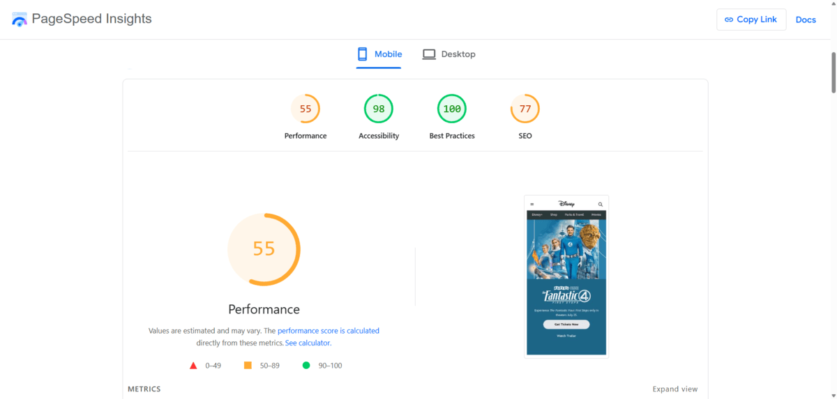
Hover over or click the bigger circle to the left of the homepage screenshot. It will reveal more data about why you received the score that you did.
The circle will show you how each of the performance metrics adds up to the total score. It will also show you which metrics positively contributed to your Performance score (in green) and which negatively contributed (in red).

If you move your mouse over any segment of the circle, it will tell you how many points were added or subtracted based on the different metrics. For instance, TBT added 28 and CLS added 25. FCP and LCP added 0, while SI added only 2.
For reference, here are the actual times/scores given for each metric.
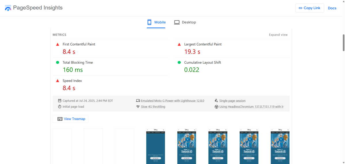
We’ll look at what makes them good or bad (in Google’s interpretation) as we explore each of the speed metrics next.
First Contentful Paint
First Contentful Paint (FCP) refers to the length of time that it takes for the browser to display the first bit of content on the screen from the DOM. DOM content includes things like:
- Imagery
- Fonts
- SVGs
- Tables
- Forms
- Embedded content (not in iframes)
<canvas>elements (non-white)
This metric is measured in seconds. In the Disney example, the FCP was 8.4 seconds.
According to Google, this is far too slow regardless of device. Here’s the rubric Google uses to determine if the FCP on mobile and desktop is fast (green), moderate (orange), or slow (red):
| FCP Scoring | Mobile | Desktop |
|---|---|---|
| Fast | 0-1.8 s | 0-0.9 s |
| Moderate | 1.8-3 s | 0.9-1.6 s |
| Slow | 3 s or more | 1.6 s or more |
To speed up the FCP, you’ll need to remove the barriers keeping your content from loading right away.
For instance, eliminating render-blocking resources is a big help. So is verifying your text appears on the screen even while your fonts load behind the scenes. If you can, cut down on the size of your DOM so there isn’t as much to load with each browser visit.
Largest Contentful Paint
Largest Contentful Paint (LCP) refers to the length of time before the biggest piece of content gets rendered on the screen. In other words, it’s the amount of time it takes before the main content appears to your visitors instead of just a blank screen.
This metric is measured in seconds. In the Disney example, the LCP was 19.3 seconds.
This is another severely underperforming metric, according to Google. Here’s the rubric Google uses to determine if the LCP on mobile and desktop is fast (green), moderate (orange) or slow (red):
| LCP Scoring | Mobile | Desktop |
|---|---|---|
| Fast | 0-2.5 s | 0-1.2 s |
| Moderate | 2.5-4 s | 1.2-2.4 s |
| Slow | 4 s or more | 2.4 s or more |
This LCP metric can be a complex one to improve because there are four parts to account for:
- Time to first byte (TTFB)
- Resource load delay
- Resource load duration
- Element render delay
Here’s a graphic from Google that demonstrates visually what’s going on:
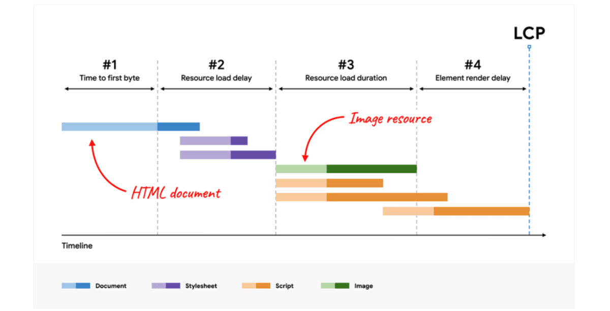
Let’s say that you have a beautiful image in the background of your hero section. That would be your largest piece of content. To load it, the browser would first unpack the HTML document, begin to load the image and then deal with anything that might prevent it from fully loading.
If you’re only looking at this as an issue of an image not loading fast enough, you might be inclined to think it’s the size of the file alone that’s problematic. This can definitely contribute to the problem. However, compressing or resizing your image would only help shorten the resource load duration portion of the process.
So, again, you’d need to look at other factors delaying the loading of elements on the page. Many of the tactics you use to improve the FCP will apply here, like removing render-blocking resources.
Total Blocking Time
Total Blocking Time (TBT) refers to the length of time it takes before a visitor can engage with the page. This might mean they can’t scroll to see content, click or tap on the interactive components, or fill in form fields, among other things.
This metric is measured in milliseconds. In the Disney example, the TBT was 160 milliseconds.
According to Google, this TBT is good, though it is on the higher end of the range of what’s considered fast. Here’s the rubric Google uses to determine if the TBT on mobile and desktop is fast (green), moderate (orange) or slow (red):
| TBT Scoring | Mobile | Desktop |
|---|---|---|
| Fast | 0-200 ms | 0-150 ms |
| Moderate | 200-600 ms | 150-350 ms |
| Slow | 600 ms or more | 350 ms or more |
The calculation of TBT is different from the two metrics we discussed above. What Google does is first determine what sorts of long tasks appear on the page. A long task is one that takes more than 50 ms to execute. It then identifies which of your long tasks take longer. Any extra time after the 50 ms is considered blocking time and gets added together to come up with the TBT.
Here’s another helpful Google graphic that shows how total blocking time works. The darker portions of the tasks occur after the “necessary” 50 ms needed to complete them:

In the case of the Disney homepage, this means there were 160 milliseconds of delays on top of the allowable 50 milliseconds per task.
To speed up the TBT, you’d need to find out what your long tasks are and why they’re taking so long. You can use a tool like Lighthouse to look through your code to find out what’s going on.
The Performance panel will show you which tasks take too long. It may also reveal that certain tasks are holding things up unnecessarily. For example, you may have time-consuming JavaScript loading that’s not even necessary for the page to function. In that case, the fix would be easy—delete the unused code.
Another helpful trick is to find more efficient ways of loading third-party scripts. Or, if possible, do away with third-party content, so you have more control over your site and how quickly it loads.
Cumulative Layout Shift
Cumulative Layout Shift (CLS) refers to visual stability. In other words, when content has loaded, will all the visible elements remain fixed? Or will they shift position after the user believes the page has finished loading?
This metric is a unitless value. In the Disney example, the CLS was 0.022.
According to Google, this CLS is good. Here’s the rubric Google uses to determine if the CLS is good (green), needs improvement (orange) or poor (red):
| CLS Scoring | All Devices |
|---|---|
| Fast | 0-0.1 |
| Moderate | 0.1-0.25 |
| Slow | 0.25 or higher |
This is a unique metric among the other Performance metrics as it has less to do with loading time as it does perceived stability and usability of the page.
CLS is a vital metric to pay attention to as an unexpected layout shift can cause a number of problems for visitors. For instance, they may:
- Lose track of what they’re looking at
- Click on the wrong button
- Stop reading or engaging with the page altogether, waiting to see if it’s done loading
It can be frustrating when a webpage suddenly moves beneath one’s cursor or finger. And if it happens more than once, it can break a visitor’s trust altogether.
As for why this happens, there are a number of reasons:
- Asynchronous loading of resources
- Images or videos aren’t programmed with set dimensions
- Embedded content and iframes lack set dimensions
- Third-party ads dynamically resize
- Fonts render incorrectly upon initial load
To stop your content from making these unexpected and jarring shifts, you’ll need to identify which components are to blame.
Note: Not all layout shifts are considered bad in Google’s eyes (or your visitors’). For instance, user interactions that lead to animations or page transitions are technically considered layout shifts. So long as the process feels smooth and natural, and doesn’t take longer than expected, they won’t count against you.
Speed Index
Speed Index (SI) refers to the pace at which content visually appears while a page loads. You can see what this looks like in PageSpeed Insights in the section below your speed metrics.

This metric is measured in seconds. In the Disney example, the SI was 8.4 seconds.
According to Google, this SI is slow. Here’s the rubric Google uses to determine if the SI is fast (green), moderate (orange) or slow (red):
| SI Scoring | Mobile | Desktop |
|---|---|---|
| Fast | 0-3.4 s | 0-1.3 s |
| Moderate | 3.4-5.8 s | 1.3-2.3 s |
| Slow | 5.8 s or more | 2.3 s or more |
This is where that often-quoted Google benchmark comes from:
If a webpage takes longer than 3 seconds to load (on mobile), it’s too slow.
As you can see, the Speed Index doesn’t account for how long it takes to fully load all the content on the page.
The Speed Index time (8.4 seconds) is the same length as the First Contentful Paint (8.4 seconds). However, the Largest Contentful Paint is 19.3 seconds.
This doesn’t mean you shouldn’t be concerned with how quickly all the visual elements load, especially the biggest ones. This is just to give you an idea of how Google determines this particular metric.
As for improving the Speed Index, all the changes recommended above apply. And if you want to see a noticeable difference in your PageSpeed Insights metrics, start by working your way through Google’s suggested changes first.
You’ll find this info below the Speed Index visualization.
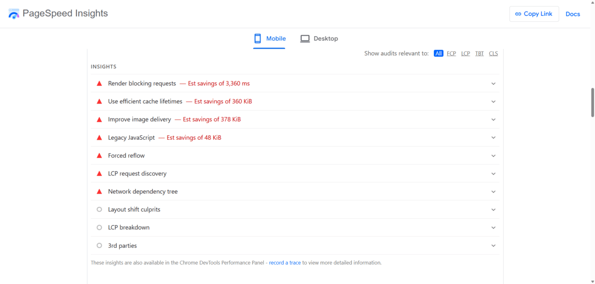
For this page, Google has marked these optimizations as most critical:
- Render blocking requests
- Use efficient cache lifetimes
- Improve image delivery
- Legacy JavaScript
- Forced reflow
- LCP request discovery
- Network dependency tree
You can click on each insight/optimization to expand the suggestion. Google usually provides instructions on how to implement the change.
Once you’ve tackled these optimizations, return to your performance metrics and see how you’re doing. If the scores still don’t fit within the good ranges that Google looks for on mobile website experiences, work on refining the experience further.
Wrapping Up
Google’s PageSpeed Insights is an invaluable tool. In addition to giving us insight about technical aspects of our website experience like accessibility and usability, it gives us a ton of details on what the loading experience looks and feels like to users when they visit a page for the first time.
As Google says, this tool gives designers and developers a way to “Discover what your real users are experiencing.”
This experience isn’t always easy to witness on our own, though, as caching can sometimes prevent us from seeing the true loading experience. What’s more, some of the changes aren’t as easy to notice, especially the ones measured in milliseconds.
So, this is why it’s great we have this tool where Google breaks down the user’s experience step by step. This gives us a clear view of their experience during the initial page load and can also help us better understand their first impressions.
By improving page loading speeds, we can reduce that early friction and instill trust from the get-go.

Suzanne Scacca
A former project manager and web design agency manager, Suzanne Scacca now writes about the changing landscape of design, development and software.

