10 Cool Design System and Style Guide Examples

Summarize with AI:
Big tech companies tend to get the most attention when it comes to design system and style guide examples, but they’re not the only ones worth checking out—these 10, for instance!
A brand’s style guide is a useful tool for defining the visual language of its digital products. A design system—which includes a style guide—is an essential resource for a brand that wants to bring stability, consistency and scalability to its omnichannel customer experience and visual strategy.
If you’re here, then you’re probably about to create a style guide or design system and looking for inspiration. While you could copy what all the big tech players like Google, Apple and Microsoft are doing, you might be surprised what you find elsewhere on the web.
10 Lesser-Known Design Systems and Style Guides for Inspiration
There are many brands and organizations out there that have created brand style guides and design systems. So if you’re wanting inspiration on what to include in your design system or how to design it, start with this list. These examples might not be as well known, but they’re all really cool examples to check out.
1. b Restaurants Style Guide
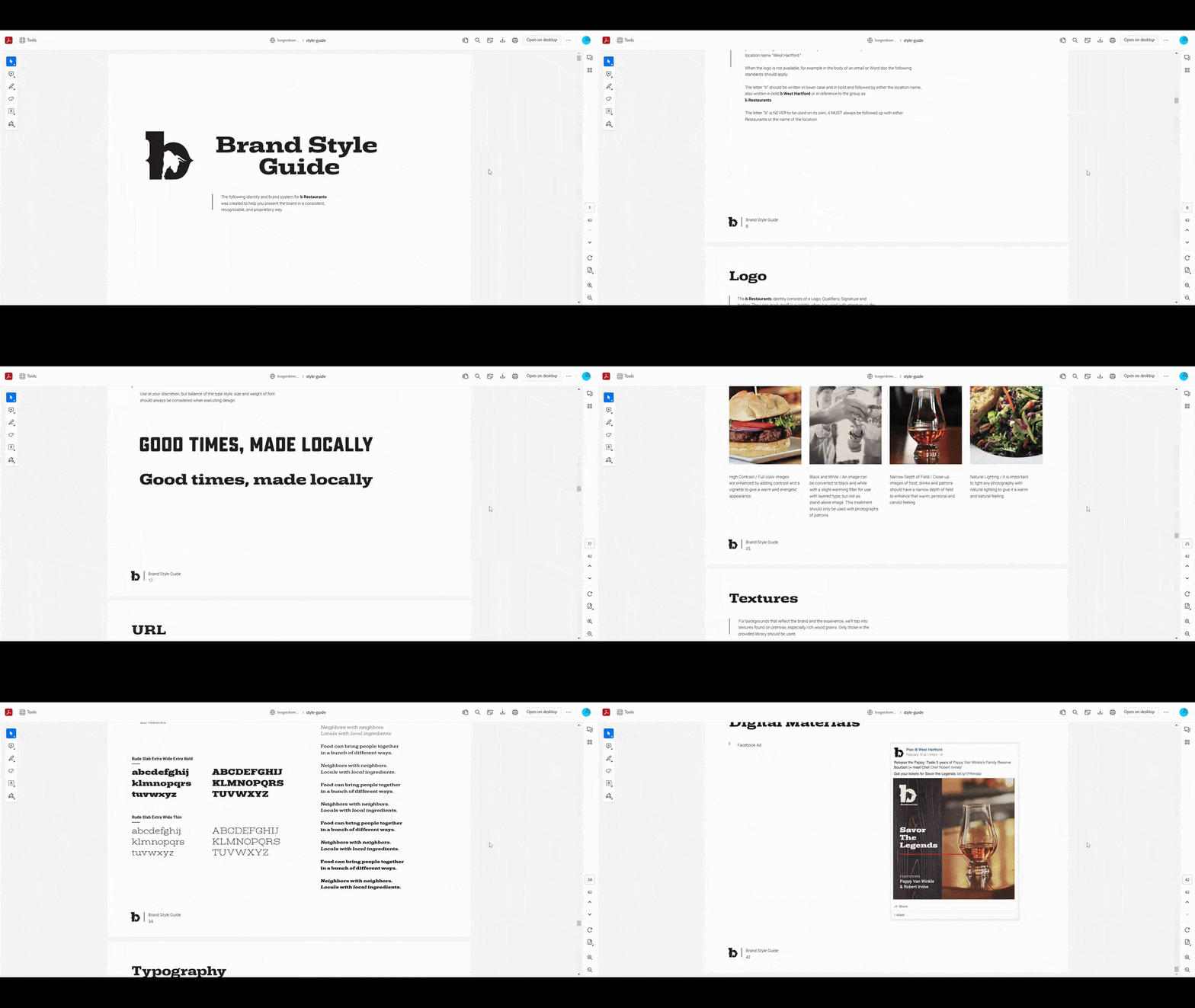
The PDF style guide for b Restaurants is a great example of omnichannel branding. The style guide includes all the visual language information you’d expect to see, like:
- Brand overview
- Logo design and usage
- Colors
- Typography
- Photography
- Textures
- Design elements
In addition, the guide is split into two. In the first part you’ll find the visual guidelines for print (which makes sense since this is a style guide for a restaurant). In the second part you’ll find the guidelines for the web. There are also a bunch of examples at the bottom that show you the style guidelines in use—on the menu, business cards, the website, Facebook ads, etc.
If you need to bridge the gap between different channels—not just physical vs. digital, but across all your digital channels as well—this style guide is a good model to follow. It’s well-organized, simply written and easy to follow.
2. Duolingo Style Guide
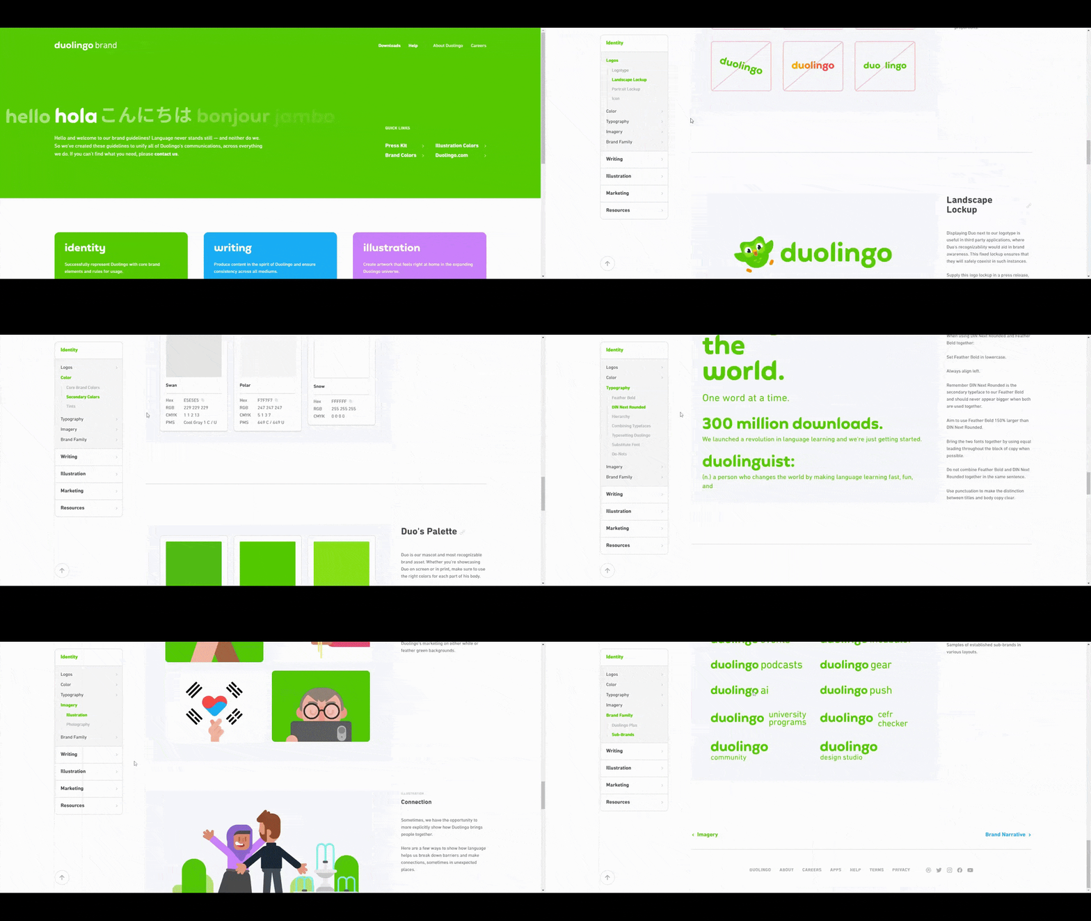
Duolingo’s online style guide is broken up into five sections:
- Identity
- Writing
- Illustration
- Marketing
- Resources
Identity contains all of the information you’d commonly see in a style guide about colors, typography, logos, etc. The rest of the style guide is pretty unique when compared to the others you’ll see here.
For starters, it includes its Writing style guide along with the visual guidelines. What’s more, the Illustration section isn’t so much about the style of graphics used in the language learning app. It’s about how the designers create every illustration using three basic shapes for the sake of rhythm, simplicity and scalability.
If you have a unique visual style and you want to ensure that new designers are able to pick up on it right away, incorporating that type of information in your style guide would be beneficial. It’s also a good way to highlight how innovative your brand is.
3. GitLab Design System
Pajamas is the name of the design system for GitLab. GitLab is an open-source software project that has more than 3,000 community contributors. Because of this, a well-documented and well-maintained design system is critical.
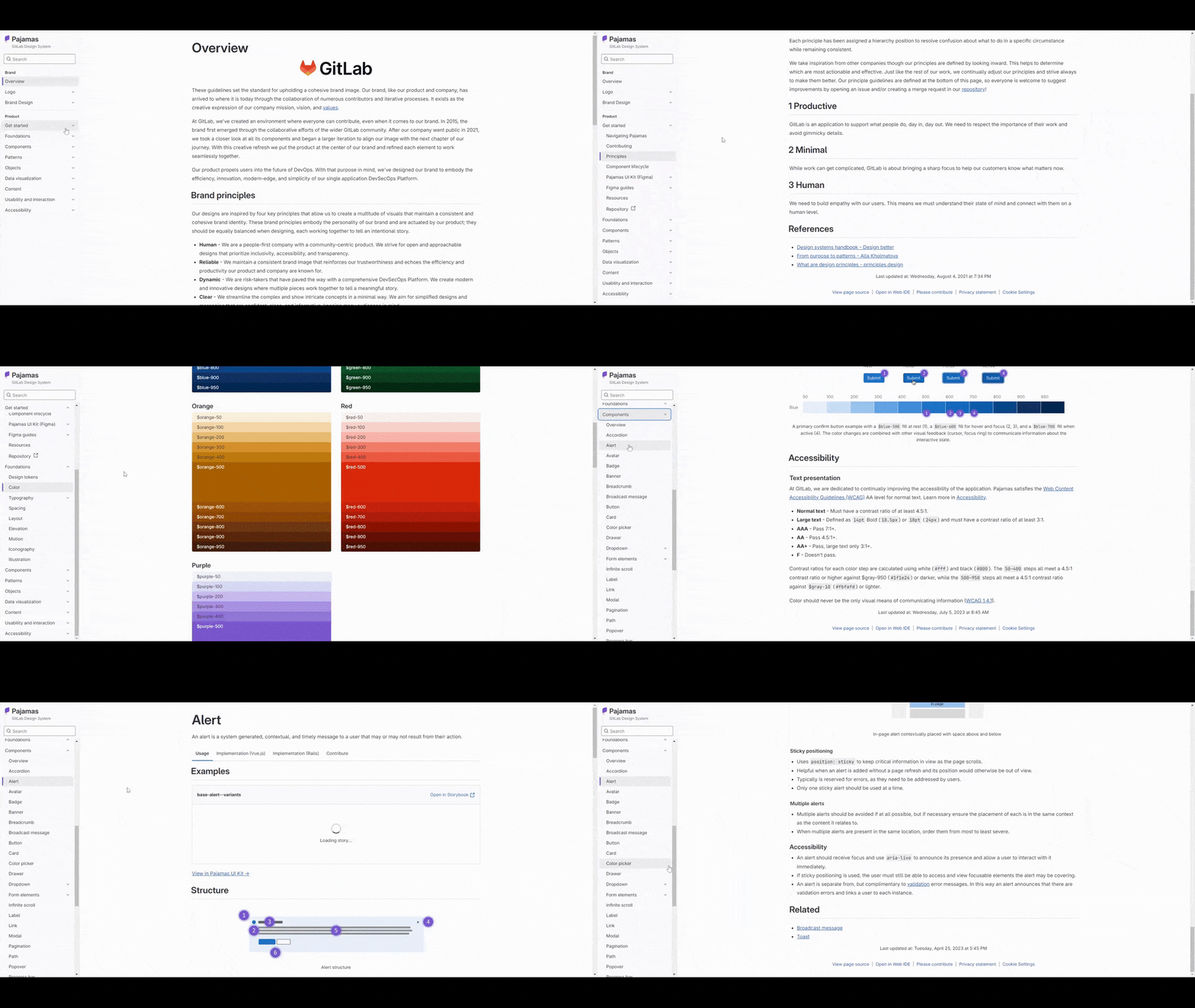
This design system is beautifully designed and easy to navigate. It includes a section at the top for the style guide foundations—the logo along with the basic UI guidelines. Down below is where you’ll find the robust design system, which includes information and guidelines for:
- Foundations
- Components
- Patterns
- Objects
- Data visualization
- Content
- Usability and interaction
- Accessibility
This is a good example of why design systems aren’t just for big tech companies or large digital agencies. Any time you have numerous contributors or partners working on your digital products, a design system is needed to keep everything and everyone straight.
4. The Guardian Style Guide
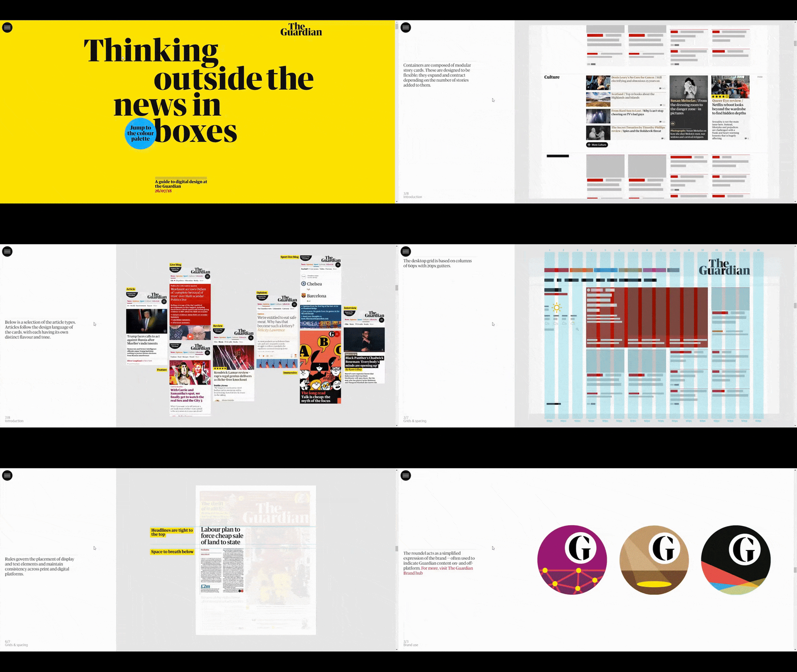
The Guardian’s style guide isn’t set up the way most online style guides are. For starters, there’s a hamburger menu in the top-left corner that allows users to navigate to the different sections:
Introduction
- Grids & spacing
- Brand use
- Typography
- Colour palette
- Graphic elements
Even then, you won’t be able to discover what’s in each section until you scroll through them.
However, I think that’s intentional. The Guardian isn’t a single-column business site with a more-or-less expected or traditional format. As such, anyone trying to understand the structure and design choices of the site should consider them one by one, which the scrolling format of the style guide allows for.
This style guide is also a good example of how to take your digital product’s unique brand and apply it to your style guide. That way, the style guide feels like the living embodiment of the brand.
5. Gusto Design System
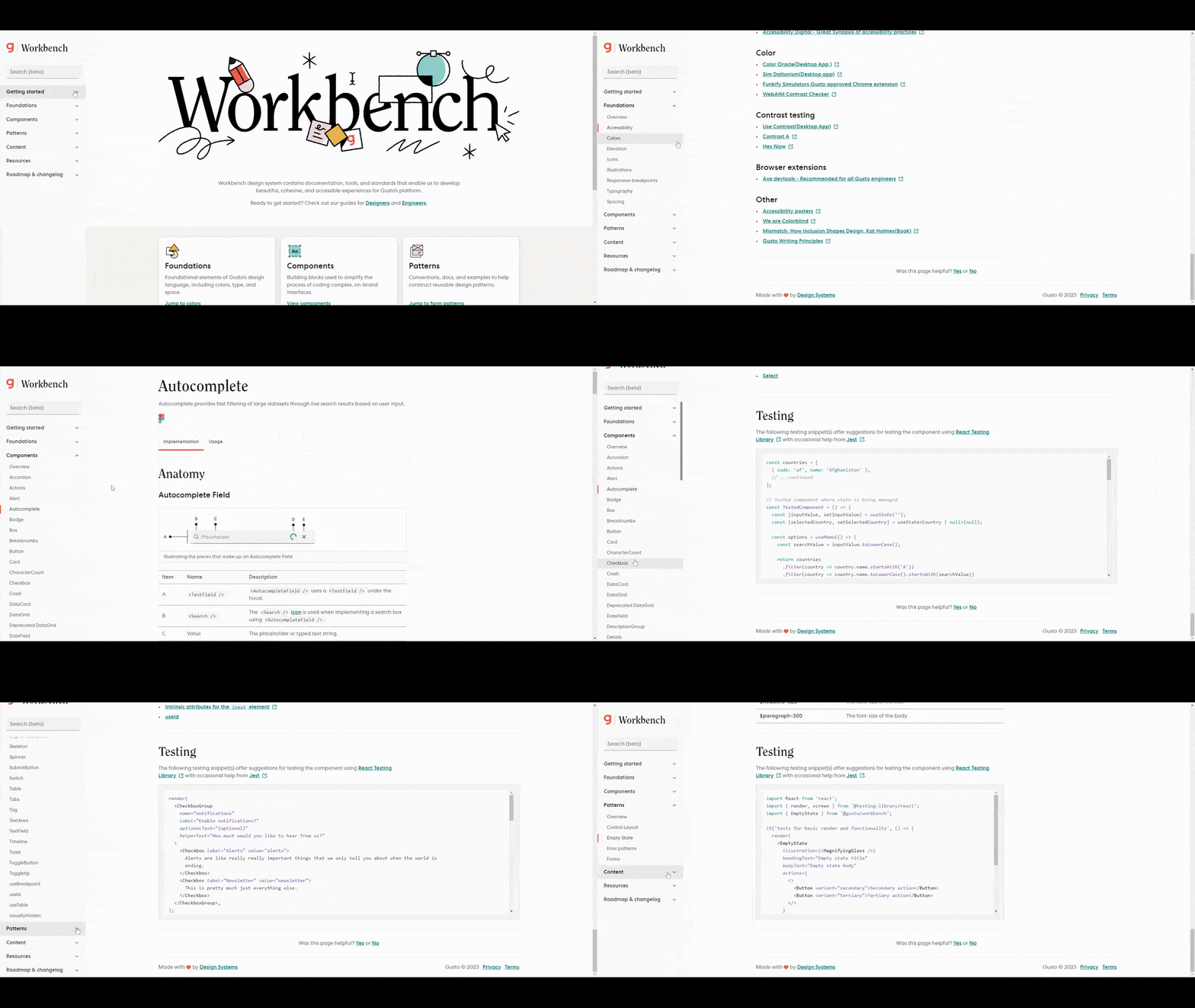
Workbench is Gusto’s design system. It’s minimally designed, fast to load and easy to navigate.
What’s noteworthy about this design system is that it doesn’t just stick with the typical parts of a design system. You know, the accordions and alerts, and form fields. There’s nothing wrong with including these common components and patterns. However, if your digital product contains other parts, they should be documented in your design system.
Workbench, for instance, documents things like:
- Elevation
- Responsive breakpoints
- Panel
- Popover
- Skeleton
- Toast
It also has a robust Resources section at the bottom. So rather than only provide links to UI kits or templates, users will find all sorts of guidelines related to browser support, responsive best practices, special symbols and more.
6. Help Scout Style Guide
Help Scout’s style guide is an interesting example. It starts with a whimsically designed and animated landing page that introduces users to the brand’s values and the driving principles behind its UI design. This is a crucial part of every style guide and the design of it gives users the space to really focus on it.
Once you’re inside the style guide, you’ll see that it’s pretty standard. It includes sections for the following:
- Logos
- Color
- Typography
- Illustration
- Graphic elements
There’s also a content style guide below the visual one. And below that is a section called Product Design. This section introduces users to Help Scout’s design system. Although we aren’t able to access the live, interactive design system, we catch glimpses of it and get to see how it helps the company achieve its goals.

7. Precor Style Guide
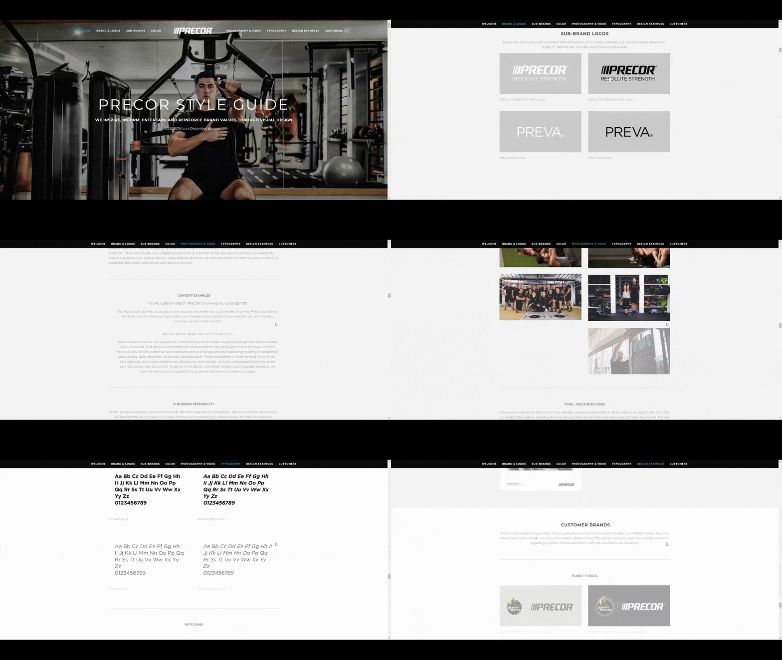
Precor is a commercial fitness equipment company that has created this simple, straightforward style guide for its brand. It’s a single landing page that contains the typical information and presentation of visual guidelines for the logo, colors, typography, imagery and more.
A style guide like this isn’t just beneficial for the company or its designers though. Commercial retailers have lots of partners to think about. And if they’re all going to be using their logo, imagery and other branded elements within digital and physical marketing campaigns, then a style guide is the best way to ensure they use the right assets and make the right design choices.
While I didn’t include the whole page in the GIF below, the page includes lots of design examples for internal reference. It also includes logo partner lockups examples at the very bottom so that fitness facilities and even hotels know how to properly integrate the Precor logo within their own.
8. Special Olympics Brand Guidelines
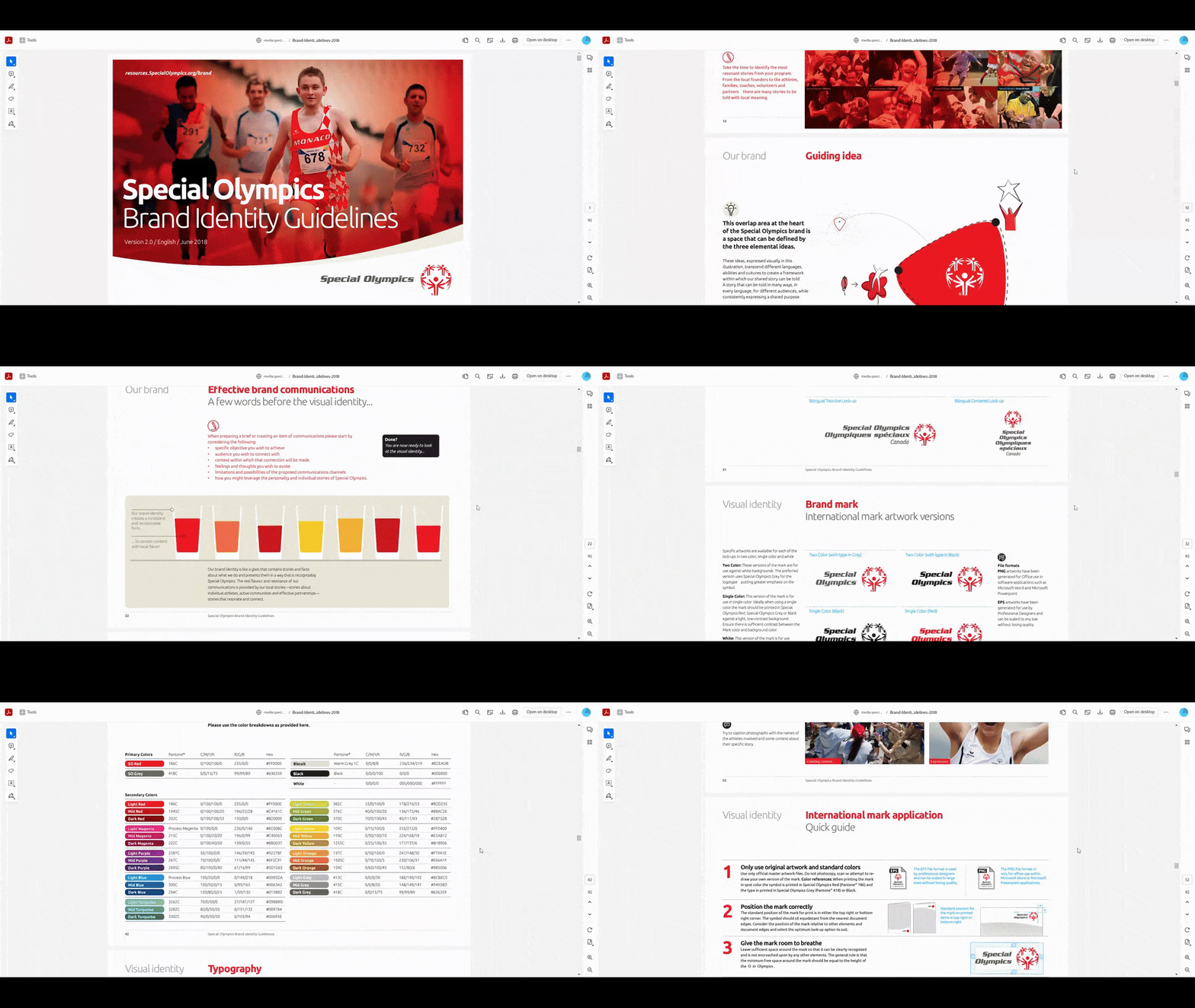
The Special Olympics brand guidelines page is a great one to look at if you’re wondering how to keep a huge brand with a global reach well-organized and documented. The main page breaks down the guidelines by languages, events, programs and more.
The one you see down below is the PDF of the English Brand Guidelines. This is a massive 92-page document that spends a good deal of time covering the brand’s history, mission, reputation, guiding idea, as well as how this story needs to be told visually.
While the style guide is indeed long, it’s well-organized, so users won’t have a hard time finding what it is they’re looking for. It’s not just the organization of the style guide that makes it easy to use. The table of contents at the front clues users in to what to expect. So they can skip ahead to relevant visual guide sections, examples and tips on brand management as needed.
9. Starbucks Style Guide
I’m sure that Starbucks has an impressive design system that the company uses behind the scenes. Otherwise, the company wouldn’t be as well known for its consistently executed omnichannel marketing strategy in stores across the world as well as on its website and mobile app.
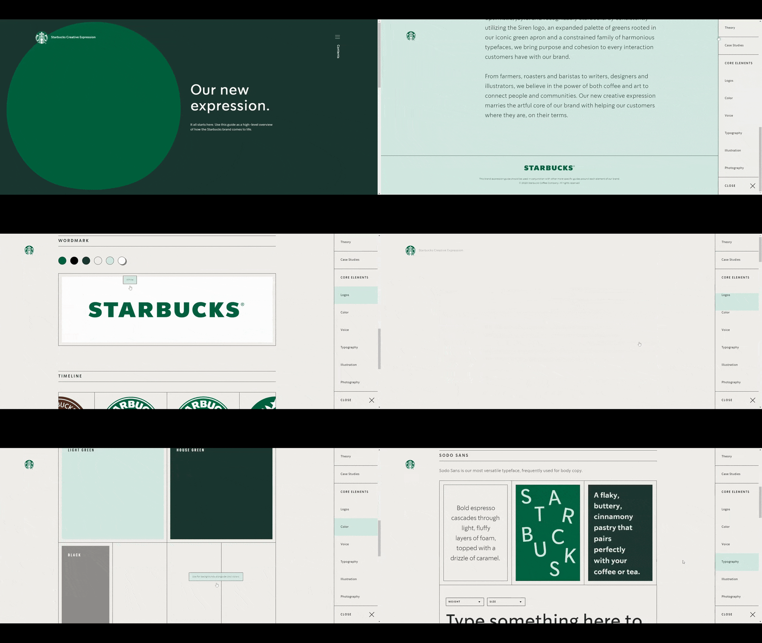
That said, this simplified style guide for the Starbucks brand is one that everyone should take a look at. At first glance, it appears to be your typical visual style guide with sections dedicated to:
- Logos
- Color
- Voice
- Typography
- Illustration
- Photography
Users will soon notice that the style guide is interactive. Not only can you play with some elements, but hover-triggered tooltips appear for each of the visual guidelines. So rather than clutter the UI with this information, it appears when users focus on the relevant elements.
What’s more, users can toggle between different design choices, like under the Logos section where they can change the color of whichever one they’re looking at. The Color section then explains when and where each color should be applied. It’s a really well-thought-out design reference.
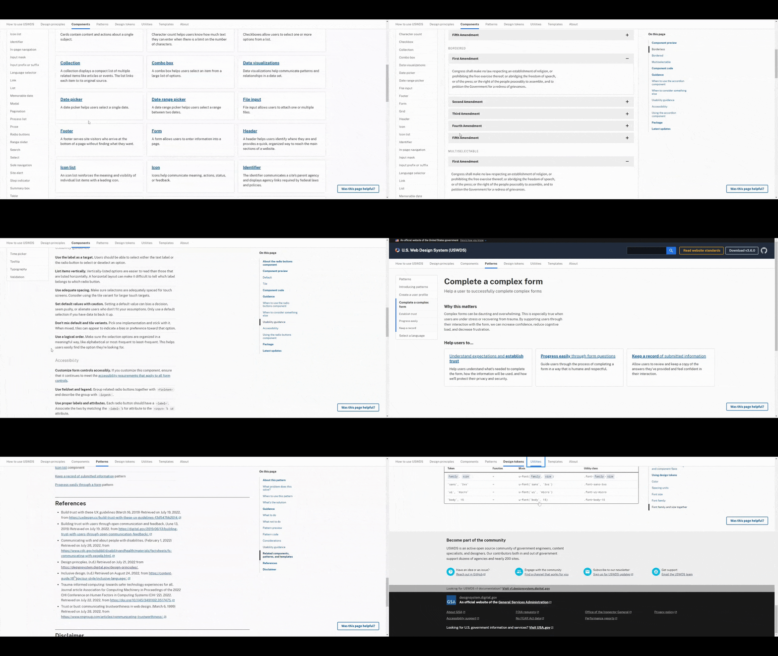
10. United States Web Design System
It’s not just corporations and software companies that benefit from having a design system. National and local governments need them as well. The U.S. web design system, for instance, is meant to be a resource for designers and developers who build government websites and other digital products.
Unlike creative and commercial brands, a governmental design system isn’t going to be the most creative or attractive one to look at. That doesn’t make it a bad example to look at though. It includes everything a good design system needs:
- Design principles
- Components
- Patterns
- Design tokens
- Utilities
- Templates
I’d argue that, if this is your first time creating a web design system, this is the one to start with. Think of this example as a minimum viable product of a design system. You’ll get to see the simplest, most straightforward way of documenting a brand’s visual identity without all the fluff. Once you nail that down, you can add whatever pizzazz you want.
Wrapping up
Style guides and design systems are essential parts of the modern design and development process. They serve as a single source of truth for product and marketing teams, allowing them to create consistent and scalable UI designs for anything they build.
Now that you’ve seen some cool examples, now it’s time to implement your own design system or style guide.
One way to do this is to build it from scratch, using an inspiring design system or style guide as a reference. Another option is to use the Progress Design System Kit. It’s based on Progress’s own design system, which you can see here:
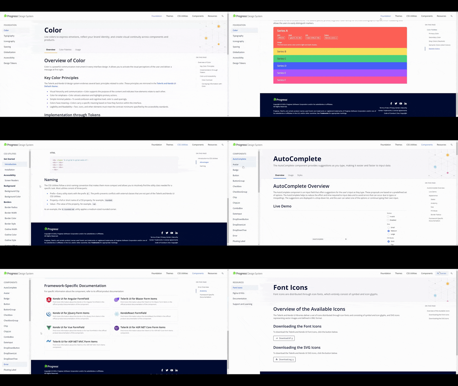
With the Design System kit, you won’t have to spend time building out the foundation of your design system or style guide. Instead, leverage the UI component libraries, professionally designed themes and ThemeBuilder to customize as much or as little to your liking. Plus, you can edit it on a global or granular level.

Suzanne Scacca
A former project manager and web design agency manager, Suzanne Scacca now writes about the changing landscape of design, development and software.

