Circular Gauge Pointers
The pointers are the values that will be marked on the scale. You can customize them through the parameters they expose:
LineCap
The LineCap parameter controls the shape of the scale ending and takes a member of the CircularGaugePointerLineCap enum:
-
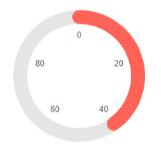
Round- by default the shape of the scale ending would be round -
Butt- flat scale ending shape
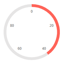
Change the shape of the scale. The result from the code snippet below.

@* Use a flat shape for the end of the scale *@

<TelerikCircularGauge>
    <CircularGaugePointers>

        <CircularGaugePointer LineCap="@CircularGaugePointerLineCap.Butt" Value="40">
        </CircularGaugePointer>

    </CircularGaugePointers>

    <CircularGaugeScales>

        <CircularGaugeScale>
            <CircularGaugeScaleLabels Visible="true" />
        </CircularGaugeScale>

    </CircularGaugeScales>
</TelerikCircularGauge>
PlaceholderColor
The PlaceholderColor (string) parameter controls the background color of the pointer. It accepts CSS, HEX and RGB colors.
Change the background color of the pointer. The result from the code snippet below:

@* Set the PlaceholderColor to light blue *@

<TelerikCircularGauge>
    <CircularGaugePointers>

        <CircularGaugePointer PlaceholderColor="lightblue" Value="40">
        </CircularGaugePointer>

    </CircularGaugePointers>

    <CircularGaugeScales>

        <CircularGaugeScale>
            <CircularGaugeScaleLabels Visible="true" />
        </CircularGaugeScale>

    </CircularGaugeScales>
</TelerikCircularGauge>
Color
The Color (string) parameter controls the color of the pointer. It accepts CSS, HEX and RGB colors.
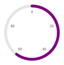
Change the color of the pointer. The result from the code snippet below

@* Change the color of the pointer to purple *@

<TelerikCircularGauge>
    <CircularGaugePointers>

        <CircularGaugePointer Color="purple" Value="60">
        </CircularGaugePointer>

    </CircularGaugePointers>

    <CircularGaugeScales>

        <CircularGaugeScale>
            <CircularGaugeScaleLabels Visible="true" />
        </CircularGaugeScale>

    </CircularGaugeScales>
</TelerikCircularGauge>
Size
The Size (double) parameter controls the size of the pointer.

@* Change the size of the pointer *@

<TelerikCircularGauge>
    <CircularGaugePointers>

        <CircularGaugePointer Size="20" Value="40">
        </CircularGaugePointer>

    </CircularGaugePointers>

    <CircularGaugeScales>

        <CircularGaugeScale>
            <CircularGaugeScaleLabels Visible="true" />
        </CircularGaugeScale>

    </CircularGaugeScales>
</TelerikCircularGauge>