Circular Gauge Labels
You can customize the appearance of the labels rendered on the scale of the Circular Gauge by using the <CircularGaugeScaleLabels>, child tag of the <CircularGaugeScale>, and the parameters it exposes:
Format
The Format (string) parameter allows you to customize the rendering of the labels by using the standard numeric format strings. You can set the values of the labels to showcase, for example, currency, percentage, and so on.
Use the Format parameter to showcase currency. The result from the code snippet below.
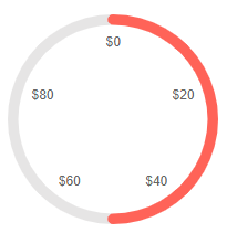
@* Use the {0:C0} format string to format the values of the labels as currency. *@


<TelerikCircularGauge>
    <CircularGaugeScales>

        <CircularGaugeScale>
            <CircularGaugeScaleLabels Format="{0:C0}" Visible="true"></CircularGaugeScaleLabels>
        </CircularGaugeScale>

    </CircularGaugeScales>

    <CircularGaugePointers>

        <CircularGaugePointer Value="50">
        </CircularGaugePointer>

    </CircularGaugePointers>
</TelerikCircularGauge>
Center Template
The center template allows you to take control of the rendering of the central section of the Circular Gauge. To use it, add the <CircularGaugeCenterLabel> a child of the <TelerikCircularGauge> It provides a context object (GaugeCenterLabelTemplateContext) which exposes a list with the pointers in the component and their values.
Use the Center Template to display the Value of the pointer. The result from the code snippet below.
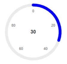
@* Print the value of the pointer in the center of the component *@

<TelerikCircularGauge>
    <CircularGaugeCenterLabel>
        <Template>
            @{
                var pointer = context.Pointers.FirstOrDefault();

                <div style="font-weight: bold">@pointer.Value</div>
            }
        </Template>
    </CircularGaugeCenterLabel>

    <CircularGaugePointers>

        <CircularGaugePointer Value="30" Color="blue">
        </CircularGaugePointer>

    </CircularGaugePointers>

    <CircularGaugeScales>

        <CircularGaugeScale Min="0" Max="100">
            <CircularGaugeScaleLabels Visible="true" />
        </CircularGaugeScale>

    </CircularGaugeScales>
</TelerikCircularGauge>
Position
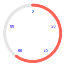
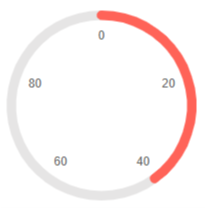
The Position parameter is of enum type CircularGaugeScaleLabelsPosition and determines whether the Gauge labels are on the inside (default) or outside of the Gauge graphic. Labels on the inside allow for a visually larger component on the same available space.
Setting Circular Gauge label position
<TelerikCircularGauge>
    <CircularGaugeScales>
        <CircularGaugeScale>
            <CircularGaugeScaleLabels Visible="true"
                                      Position="@CircularGaugeScaleLabelsPosition.Inside" />
        </CircularGaugeScale>
    </CircularGaugeScales>

    <CircularGaugePointers>
        <CircularGaugePointer Value="66">
        </CircularGaugePointer>
    </CircularGaugePointers>
</TelerikCircularGauge>

<TelerikCircularGauge>
    <CircularGaugeScales>
        <CircularGaugeScale>
            <CircularGaugeScaleLabels Visible="true"
                                      Position="@CircularGaugeScaleLabelsPosition.Outside" />
        </CircularGaugeScale>
    </CircularGaugeScales>

    <CircularGaugePointers>
        <CircularGaugePointer Value="66">
        </CircularGaugePointer>
    </CircularGaugePointers>
</TelerikCircularGauge>
Color
The Color (string) parameter controls the color of the labels. It accepts CSS, HEX and RGB colors.
Change the color of the labels. The result from the code snippet below.
@* Change the color of the labels to blue *@

<TelerikCircularGauge>
    <CircularGaugeScales>

        <CircularGaugeScale>
            <CircularGaugeScaleLabels Color="blue" Visible="true"></CircularGaugeScaleLabels>
        </CircularGaugeScale>

    </CircularGaugeScales>

    <CircularGaugePointers>

        <CircularGaugePointer Value="60">
        </CircularGaugePointer>

    </CircularGaugePointers>
</TelerikCircularGauge>
Visible
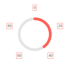
The Visible (bool) parameter controls whether the labels will be rendered. Its default value is false. If you want to display the labels include the <CircularGaugeScaleLabels> tag in the <CircularGaugeScale> and set its Visible parameter to true.
Show the labels by using the Visible parameter. The result from the code snippet below
@* Set the Visible parameter to true to show the labels *@

<TelerikCircularGauge>
    <CircularGaugeScales>

        <CircularGaugeScale>
            <CircularGaugeScaleLabels Visible="true"></CircularGaugeScaleLabels>
        </CircularGaugeScale>

    </CircularGaugeScales>

    <CircularGaugePointers>

        <CircularGaugePointer Value="40">
        </CircularGaugePointer>

    </CircularGaugePointers>
</TelerikCircularGauge>
Additional Customization
To further customize the elements of the Circular Gauge you can use nested tags. When configuring nested properties and child elements in your Circular Gauge, the inner tags will contain their parent tag name and add specifics to its end. In general the structure of such nested tags will be <CircularGauge*Category**Specifics*> where the Category can be one of the following:
- Scale
- GaugeArea
Customize the background and the margin of the Labels. The result from the code snippet below.
@* Customize the position, border and padding of the labels. *@

<TelerikCircularGauge>
    <CircularGaugeScales>

        <CircularGaugeScale>
            <CircularGaugeScaleLabels Position="CircularGaugeScaleLabelsPosition.Outside" Visible="true">
                <CircularGaugeScaleLabelsBorder Width="1" Color="rgb(255,99,88)" DashType="DashType.Solid"></CircularGaugeScaleLabelsBorder>
                <CircularGaugeScaleLabelsPadding Top="3" Bottom="3" Left="3" Right="3"></CircularGaugeScaleLabelsPadding>
            </CircularGaugeScaleLabels>
        </CircularGaugeScale>

    </CircularGaugeScales>

    <CircularGaugePointers>

        <CircularGaugePointer Value="40">
        </CircularGaugePointer>

    </CircularGaugePointers>
</TelerikCircularGauge>