Heatmap Chart
The Blazor Heatmap chart shows the data in a grid-like structure that shows the magnitude of a value over two dimensions.

In this article:
This article assumes you are familiar with the chart basics and data binding.
To create a Heatmap chart:
- add a
ChartSeriesto theChartSeriesItemscollection - set its
Typeproperty toChartSeriesType.Heatmap - provide a data collection to its
Dataproperty and set the corresponding attributes:XField- the field that will be displayed on the X-axisYField- the field that will be displayed on the Y-axisField- the field that will be rendered in the contents of the Heatmap Chart
- optionally, provide data for the X and Y axes
Categories
A Heatmap Chart that shows commits made by developers
Data Binding Notes
When you are data binding the Heatmap Chart you should have the following points under consideration:
- When you have set a value for the
XFieldandYFieldattributes, you do not have to provide anobject[]to theCategoriesattribute of the<ChartXAxis>, and the<ChartYAxis>.- If you define both
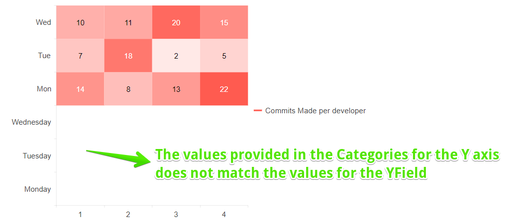
X/YFieldand the<ChartX/YAxis>the items must match, otherwise blank data items will be rendered in the Heatmap content.
- If you define both
Heatmap Chart where the data for the
Categoriesdoes not match theYFieldvalue. Problematic behavior. The result from the code snippet below.
Heatmap Chart Specific Appearance Settings
Setting the Marker Type
To change the marker type you should set the Type parameter, exposed on the ChartSeriesMarkers tag (child tag of the <ChartSeries>). It takes a member of the Telerik.Blazor.Components.ChartSeriesMarkersType enum:
-
Rect- the default value - specifies a rectangular form of the marker. -
RoundedRect- specifies a rectangle with rounded edges form of the marker.
Change the Type of the marker.
Color
The Color parameter controls the general color palette for the markers of the Heatmap. The individual marker color set to the markers depends the value bound to the Field - the higher the value the darker the color.
Change the Color of the Heatmap.
ColorField
The ColorField parameter allows you to control the color of an individual marker in the content of the Heatmap. If you do not provide a color in the field bound to the ColorField the Heatmap will render white markers.
Provide a custom color to all markers in the Heatmap.
Customize Chart Elements - Nested Tags Settings
When configuring nested properties and child elements in your chart, the inner tags will contain their parent tag name and add specifics to its end. In general the structure of such nested tags will be <Chart*Category**Specifics*> where the Category can be one of the following:
- CategoryAxis
- ChartArea
- Legend
- PlotArea
- SeriesItems
- Title
- Tooltip
- ValueAxis
- XAxes
- YAxes
- and others
To customize the chart, look for nested tags and their properties - the inner tags will contain their parent tag name and add specifics to its end. For example, the
ChartSeriestag has aChartSeriesLabelstag that exposes configuration options and more child tags.
For example, for axis-free charts you can rotate their Labels, Title, Legend and others. Example for doing so is customizing the Chart Series Labels by using the parameters in the
ChartSeriesItems > ChartSeries > ChartSeriesLabels tag and its child tags.
This approach is not limited only to the Labels - it can be used with to all tags that are applicable for the chart type, for example the Chart Title ChartTitle > ChartTitleMargin.
Hide the Labels for both X and Y axes.