
KendoReact
What's New R2 2023
What's New HistoryNew Component: React SpreadSheet
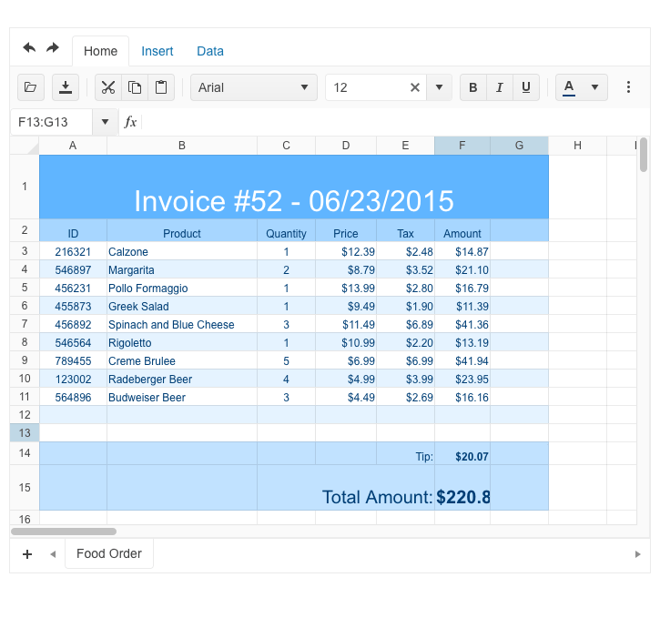
The new KendoReact Spreadsheet enables you to bring advanced Excel-like experience to your React applications. With a wide range of functionalities, the component empowers users to effectively manage and manipulate data in a spreadsheet-like interface. The Spreadsheet includes undo/redo buttons, enabling users to easily revert or redo changes with a simple click.
The Home tab provides essential formatting features, including bold, italic, and underline, as well as dropdown lists for customizing font name and size. The available color pickers for text and background offer an additional level of customization. The alignments and text wrapping capabilities make it easy to adjust the data appearance. Users can also toggle gridlines for imoproved visibility and utilize different formatting options to enhance the visual representation of the data.
By using the Insert tab, users can easily add or delete columns and rows in various positions, ensuring flexibility in data management. The name box and formula bar serve as convenient tools for navigating specific cells and entering formulas to perform advanced calculations. This functionality enables users to efficiently handle data manipulation and perform complex calculations within the React spreadsheet.
The content grid allows users to adjust the size of rows and columns, ensuring optimal data presentation. In addition, users can select rows, columns, and individual cells to efficiently manipulate data. The React Spreadsheet also supports the input of formulas directly into cells, automatically calculating the results.
See the React SpreadSheet demo
New Component: React ContextMenu
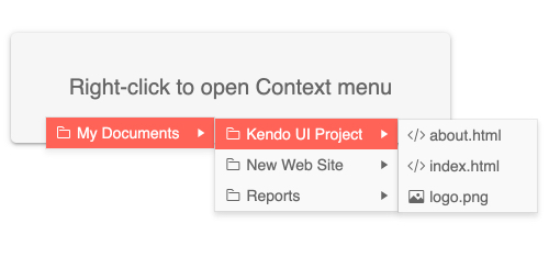
The new React ContextMenu provides a user-friendly menu that displays a contextual popup with data in a traditional menu-like structure. The component enables you to invoke commands while preserving the screen real estate.
See the React ContextMenu demo
New Component: React TimeLine
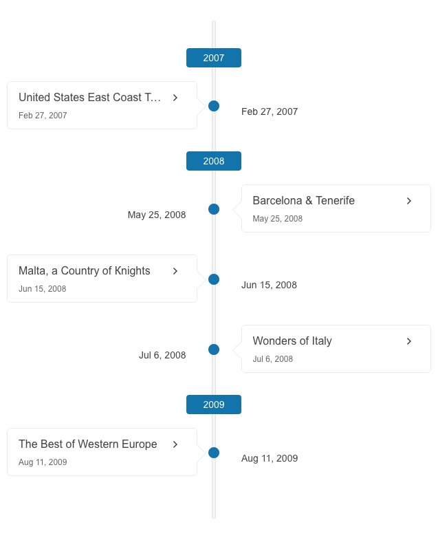
The new Timeline component enables you to easily present a collection of events in chronological order, making it the perfect option for displaying company history or visualizing significant milestones. In this initial version of the React Timeline, the component offers support for a vertical mode, where events can be collapsed, allowing for a neat and structured view.
React Grid: Integrated ContextMenu
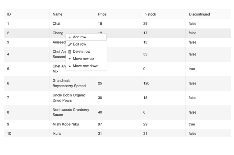
The KendoReact GridRow now exposes an `onContextMenu` event that enables you to set up a context menu within any Grid command. You can configure the context menu to show any cell or row operation, as well as export features.
See the React Grid Integrated ContextMenu demo
React Grid Enhancement: Integrated PageSize All Option
The pager dropdown list All option is now available in the KendoReact Grid component. It is controlled by the respective pageable property.
React StockChart: Navigator Top Position
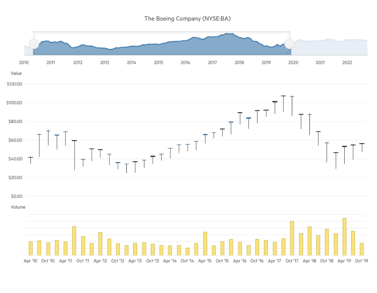
The KendoReact StockChart UI component has been enhanced with a new property enabling you to position its navigator on top (in addition to the existing bottom position).
React Date Input Components: Adaptive Rendering
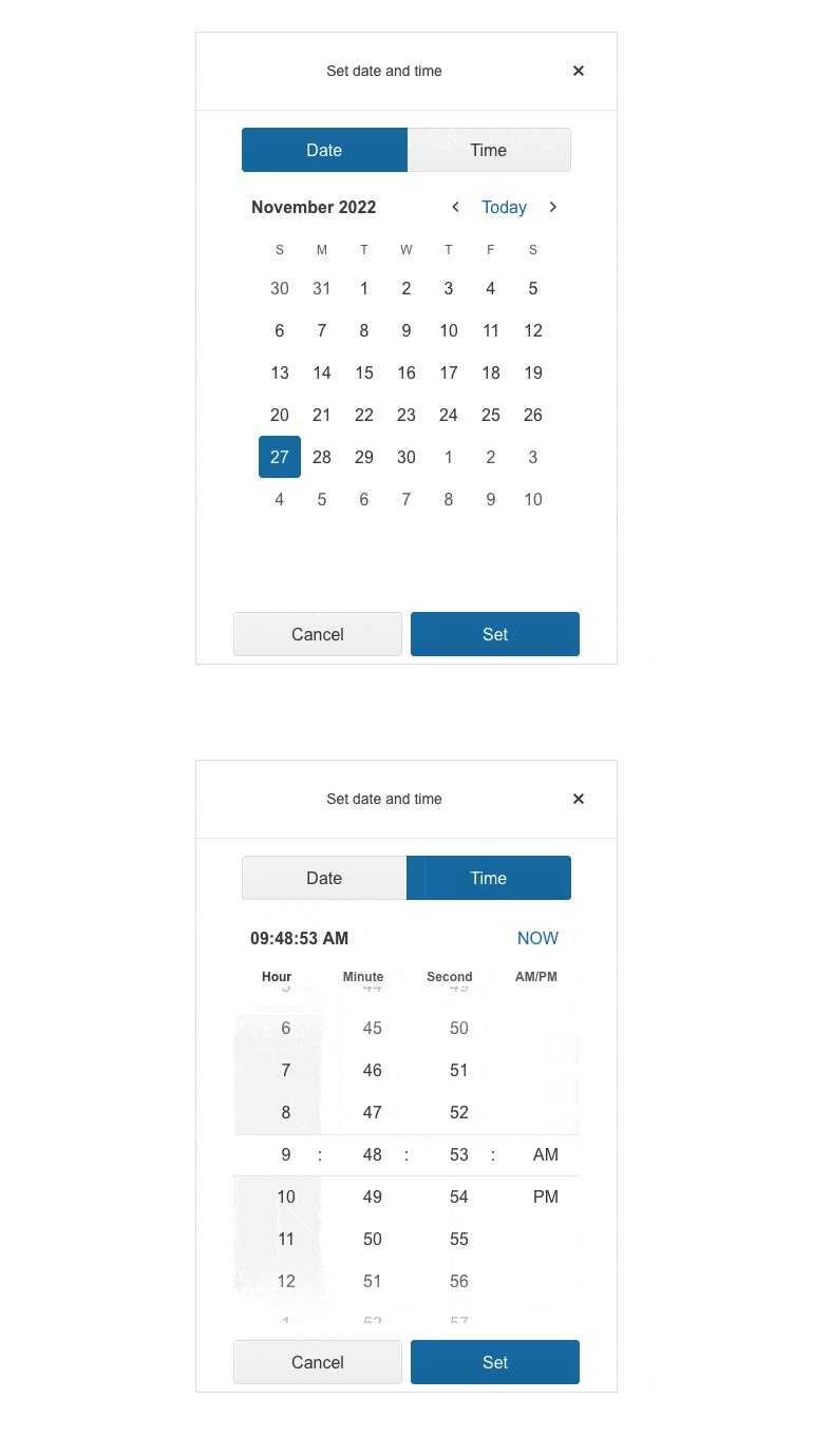
The KendoReact Date Input components (incl. DateTimePicker, DateRangePicker, DatePicker, and TimePicker) now support an adaptive mode which provides a mobile-friendly rendering of the calendar popup. When the adaptive mode is enabled, the components automatically adapt to the current screen size and change their rendering accordingly.
See the React DateTimePicker Adaptive Rendering demo as an example
React DropDown Components: Adaptive Rendering
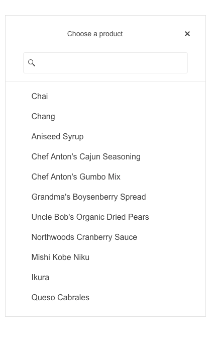
The KendoReact DropDown components (incl. ComboBox, DropDownList, DropDownTree, MultiSelect, MultiSelectTree, and MultiColumnComboBox) now support an adaptive mode, enabling a mobile-friendly rendering of the components’ popup. When the adaptive mode is enabled, the components will automatically adapt to the current screen size and change their rendering accordingly.
See the React ComboBox Adaptive Rendering demo as an example
React DropDown Components Enhancement: Grouping
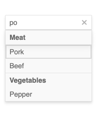
The React DropDown components (incl. AutoComplete, ComboBox, MultiColumnComboBox, MultiSelect, and DropDownList) now provide the possibility to group similar data items in logical categories to help users easily navigate through the drop-down list.
See the React AutoComplete Grouping demo as an example
React TabStrip Enhancement: Right-to-Left Support
The KendoReact TabStrip component now enables you to easily change the direction of the content from left-to-right to right-to-left and vice versa.
See the KendoReact TabStrip Right-to-Left Support demo
React Pager Enhancement: All Pages Configuration
The KendoReact Pager component can now be configured to show all items in a single page. The feature can be enabled initially, or through the PageSize DropDownList.
See the KendoReact PagerProps here
React ActionSheet Enhancement: Animations
The KendoReact ActionSheet component now supports animations, making the process of opening and closing the ActionSheet’s menu smooth and engaging.
See the KendoReact ActionSheet Animations demo
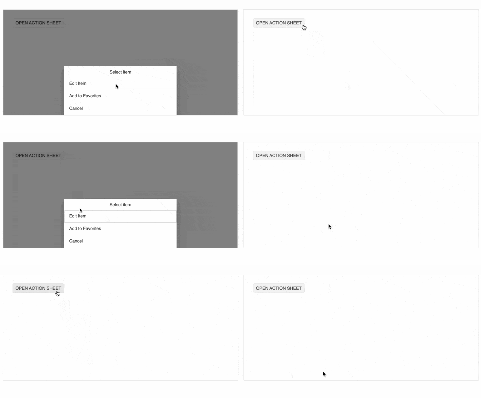
React ActionSheet Enhancement: Keyboard Navigation
The KendoReact ActionSheet component now supports keyboard navigation, enabling end users to use the keyboard to navigate the component and invoke actions such as buttons click, grid paging and more.
See the KendoReact ActionSheet Keyboard Navigation demo

React FlatColorPicker and ColorGradient: Мultiple Еnhancements
The React FlatColorPicker has been enhanced with the following props:
defaultValue: enabling you to set a default color value, ensuring a consistent starting point for color selection.
format: now you can specify the default input format for the gradient input editor and choose between "rgb," "hex," or "rgba" based on your your preferred color format.
opacity: get more flexibility with the option to display the opacity slider. Enabling this feature allows users to select the transparency along with their color choices.
In addition, we are introducing a new method called onChange. This method triggers an event handler whenever the user edits the color value. You can utilize this functionality to effectively capture and respond to any changes made by the user.
Furthermore, we have enhanced the ColorGradient component, which plays a crucial role in the FlatColorPicker. The ColorGradient now incorporates the "format" prop, enabling you to specify the default input format in the gradient input editor.
Scaffolders Enhancement: New Configuration Options
The scaffolders are now enriched with multiple configuration options:
-
The KendoReact Charts component can now be configured allowing you to choose from a wide range of chart types, including Area, Bar, Box Plot, Bubble, Bullet, Donut, Funnel, Heatmap, Line, Pie, Polar, Radar, RangeArea, RangeBar, Scatter and WaterFall.
-
The KendoReact Grid scaffolder now supports filtering, editing and paging customizations. In addition, the column can specify its own custom editor type. The Grid scaffolder snippet allows you to specify your data source or choose an automatically generated one so that the snippet will compile right away.
Font to SVG Icon Migration
With the R2 2023 release, the default icon type in the KendoReact components and Kendo UI themes is changed from Font to SVG. By eliminating the font icon inline scripts present in the themes, we have managed to reduce the security risk and improve the overall CSP compliance.
Design System Documentation Site
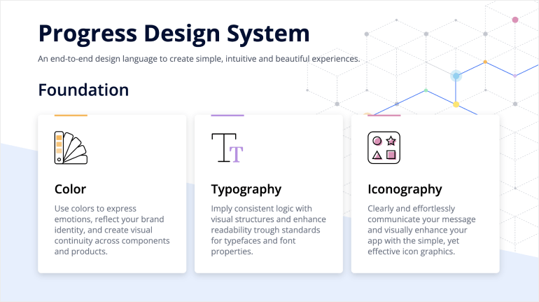
One of the key release items in R2 2023 is the launch of a dedicated design system documentation site, which offers a wide range of resources, design assets and frontend documentation specifically tailored for the Telerik and Kendo UI libraries. With this release, we have included related design and frontend documentation for nearly 20 of the most crucial components. Our ongoing dedication is to expand this site further, aiming to provide you with all the necessary tools to craft seamless and visually captivating digital experiences and design systems utilizing the power of Telerik and Kendo UI component libraries.
KendoReact - R2 2023
- New Component: React SpreadSheet
- New Component: React ContextMenu
- New Component: React TimeLine
- React Grid: Integrated ContextMenu
- React Grid Enhancement: Integrated PageSize All Option
- React StockChart: Navigator Top Position
- React Date Input Components: Adaptive Rendering
- React DropDown Components: Adaptive Rendering
- React DropDown Components Enhancement: Grouping
- React TabStrip Enhancement: Right-to-Left Support
- React Pager Enhancement: All Pages Configuration
- React ActionSheet Enhancement: Animations
- React ActionSheet Enhancement: Keyboard Navigation
- React FlatColorPicker and ColorGradient: Мultiple Еnhancements
- Scaffolders Enhancement: New Configuration Options
- Font to SVG Icon Migration
- Design System Documentation Site


