
KendoReact
What's New R1 2023
What's New HistoryKendo UI Productivity Tools for VS Code: Scaffolders for React
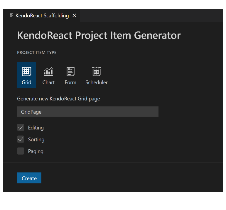
The Kendo UI Productivity Tools for Visual Studio Code is a VS Code Extension intended to help developers using KendoReact to boost their productivity when using our React UI components. With this update the Kendo UI Productivity Tools have added React Scaffolders, providing even quicker ways to generate sets of UI components or entire pages through just a couple of clicks. Current scaffolders include many common configurations of the most-used KendoReact components, including the React Data Grid, and future releases will continue to add more scaffolders and scenarios.
See the Kendo UI Productivity Tools for VS Code
New Component: React ActionSheet
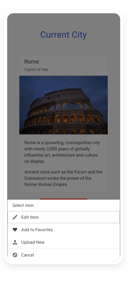
The React ActionSheet, sometimes called BottomSheet, is a UX device used for smaller screens when you need to alert or prompt users to action. It appears on the bottom of a screen as a modal dialog and presents users with a choice of actions that they must take. Since this element is popular in iOS and Android, it gives you an easy way to add a popular workflow to mobile or responsive applications.
See the React ActionSheet demo
New Component: React PDFViewer
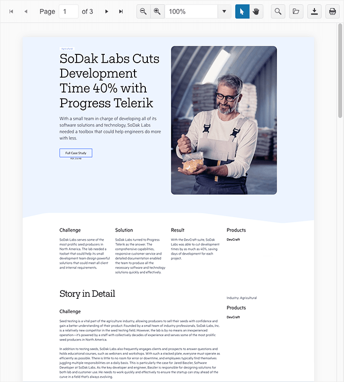
The React PDFViewer enables end-users to review PDF files directly in the browser without the need to download the file first, or without using third-party viewers. It includes all the features they are accustomed to in PDF viewers including print and save functionality, built-in accessible and localized toolbar, and various configuration settings. Additionally, you can choose either PDFJS or the Telerik Document Processing Library for rendering.
React Charts Enhancement: New Subtitle Property
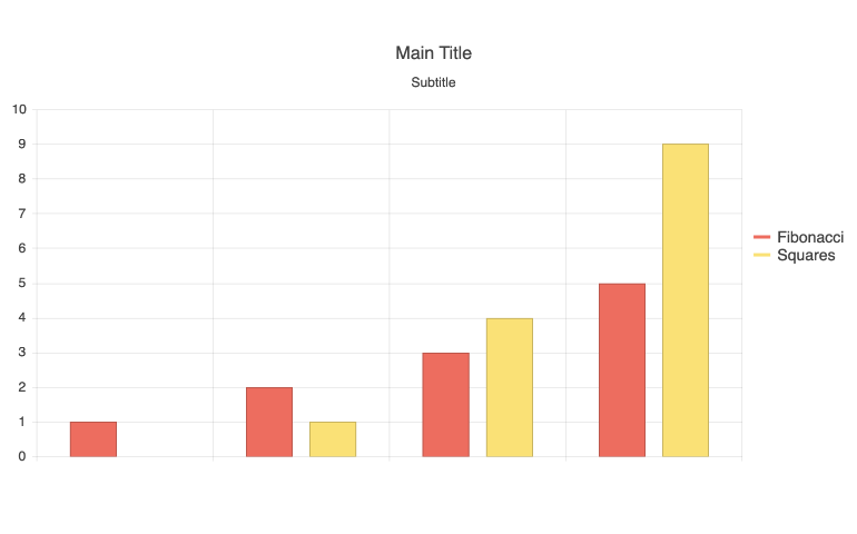
The new Subtitle feature of the React Charts enables developers to set a subtitle for any of the available KendoReact chart types. This adds a uniquely styled element under the main title of the React Chart. A single configuration option enables you to include this element in your chart.
See React Charts Subtitle Property demo
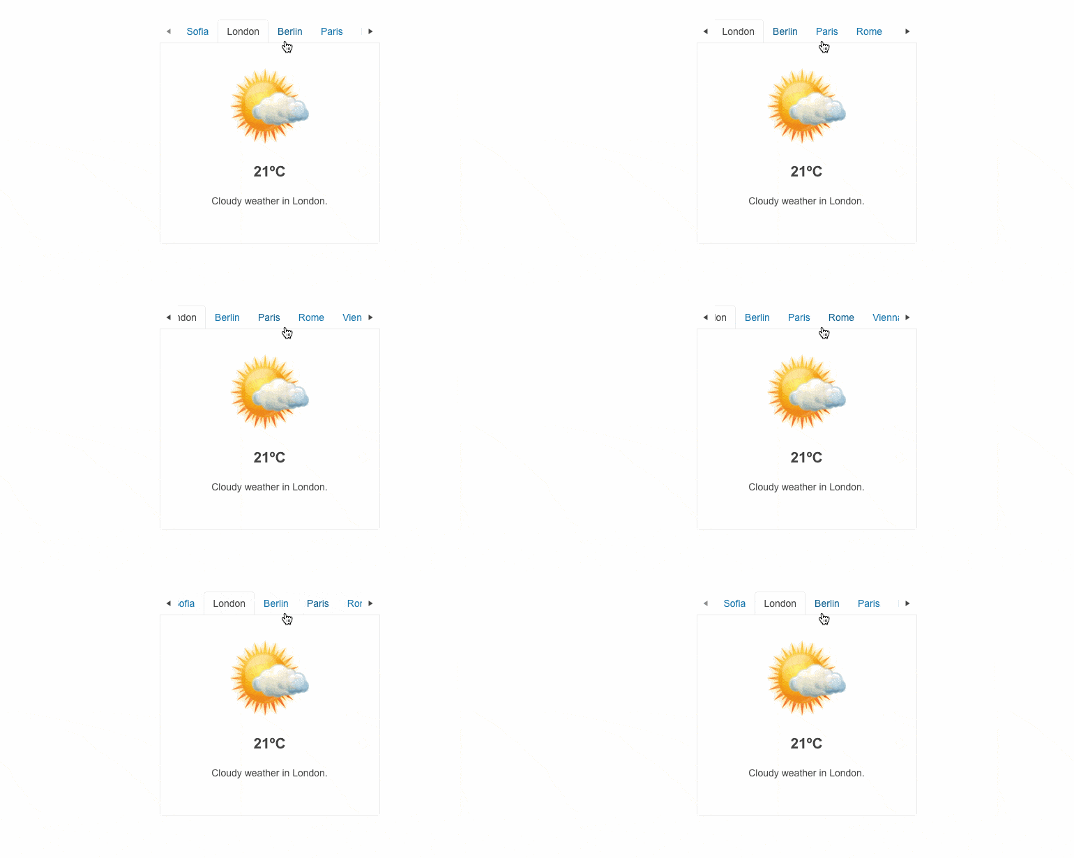
React TabStrip Enhancement: Scrollable Tabs
When the space your tabs occupy is greater than the width of the container, your layout can become unpleasant. To avoid this, the KendoReact TabStrip will automatically add scroll controls. Your layout will be intact, and your users will be pleased.
See the KendoReact Scrollable Tabs demo
Various Components: Accessibility Improvements
With every release, we maintain and improve KendoReact’s accessibility and A11Y compliance. These improvements are related to WAI-ARIA attributes and keyboard navigation. Improved components include the Data Grid, DateTimePicker, Buttons, DropDownButton, FloatingActionButton, Toolbar, Calendar, TreeView, ListBox, and more!
Also, to raise the level of AY11 compliance even higher we shipped a new color swatch called Ocean Blue A11Y (an enhanced version of the already existing Ocean Blue) which addresses corner cases for color contrast in several UI components.

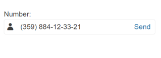
React Masked and Numeric Text Box Enhancement: Prefix and Suffix Adornments
When working with the MaskedTextBox and NumericTextBox components, you can now add prefix and suffix adornments. These are custom items, usually an icon or button, inside the field before or after the input area.
See how to add adornments to KendoReact MaskedTextBox and NumericTextBox UI components
New React Admin Dashboard Sample
This new sample helps developers get a head start on a very common type of application. The React Admin dashboard provides a few types of pages with embedded components and dummy date. You can copy, paste, and customize as you wish.
See the React Admin Dashboard Sample Application

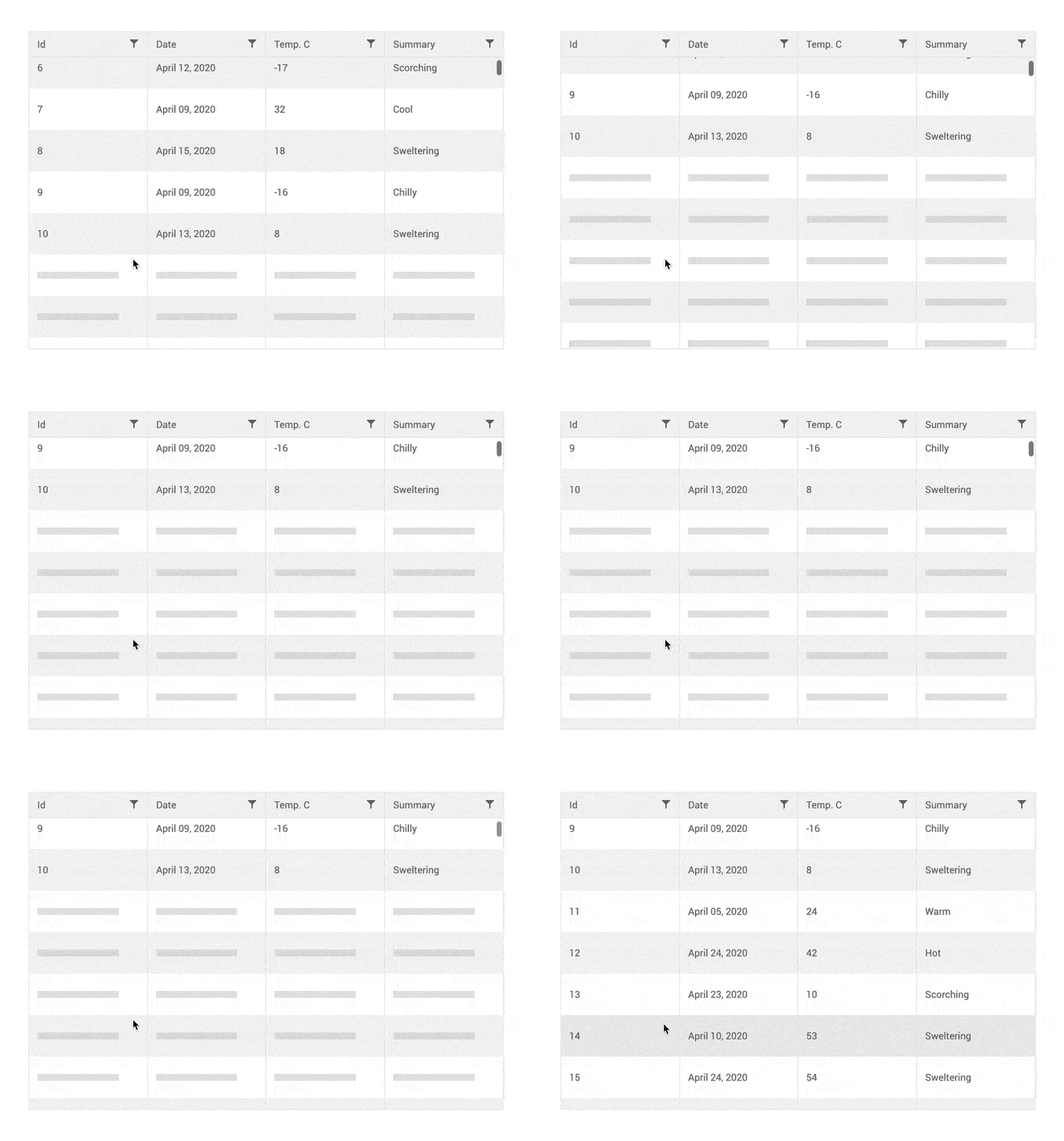
React Data Grid Enhancement: Improved Virtualization
We have added a new and improved mode of virtual scrolling that ensures a smooth experience. This mode is designed to ensure that the scrollbars never get out of sync with the data view, even during rapid scrolling.
See React Data Grid Virtual Scrolling documentation.
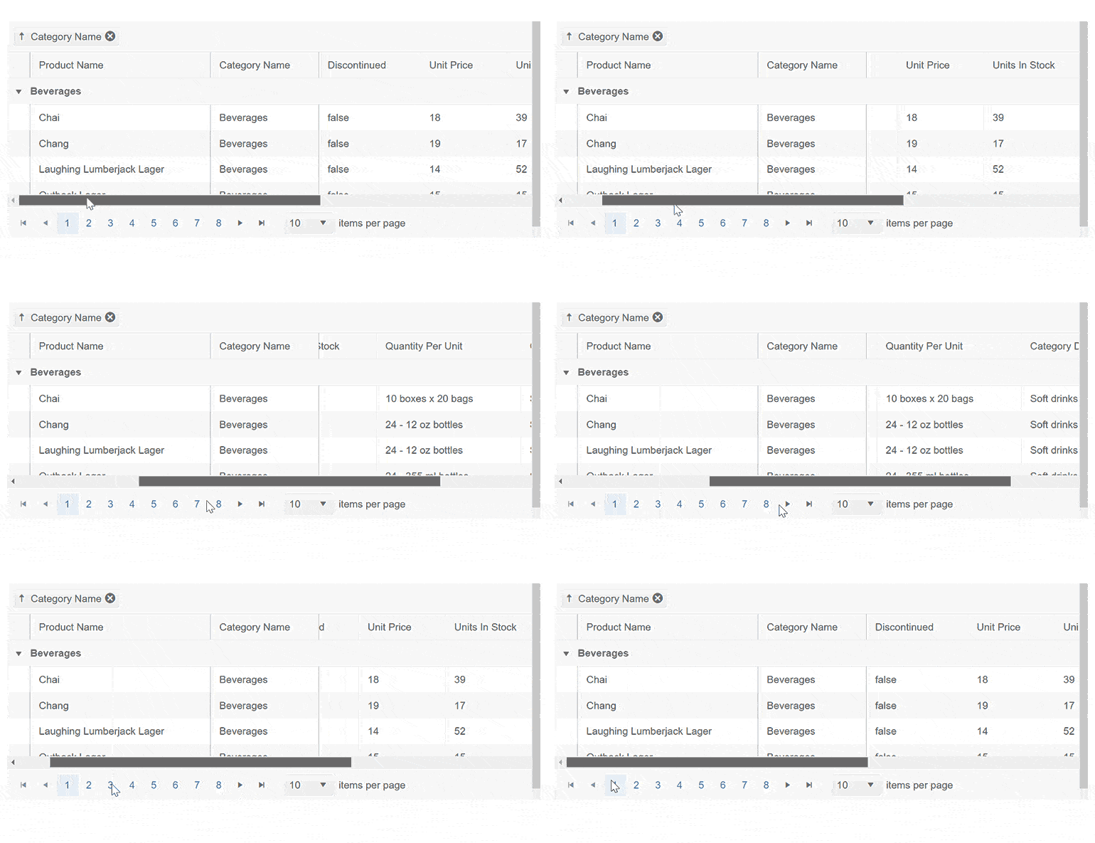
React Data Grid Enhancement: Locked Group Headers
Until now, there have been some limitations when combining frozen columns with grouping in the React Data Grid. Those limitations have been removed and it is now easy to keep the first grouping column locked.
See the React Locked Group Headers demo
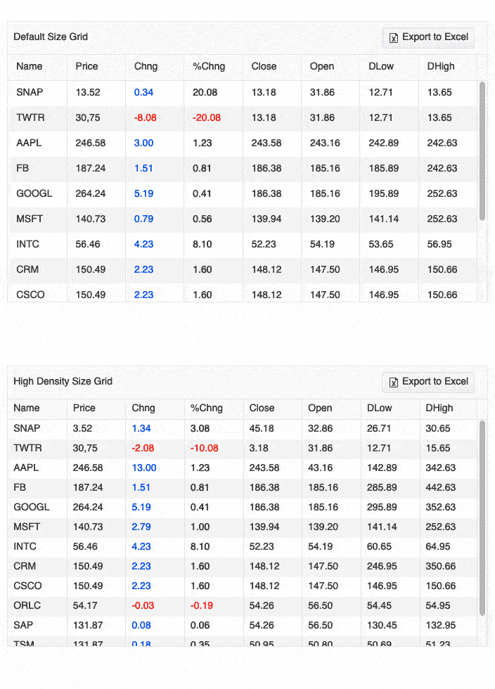
React Data Grid enhancement: Compact Grid
Small screens are a primary channel for app delivery, and developers are challenged with presenting data grid views in ways that device users can understand. To help solve this need, the React Data Grid now has a compact rendering mode. In this mode, cell padding will automatically be decreased, regardless of which built-in theme is being used (Kendo Default, Material, Fluent, Bootstrap).
See the React Data Grid Sizing demo
React Charts Enhancement: Label Support in Bullet Charts
With R1 2023, you can easily add labels to your React Bullet Charts, giving users more contextual information about the graph they are interacting with.
See the React Bullet Charts Displaying Labels demo

KendoReact - R1 2023
- Kendo UI Productivity Tools for VS Code: Scaffolders for React
- New Component: React ActionSheet
- New Component: React PDFViewer
- React Charts Enhancement: New Subtitle Property
- React TabStrip Enhancement: Scrollable Tabs
- Various Components: Accessibility Improvements
- React Masked and Numeric Text Box Enhancement: Prefix and Suffix Adornments
- New React Admin Dashboard Sample
- React Data Grid Enhancement: Improved Virtualization
- React Data Grid Enhancement: Locked Group Headers
- React Data Grid enhancement: Compact Grid
- React Charts Enhancement: Label Support in Bullet Charts


