Telerik UI for Blazor
What's New R2 2019
What's New HistoryNew Component: Grid
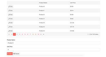
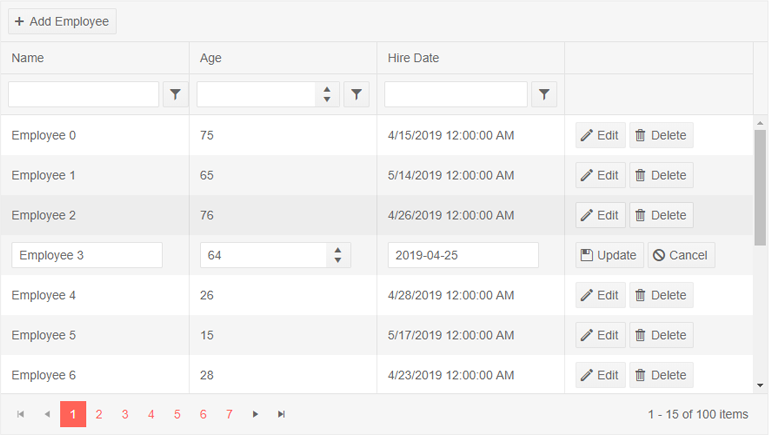
The Grid component is ready to roll right out of the box. We couldn’t imagine starting a UI library without one of your favorite components. You can enjoy many features like inline, popup and in-cell editing, along with row, column and edit templates, and even advanced features like paging and sorting data.
New Component: Charts
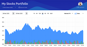
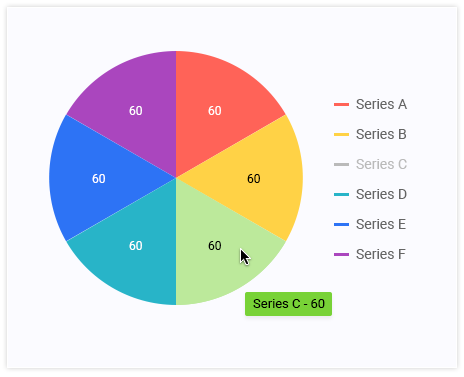
The Chart is another one of our most popular components. The chart types you have come to know and love are now available for our Blazor suite. Pick the Bar for data comparison, pick the Pie and Donut for visualizing parts of a whole, or for some trend analysis go for the Line or the Area series types.
New Component: Drop Down List
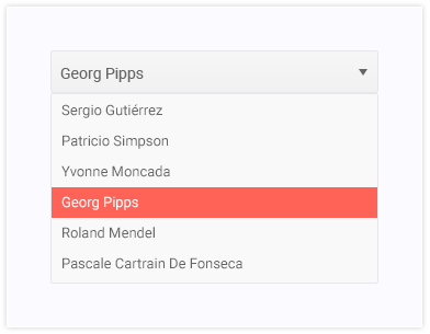
A lightweight and highly-customizable dropdown list is the easiest way to let your users pick an option from a predetermined list. Developers can control the data, sizes and various appearance options like class and templates.
New Component: Numeric Text Box
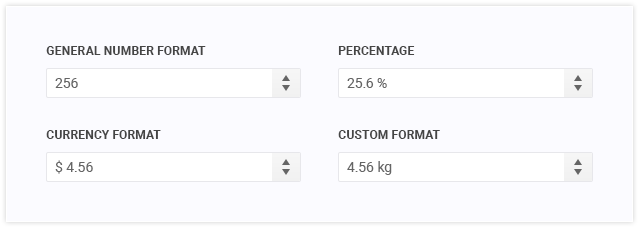
We now support a customizable, standard numerical input field with all the capabilities you are readily expecting – setting the expected range and steps, disabling non-numeric input, use different formats for currency, percentages or other units.
New Component: Text Box
Customization, customization...customization! It is one of our core goals and highly sought-after quality of in all Telerik components. With our TextBox you can easily setup text input fields with complex behavior outside of simple HTML inputs. Control the text length or check if it matches your desired pattern.

New Component: Date Input
You need a text input field, a numeric input field and of course you also need a date field. The DateInput widget enables you to enter date/time via direct input. It provides separate sections for day, month, year, hours and minutes. Furthermore, you can customize the date and time format by using standard format strings.

New Component: Window
Whether you want to alert the user about an error or present them with login options, the need to launch a new modal or non-modal window is a must. Add your own touch - change the window’s look, feel and behavior to make your new Blazor project more user friendly.

New Component: Date Picker
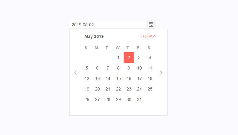
Having a Date Picker component in our Blazor 1.0 release was a popular request. The widget allows users to effortlessly edit and select values directly into the input area or from a calendar popup. Combine date editing functionality and animated dropdown. The values of the two controls are synchronized to enable further change of the chosen date.
New Component: Button
To complete our selection of input controls, we also added button that can be easily styled. A mix of icons and custom CSS that can produce the perfect button for you app.

New Component: Tab Strip
Tabs are a crucial piece of modern UI design and irreplaceable when it comes to reducing the amount of data visible on the screen at the same time. Our Blazor suit brings you this space saving component, so you can create new, beautiful and easy to navigate web applications.

New Component: Animation Container
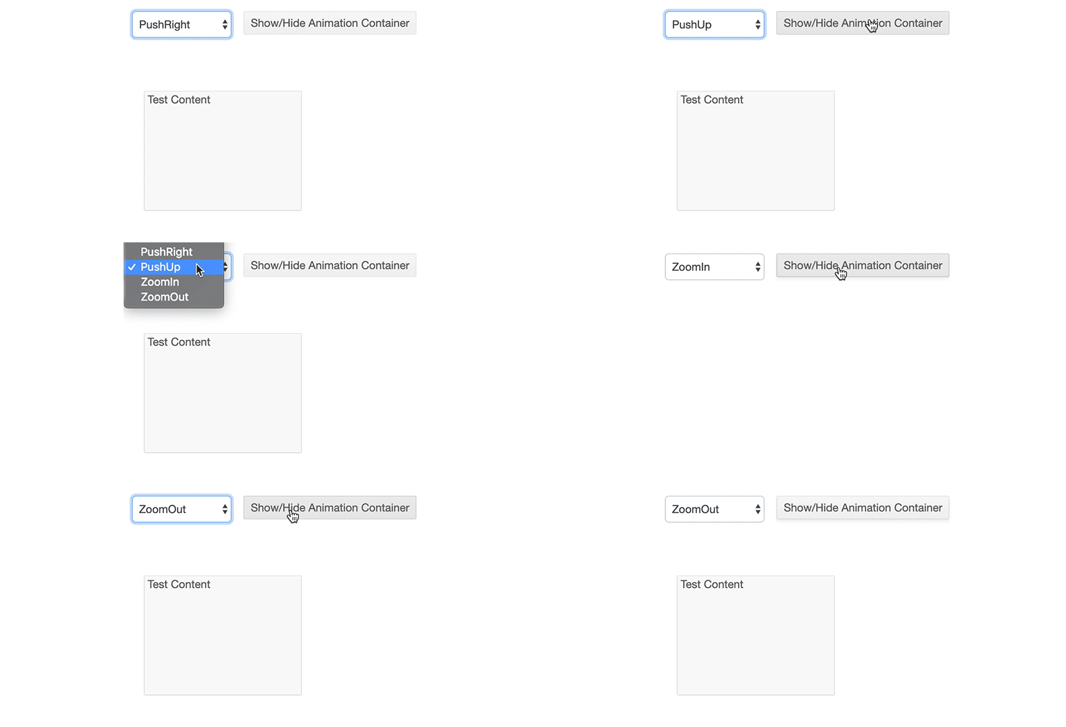
Add flare to your application with a single line of code. Enhance the user’s experience by choosing from 12 different animation styles without any special CSS or other code. Animate whatever element you wish and get a pixel-perfect result every time.
New Component: Calendar
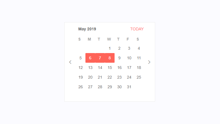
The Calendar component allows the user to scroll through a calendar and select one or more dates. You can control to what level the user can zoom the calendar (for example, up to months or years), the minimum and maximum date the user can navigate to, and whether they can select one or more dates.
We now support multiple day selection in its calendar timeline view! Selections can be made by range or by week. This allows you to create delightful experiences for the users of your professional web apps.
Telerik UI for Blazor - R2 2019
- New Component: Grid
- New Component: Charts
- New Component: Drop Down List
- New Component: Numeric Text Box
- New Component: Text Box
- New Component: Date Input
- New Component: Window
- New Component: Date Picker
- New Component: Button
- New Component: Tab Strip
- New Component: Animation Container
- New Component: Calendar
New features & Roadmap
Have a feature request?
Post your feedback via the Blazor UserVoice portal or the Public forums
What's new across all Telerik products?

Next Steps
See Telerik UI for Blazor in action and check out how much it can do out-of-the-box.
Check out the offers. Purchase an individual suite, or treat yourself to one of our bundles.
Try Telerik UI for Blazor with dedicated technical support.
