background cover
background cover

Telerik UI for ASP.NET Core

Roadmap

What's Coming in 2025?

We are pleased to announce our updated product release schedule, aiming to increase the frequency in which we deliver value to you. Here is the timeline for our upcoming major releases this year:

  • 2024 Q1 Release - February (Live)
  • 2024 Q2 Release - May (Live)
  • 2024 Q3 Release - August (Live)
  • 2024 Q4 Release - November (Live)
  • 2025 Q1 Release - February

    In addition to the major releases, we will continue to deliver incremental improvements through our 6-week release cadence.

    Look forward to exciting new features and improvements in each release.

    We believe that our customer input is extremely valuable when we determine the next releases of Telerik UI for ASP.NET Core. To have a direct impact on our product roadmap we encourage you to keep sharing your thoughts, plans, and ideas for what you would like to see developed next in the ASP.NET Core suite in our dedicated feedback portal.  

    Telerik UI for ASP.NET Core

    Support for .NET 10 Previews

    Improvement

    Telerik UI for ASP.NET Core will fully support the upcoming .NET 10 previews. Our team is committed to ensuring compatibility and taking full advantage of the new features and improvements in .NET 10.

    Chart Wizard Component

    New component

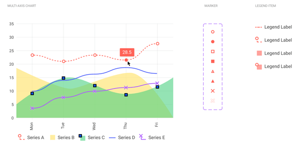
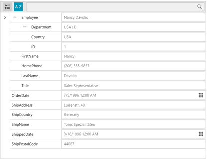
    The new Chart Wizard component lets you create a chart using data from a Grid, another data-bound component, or an external source. The Chart Wizard has a simple interface that allows you to set up the chart type, series, axes, data source, and more.

    Input OTP Component for Seamless Two-Factor Authentication

    New component
    In an era where digital security is paramount, our new Input OTP component is designed to simplify and enhance two-factor authentication (2FA) workflows. This dedicated component addresses the growing need for a secure, user-friendly solution to OTP input, combining advanced customization, intuitive interactions, and rigorous security measures. With features like configurable input lengths, automatic focus shift, built-in validation, and accessibility support, the Input OTP component ensures a smooth and secure user experience. Fully customizable to fit any design system, it supports theming, localization, and integration with form validation libraries. Whether you're building login flows or verification steps, this component empowers developers to deliver robust, secure applications with ease.


    PDFViewer: Annotations and Form Filling

    New feature
    The PDFViewer will support Annotations and Form Filling, enhancing the utility and functionality of PDF documents. Annotations enable users to collaborate, review, and provide feedback, making them essential for communication and document editing. Form filling capabilities will make applications more versatile and user-friendly by allowing users to interactively fill out forms within PDF documents.


    Adaptiveness of ASP.NET Core UI Components

    Improvement

    We continue our efforts to improve the adaptive and responsive behavior of our components. In our short-term plans, we will enhance the Data Grid, Toolbar, Pager, ColorPicker and TabStrip UI components so that their design and UX is seamless regardless of the device they are displayed.

    Multiple Components Enhancements

    New feature
    We closely monitor your suggestions, and based on your feedback, we will implement gradual improvements to our existing components. Keep an eye on future improvements to the Grid, Scheduler, Chart, TabStrip, Menu components, and many others.

    Telerik and Kendo UI Design Kits for Figma Upgrade!

    Improvement
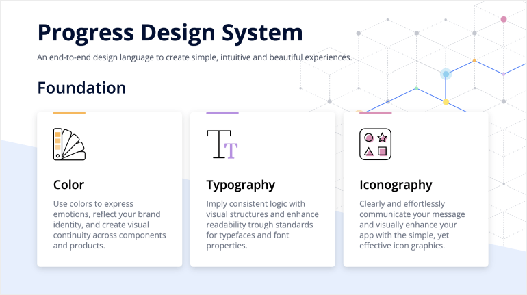
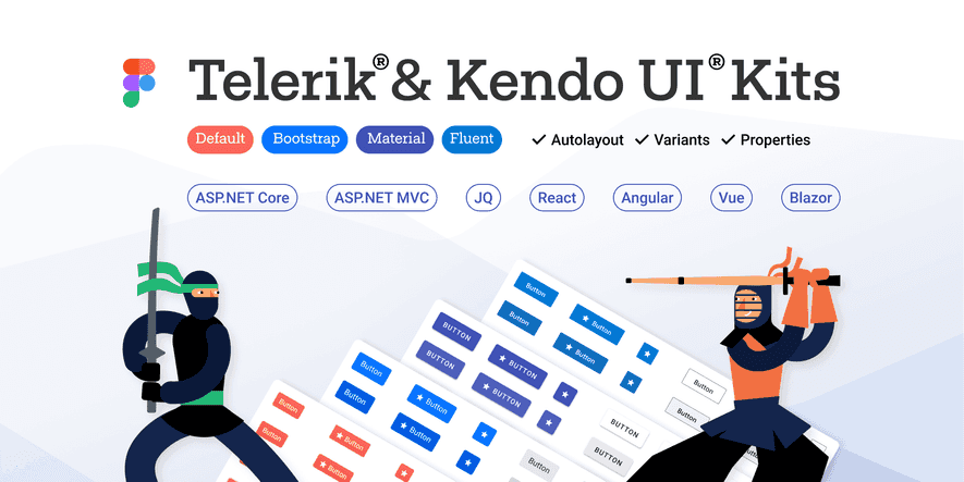
    Significant overhaul to our Figma UI Kits is on the way! Central to these updates is the introduction of a rich variables library, seamlessly integrated with our design system. This library includes dynamic color, spacing, and radii variables, ensuring consistency and flexibility across your designs. Additionally, we're enhancing our Typography and Elevation systems to provide even more design possibilities. Dark mode enthusiasts will rejoice as we introduce Dark mode options, complemented by common theme color swatches. Our file structure has been revamped for improved organization, making it easier than ever to find what you need. Stay tuned for the addition of new components, including updates aligned with MS Fluent 2. Detailed component descriptions and improved color contrast are planned later in the year. Get ready for a smoother, more efficient design workflow with our upcoming Kendo and Telerik UI kits for Figma upgrade!

    Color System Evolution

    Improvement
    We are introducing a new unified color system across all Kendo themes, ensuring a shared palette of colors. This enhancement will foster consistency and efficiency in styling across various themes, while also decreasing the size of theme files. In May 2024, the new  color system system will become default. Both color systems will be available until Q2 2025, giving you time to adapt at your own pace. For additional details, refer to our blog post.

    Accessibility Improvements

    Improvement

    In our upcoming 2025 releases, we will continue with our efforts to improve the overall accessibility of Telerik UI for ASP.NET Core components, ensuring the highest level of compliance with WAI-ARIA, Section 508, and the latest WCAG standards.

    No items found.

    Get Started Waves

    Next Steps

    Launch demos

    See Telerik UI for ASP.NET Core in action and check out how much it can do out-of-the-box.

    Compare pricing

    Check out the offers. Purchase an individual suite, or treat yourself to one of our bundles.

    Download Free Trial

    Try Telerik UI for ASP.NET Core with dedicated technical support.