New to Telerik UI for WPF? Start a free 30-day trial
Visual Structure
Updated over 1 year ago
This article describes all the visual elements and terms used in RadStepProgressBar control.
-
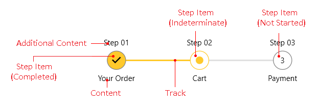
Step Item: Represents the steps (RadStepProgressBarItem) in the control. The steps are clickable which changes their states. The available states are Not Started, Indeterminate and Completed.
-
Content: Displays the element (text or other UI) positioned under the Step Item.
-
Additional Content: Displays an additional element (text or other UI) positioned above the Step Item.
-
Track: The line drawn between the steps. Selecting the next step will animate color change in the line.