Data Binding (MVVM)
The RadStepProgressBar control can be used in a data binding scenario.
The component's ItemsSource property can be assigned to a collection of any objects. A RadStepProgressBarItem will be auto generated for each item in the ItemsSource. The following example shows how to setup the control in this scenario.
Defining the models
	public class StepInfo
	{
		public string Text { get; set; }
        public string AdditionalText { get; set; }
	}

	public class MainViewModel : ViewModelBase
	{
		private StepInfo selectedStep;
		private Geometry stepShapeGeometry;

		public Geometry StepShapeGeometry
		{
			get { return stepShapeGeometry; }
			set
			{
				stepShapeGeometry = value;
				OnPropertyChanged("StepShapeGeometry");
			}
		}

		public ObservableCollection<StepInfo> Steps { get; set; }

		public StepInfo SelectedStep
		{
			get { return selectedStep; }
			set
			{
				selectedStep = value;
				OnPropertyChanged("SelectedStep");
			}
		}

		public MainViewModel()
		{
			Steps = new ObservableCollection<StepInfo>();
			Steps.Add(new StepInfo() { Text = "Your Cart", AdditionalText = "Step 1" });
			Steps.Add(new StepInfo() { Text = "Cart", AdditionalText = "Step 2" });
			Steps.Add(new StepInfo() { Text = "Payment", AdditionalText = "Step 3" });

			var geometry = new RectangleGeometry(new Rect(0, 0, 1, 1));
			geometry.Transform = new RotateTransform(45);
			StepShapeGeometry = geometry;
		}
}Initializing the view model
	public MainWindow()
	{
		InitializeComponent();
		DataContext = new MainViewModel();
}Setting up the XAML
	<telerik:RadStepProgressBar ItemsSource="{Binding Steps}"
								SelectedItem="{Binding SelectedStep, Mode=TwoWay}">
		<telerik:RadStepProgressBar.ItemContainerStyle>
			<Style TargetType="telerik:RadStepProgressBarItem">
				<Setter Property="ShapeStroke" Value="#EC6CEE" />
				<Setter Property="ShapeGeometry" Value="{Binding RelativeSource={RelativeSource AncestorType=telerik:RadStepProgressBar}, Path=DataContext.StepShapeGeometry}" />
			</Style>
		</telerik:RadStepProgressBar.ItemContainerStyle>
		<telerik:RadStepProgressBar.ItemTemplate>
			<DataTemplate>
				<TextBlock Text="{Binding Text}" FontWeight="Bold" />
			</DataTemplate>
		</telerik:RadStepProgressBar.ItemTemplate>
		<telerik:RadStepProgressBar.ItemAdditionalContentTemplate>
			<DataTemplate>
				<TextBlock Text="{Binding AdditionalText}" Foreground="#8591A2" />
			</DataTemplate>
		</telerik:RadStepProgressBar.ItemAdditionalContentTemplate>
	</telerik:RadStepProgressBar>
Data bound StepProgressBar control
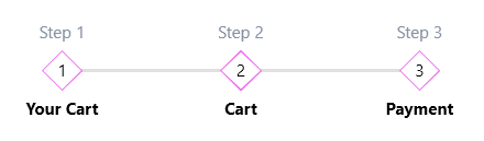
The previous example shows how to data bind the ItemsSource and SelectedItem of the control. This will populate it with data. The SelectedItem binding can be used in a separate visual element if you need to connect the selected step with a separate view.
The visualization of the text at the bottom and top is customized via the ItemTemplate and ItemAdditionalContentTemplate properties. Alternative of the ItemTemplate setting is the DisplayMemberPath that can point to a property from the model of the step.
The ItemContainerStyle property is used to customize the RadStepProgressBarItem elements created for each object in the ItemsSource.