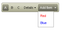
Getting Started Overview
This tutorial will walk you through creating a RadToolBar and shows how to:
-
Use the RadToolBar Item Editor to build a simple toolbar.
-
Use different types of toolbar buttons.
-
Apply a skin to the toolbar to change its look & feel.
-
Drag a RadToolBar component from the toolbox onto your Web page. The RadToolBar Smart Tag should appear automatically:

-
On the Smart Tag, choose Edit Items. The RadToolBar Item Editor appears:

-
Click the Add RadToolBarButton button (
 ) to add a button to your toolbar.
 -
In the properties pane on the right of the item editor, set the following properties for the button you added:
-
Set the Text property to "A".
-
Set the CheckOnClick property to True. This makes the button have two states, "on" (checked) and "off" (unchecked).
-
Set the Checked property to True. This sets this button's state to "on".
-
Set the Group property to "Group1". This makes the button part of a group that act like radio buttons.
- Click the Add RadToolBarButton button two more times to add two more buttons to the toolbar. Set their properties as follows:
-
Set the Text property to ""B" and "C", respectively.
-
Set the CheckOnClick property to True.
-
Set the Group property to "Group1".The item editor should now look like the following:(
 )
)
-
Click the Add RadToolBarDropDown button (
 ) to add a drop-down button to the toolbar. With the drop-down button selected, use the properties pane to change its Text property to "Details".
 -
With the "Details" button selected, click the Add RadToolBarButton to drop-down button (
 ) to add a button to the drop-down list of the "Details" button. Select the button you added to the list and set its Text property to "One".
 -
Select the "Details" button again and click the Add RadToolBarButton to drop-down button two more times to add two more buttons to the drop-down list.
- On the first of these (the second button in the drop-down list), set the IsSeparator property to True and the Text property to an empty string.The item builder should now look like the following:(
 )
)
- Click the Add RadToolBarSplitButton button (
 ) to add a split button to the toolbar.
-
Set its Text property to "Add Item".
-
Set its EnableDefaultButton property to False.
- With the "Add Item" button selected, click the Add RadToolBarButton to drop-down button two times to add two child buttons to the drop-down list of the split button.
-
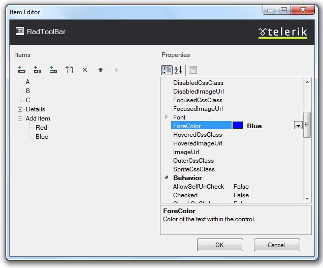
On the first, set the Text property to "Red" and the ForeColor property to "Red".
-
On the second, set the Text property to "Blue" and the ForeColor property to "Blue".The item builder should look like the following:
-
Click Ok to exit.
-
In the RadToolBar Smart Tag, use the Skin drop-down to change the skin for the RadToolBar to "Hay":

-
Still in the Smart Tag, click the Edit Templates link to apply a template to one of the toolbar buttons:

-
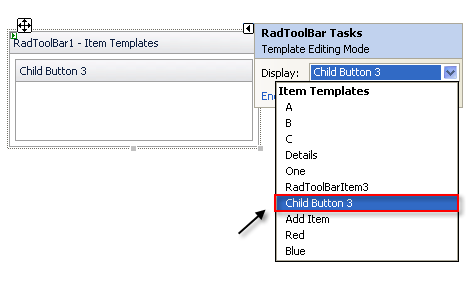
The Smart Tag changes to template editing mode.From the Display drop-down, select "Child Button 3" to attach a template to "Child Button 3":
-
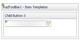
Drag a RadDatePicker from the toolbox onto the Template Design Surface and set its Skin property to "Inox":
-
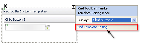
Choose End Template Editing from the RadToolBar Smart Tag:
-
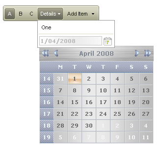
Run the application. Click on the first three buttons on the toolbar ("A", "B", and "C") and note how they function as a radio group. Click on the "Details" button to expand its drop-down list. Note the separator you added, and the date picker, which you can click to select a date:
-
Click the "Add Item" button, and note that its appearance changes to respond to the click, but the drop-down does not appear unless you click the drop-down arrow:
