Icons
The Stepper allows configuring the icons in the Steps indicator elements. All the built-in icons distributed with Telerik UI for ASP.NET AJAX suite can be used in RadStepper.
In addition, all the Kendo UI Web Font Icons are also available for using in the component.
To include a desired embedded icon use the exposed icon properties - Icon, SuccessIcon of the RadStepper. The ClientIconTemplate exposed by RadStepper provides flexibility in customizing the icon.
Step Icon
The icons rendered for each StepperStep. It is also clickable and can be configured through the Icon property of each StepperStep.
By default, the Step icon is visible. To hide the icons in RadStepper set its ShowIndicator property to 'false'. If no Icon is specified for a Step, the consecutive number of the Step is rendered as its icon.
Sample usage of Icons:
Below is the code producing this result:
<telerik:RadStepper runat="server" ID="RadStepper1">
    <Steps>
        <telerik:StepperStep Label="Home" Icon="home" />
        <telerik:StepperStep Label="Settings" Icon="gear" />
        <telerik:StepperStep Label="Attachments" Icon="attachment" />
        <telerik:StepperStep Label="Save" Icon="save" />
    </Steps>
</telerik:RadStepper>
Success Icon
Defines Icons rendered in a previously completed/selected step with no error. It can be configured through the SuccessIcon property of a StepperStep element.
When no SuccessIcon is specified for a Step, the icon in a completed step remains the one set to its Icon property. In case a Step has neither an Icon or SuccessIcon specified, a default checkmark icon is applied as SuccessIcon.
Sample declaration:
<telerik:RadStepper runat="server" ID="RadStepper3" Width="750" Skin="Silk">
    <Steps>
        <telerik:StepperStep Label="Step 1" SuccessIcon="success" />
        <telerik:StepperStep Label="Step 2" SuccessIcon="success" />
        <telerik:StepperStep Label="Step 3" Error="true" SuccessIcon="success" />
        <telerik:StepperStep Label="Step 4" SuccessIcon="success" />
        <telerik:StepperStep Label="Step 5" SuccessIcon="success" />
        <telerik:StepperStep Label="Step 6" SuccessIcon="success" Selected="true" />
        <telerik:StepperStep Label="Step 7" SuccessIcon="success" />
        <telerik:StepperStep Label="Step 8" SuccessIcon="success" />
    </Steps>
</telerik:RadStepper>
ClientIconTemplate
RadStepper uses Kendo UI Templates to provide full control over the rendering of the icon in the indicator of each step.
The fields which can be used in the template are:
labelString - the label set on the stepiconString - the icon specified for this step (if any)successIconString - the successIcon specified for this step (if any)enabledBoolean - indicates whether the step is enabled (true) or disabled (false)errorBoolean - indicates whether the step has error (true) or not (false)selectedBoolean - indicates whether the step is selectedpreviousBoolean - indicates whether the step is before the currently selected or notindexNumber - a zero-based index of the current stepisFirstStepBoolean - indicates whether the step is the initial one in the StepperisLastStepBoolean - indicates whether the step is the last one in the StepperindicatorVisibleBoolean - indicates whether the indicator, which holds the icon should be displayed or notlabelVisibleBoolean - indicates whether the label section of the step should be displayed or not
Example
Markup declaration of the Stepper shown above:
<telerik:RadStepper runat="server" ID="RadStepper1" Skin="Silk">
    <Steps>
        <telerik:StepperStep Label="ONE"/>
        <telerik:StepperStep Label="TWO">
            <ClientIconTemplate>
                <strong>#: label #</strong>
            </ClientIconTemplate>
        </telerik:StepperStep>
        <telerik:StepperStep Label="THREE"/>
    </Steps>
</telerik:RadStepper>
The default appearance of a StepperStep can be achieved with the template declaration shown below. It can serve as a convenient basis for further modifications:
<telerik:StepperStep Label="Step 1" Icon="home" SuccessIcon="success" Enabled="true" Error="false" Selected="false" >
    <ClientIconTemplate>
        #if(successIcon && previous && !error) {#
            <span class="k-step-indicator-icon k-icon k-i-#: successIcon #"></span>#
        }
        else if(icon) {#
            <span class="k-step-indicator-icon k-icon k-i-#: icon #"></span>
        #}
        else if(previous && !error) {#
            <span class="k-step-indicator-icon k-icon k-i-check"></span>
        #} else {#
            <span class="k-step-indicator-text">#: index + 1 #</span>
        #}#
    </ClientIconTemplate>
</telerik:StepperStep>
With the declaration above, the Indicator element of the Step should be the same as if ClientIconTemplate is not in use.
Custom Attributes
The StepperStep object exposes Attributes property that can be used for processing additional information inside the ClientIconTemplate.
Check out the example below to see how to use Step's custom attribute in the Template:
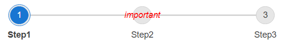
<telerik:RadStepper runat="server" ID="RadStepper1" Width="600px">
    <Steps>
        <telerik:StepperStep Label="Step1"></telerik:StepperStep>
        <telerik:StepperStep Label="Step2">
            <ClientIconTemplate>
                <span style="color:red">
                    <em>#: data.attributes['my-custom-attribute'] #</em>
                </span>
            </ClientIconTemplate>
        </telerik:StepperStep>
        <telerik:StepperStep Label="Step3"></telerik:StepperStep>
    </Steps>
</telerik:RadStepper>protected void Page_Load(object sender, EventArgs e)
{
foreach (StepperStep step in RadStepper1.Steps)
{
step.Attributes.Add("my-custom-attribute", "important");
}
}