Controlling Appearance
There are a number of ways to customize the look and feel of RadSlider:
-
To change the overall look and feel of the RadSlider control, set its Skin property.
-
To change the layout of RadSlider, use the Orientation property.
-
To change the visibility of handles, use the ShowDragHandle, ShowDecreaseHandle and ShowIncreaseHandle properties.
-
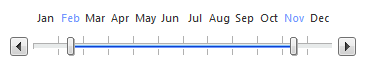
To show two drag handles use the IsSelectionRangeEnabled property
-
To reverse the slider set the IsDirectionReversed property to true
-
To Disable the slider set the Enabled property to false
Visual Examples:
Horizontal Slider:
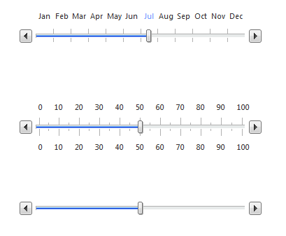
From top to bottom: Slider with Items, Slider with Ticks, Slider
Reversed Horizontal Slider:
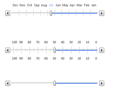
From top to bottom: Slider with Items, Slider with Ticks, Slider
Vertical Slider
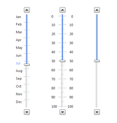
From left to right: Slider with Items, Slider with Ticks, Slider
Vertical Slider Reversed
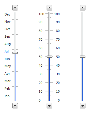
From left to right: Slider with Items, Slider with Ticks, Slider
Slider with two Drag Handles
Disabled Slider