Design Time
The RadImageGallery designer provides a convenient Smart Tag that allows easy access to frequently needed tasks. You can display it by right clicking on the control in the design window, and choosing Show Smart Tag from its context menu, or by simplyclicking on the arrow button on top-right corner of the control.
The Smart Tag enables easy visual configuration of the control at design-time.
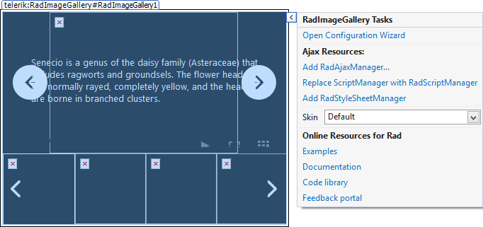
RadImageGallery Smart Tag lets you perform the following:
RadImageGallery Tasks
- Open Configuration Wizard: - Opens the RadImageGalleryWizardForm window for further customization of the control settings.
Ajax Resources
-
Add RadAjaxManager: Adds a RadAjaxManager component to your Web page, and displays the RadAjax Property Builder where you can configure it.
-
Replace ScriptManager with RadScriptManager: Replaces the default ScriptManager component added for AJAX-enabled Web sites with RadScriptManager.
-
Add RadStyleSheetManager: Adds a RadStyleSheetManager to your Web page.
Skin
The Skin drop-down lets you select from a list of available skins to customize the look of your RadImageGallery control.
Learning Center
Links navigate you directly to RadImageGallery examples, help or Code Library. You can also search the Telerik web site for a given string.The last link will take you to Telerik feedback portal where you can submit your ideas or opinions regarding the control.
RadImageGalleryWizardForm
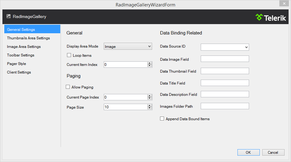
The wizard will smoothly guide you through the various settings and properties of RadImageGallery providing an accessible and organized way of configuring the control.
General Settings
-
Display Area Mode: : Controls the mode that the RadImageGallery will operate in. The mode determines the appearance and the way the entire control will work.
-
Loop Items: If enabled, this will loop the items when the last/first one is reached.
-
Page Size: Controls the number of items that the RadImageGallery will populate at a given time.
-
Data Source ID: Defines the ID of the control from which the RadImageGallery retrieves its list of data items.
-
Images Folder Path: Indicates a relative or absolute path to a folder from which the RadImageGallerywill populate its items.
-
Append Data Bound Items:Indicates whether RadImageGallery.Items collection is cleared beforeDataBinding. If enabled, the RadImageGallery will append the retrieved items from the datasource to the statically declared ones.
Thumbnails Area Settings
-
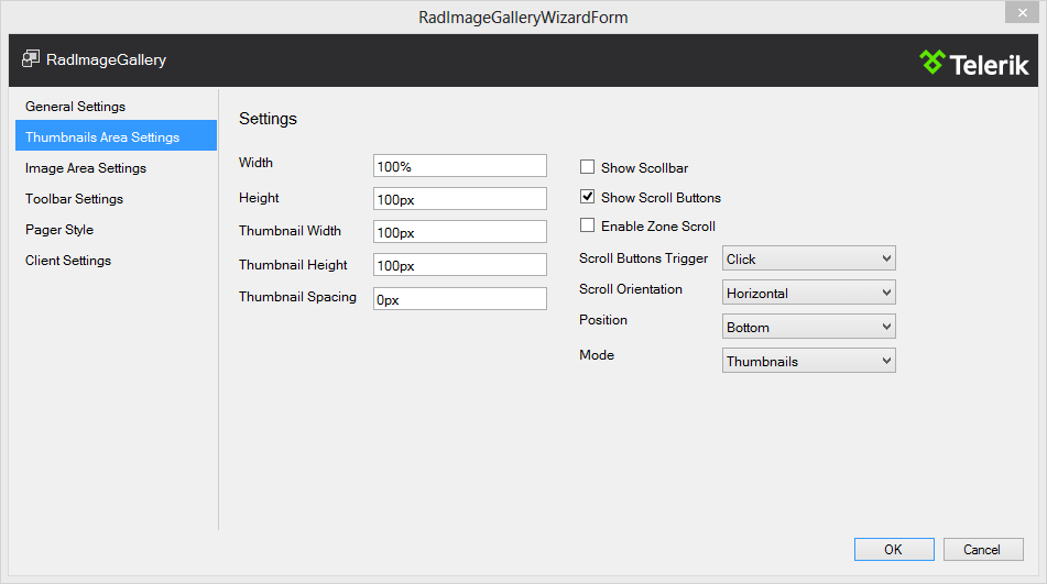
Thumbnail Spacing: Controls the padding between the items in the area.
-
Show Scrollbar: Determines if a scrollbar will be displayed in the ThumbnailsArea.
-
Show Scroll Buttons: Indicates if the buttons that scroll the ThumbnailsArea view will be visible.
-
Enable Zone Scroll: Determines if the ThumbnailsArea will be automatically scrolled when the mouse is closeenough from the left or right side of the area.
-
Scroll Buttons Trigger: An enumeration value, which determines when the scroll buttons action will be triggered.Note that scroll amount changes based on the value specified.
-
Scroll Orientation: Determines the position of the scrollbar and in what direction (horizontally or vertically) the content will be moved.
-
Mode: An enumeration value, which determines how the ThumbnailsArea will look and function.
Image Area Settings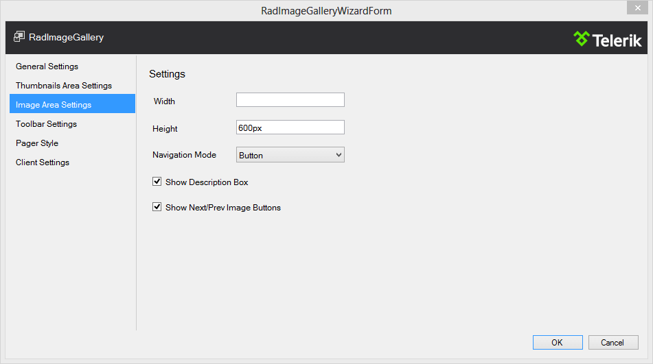
-
Navigation Mode: An enumeration value, which determines the way images will be navigated.
-
Show Description Box: Determines if the box that holds the item title and description will be visible.
-
Show Next/Prev Image Buttons: Determines if the Next/Prev navigate buttons will be visible.
Toolbar Settings
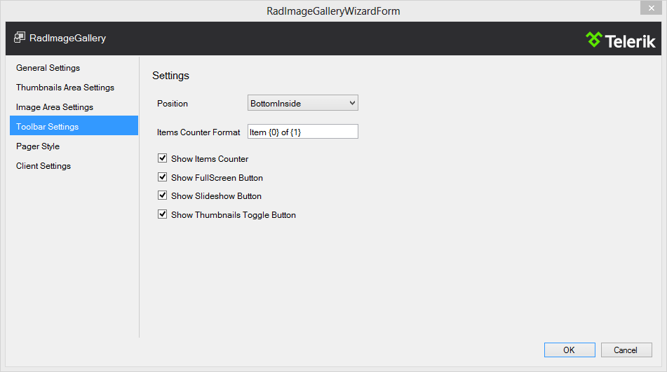
-
Position: An enumeration value, which represents where the Toolbar item will be created relativeto the RadImageGallery position.
-
Item Counter Format: The string used to format the item counter text that appears in the Toolbar.
-
Show Items Counter: Controls the visibility of the items counter information text.
Pager Style
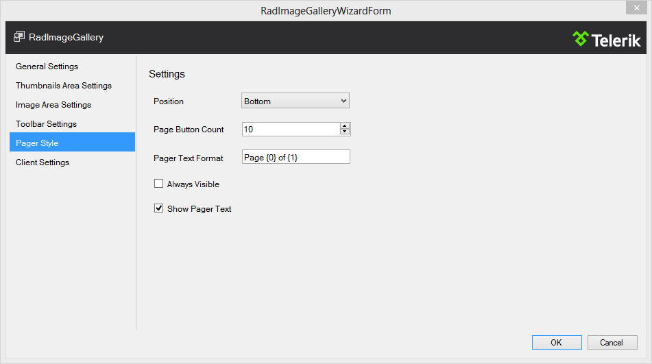
-
Position: An enumeration value, which represents where the pager items will be created relative tothe RadImageGallery position.
-
Page Button Count: Controls the number of page buttons that will be rendered if the pager is in mode that renders the page buttons.
-
Pager Text Format: The string used to format the description text that appears in a pager item.
-
Always Visible: Determines whether the pager item will be still visible when there is only one page.
Client Settings
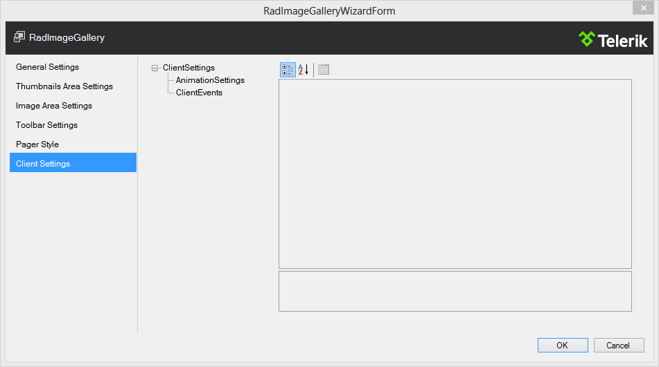
-
AnimationSettings: Defines the animation settings for the RadImageGallery. Inner settings determine the animations between images.
-
ClientEvents: Provides a reference to ImageGalleryClientEvents collection, which holds properties for setting the client-side events of the RadImageGallery.