
UI for ASP.NET AJAX
ASP.NET AJAX DateRangePicker
- The ASP.NET AJAX DateRangePicker component allows users to easily input or select a date range from a calendar. Comes with built-in skins, flexible date configuration options, keyboard navigation support and accessibility features.
- Part of the Telerik UI for ASP.NET AJAX library along with 120+ professionally designed UI components.
- Includes support, documentation, demos, virtual classrooms and more!
-
Overview
The Telerik UI for ASP.NET AJAX DateRangePicker component lets users select a range of dates. It combines two DatePicker components and a shared MultiView Calendar. It can be used in multiple app scenarios, such as appointment scheduling, hotel bookings, event planning and many more. The control features flexible client-side API, built-in skins, different date settings, popup option, localization and keyboard navigation.
See the Telerik UI for ASP.NET AJAX DateRangePicker in action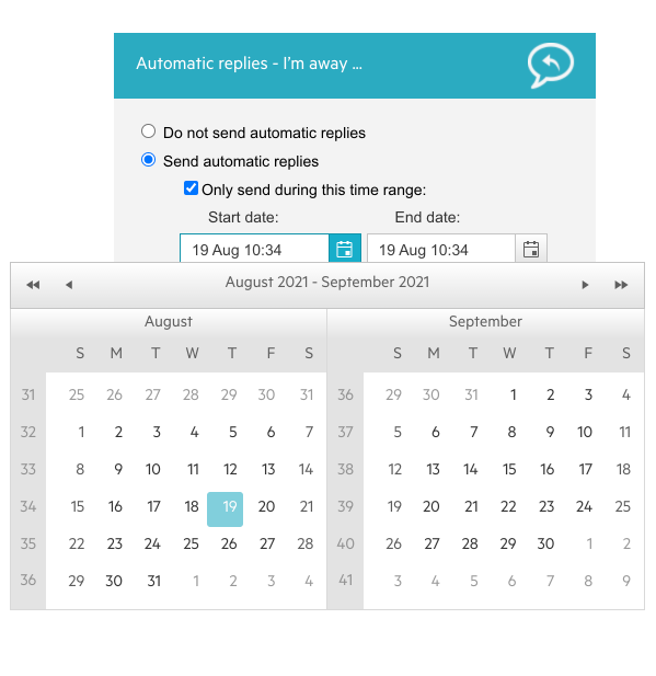
-
Data Binding
Easily bind the Telerik DateRangePicker control to a data source using the exposed DbRangeSelectionStartDate and DbRangeSelectionEndDate properties. You can also embed the control inside a data-bound component. To do so, you must use a data-binding expression with either the Eval or Bind functions.
Explore the DateRangePicker Data Binding options
-
DateRange Selection
The component provides two ways in which date ranges can be selected: Consecutive Clicks and OnKeyHold. Consecutive Clicks allows users to select a range by clicking consecutively on two different dates. OnKeyHold lets users choose a range by pressing the Shift button and clicking on the end date while having the Start date calendar open.
The first option is enabled by default, yet the component gives you full control to customize it to fit your project needs.
-
Customization
As the DateRangePicker comprises two DatePickers that act as two connected calendars, you can easily configure the entire component with the following options:
-
Set minimum and maximum allowed dates
-
Define the number of months visible
-
Configure date settings and format
-
-
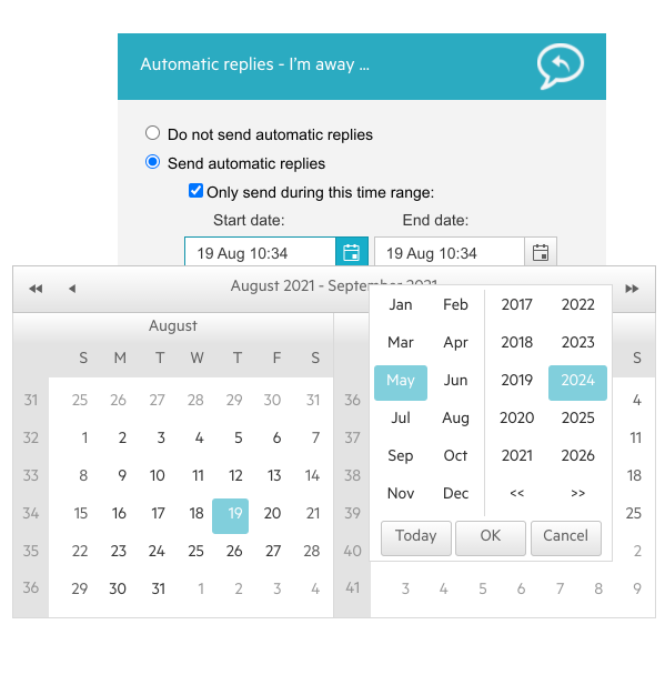
Month/Year Popup Option
The Month/Year popup option appears if the user clicks on the title bar of the calendar. It allows the selection of a year and a month to help users navigate faster to their desired dates. It also features three different buttons for better UX: Today, Ok and Cancel. -
Events
Use the rich server- and client-side API found within the DateRangePicker to implement advanced and specific scenarios. Explore the various events fired by the component, such as OnRangeSelectionChanged, OnPopupOpening, OnPopupClosing and more.
Check out the AJAX DateRangePicker Client-Side Events demo or explore the Server-Side Events
-
Globalization & Localization
The Telerik UI for ASP.NET AJAX DateRangePicker supports globalization as a feature and is designed to work in different cultures and respond to their requirements for date and time formatting, week and month names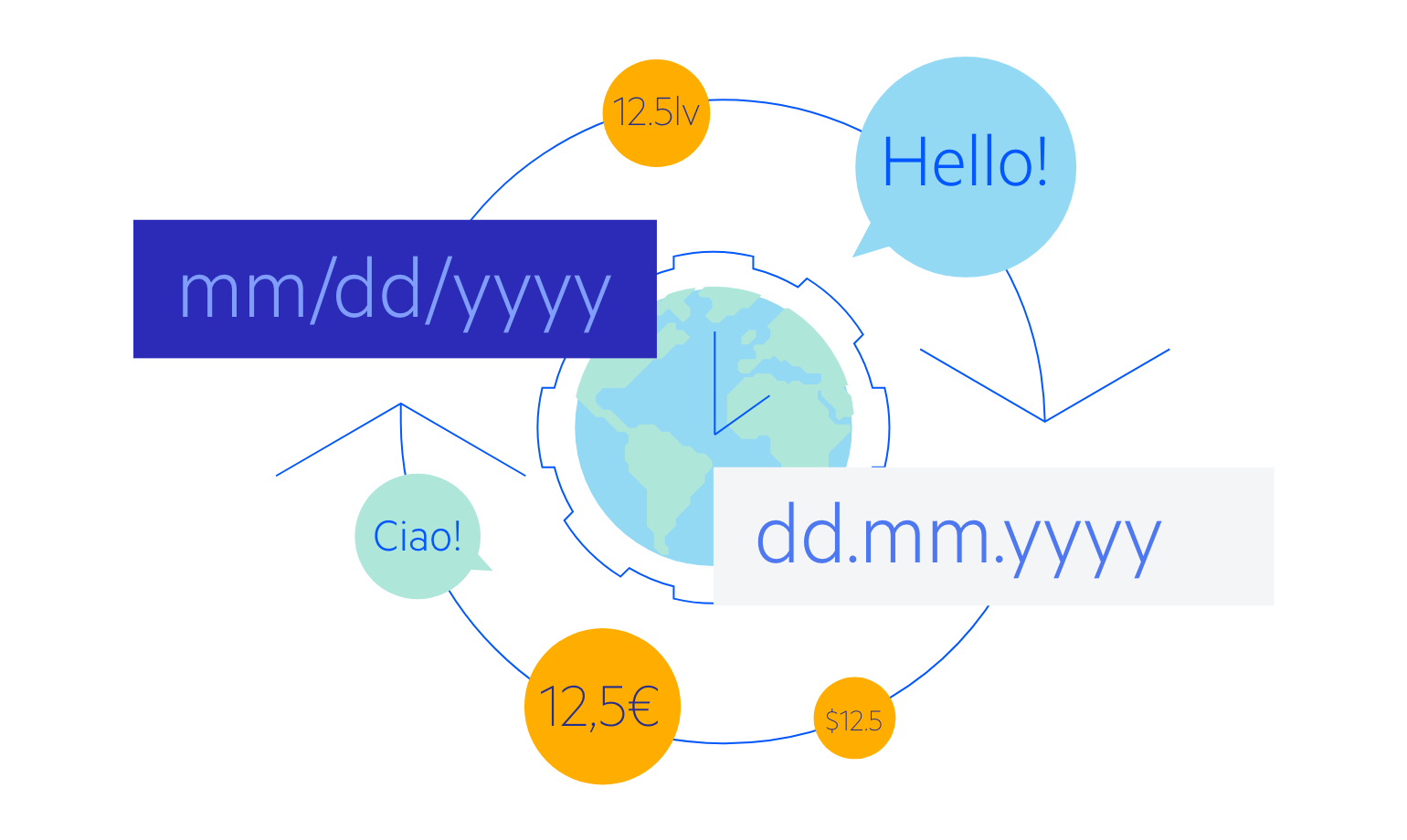
-
Accessibility
The ASP.NET AJAX DateRangePicker is compliant with Section 508 and follows all WCAG 2.1 guidelines to satisfy the needs of all users.
-
Keyboard Navigation
The Telerik UI for ASP.NET AJAX DateRangePicker is one of the many components in the UI suite with out-of-the-box keyboard navigation support. This allows users to easily navigate the component using only their keyboard. To see the supported keys and user actions, check out this demo.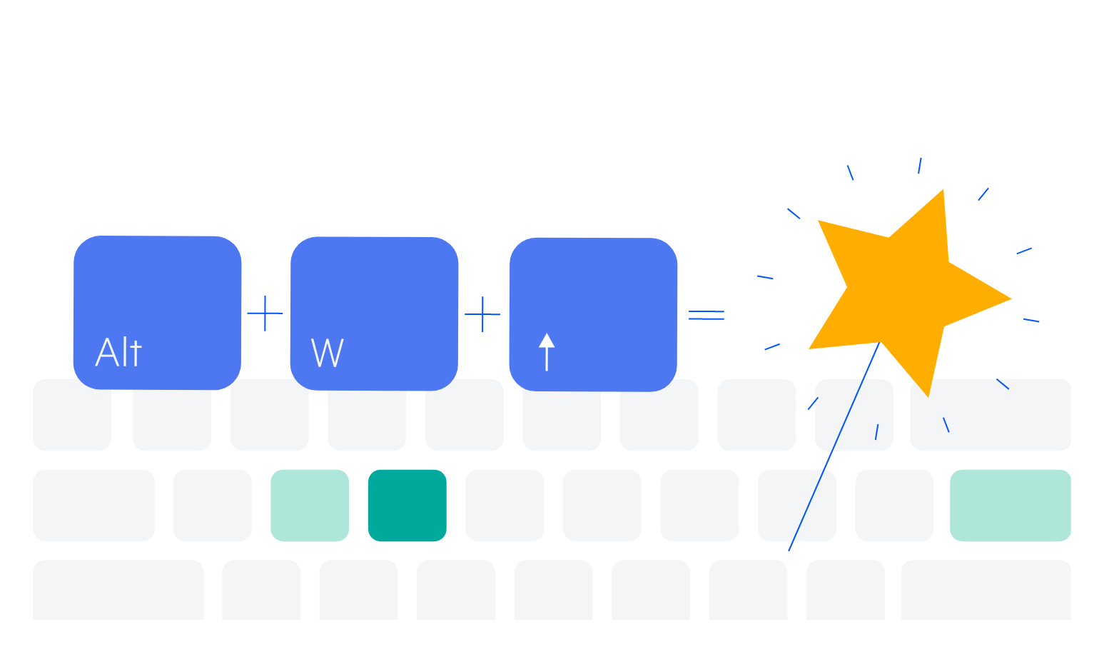
-
Appearance and Styling
The ASP.NET AJAX DateRangePicker comes with multiple built-in skins that allow you to control the overall look-and-feel of the component and tailor it to fit your design requirements. If you want to further customize the component’s appearance, you can use the Progress SASS ThemeBuilder or add your own CSS styling.
