New to Telerik UI for .NET MAUI? Start a free 30-day trial
.NET MAUI TabView Header Styling
Updated over 1 year ago
The TabView control provides the built-in HeaderStyle property, which allows you to apply styling properties to the TabViewHeader.
The following table summarizes the properties that you can apply to the TabViewHeader:
| Property | Description |
|---|---|
BackgroundColor (Color) | Specifies the background color of the header area. |
BorderColor (Color) | Specifies the border color of the header area. |
BorderThickness (Thickness) | Specifies the border thickness of the header area. |
CornerRadius (Thickness) | Specifies the corner radius of the header area. |
ContentPadding (Thickness) | Specifies the padding of the inner content of the header area. |
Spacing (double) | Specifies the spacing in pixels between the header items in the header area. |
SelectedIndex (int) | Specifies the index of the currently selected item in the header area. |
IsScrollable (bool) | Specifies whether the header area can be scrolled with a pan gesture. |
Orientation (enum of type Telerik.Maui.Controls.TabViewScrollOrientation) | Specifies the scroll orientation of the header area. The available options are Horizontal and Vertical. |
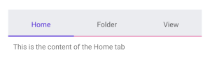
The example below shows how to style the header of the TabView:
XAML
<telerik:RadTabView x:Name="tabView">
    <telerik:RadTabView.HeaderStyle>
        <Style TargetType="telerik:TabViewHeader">
            <Setter Property="BackgroundColor" Value="#EBECF0" />
            <Setter Property="BorderColor" Value="#e05194" />
        </Style>
    </telerik:RadTabView.HeaderStyle>
    <telerik:TabViewItem HeaderText="Home">
        <Label Margin="10" Text="This is the content of the Home tab" />
    </telerik:TabViewItem>
    <telerik:TabViewItem HeaderText="Folder">
        <Label Margin="10" Text="This is the content of the Folder tab" />
    </telerik:TabViewItem>
    <telerik:TabViewItem HeaderText="View">
        <Label Margin="10" Text="This is the content of the View tab" />
    </telerik:TabViewItem>
</telerik:RadTabView>
The example produces the following result:
For a runnable example with the TabView
HeaderStylescenario, see the SDKBrowser Demo Application and go to TabView > Styling.