New to Telerik UI for .NET MAUI? Start a free 30-day trial
.NET MAUI TabView Header Item Styling
Updated over 1 year ago
The TabView control provides the built-in HeaderItemStyle property, which allows you to apply styling properties to the TabViewHeaderItem.
The following table summarizes the properties that you can apply to the TabViewHeaderItem:
| Property | Description |
|---|---|
BackgroundColor | Specifies the background color of the header item. |
BorderColor | Specifies the border color of the header item. |
BorderThickness | Specifies the border thickness of the header item. |
CornerRadius | Specifies the corner radius of the header item. |
ContentPadding | Specifies the padding of the inner content of the header item. |
TextColor | Specifies the color of the text in the header item. |
FontFamily | Specifies the font family of the text in the header item. |
FontSize | Specifies the font size of the text in the header item. |
FontAttributes | Specifies the font attributes of the text in the header item. |
TextDecorations | Specifies the decorations of the text in the header item. |
HorizontalTextAlignment | Specifies the horizontal alignment of the text in the header item. |
VerticalTextAlignment | Specifies the vertical alignment of the text in the header item. |
ImageSource | Specifies the source of the image icon in the header item. |
ImageAspect | Specifies the aspect of the image icon in the header item. |
ImageWidth | Specifies the width of the image icon in the header item. |
ImageHeight | Specifies the height of the image icon in the header item. |
ImageSpacing | Specifies the spacing between the image icon and the text in the header item. |
ImagePosition | Specifies the position of the image icon relative to the text (Left, Top, Right, and Bottom). |
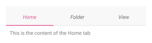
The example below shows how to style the header item of the TabView:
XAML
<telerik:RadTabView x:Name="tabView">
    <telerik:RadTabView.HeaderItemStyle>
        <Style TargetType="telerik:TabViewHeaderItem">
            <Setter Property="FontAttributes" Value="Italic"/>
            <Setter Property="TextColor" Value="#99000000" />
            <Setter Property="VisualStateManager.VisualStateGroups">
                <VisualStateGroupList>
                    <VisualStateGroup Name="CommonStates">
                        <VisualState Name="Normal" />
                        <VisualState Name="Disabled">
                            <VisualState.Setters>
                                <Setter Property="TextColor" Value="#61000000" />
                            </VisualState.Setters>
                        </VisualState>
                        <VisualState Name="Selected">
                            <VisualState.Setters>
                                <Setter Property="TextColor" Value="#e05194" />
                                <Setter Property="BorderColor" Value="#e05194" />
                            </VisualState.Setters>
                        </VisualState>
                    </VisualStateGroup>
                </VisualStateGroupList>
            </Setter>
        </Style>
    </telerik:RadTabView.HeaderItemStyle>
    <telerik:TabViewItem HeaderText="Home">
        <Label Margin="10" Text="This is the content of the Home tab" />
    </telerik:TabViewItem>
    <telerik:TabViewItem HeaderText="Folder">
        <Label Margin="10" Text="This is the content of the Folder tab" />
    </telerik:TabViewItem>
    <telerik:TabViewItem HeaderText="View">
        <Label Margin="10" Text="This is the content of the View tab" />
    </telerik:TabViewItem>
</telerik:RadTabView>
The example produces the following result:
For a runnable example with the TabView
HeaderItemStylescenario, see the SDKBrowser Demo Application and go to TabView > Styling.