New to Telerik UI for .NET MAUI? Start a free 30-day trial
.NET MAUI TabView Content Styling
Updated over 1 year ago
The TabView control provides the built-in ContentStyle property, which allows you to apply styling properties to the TabViewContent.
You can use the following properties to style the content of the TabView:
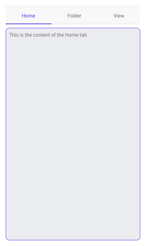
BackgroundColor(Color)—Specifies the background color of the content.BorderColor(Color)—Specifies the border color of the content.BorderThickness(Thickness)—Specifies the border thickness of the content.CornerRadius(Thickness)—Specifies the corner radius of the content.ContentPadding(Thickness)—Specifies the padding of the inner content of the content.
The example below shows how to style the content of the TabView.
XAML
<telerik:RadTabView x:Name="tabView"
                    HeaderSpacing="10">
    <telerik:RadTabView.ContentStyle>
        <Style TargetType="telerik:TabViewContent">
            <Setter Property="BackgroundColor" Value="#EBECF0" />
            <Setter Property="BorderColor" Value="#623FEA" />
            <Setter Property="BorderThickness" Value="1" />
            <Setter Property="CornerRadius" Value="10"/>
        </Style>
    </telerik:RadTabView.ContentStyle>
    <telerik:TabViewItem HeaderText="Home">
        <Label Margin="10" Text="This is the content of the Home tab" />
    </telerik:TabViewItem>
    <telerik:TabViewItem HeaderText="Folder">
        <Label Margin="10" Text="This is the content of the Folder tab" />
    </telerik:TabViewItem>
    <telerik:TabViewItem HeaderText="View">
        <Label Margin="10" Text="This is the content of the View tab" />
    </telerik:TabViewItem>
</telerik:RadTabView>
The example produces the following result:
For a runnable example with the TabView
ContentStylescenario, see the SDKBrowser Demo Application and go to TabView > Styling.