.NET MAUI GridSplitter Overview
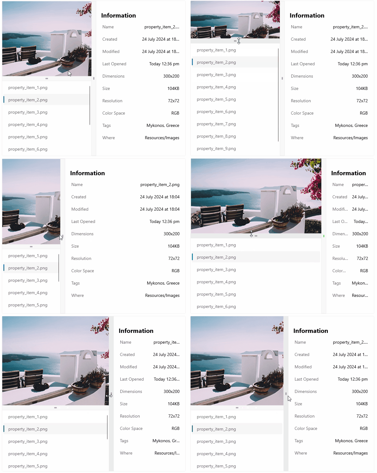
The Telerik UI for .NET MAUI GridSplitter lets users resize rows or columns in a Grid layout by dragging a splitter. This is useful when you want the layout to adapt to different content sizes or when you want users to control how much space each region receives.
 Start Free Trial
The GridSplitter automatically detects the target rows or columns that it should resize based on its position in the Grid. You can also control whether it resizes rows or columns and which neighboring definitions it adjusts while the user drags it.
When Should You Use a GridSplitter
Use a GridSplitter when you want to:
- Let users resize panels, content areas, or navigation regions in a
Grid. - Adjust the space between columns or rows without rebuilding the layout.
- Support dashboard, master-detail, or side-by-side content layouts that benefit from manual resizing.
How Does GridSplitter Placement Work
You can place the GridSplitter in different ways depending on the layout you want:
- Put it in its own row when the splitter resizes rows.
- Put it in its own column when the splitter resizes columns.
- Place it in the same cell as another control when you want the splitter to share space with existing content.
- Add it as the last element in the
Gridwhen you want it to appear on top of another control in the same cell.
In most layouts, a horizontal GridSplitter resizes rows and a vertical GridSplitter resizes columns.
Key Features of the .NET MAUI GridSplitter
Use the following articles to configure the main GridSplitter capabilities:
- Resize behavior—Controls which columns or rows are resized relative to the splitter position.
- Resize direction—Controls whether the GridSplitter resizes rows or columns.
- Visual states—Changes the appearance of the control based on its state, for example when it is disabled or hovered.
- Styling API—Customizes the background, border, gripper color, and other visual properties.
Next Steps
Use the following resources to continue:
- Get started with the Telerik UI for .NET MAUI GridSplitter
- Configure GridSplitter resize behavior and direction
- Style the Telerik UI for .NET MAUI GridSplitter