.NET MAUI GridSplitter Configuration
The GridSplitter control provides set of properties to configure its parent element, resize direction and resize behavior.
Parent Element
You can use the ParentLevel (int) property to specify the level of the parent grid to resize.
Resize Direction
You can control whether the GridSplitter control resizes rows or columns by using the ResizeDirection (enum of type Telerik.Maui.Controls.RadGridSplitter.GridResizeDirection) property.
The following options are supported:
- (Default)
Auto—Determines whether to resize rows or columns based on its alignment (based on the value of theHorizontalOptionsandVerticalOptionsproperties) and width compared to height. Columns—Resizes columns when dragging the splitter.Rows—Resize rows when dragging the splitter.
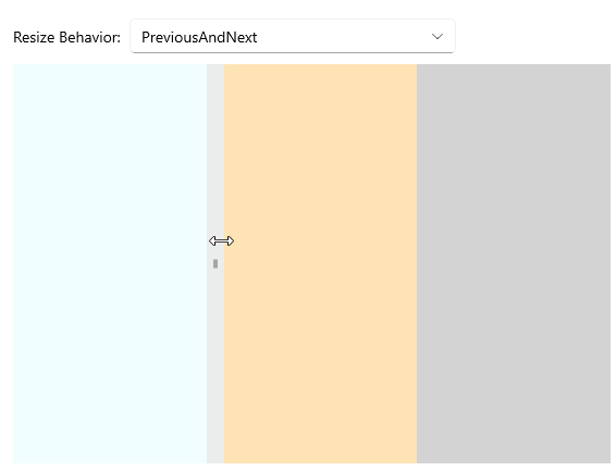
Resize Behavior
You can control which columns or rows are resized relative to the column or row for which the GridSplitter control is defined by using the ResizeBehavior (enum of type Telerik.Maui.Controls.RadGridSplitter.GridResizeBehavior) property.
The following options are supported:
- (Default)
BasedOnAlignment—Determines whichGridcolumns or rows to resize based on its alignment (based on the value of theHorizontalAlignmentandVerticalAlignmentproperties). CurrentAndNext—Resizes the current and nextGridcolumns or rows. For a horizontal GridSplitter, space is redistributed between the row that is specified for the GridSplitter and the next row that is below it. For a vertical GridSplitter, space is redistributed between the column that is specified for the GridSplitter and the next column that is to the right.PreviousAndCurrent—Resize the previous and currentGridcolumns or rows. For a horizontal GridSplitter, space is redistributed between the row that is specified for the GridSplitter and the row that is above it. For a vertical GridSplitter, space is redistributed between the column that is specified for the GridSplitter and the column that is to the left.PreviousAndNext—Resize the previous and nextGridcolumns or rows. For a horizontal GridSplitter, space is redistributed between the rows that are above and below the row that is specified for the GridSplitter. For a vertical GridSplitter, space is redistributed between the columns that are to the left and right of the column that is specified for the GridSplitter.
Here is an example of how to set the ResizeBehavior correctly.
1. Define the GridSplitter in XAML:
<Grid RowSpacing="10">
    <Grid.RowDefinitions>
        <RowDefinition Height="Auto" />
        <RowDefinition />
    </Grid.RowDefinitions>
    <Grid ColumnDefinitions="Auto, *"
          ColumnSpacing="8">
        <Label Text="Resize Behavior: "
               VerticalTextAlignment="Center" />
        <telerik:RadComboBox x:Name="comboRB"
                             Grid.Column="1"
                             SelectedItem="{Binding ResizeBehavior, Source={x:Reference gridSplitter}}"
                             WidthRequest="{OnPlatform MacCatalyst=300, WinUI=300}"
                             HorizontalOptions="{OnPlatform MacCatalyst=Start, WinUI=Start}" />
    </Grid>
    <Grid Grid.Row="1">
        <Grid.ColumnDefinitions>
            <ColumnDefinition />
            <ColumnDefinition Width="Auto" />
            <ColumnDefinition />
            <ColumnDefinition />
        </Grid.ColumnDefinitions>
        <Label Background="Azure"
               HorizontalTextAlignment="Center"
               VerticalTextAlignment="Center" />
        <Label Grid.Column="2"
               Background="Moccasin"
               HorizontalTextAlignment="Center"
               VerticalTextAlignment="Center" />
        <Label Grid.Column="3"
               Background="LightGray"
               HorizontalTextAlignment="Center"
               VerticalTextAlignment="Center" />
        <telerik:RadGridSplitter x:Name="gridSplitter"
                                 Grid.Column="1"
                                 VerticalOptions="Fill"
                                 HorizontalOptions="Start"
                                 ResizeBehavior="PreviousAndNext" />
    </Grid>
</Grid>
2. Add the telerik namespace:
xmlns:telerik="http://schemas.telerik.com/2022/xaml/maui"This is the result on WinUI:
For a runnable example with the GridSplitter
ResizeDirectionscenario, see the SDKBrowser Demo Application and go to GridSplitter > Features category.