New to Telerik UI for .NET MAUI? Start a free 30-day trial
.NET MAUI Button Styling
Updated on Jan 2, 2026
The Button provides a set of styling options by exposing properties for customizing its visual appearance.
Styling the Button
To style the Button, you can use the following properties:
Background(Brush)—Specifies the background brush of the control.BackgroundColor(Color)—Specifies the background color of the control.BorderColor(Color)—Specifies the border color of the control.BorderThickness(Thickness)—Specifies the border thickness of the control. IfBorderWidthproperty is set, it will be used with higher precedence and will override the value of theBorderThickness.BorderWidth(double)—Specifies the width of the border, in device-independent units.CornerRadius(CornerRadius)—Specifies the corner radius of the control.TextColor(Color)—Specifies the color of theButton.Text.
Example
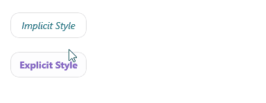
The following example demonstrates how to apply styling to the RadButton.
1. Define the Button in XAML:
XAML
<VerticalStackLayout Spacing="20" HorizontalOptions="{OnPlatform Default=Start, Android=Center, iOS=Center}">
    <telerik:RadButton Text="Implicit Style" />
    <telerik:RadButton Text="Explicit Style"
                       Style="{StaticResource ButtonStyle}" />
</VerticalStackLayout>
2. Add the telerik namespace:
XAML
xmlns:telerik="http://schemas.telerik.com/2022/xaml/maui"3. Define the resources for explicit button style:
XAML
<Style x:Key="ButtonStyle" TargetType="telerik:RadButton">
    <Setter Property="Padding" Value="12, 8" />
    <Setter Property="CornerRadius" Value="12" />
    <Setter Property="FontAttributes" Value="Bold" />
    <Setter Property="TextColor" Value="#8660C5" />
    <Setter Property="VerticalContentAlignment" Value="Center" />
    <Setter Property="HorizontalContentAlignment" Value="Center" />
    <Setter Property="BorderColor" Value="#DFDFDF" />
    <Setter Property="BorderThickness" Value="1" />
    <Setter Property="Background" Value="White" />
    <Setter Property="VisualStateManager.VisualStateGroups">
        <Setter.Value>
            <VisualStateGroupList>
                <VisualStateGroup Name="CommonStates">
                    <VisualState Name="Normal" />
                    <VisualState Name="PointerOver">
                        <VisualState.Setters>
                            <Setter Property="Background" Value="#F2EFF9" />
                        </VisualState.Setters>
                    </VisualState>
                    <VisualState Name="Pressed">
                        <VisualState.Setters>
                            <Setter Property="TextColor" Value="#998660C5" />
                            <Setter Property="Background" Value="#F2EFF9" />
                        </VisualState.Setters>
                    </VisualState>
                    <VisualState Name="Disabled">
                        <VisualState.Setters>
                            <Setter Property="TextColor" Value="#618660C5" />
                        </VisualState.Setters>
                    </VisualState>
                </VisualStateGroup>
            </VisualStateGroupList>
        </Setter.Value>
    </Setter>
</Style>
4. Define the resources for implicit button style:
XAML
<Style TargetType="telerik:RadButton">
    <Setter Property="Padding" Value="12, 8" />
    <Setter Property="CornerRadius" Value="12" />
    <Setter Property="FontAttributes" Value="Italic" />
    <Setter Property="VerticalContentAlignment" Value="Center" />
    <Setter Property="HorizontalContentAlignment" Value="Center" />
    <Setter Property="TextColor" Value="#00897B" />
    <Setter Property="BorderColor" Value="#DFDFDF" />
    <Setter Property="BorderThickness" Value="1" />
    <Setter Property="Background" Value="White" />
    <Setter Property="VisualStateManager.VisualStateGroups">
        <Setter.Value>
            <VisualStateGroupList>
                <VisualStateGroup Name="CommonStates">
                    <VisualState Name="Normal" />
                    <VisualState Name="PointerOver">
                        <VisualState.Setters>
                            <Setter Property="Background" Value="#E8F5F4" />
                        </VisualState.Setters>
                    </VisualState>
                    <VisualState Name="Pressed">
                        <VisualState.Setters>
                            <Setter Property="TextColor" Value="#9900897B" />
                            <Setter Property="Background" Value="#E8F5F4" />
                        </VisualState.Setters>
                    </VisualState>
                    <VisualState Name="Disabled">
                        <VisualState.Setters>
                            <Setter Property="TextColor" Value="#6100897B" />
                        </VisualState.Setters>
                    </VisualState>
                </VisualStateGroup>
            </VisualStateGroupList>
        </Setter.Value>
    </Setter>
</Style>
This is the result on WinUI:
For a runnable example demonstrating the Button Styling, see the SDKBrowser Demo Application and go to the Button > Features category.