New to Telerik UI for .NET MAUI? Start a free 30-day trial
Creating Circular Buttons
Updated over 1 year ago
Environment
| Product | Progress® Telerik® UI for .NET MAUI Button |
| Product Version | 0.2.0 |
Description
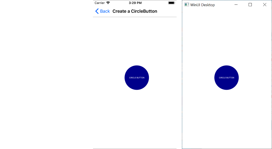
How can I create a circular Button based on the Button control for my Telerik UI for .NET MAUI project?
Solution
To create a circular button with the Telerik UI for .NET MAUI Button, adjust its Width, Height, and CornerRadius properties in the following way:
- Set
Widthas equal toHeight. - Set
CornerRadiusas half of theWidth/Heightvalue.
The following example demonstrates how to implement the suggested approach.
XAML
<telerik:RadButton WidthRequest="120"
   			   HeightRequest="120"
   			   Text="Circle Button"
   			   FontSize="Micro"
   			   TextColor="White"
   			   BackgroundColor="DarkBlue"
CornerRadius="60" />- Add the namespace:
XAML
xmlns:telerik="http://schemas.telerik.com/2022/xaml/maui"The following image shows the end result.