New to Telerik UI for .NET MAUI? Start a free 30-day trial
.NET MAUI Border Corner Radius
Updated on Sep 14, 2026
Telerik UI for .NET MAUI Border enables you to set a different corner radius to its angles through the CornerRadius property.
The CornerRadius property represents the degree to which the corners of the Border are rounded. CornerRadius is of the Microsoft.Maui.Thickness type.
XAML
<telerik:RadBorder BorderColor="#04A2AA"
                   CornerRadius="0, 8, 0, 0"
                   BorderThickness="1">
    <Label Text="Hello!" Margin="8" />
</telerik:RadBorder>
<telerik:RadBorder BorderColor="#04A2AA"
                   CornerRadius="0, 0, 8, 8"
                   BorderThickness="1">
    <Label Text="How can I help you today?" Margin="8" />
</telerik:RadBorder>
The following image shows the result from that implementation.
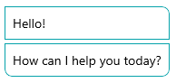
Additionally, the wrapped content will be clipped according to the specified corner radius of each side.
The example below demonstrates how to render a circle image by wrapping an Image control in a Border.
Let's use the following Image:

XAML
<telerik:RadBorder BorderColor="#04A2AA"
                   CornerRadius="16"
                   WidthRequest="32"
                   HeightRequest="32"
                   BorderThickness="2"
                   VerticalOptions="Start">
    <Image Source="person_01.png"
           WidthRequest="32"
           HeightRequest="32" />
</telerik:RadBorder>
Here is the result: