What You Need to Know About Logo Design (with 15 Examples)

Summarize with AI:
Thinking about offering logo design services to clients? Before you do, make sure you’re well-acquainted with everything that goes into a great logo. From the different ways to piece a logo together to the principles that drive effective logo design, this post has you covered.
What do you do when a new client comes to you with no logo or with one that’s going to stick out like a sore thumb compared to the digital product you build for them? You might be tempted to hand them over to a graphic designer who can create a new logo for them. But why do that?
There are three things you need in order to design a great logo:
- A crystal-clear understanding of your client’s brand and identity
- Deep knowledge of their target audience
- Information on the competitive landscape (especially as it pertains to their visual branding)
Regardless of what type of products you build, you have to gather this information together anyway. So why not leverage it to design a logo for them as well? They’ll probably end up with a better design if the same designer works on all of their assets anyway.
If you’re thinking about adding logo design to your offering, here’s what you need to know about designing these types of assets.
Choosing the Right Logo Type
There are a number of elements that designers bring together to create the perfect logo for a brand:
- Wording
- Typography
- Color
- Imagery
- White space
Unlike a website or app where you’d incorporate all of these elements, that’s not the case for logos. To better understand why this is, let’s take a look at the eight different types of logo formats:
1. Pictorial Marks
Pictorial mark logos consist only of an image. Specifically, the image represents a recognizable object.
For example, this is the pictorial mark logo for Acorns:

The logo is a bright green acorn. However, it’s not a continuous illustration of an acorn. It’s two solid pieces—the cap and the nut—separated by white space. Thanks to the UX laws of proximity and closure, users’ eyes won’t see these two pieces as separate units. Instead, they see one whole acorn.
These types of logos are good for companies with names of real-world objects. Like Acorns, Apple or Target.
2. Mascot Logos
Mascot logos are a type of pictorial mark. Instead of representing inanimate objects, however, these logo designs represent animals or people that stand in for the brand.
Like the logo for the Philadelphia Eagles:
Mascot logos work well for team sports, but can also be used for brands with mascots that get lots of airtime or have long-standing relationships with the brand. Starbucks’s mermaid and MailChimp’s monkey are good examples of this.
3. Abstract Marks
Abstract marks are similar to pictorial marks in that they’re standalone graphics. However, they don’t represent recognizable objects or personas. Instead, they’re uniquely crafted shapes and layouts that represent a brand and nothing else.
The Mastercard logo is a good example:
This logo design does represent a shape that many people might recognize—a Venn diagram. However, there’s no counterpart for it in our physical world which makes its shape and color combination uniquely specific to Mastercard.
Pepsi’s colorful orb as well as Nike’s swoosh are other examples of abstract marks.
4. Combination Marks
Combination marks bring together a graphical logo design with lettering. What’s nice about this option is it offers a lot of flexibility. The brand can use the full logo design as Feedly does here:
On the other hand, brands can tear the two components apart. Typically, this is done when the logo has to appear in a smaller space—like in the browser tab, as a social media account icon or representing the app on users’ home screens.
The key to making this type of logo work is to keep the typography simple and to pair it with a unique graphic. There are countless examples of companies whose logos are combination marks.
5. Emblem Logos
Emblem logos may combine numerous elements within a circular shape or seal. They could be strictly typographical like in the example of Jersey Mike’s:
In other cases, they include graphics. It depends on the type of emblem as well as the brand it represents. For instance, if it’s meant to look more vintage or medieval, the design might resemble a coat of arms. If it’s meant to look more formal or traditional, it might resemble a seal or stamp.
Look at older beer companies like Samuel Adams or universities with lengthy histories and you’re bound to find emblem logos.
6. Wordmarks
Wordmarks (or logotypes) are logos without any graphics. The typographical element is the full name of the brand. For example, this is Pandora’s wordmark:
Wordmarks are effective for so many types of brands. If you’re feeling stuck in coming up with a matching graphic for your logo, this would be a good option.
Wordmarks are also a good choice for brands that have powerful name recognition. Coca-Cola and Disney are good examples of brands that need no visual representation to make their logos or names stand out.
7. Lettermarks
Lettermarks (or monogram logos) are also logos without graphics. Unlike wordmarks that spell out the name of a brand, lettermarks are abbreviated versions of brand names.
For example, the London Symphony Orchestra uses the letters “LSO” in its lettermark design:
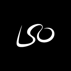
What’s neat about this design is it’s actually a lettermark and abstract mark. The stylized font reads “LSO.” However, the swoops of the lettering are intentionally drawn in the shape of someone conducting an orchestra.
Lettermarks don’t need to be fancy or abstract in order to be effective. Organizations like The Wall Street Journal (WSJ) and the American Society for the Prevention of Cruelty to Animals (ASPCA) have unstylized lettermarks when compared to LSO’s. And, yet, people have no problem remembering their brand names.
8. Letterforms
Letterforms are an even more abbreviated version of a wordmark. They contain just a single letter—typically, it’s the first letter in the company’s name.
For example, the Publix letterform is a lowercase, rounded “p” inside of a green circle:

Just as lettermarks and wordmarks are good for a wide variety of brands, so too are letterforms.
However, I also think they’re a good option when you need a shortened version of your logo for tight spaces. Letterforms like Publix’s with the original-looking rounded font are the most effective because they’ll be easier to pick out from other logos in open browser tabs, while scrolling through social media or checking one’s email inbox.
The Principles of Good Logo Design
In addition to following the UX laws you use to design digital products, there are principles specific to logo design to keep in mind:
Simple
A logo should be simple enough to immediately understand what it says or what it represents. Like the Sidecar Health logo:

No one is going to struggle to read the wordmark piece of the logo. And even if they’ve never seen a sidecar before, the pictorial part of the logo can’t be misinterpreted for anything else.
Memorable
A logo should be memorable enough where, no matter how many distractions there are, users or followers of the brand would instantly notice it in a crowd. The logo for Gaiam is memorable mostly because of its mandala pictorial mark:
Yoga acolytes and mindfulness fanatics will have no problem remembering who this company is or what kinds of products it sells because of this symbol.
Original
A logo should be original enough so it can’t be confused with any other logos, especially direct competitors’ logos. You saw the Pandora wordmark above. Now take a look at the logo used in the app:
![]()
Compared to common mobile apps that seem to use similar colors and shapes, this one screams for attention with its unique design choices.
Modern
A logo should be modern enough that people won’t start wondering when the logo was designed and why no one has updated it recently. Banfield Pet Hospital’s logo is a good example of modern logo design:

Not only is this a clean and well-designed combination mark, the pictorial has hidden shapes in it. At first glance, customers might not notice them. But when they do, the dog and cat shapes are sure to make them smile.
Relevant
A logo should be relevant enough where users nod their heads in agreement at the font, color and graphic choices. The logo for Visit Jacksonville is a great example:
The handwritten font gives Jacksonville and the beach towns alongside it a casual, relaxed vibe. And the diacritical marks over the “o” look a lot like the sunrises here (which cities on this side of Florida are known for).
Harmonious
A logo should be harmonious in terms of layout and color. A logo that feels out of balance can make people looking at it feel out of balance. Look to Zoho for an example:
Zoho’s logo achieves balance and harmony despite being a totally original design compared to SaaS alternatives that tend to take safer approaches to logo design.
Versatile
A logo should be versatile enough that the logo can be used consistently throughout the brand’s digital and physical channels. Or, at the very least, can be slightly modified and still be recognizable. WeVideo does this well:

When designing a logo, you have to consider all of the places it might appear—e.g., the top corner of a website, the browser favicon, smartphone or tablet home screens, social media account pages, physical merchandise, digital assets, etc. You also have to think about the color context as well and to come up with alternatives so the logo can be used wherever it’s needed.
Wrap-up
Logos aren’t some superficial branding matter that only the head honchos of corporations are concerned with. Logo design can impact the success of any product, marketing campaign or rebranding effort. (Remember these recent rebranding fails?)
When starting a new logo design, it’s important to do your research—on the brand, their target user, as well as the existing market. If the logo stands out like a sore thumb, if it blends in a little too seamlessly to the crowd, or if it simply rubs users the wrong way, it could have a negative impact on a brand’s reputation and success.

Suzanne Scacca
A former project manager and web design agency manager, Suzanne Scacca now writes about the changing landscape of design, development and software.

