
Using Your Organization’s Theme with Your Telerik and Kendo UI Components

Summarize with AI:
Implement your organization’s brand styles onto your existing (or new) Telerik or Kendo UI components with ease using Progress ThemeBuilder.
For any web-based application (and “any” platform means Angular, React, Vue, ASP.NET, Blazor or plain old JavaScript) it’s easy to style the Progress Kendo UI components using the pre-defined Progress Telerik styles (and, thanks to Progress’ use of SCSS, it’s also easy to customize those styles).
If your organization is using the Bootstrap, Material or Fluent design systems (from Bootstrap, Google and Microsoft, respectively) to style your webpages, then you’ll probably find that the Progress Telerik and Kendo UI components blend pretty seamlessly into your pages, just by picking the matching Progress themes. But, if your organization has its own style rules that don’t follow those design systems, you may have to do a bit of customizing.
The easiest solution to that is to use Progress’ visual editing and preview tool, ThemeBuilder to create a custom theme for your Kendo UI components that does match your organization’s styles (ThemeBuilder is also, by the way, a good choice for creating/managing your own stylesheets).
If you’ve already created stylesheets to style your Kendo UI components, there’s more good news: You can import those styles into ThemeBuilder and avoid having to start from scratch.
Creating Your Own Theme
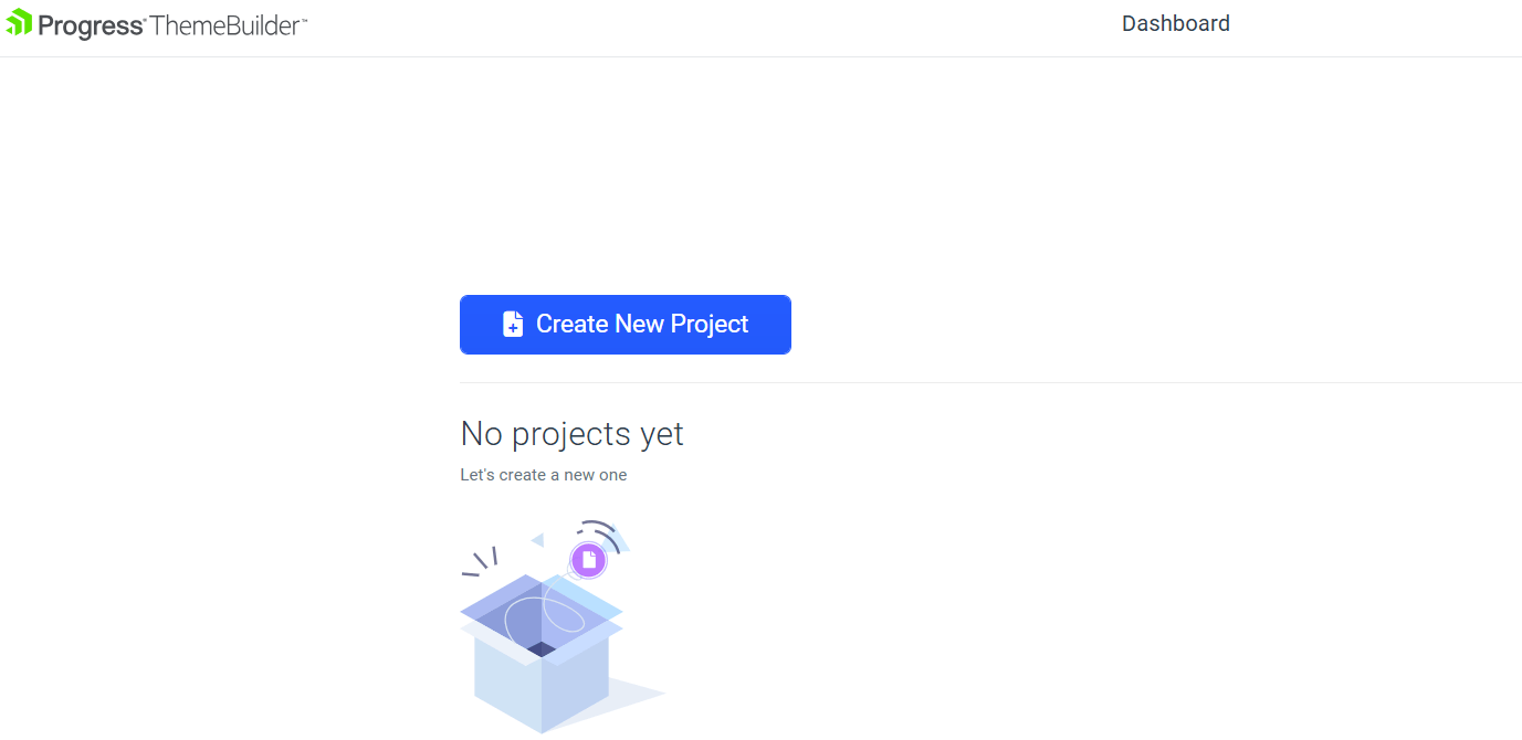
To start integrating your styles with your Kendo UI controls, first surf to the ThemeBuilder site and click on the Create New Project button.
First, from the menu that appears on the left, pick one of “Start from Kendo Theme” and “Start from Scratch.” The “from Scratch” option is a good choice if you’re using ThemeBuilder to create your own stylesheet (the “starter” project even comes with some basic features, like padding and font settings, already set up for you).
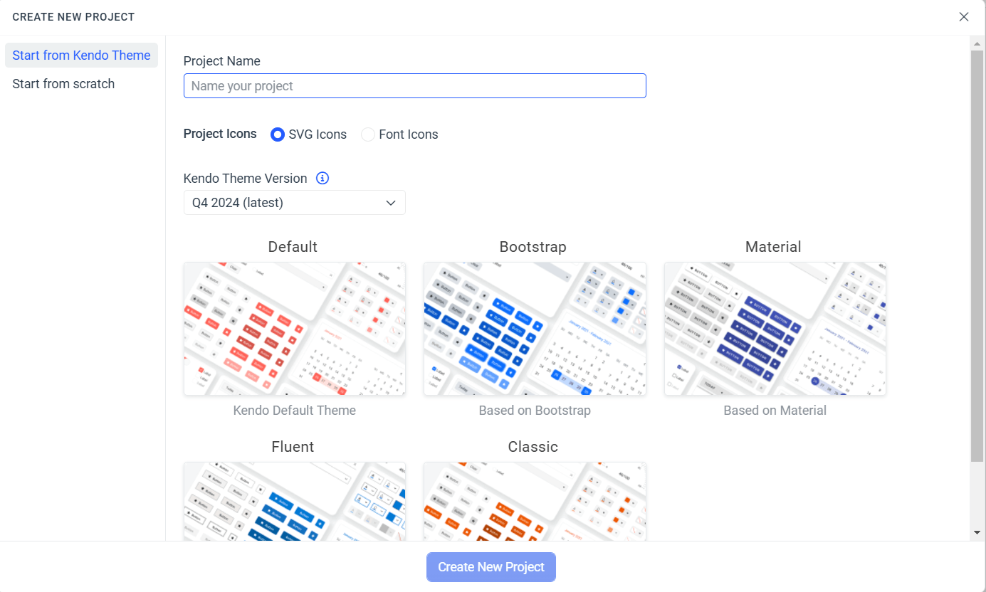
If, however, your goal is to integrate with your organization’s style with your Kendo UI components, then you’re better off with picking the “from Kendo theme” choice. Once you pick that and give your project a name, you’ve got a couple of choices to make.
SVG or Font Icons
One of the benefits of using the Kendo UI components is that they come with access to the Progress icon library. If you’re already using icons, you can mix your icons with the Telerik icons but you’ll need to configure your theme based on whether you’re using SVG or font icons.
If you’re not already committed to a set of icons, you’ll need to pick between SVG and font icons as part of creating your project (this is an either/or choice for most platforms—the one exception being Blazor, where you can intermix SVG and font icons). Don’t panic! Your choice isn’t irrevocable—you can change this choice in your project’s settings later if you need to.
When making your choice, the primary distinctions between the two types of icons are:
- Accessibility: SVG icons provide better compatibility with W3G accessibility guidelines than font icons.
- Color: Font icons are single color only; SVG icons can have multiple colors.
- Download time: Font icons are lighter weight which, if you use enough icons, can reduce download time.
Progress Telerik and Kendo UI Themes
After that choice, you can pick one of the Kendo UI themes as a start point for your project’s styles (or import any existing stylesheets you’ve already created—see the section on Migrating to ThemeBuilder, below). Obviously, picking a theme that’s closer to your organization’s existing styles will reduce the number of changes you’ll have to make later.
Probably the easiest way to determine which theme to use as your start point that is try out some of the likely looking candidate themes with one of your existing Kendo UI–enabled applications. In fact, it’s probably a good idea to pick an app to use to test your custom theme as you make changes.
In both Visual Studio and Visual Studio Code, swapping between styles can be done easily using the Telerik extensions to both of those editors. For many platforms, just tweaking the URL for the CDN version of the styles will let you try out various styles on a single app. This is all that’s required to use the current version of the default Kendo UI theme in a JavaScript app, for example:
<link rel="stylesheet"
  href="https://kendo.cdn.telerik.com/themes/10.0.1/default/default-main.css" />
Tweaking Your Theme
Once you have your project created and picked a starting theme, your project will display, giving you what may, initially, seem like an intimidating set of items that you can use to create your custom theme. Down the left-hand side of the page, for example, are all the CSS rules and settings, while the middle of the page is occupied by mockups of all the Kendo UI components (and Kendo UI has a lot of components).
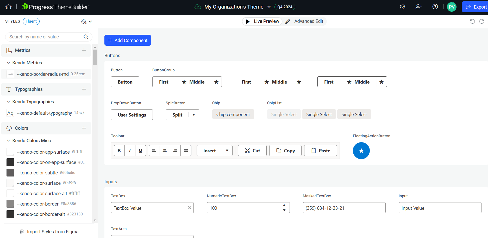
Managing Components
To get your options under control, you can reduce the number of components displayed to just the components that you’re currently using in the app where you’ll try out your custom theme (this assumes that you’re not using every Kendo UI component in that app). To reduce the number of components in your project, in the upper right corner of ThemeBuilder, click on the “checked list icon” to get a list of all of the components available to ThemeBuilder.
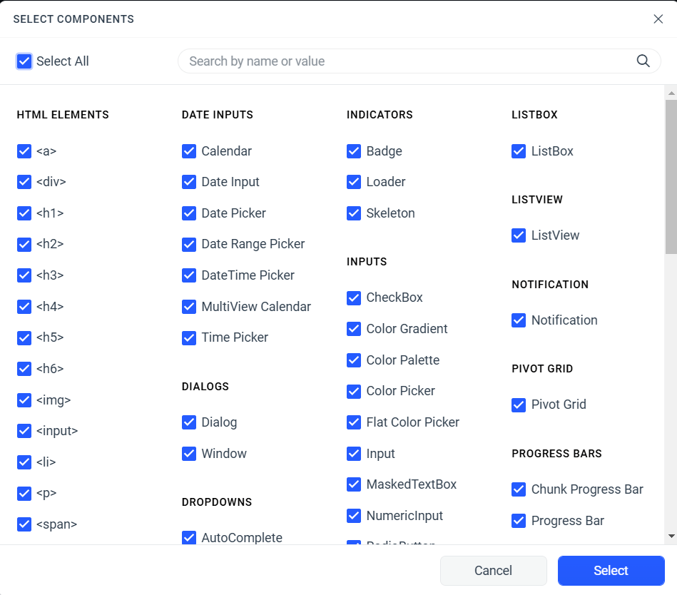
Once you have that list, uncheck the Select All checkbox in the upper left corner of the dialog, and then check just the components that you’re going to use for your sample app (finding the component you want can be daunting—use the search box on this form to find your app’s components quickly). Once you’ve picked the components you want to work with, click the Select button in the bottom right to return to ThemeBuilder with just those selected components displayed.
Fonts
If you’re using a font file in your sample app then, before you start tweaking your components’ settings, add that file to your project from the Project Settings panel (available from the cog while in the upper right corner of the ThemeBuilder page).
Once you’ve opened Project Settings panel, just select Fonts from the settings menu on the left of the panel and upload your font file (ThemeBuilder supports TTF, OTF, EOT and WOFF/WOFF2) files. The fonts in the file(s) you add will be automatically added to the list of fonts available in ThemeBuilder.
Modifying Component Styles
Your next step is to start modifying the default style you picked when creating your project. You’ll begin by modifying one of your selected components.
First, set the toggle at the top of the ThemeBuilder page to Advanced Edit and then select the component you want to change. If you want, you can just modify that component’s default style to create your custom theme. That approach does make it more difficult to return to that style, if you ever need to. If you have the Ultimate plan, after selecting a component, you can click on the three dots in the component’s upper right corner and pick Duplicate. That will create a copy of the style that you can modify, leaving the original style untouched.
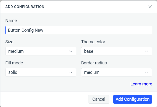
Beginning in early 2024, some components support an Add Configuration option from that same menu (adding a configuration is being extended to more components as ThemeBuilder evolves). Add Configuration lets you create and style a new component configuration (Add Configuration is only available under some licenses:
Clicking on a component (duplicated or original) or a configuration will open an editing page for modifying a component’s style settings. The main part of the page shows the component in all of its states. Down the right-hand side, a Component Parts panel holds all the style settings that apply to this component. You can change the settings in Component Settings (usually by picking from a list) and see the result immediately in the main window.
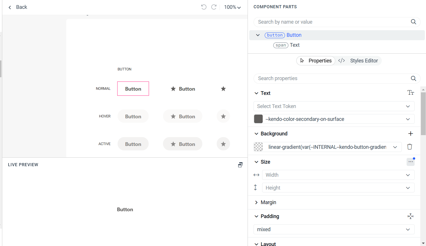
Many settings let you select from several predefined Kendo UI settings. Having said that, if the default setting isn’t right for you, it’s unlikely any of the other’s will be, either. In addition, picking a different predefined style in the Component Parts panel on the right will affect only the currently selected component’s appearance.
However, since the Progress team has used the style rules and metrics in Styles list on the left of screen consistently across their suite of components, it probably makes more sense to change the settings for the default rule already selected in the Component Styles list. Changes made in the Styles list on the left will propagate the change to every other component in your project that uses that style.
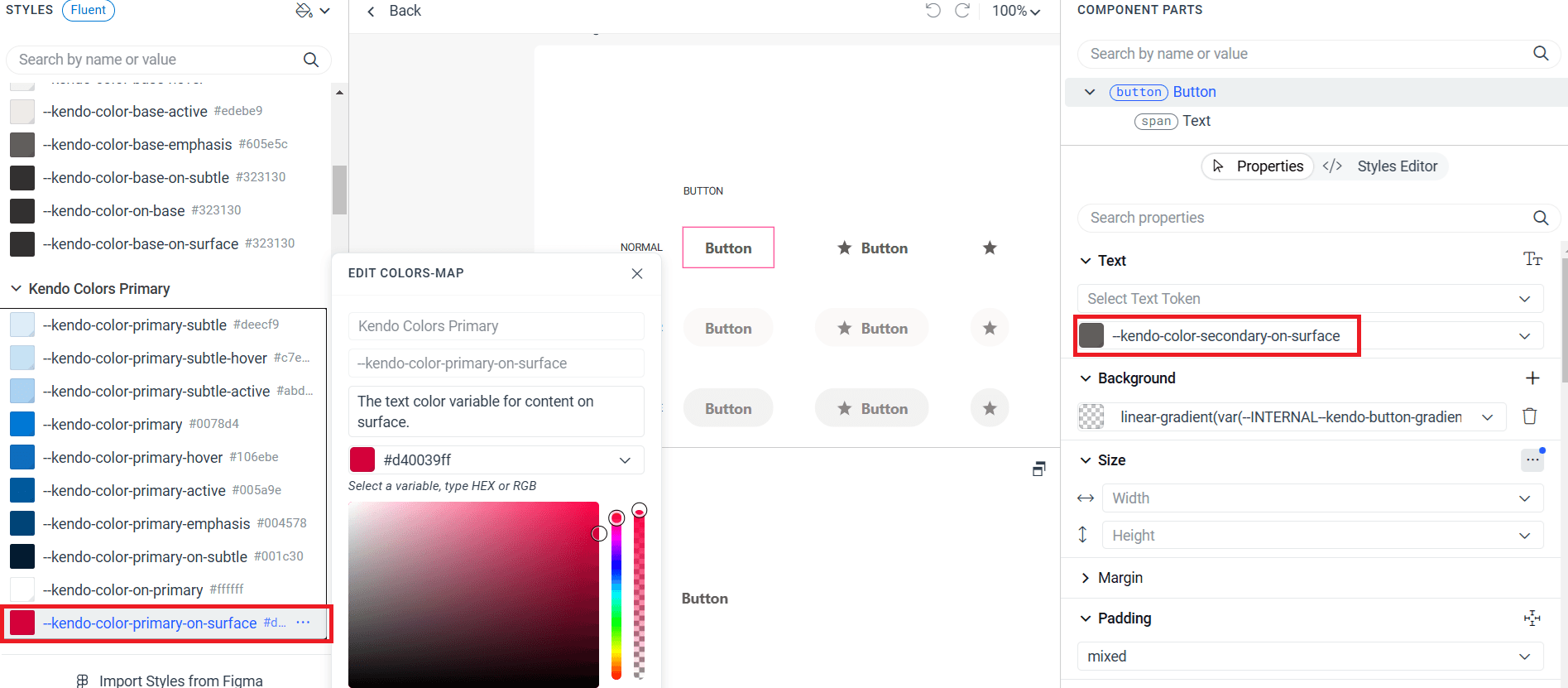
Regardless of where you make a change, you’ll notice the impact of change immediately in the main window of the live edit page. If you changed the style in the Styles list on the left, when you return to the list of all the components in your project, you’ll see the impact of changing that style on all of the components.
And of course, as you add more Kendo UI components to the inventory of components you’re managing in this project, at least some (and perhaps all) of the settings on those components will pick up the changes you’ve made to the predefined styles. Furthermore, when you use your customized stylesheet in another app, your changes will affect all the Kendo UI components in that app, not just the components referenced in your project.
Presumably (and eventually), you’ll find that your custom theme covers enough styles that adding a new component to an app doesn’t require any additional changes to your custom theme.
Migrating Existing Kendo UI Styles
To include any existing styles you’ve created outside of ThemeBuilder to style your Kendo UI components, first click on the settings cog in the upper-right corner of the ThemeBuilder window. That will open the Project Settings panel; in that panel’s left-hand menu, select External Styles. You can then click the Upload External Styles on the right to browse to your organization’s CSS files and upload them.
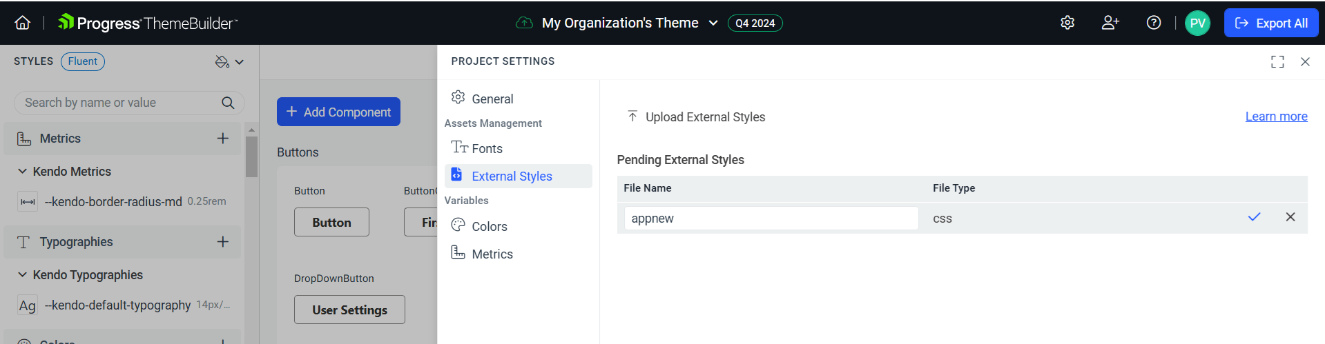
There are a few limitations with uploading an external stylesheet. You can’t, for example, upload a CSS file that uses URLs (as you might to load an image).
Once you’ve uploaded a style, you can assign it a new name (might be necessary if you have multiple stylesheets with the same name) and then click the checkmark to the right of the file name to add the stylesheet to your theme.
Deploying Your Style
Once you’ve finished with your changes, deploying your changes is easy: Click the Export All button in the upper-right corner of ThemeBuilder to generate a ZIP file with the CSS and SCSS files for your theme. You can now add those to your web app.
Set your expectations appropriately! Recognize that it’s good that deploying your custom theme is relatively easy because, odds are, you won’t get a match you’re completely happy with on your first pass. But, with ThemeBuilder, you do have all the tools you need to get your Kendo UI components to blend seamlessly with the rest of your page (or as seamlessly as you want, at any rate).
Try Progress ThemeBuilder
Poke around in ThemeBuilder with the free trial. Or explore the Telerik DevCraft bundle for a more inclusive package.

Peter Vogel
Peter Vogel is both the author of the Coding Azure series and the instructor for Coding Azure in the Classroom. Peter’s company provides full-stack development from UX design through object modeling to database design. Peter holds multiple certifications in Azure administration, architecture, development and security and is a Microsoft Certified Trainer.
Related Posts
Comments
All articles
Topics
Web MobileMobile
Desktop
Design
Productivity
People
