
Using Kendo UI Cards on an Angular Dashboard ⭐ ⭐ ⭐

Summarize with AI:
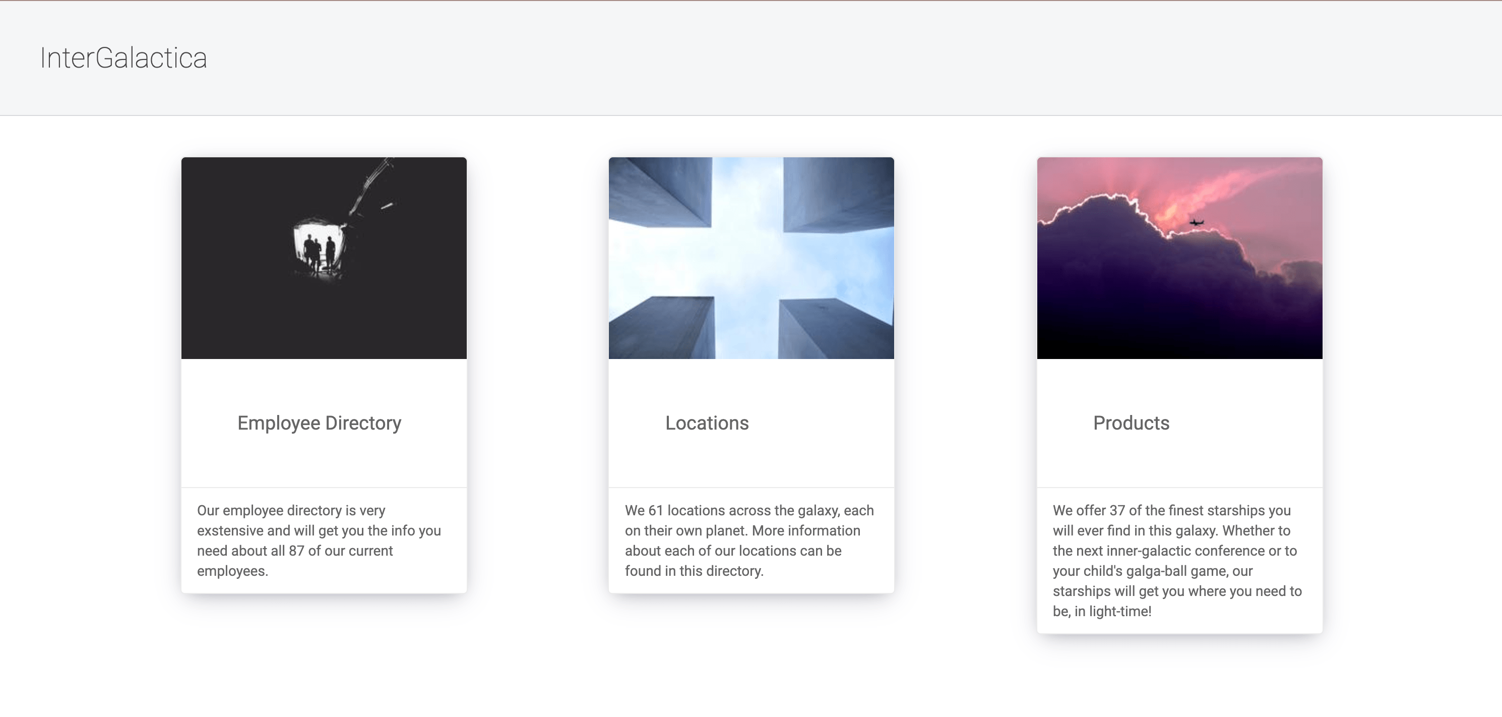
To show off one of our newer Kendo UI for Angular card components in a not-so-conventional way, I created InterGalactica,
an internal dashboard for employees to use. This dashboard will give employees access to company
locations, employees, and products.
When creating the Angular project, I used this command with these various flags to generate the application:
ng new kui-enterprise-demo --skipTests=true --style=scss --viewEncapsulation=None --routing=true
In this walk-through, I’m not using tests, so I skipped the creation of those files. I used the
style flag to generate scss files for my project. I also set viewEncapsulation to none, I
like cascading styles and don’t feel the need to keep component styles encapsulated. I also set
routing to true, so we would start off with a routes file!
Check out the finished project here on Github: https://github.com/alyssamichelle/intergalactica
Note: I used the Lorem Picsum API for images and the SWAPI for content in this project! 💜
In order to get our new project on the latest versions of the CLI and Angular, I next used this update command:
ng update @angular/cli @angular/core
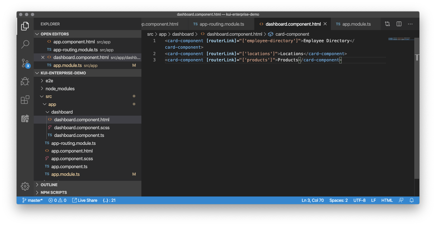
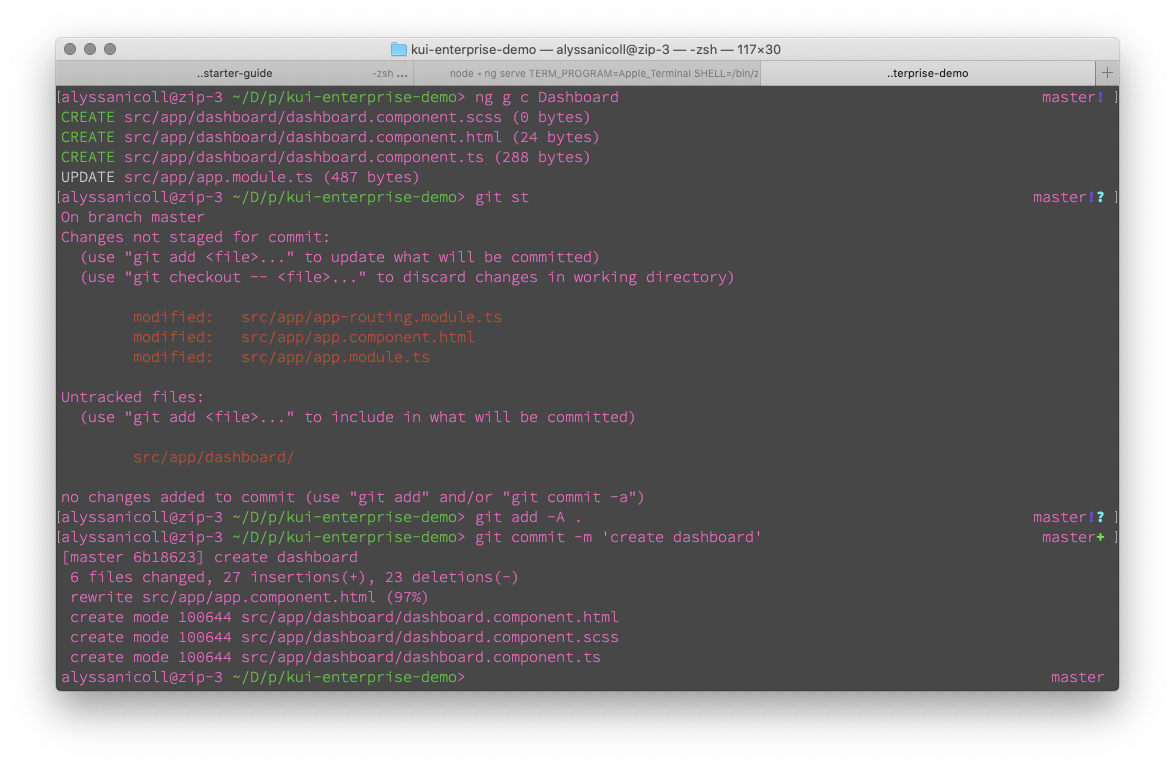
Next I created a dashboard component with the ng generate command and started mocking out
“card-components” with routes:
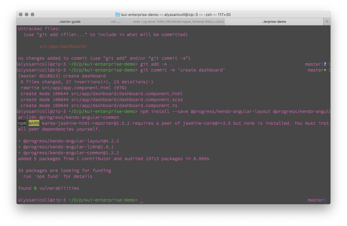
We are finally ready to get rocking with the Kendo UI Card Component!! On each one of our components, you can find an
ng add command to easily add that component and it’s family components to your application. If you
are using CLI version 6 or earlier though, you will need to do the manual install. This can be useful in fully
up-to-date applications as well, though. If you are performance conscious and want to only include the components your
application will be using, then the manual install instructions are for you! Check out both the quick install and manual
install instructions for the Card Component here under the Layout components family.
npm install --save @progress/kendo-angular-layout @progress/kendo-angular-l10n @progress/kendo-angular-common
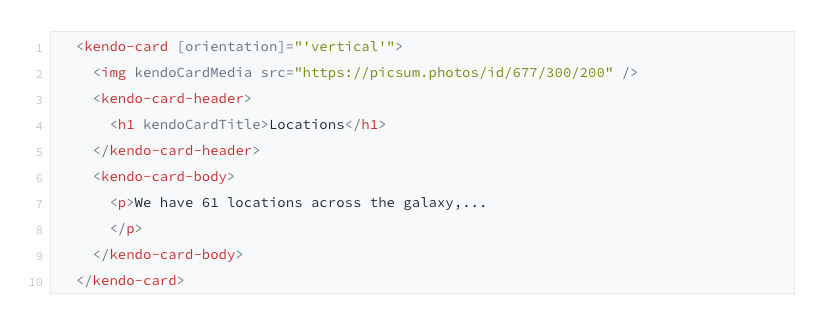
Now, we can replace the mock cards for the real deal. Here is a break down of the anatomy of our card component!
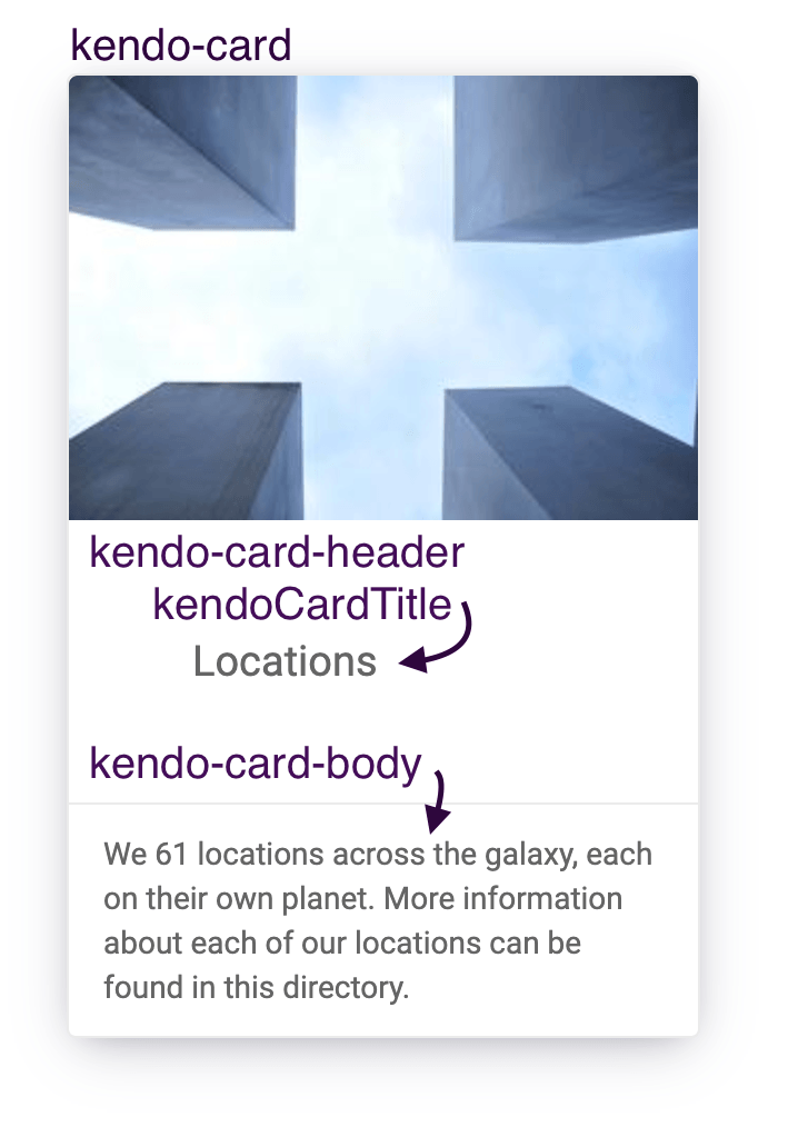
So for each of our three “portals” I created a card using these pieces.
I also created these default styles in styles.scss:
body {
font-family: "Roboto", Helvetica,Arial, sans-serif;
font-size: 14px;
color: rgb(70, 70, 70);
margin: 0;
}
h1 {
font-weight: 100;
}
a {
color: rgb(70, 70, 70);
text-decoration: none;
}
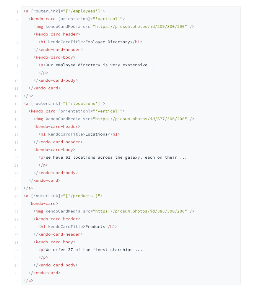
We do need to customize the cards a bit. We want each of them to look and be clickable. So this is where the drop
shadow comes in handy! First we will need to wrap each of our card components in an anchor tag with corresponding
routerLinks.
To let our users know that the cards are clickable, I added a default drop shadow to all the cards (that can be seen in the above screenshot). On hover, I made the drop shadow darker. Here are the additional custom styles I added:
@import 'src/variables';
// this lines our cards up nicely in a row
:host {
display: flex;
justify-content: space-evenly;
}
.k-card {
transition: box-shadow .4s ease;
box-shadow: $box-shadow;
}
a:hover .k-card {
transition: box-shadow .4s ease;
box-shadow: $box-shadow-darker;
}
The variables stylesheet I am importing consists of a few variables I thought I would use over and over again, so I moved them into a separate reusable file:
$professional-grey: #f5f6f7;
$dark-grey: #4d4f52;
$page-padding: 40px;
$box-shadow: 0 7px 27px -5px hsla(240, 30.1%, 28%, 0.25), 0 4px 16px -8px hsla(0, 0%, 0%, 0.3), 0 -6px 8px -6px hsla(0, 0%, 0%, 0.03);
$box-shadow-darker: 0 13px 27px -5px hsla(240, 30.1%, 28%, 0.25), 0 8px 16px -8px hsla(0, 0%, 0%, 0.3), 0 -6px 16px -6px hsla(0, 0%, 0%, 0.03);
So we have our box shadows indicating clickability and we have our anchors with our routerLinks, so we will actually
go to the proper route on click. However, there is one more final detail that is bothering me. You can see at the
beginning of the video, the cards “pop” once the content and then the image loads in. To take care of this
popping issue, we simply need to set a minimum height on our .k-cards and the .k-card imgs.
@import 'src/variables';
:host {
display: flex;
justify-content: space-evenly;
}
.k-card {
transition: box-shadow .4s ease;
box-shadow: $box-shadow;
// next 2 lines are to avoid the "popping in" issue
min-height: 382px;
img {
min-height: 200px;
}
}
a:hover .k-card {
transition: box-shadow .4s ease;
box-shadow: $box-shadow-darker;
}
Note: Don’t forget to add the
transitionto the.k-card's normal state as well as the:hover!
Easy-peasy-lemon-squeezy! Next up, let’s build out those routes so the routerLinks work!
Inside of our app-routing.module.ts, I defined all three of the portal routes as well as default route
for our escape hatch to use.
import { NgModule } from '@angular/core';
import { Routes, RouterModule } from '@angular/router';
import { DashboardComponent } from './dashboard/dashboard.component';
import { EmployeesComponent } from './employees/employees.component';
import { LocationsComponent } from './locations/locations.component';
import { ProductsComponent } from './products/products.component';
const routes: Routes = [
{ path: '', component: DashboardComponent },
{ path: 'employees', component: EmployeesComponent },
{ path: 'locations', component: LocationsComponent },
{ path: 'products', component: ProductsComponent },
];
@NgModule({
imports: [RouterModule.forRoot(routes)],
exports: [RouterModule]
})
export class AppRoutingModule { }
I’m was very impressed with how easy it was to get going with the Card Component and to customize it as well. Check out the rest of the features of the Card Component here and as always, happy coding everyone!

Alyssa Nicoll
Alyssa is an Angular Developer Advocate & GDE. Her two degrees (Web Design & Development and Psychology) feed her speaking career. She has spoken at over 30 conferences internationally, specializing in motivational soft talks, enjoys gaming on Xbox and scuba diving in her spare time. Her DM is always open, come talk sometime.