ThemeBuilder Styles in Native Apps

Summarize with AI:
ThemeBuilder helps to visually customize design systems, and the resulting styles can be reused across platforms, even for native apps.
Modern web apps often strive for delightful UX, and beautifully styled UI is one way designers/developers can achieve the goal. Styling every aspect of UI manually across modern web apps is a chore—designers often want to start with a design system and have customizations applied to all types of UI. Developers working by themselves could use a better starting point to have consistent themes applied to variety of UI—visual representation never hurt before stepping down to CSS/Sass. When designers and developers work together, the hand-off can often have frictions—design fidelity has to be upheld, but balanced with development needs.
All this demands the need for good tooling with styles being reused across platforms—enter ThemeBuilder.
Style Elegantly
Progress ThemeBuilder is a versatile tool that helps create visual UI styles—while it serves all types of modern web apps, designers/developers would find things particularly beneficial if rendering Telerik and Kendo UI web components.
ThemeBuilder offers an intuitive UX to visualize web UI styles and see how changes look for all types of UI components—this includes colors, visual states, properties, typography and more. With ThemeBuilder Advanced Customization for Telerik/Kendo UI components, one can change virtually every appearance-related property of the UI elements until the desired style is achieved. The final result of using the ThemeBuilder app is a vibrant custom theme bundled as a package that contains ready-to-use Sass and CSS styles—ready to be dropped in and light up beautiful, consistent UI.
Designers will often begin with popular design systems as a starting point and then customize aspects of UI to fit a certain brand—this would be a perfect beginning in ThemeBuilder. Another very popular tool to prototype UI/UX is Figma—a powerful, collaborative design tool for teams. ThemeBuilder provides a plugin that integrates into Figma and enables UI/UX designers to export design styles and variables to Sass/CSS variables and to generate icon fonts. Once developers export out the styles, all of the design richness is captured in high fidelity—ready to be integrated into web apps written with any modern application platforms.
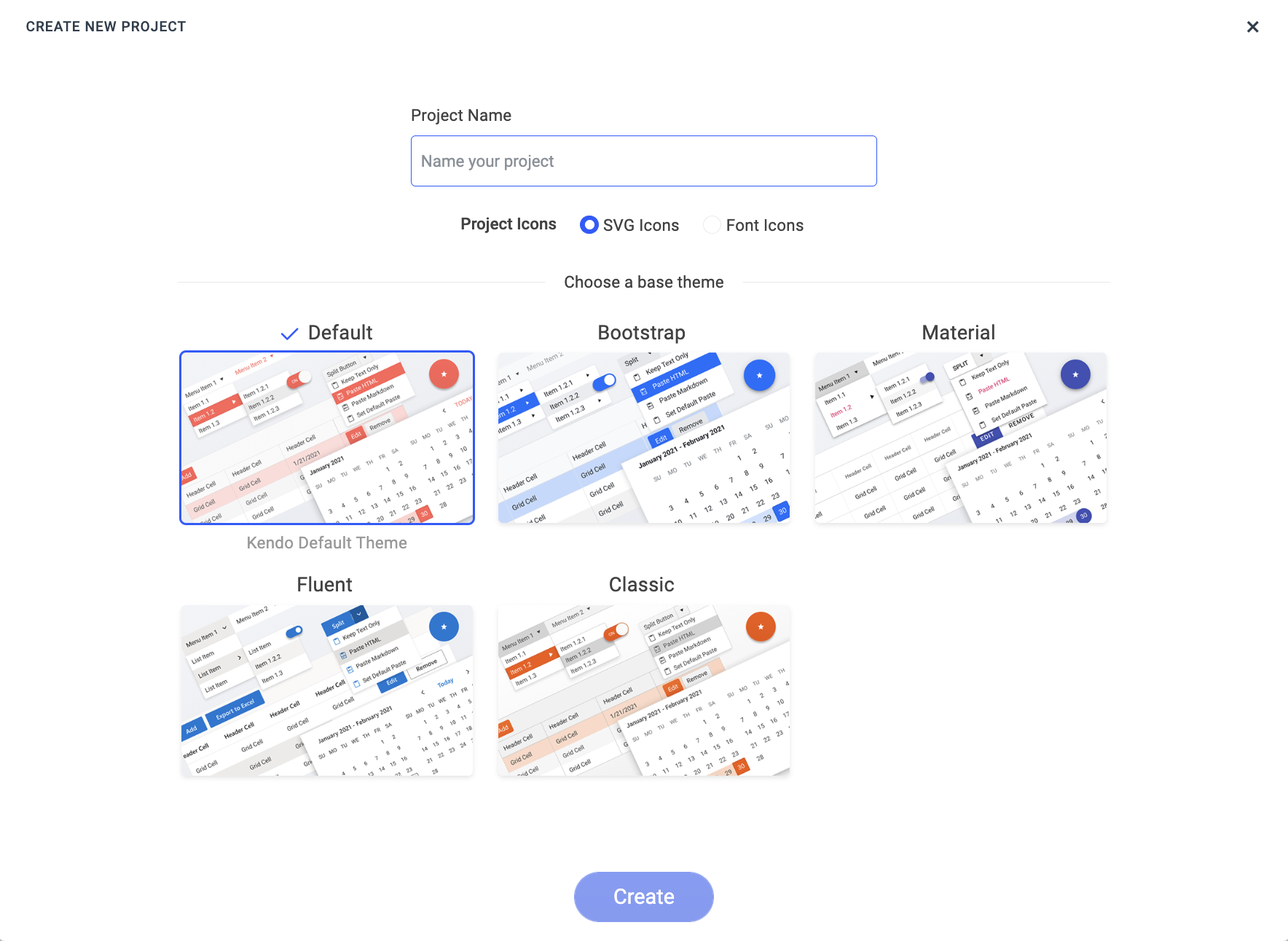
To get started, one would need a Telerik account and registering for ThemeBuilder—the free trial is a good way to get your feet wet. Creating a new project begins with selecting a popular design system theme or rolling with the default Kendo Bootstrap theme.
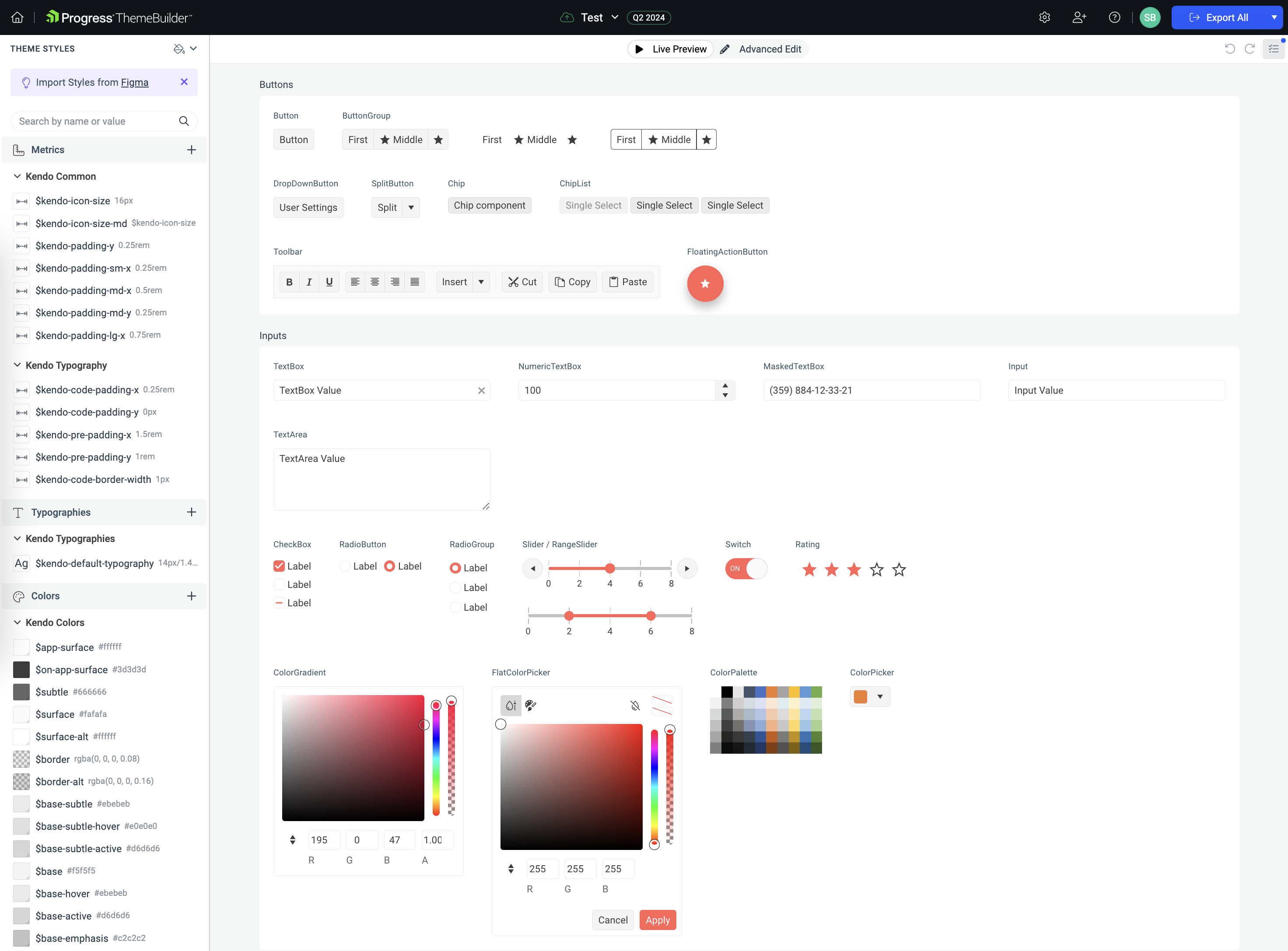
Once the project is created, the ThemeBuilder workspace welcomes users—a variety of live UI components are rendered on a single page, with styling customizations on the left. Any style changes are immediately reflected in the rendered UI components—users are free to fine-tune styling to get things exactly as desired.
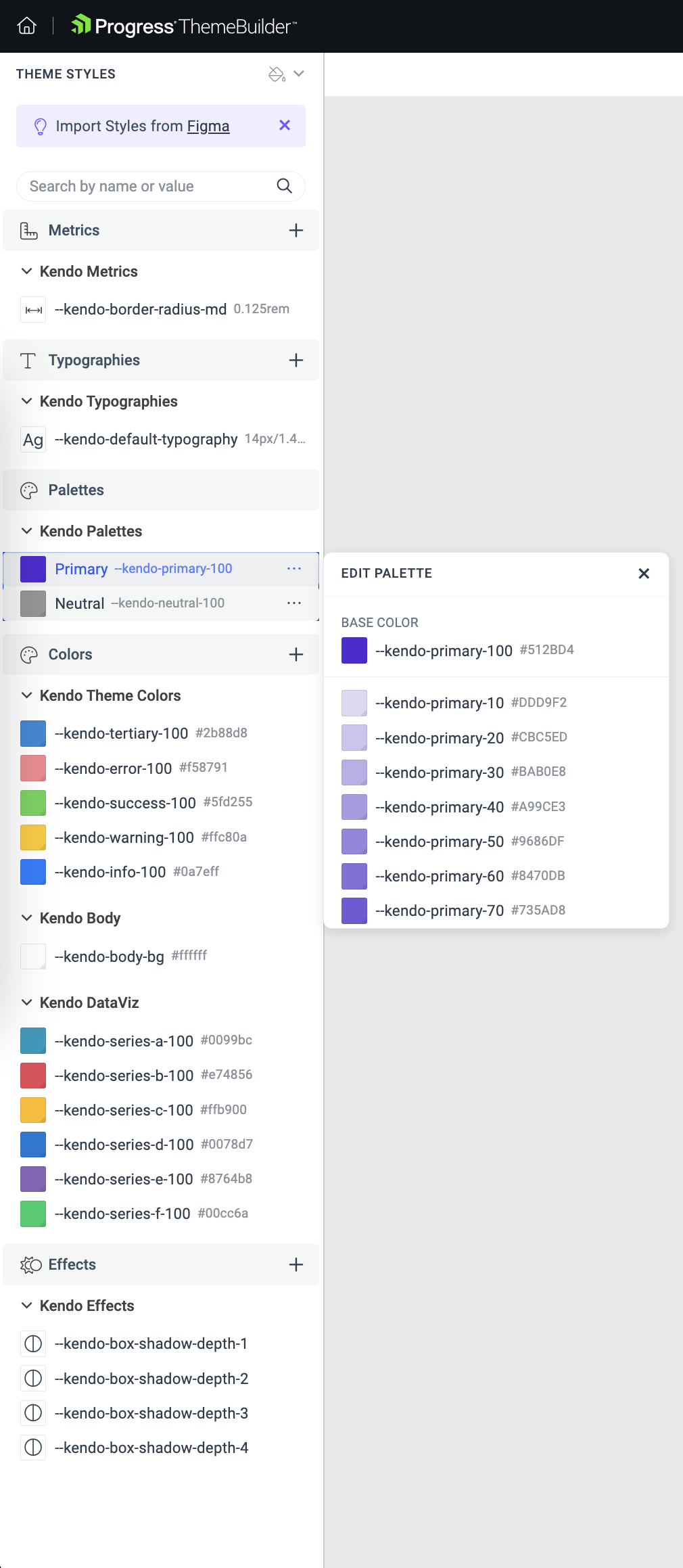
One of the first things to tinker with are colors—changing the primary color palette affects all UI components. As evident from the article title, we will try using ThemeBuilder styles in native mobile/desktop apps. Let's choose the default .NET purple as our primary color palette. For anyone curious, the .NET purple HEX is #512BD4.
Right away, we see all our UI turning purple—wherever the primary color brush is used.
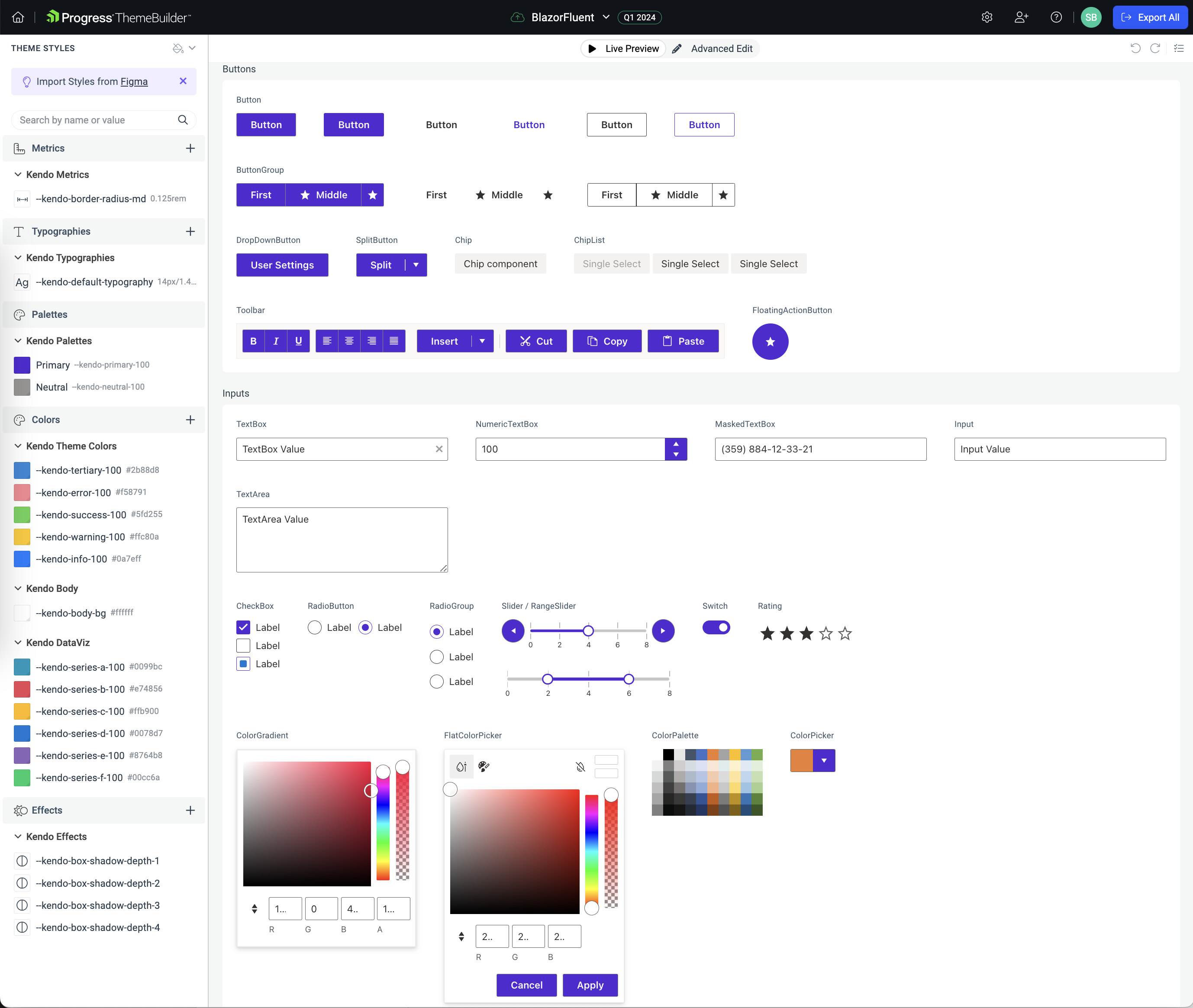
You can select any UI component and go into Advanced Edit mode—this allows for tinkering with virtually every appearance-related property of the UI elements until the desired style is achieved.
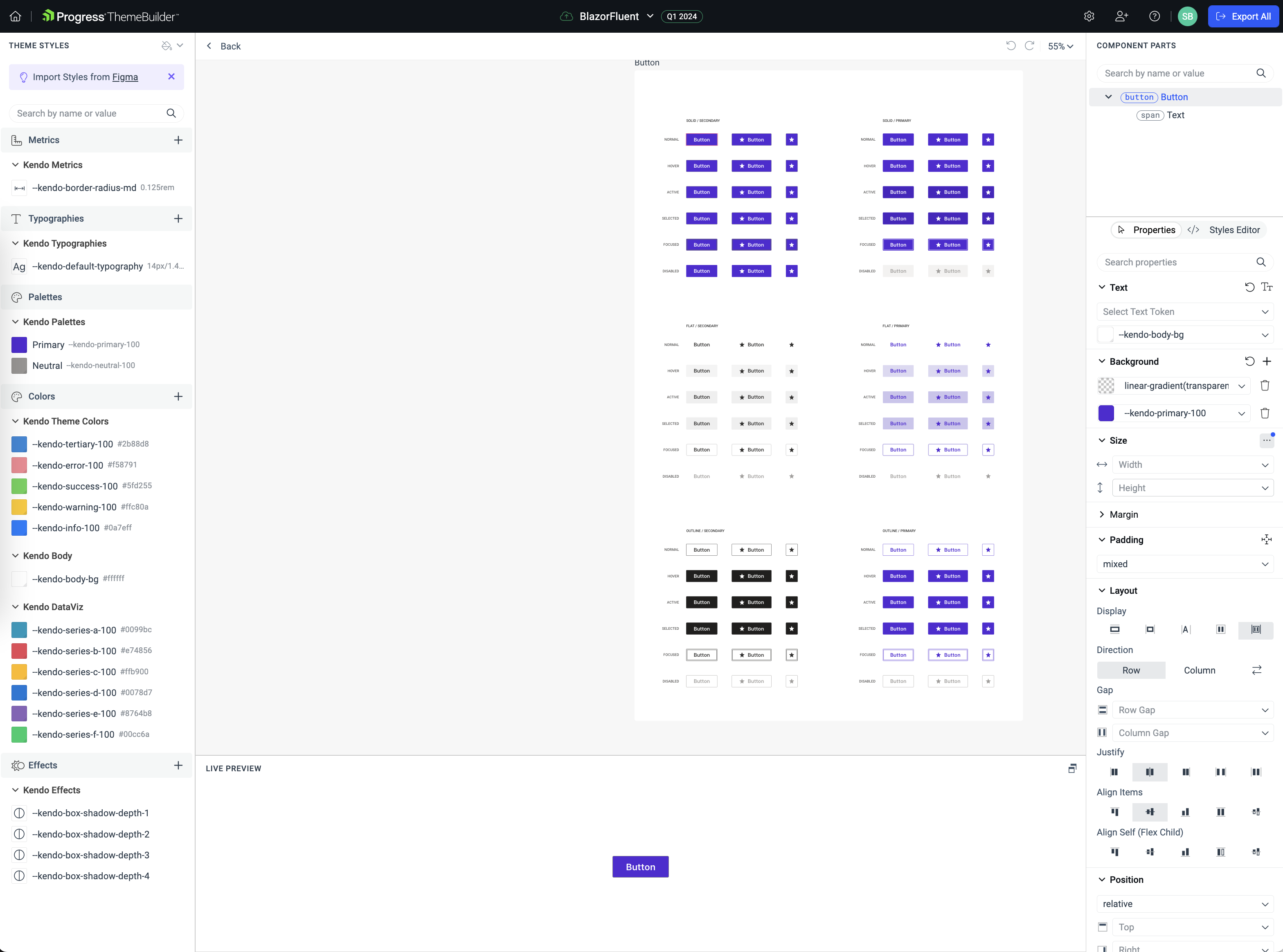
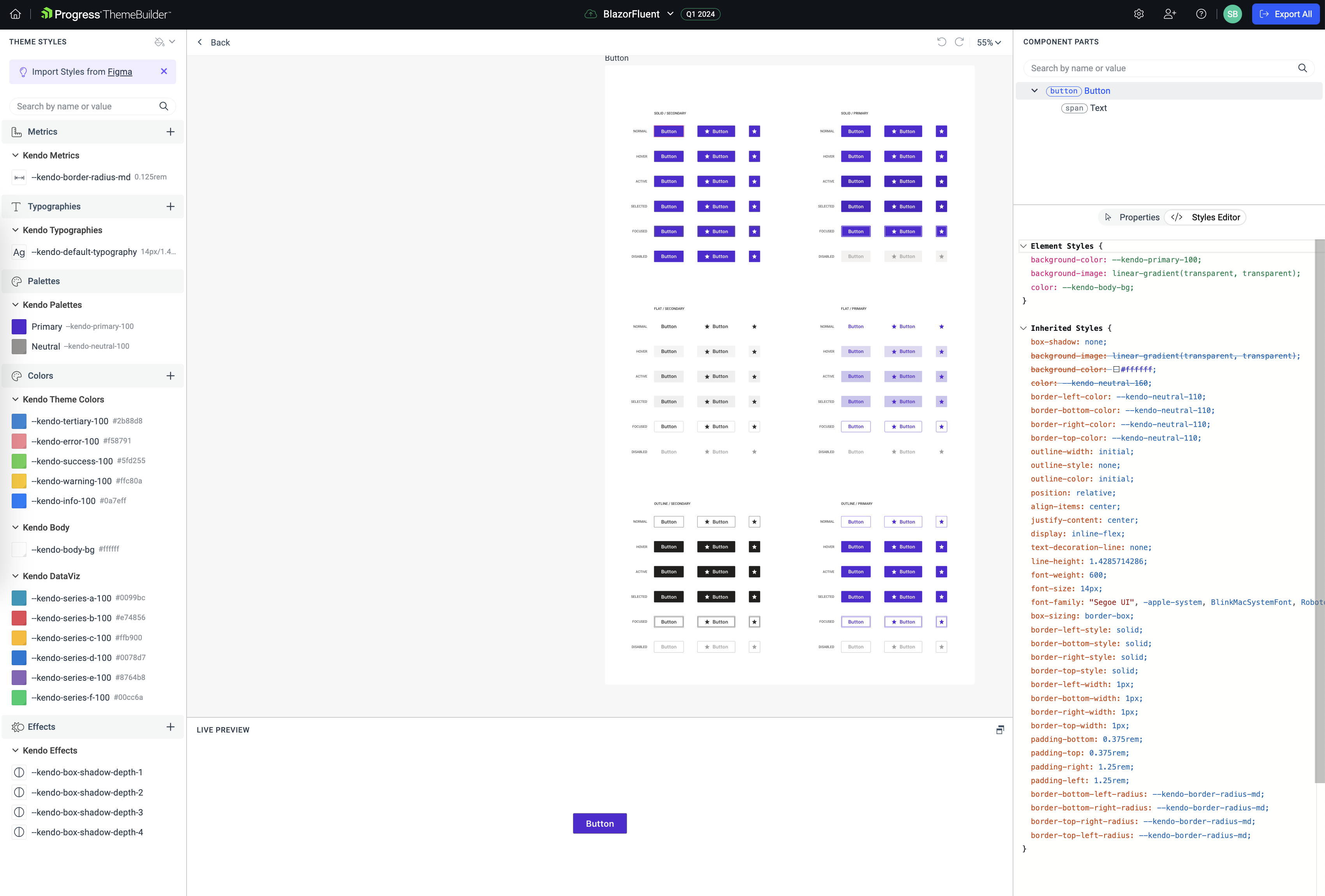
Advanced Edit for UI components opens up every aspect of the UI—like colors, visual states, alignment, position, typography and much more. Each of the UI element's properties can be tweaked visually, with the option of seeing the styles generated as a result.
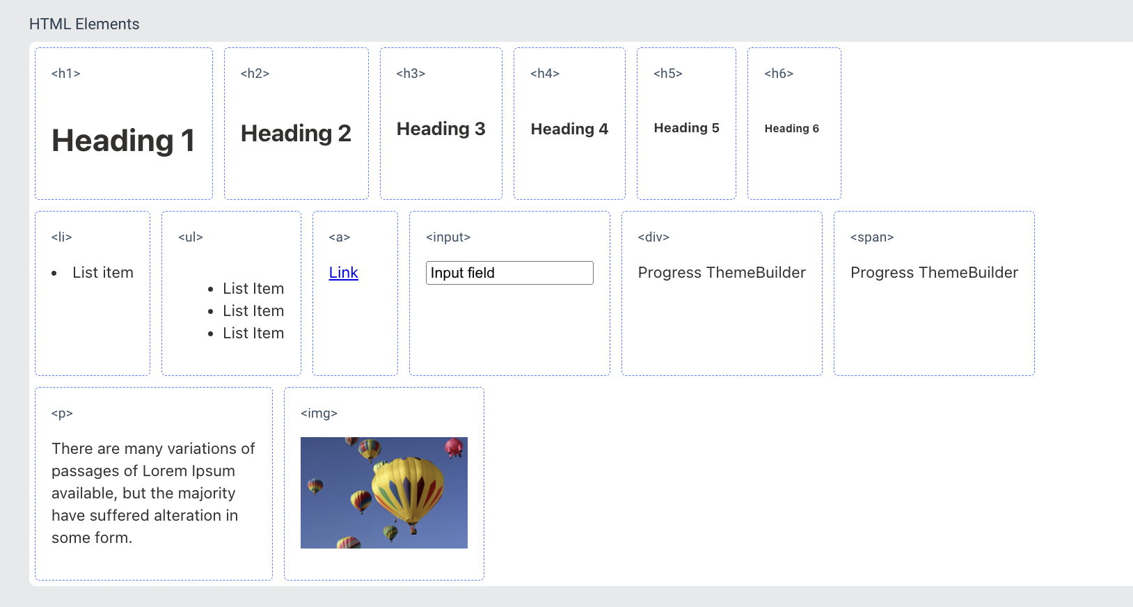
The real benefit with ThemeBuilder is to visualize styling for complex web UI components—this includes everything in Telerik UI for Blazor/ASP.NET MVC/Core, Kendo UI for jQuery/Angular/Vue and KendoReact. However, aside from complex UI, ThemeBuilder also shows rendering of plain HTML UI elements—this helps visualize styling for common HTML content that might be included in the web app.
Once you're satisfied with styling customization, the entire ThemeBuilder project output can be downloaded as a package or zipped content—inside is CSS/Sass that is ready to use and encapsulates all the styling. We started with the Fluent design theme and customized the primary color—all of that is encapsulated in the downloaded styles. This is not a one-way street though—further down the road, the project can be customized further and styling changes reapplied to apps being built.

Reuse ThemeBuilder Styles
Tools like ThemeBuilder are great to visually add styles to UI elements—this helps improve consistency with a design system that applies all through an app or a family of apps.
However, all this design and styling goodness is mostly for web apps—will native mobile/desktop apps be left high and dry? Of course not—the trick would be to bring web goodness to native apps and reuse UI components along with associated styling. Shared code and shared styles makes for happy developers—let's explore some techniques.
Blazor Hybrid
.NET MAUI is the evolution of modern .NET cross-platform development stack, allowing developers to reach mobile and desktop form factors from a single shared codebase. While .NET MAUI is squarely meant for developers to build native mobile/desktop apps, armed with modern smart WebViews, .NET MAUI is more than capable to welcome web content to native land. In fact, Blazor/JavaScript developers should feel empowered to bring web UI components, routing, styling and more to native cross-platform .NET MAUI apps, while gaining complete native platform API access.
Blazor is eating the world. Blazor is the free, open-source and much beloved web framework for building modern web apps. Developers can leverage the power of modern .NET, C# front and back, and modern tooling to build interactive beautiful web apps. The Blazor component model, rendering engine and styling mechanisms offer flexibility—and all of Blazor goodness is also welcome on native mobile/desktop apps through .NET MAUI.
We can get started with a vanilla .NET MAUI with Blazor app template to bring in Blazor UI/styles to native mobile/desktop apps. Or, we could have a better starting point and bring in Telerik UI for Blazor—a comprehensive suite of gorgeous performant UI components. All of Telerik UI for Blazor works inside native mobile/desktop apps with .NET MAUI's modern WebViews. Be it Visual Studio or Visual Studio Code, the Telerik Extensions have templates for Blazor Hybrid apps with Telerik UI built-in—everything is wired up to have polished Blazor UI light up .NET MAUI apps.
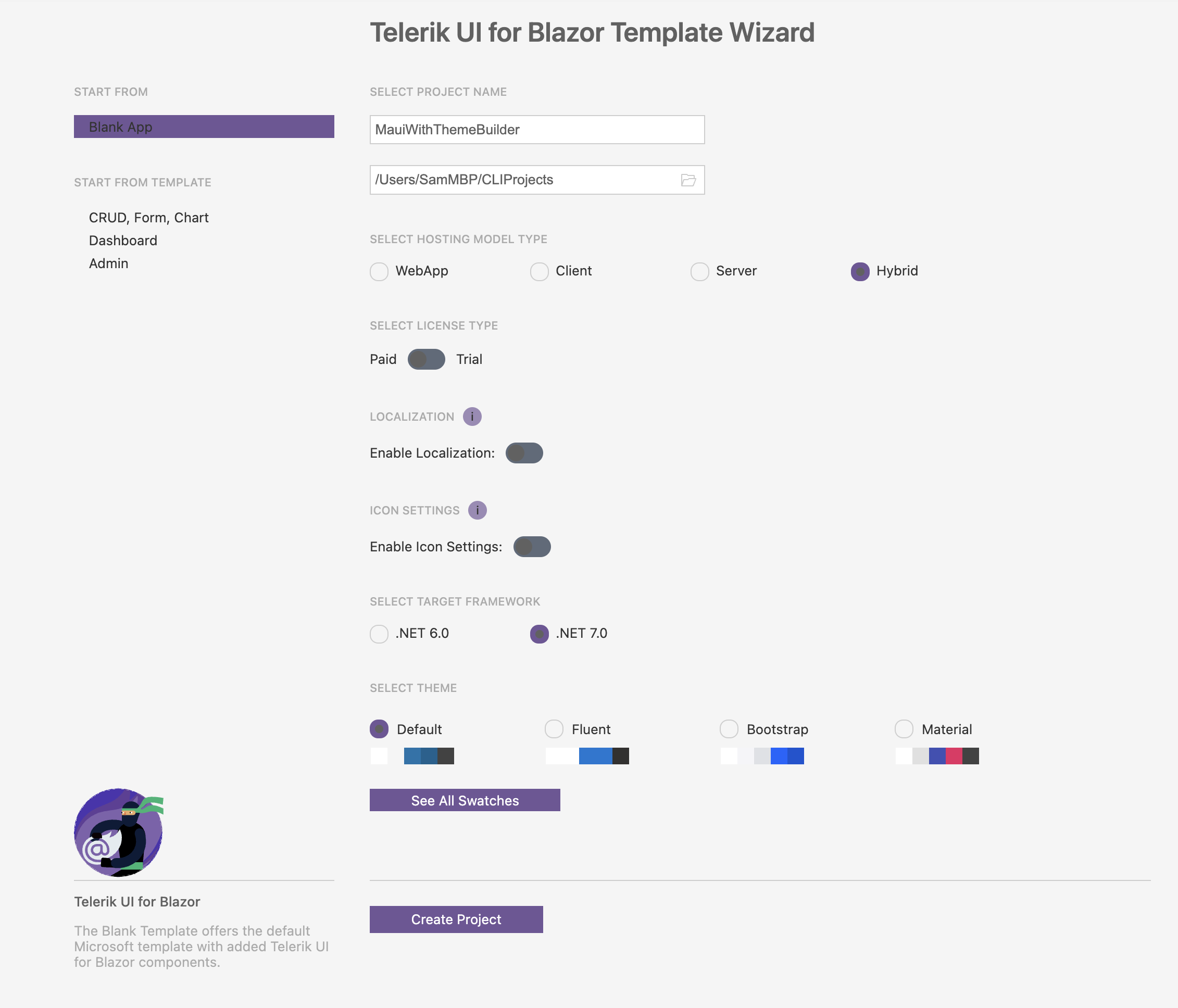
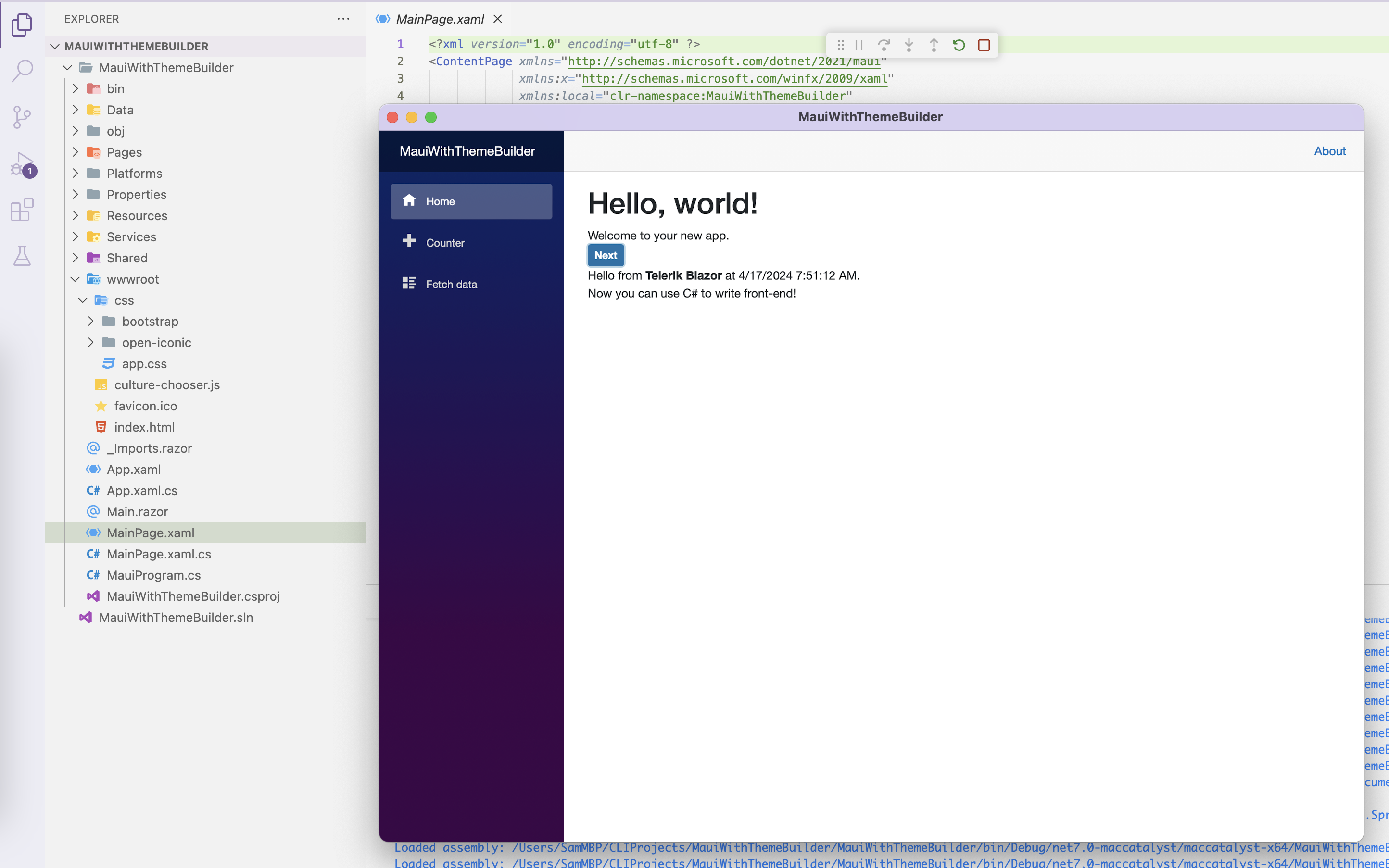
Since our ThemeBuilder style started from the Fluent design system, we can pick a different theme for our Blazor Hybrid app just to see the changes. We can run our app and see Blazor UI powering the .NET MAUI app for mobile/desktop.
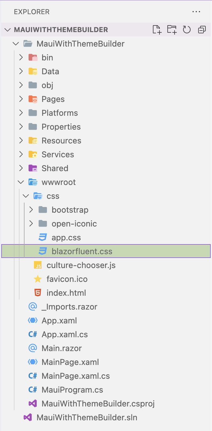
Now, we want our Blazor UI to have the same styles as customized on ThemeBuilder. We can simply drop the exported CSS file inside our .NET MAUI with Blazor app in the wwwroot/css folder. The CSS file is big, but honors all styling customizations.
And in the index.html file, we would unwire the default CSS and bring in a reference to the updated Blazor style customized from Fluent design system.
<!DOCTYPE html>
<html lang="en">
<head>
    <meta charset="utf-8" />
    <meta name="viewport" content="width=device-width, initial-scale=1.0, maximum-scale=1.0, user-scalable=no, viewport-fit=cover" />
    <title>MauiWithThemeBuilder</title>
    <base href="/" />
    <link rel="stylesheet" href="css/bootstrap/bootstrap.min.css" />
    <!-- <link href="css/app.css" rel="stylesheet" /> -->
    <link href="css/blazorfluent.css" rel="stylesheet" />

    <script src="https://blazor.cdn.telerik.com/blazor/5.0.1/telerik-blazor.min.js" defer></script>
</head>

<body>
    ...
</body>
</html>
Let's fire up the app again and, sure enough, the Blazor Button is now styled with .NET purple. ThemeBuilder styles are now lighting up Blazor UI inside a native .NET MAUI mobile/desktop app.
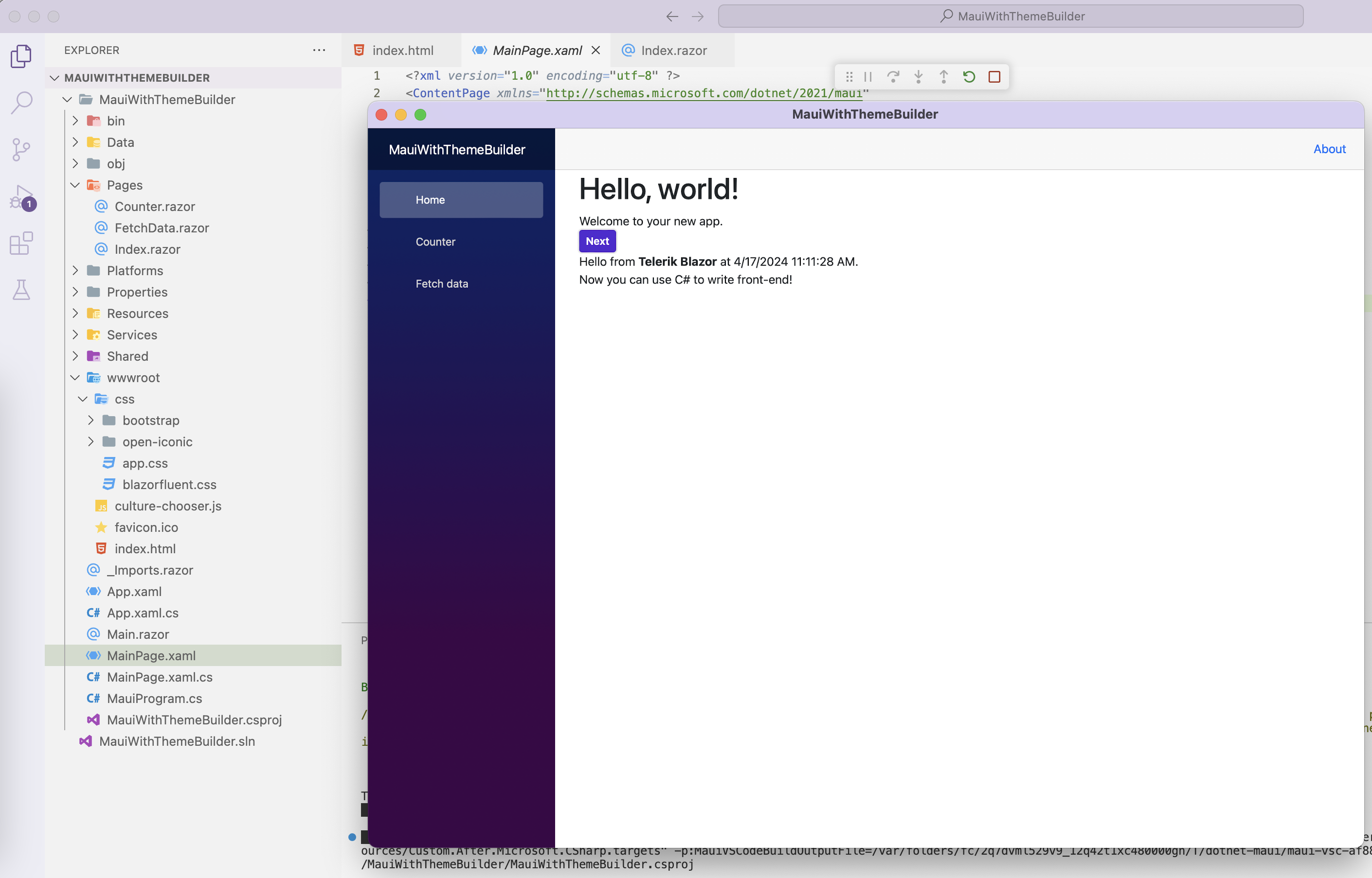
Why stop at a Button when we can see all of the UI rendered in accordance with our ThemeBuilder style? Let's drop a bunch of random Telerik Blazor UI components in the index.razor page.
@page "/"

@using System.Threading
@using Telerik.Blazor.Services

<h1>Hello, world!</h1>

Welcome to your new app.
<br />

@* <TelerikButton OnClick="@SayHelloHandler" ThemeColor="@(ThemeConstants.Button.ThemeColor.Primary)">Next</TelerikButton> *@
<TelerikButton OnClick="@SayHelloHandler">Next</TelerikButton>

<br />

@helloString

<br />
<TelerikButtonGroup>
    <ButtonGroupButton>First button</ButtonGroupButton>
    <ButtonGroupToggleButton>Second button</ButtonGroupToggleButton>
    <ButtonGroupToggleButton>Third button</ButtonGroupToggleButton>
</TelerikButtonGroup>
<br /><br/>
<TelerikBarcode Width="300px"
                Height="200px"
                Value="123456789">
</TelerikBarcode>

<TelerikCalendar Min="@min" Max="@max" @bind-Date="@theDate">
</TelerikCalendar>

<TelerikDatePicker @bind-Value="datePickerValue"
                Format="dd MMMM yyyy"
                Min="@min" Max="@max" AdaptiveMode="AdaptiveMode.Auto">
</TelerikDatePicker>
The selected date is: @datePickerValue.ToShortDateString()
<br />

<TelerikCircularGauge Width="300px" Height="300px">

    <CircularGaugePointers>
        <CircularGaugePointer Value="30" Size="10" />
    </CircularGaugePointers>

    <CircularGaugeCenterLabel>
        <Template>
            @{
                var pointer = context.Pointers.FirstOrDefault();

                <div style="font-weight: bold; font-size:30px">@pointer.Value</div>
            }
        </Template>
    </CircularGaugeCenterLabel>

</TelerikCircularGauge>

<br />

<TelerikCard Width="300px">
    <CardHeader>
        <CardTitle>Tourism</CardTitle>
    </CardHeader>
    <CardImage Src="https://docs.telerik.com/blazor-ui/components/card/images/rome.jpg"></CardImage>
    <CardBody>
        <CardTitle>Rome</CardTitle>
        <CardSubTitle>Capital of Italy</CardSubTitle>
        <CardSeparator></CardSeparator>
        <p>
            Rome is a sprawling, cosmopolitan city with nearly 3,000 years of globally influential art, architecture and culture on display.

            Ancient ruins such as the Forum and the Colosseum evoke the power of the former Roman Empire.
        </p>
    </CardBody>
    <CardActions Layout="@CardActionsLayout.Stretch">
        <TelerikButton Class="k-flat" Title="Like">Like</TelerikButton>
        <TelerikButton Class="k-flat" Title="Comment">Comment</TelerikButton>
        <TelerikButton Class="k-flat">Read More</TelerikButton>
    </CardActions>
    <CardFooter>
        <span style="float:left">Created by @@john</span>
        <span style="float:right">March 05, 2021</span>
    </CardFooter>
</TelerikCard>


@code {
    MarkupString helloString;

    private DateTime min = new DateTime(2020, 1, 1);
    private DateTime max = new DateTime(2030, 12, 31);
    private DateTime theDate { get; set; } = DateTime.Now;
    DateTime datePickerValue { get; set; } = DateTime.Now;

    void SayHelloHandler()
    {
        string msg = string.Format("Hello from <strong>Telerik Blazor</strong> at {0}.<br /> Now you can use C# to write front-end!", DateTime.Now);
        helloString = new MarkupString(msg);
    }
}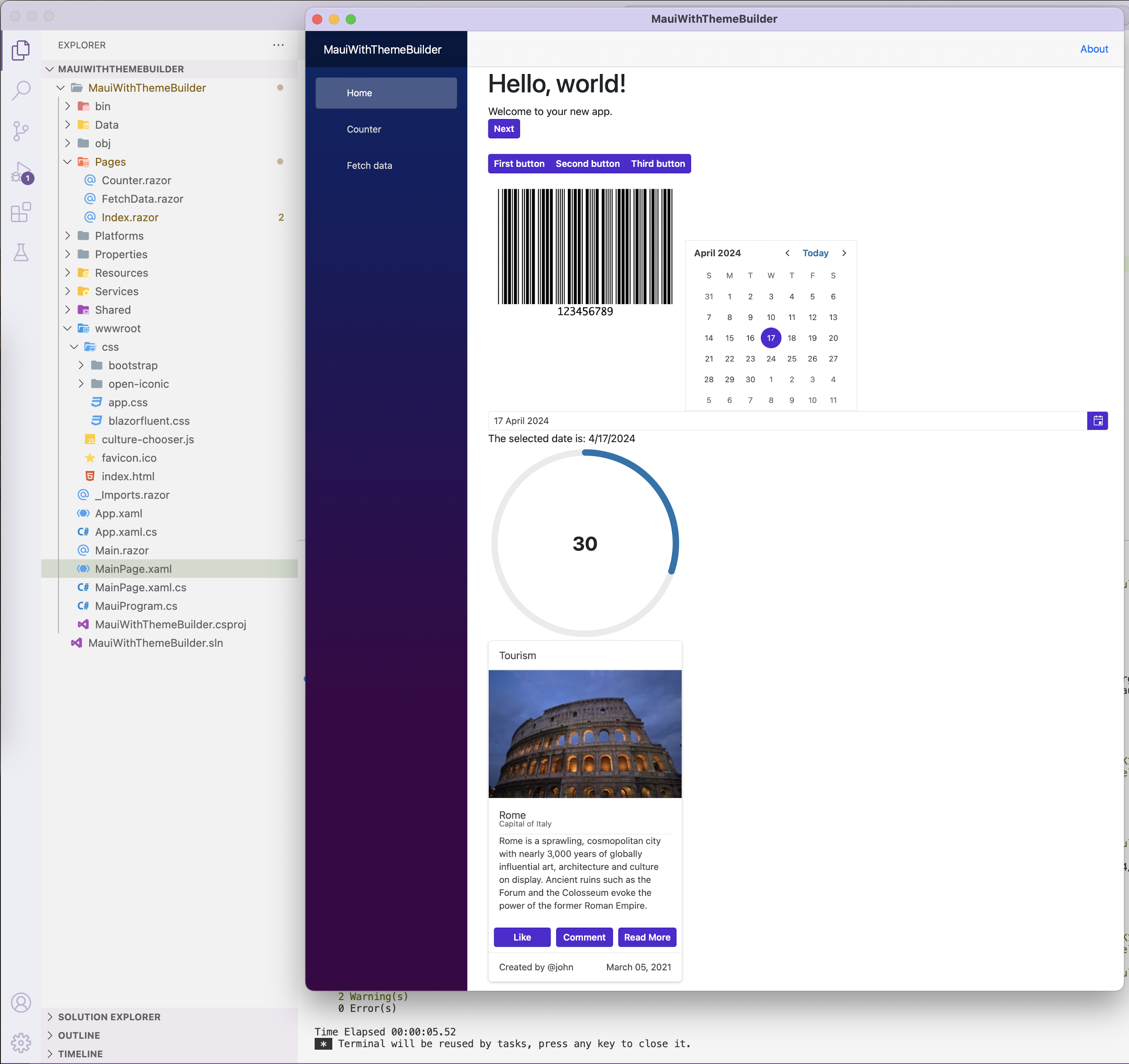
We can now see complex Blazor UI components inside our .NET MAUI app, like Calendar, Button Group, DatePicker, Gauge, Card and more—all styled in accordance to our customized ThemeBuilder style. This is true reusability of styles across web and native apps.
Share CSS Between Web & Native
While it is nice that CSS styles from Blazor/web apps can be dropped directly inside .NET MAUI Blazor Hybrid apps, this may not be a realistic solution for many. The same CSS styling now has be maintained in two places—one for web apps and one for mobile/desktop apps. A much cleaner solution is to truly share common CSS styling across web and native apps—one set of ThemeBuilder customized styles that drives UI/UX across browser and native mobile/desktop apps.
The trick to pull off true style sharing is abstraction—the common web UI components/styles cannot belong inside either the Blazor project for web apps or the Blazor Hybrid project for native apps. Instead, a simple Razor Class Library (RCL) can house the web UI/styles and this project is referenced from both web and native apps. The huge benefit is one set of web UI components and their corresponding CSS styles can drive the UI across web and native experiences—and ThemeBuilder can help customize a design system that works for both.
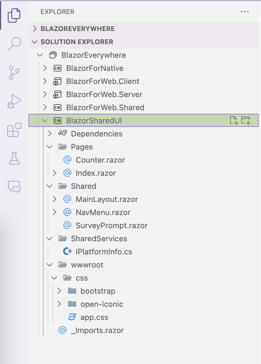
While .NET MAUI/Blazor developers can pull off such shared UI manually today, this will get a whole lot easier with .NET 9 runtime. The .NET MAUI for .NET 9 Preview bits now include a brand new Blazor Hybrid + Web project template—this works exactly as desired. The template spins up a few projects—a native .NET MAUI Blazor Hybrid app, a Blazor web app and a Razor Class Library project that houses shared UI/styles.
The same strategy of dropping in a styled CSS file to light up web UI components inside a native .NET MAUI apps also works for other web frameworks—Angular/React/Vue and others are also welcome to have ThemeBuilder styles drive the UI. Style sharing between web and native apps is great for developer productivity—good to see modern frameworks/tooling evolve to provide such flexibility.
Progressive Web App
For many, building a native mobile/desktop app from ground up can be an expensive endeavor—a lower hanging fruit might be a Progressive Web App (PWA). A PWA is essentially a smart web app that can be a very good citizen on mobile/desktop form factors—web UI rendered in a WebView powers the UX, but without the browser chrome.
PWAs have several features that make a web app feel like a native app—immersive experience with app icon shortcuts, offline mode, support for push notifications, access to hardware, refreshed content while app isn't running and many more. PWAs can benefit from all the web deployment features, but can also be bundled up for App Store presences. While it takes some work to build an efficient PWA, the benefits are obvious.
Most modern web frameworks allow for building PWAs easily—let's take a look at how to do things with Blazor. For Blazor web apps starting from Visual Studio templates, adding the PWA option is just a checkbox—an extra parameter does it when using .NET CLI.
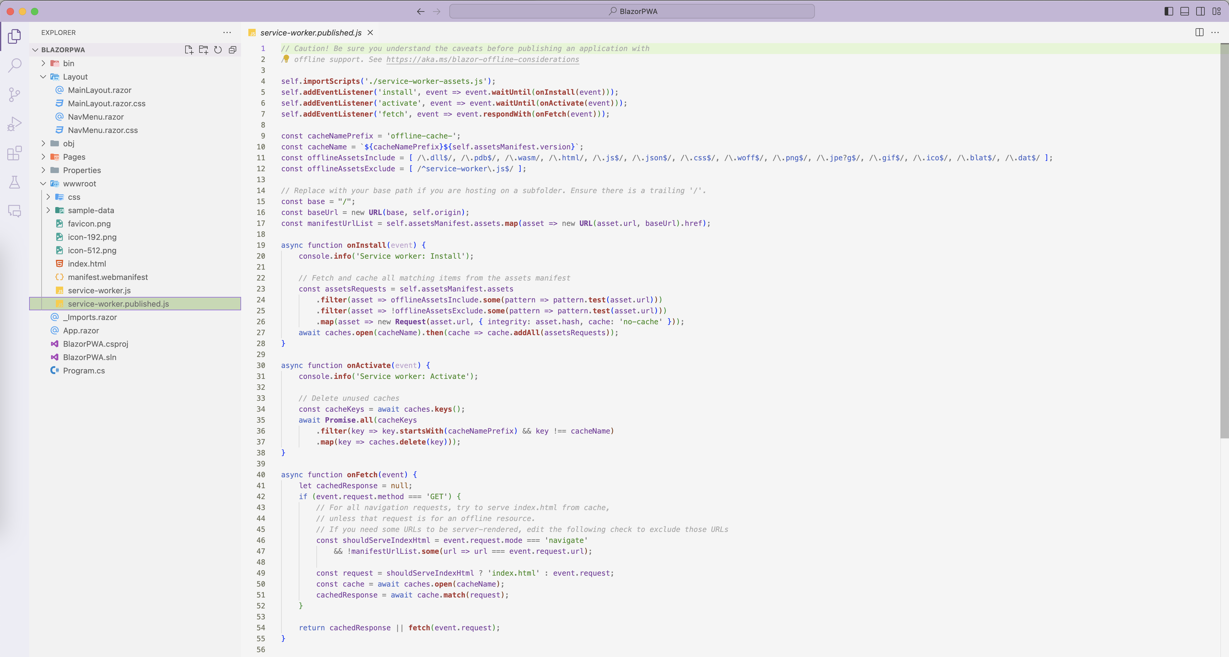
dotnet new blazorwasm --pwaThe resulting Blazor web app project has some key things wired up to function as a PWA—manifest file, app icons and the all-important service workers for background work. Service workers in PWAs get do a variety of tasks—the default one does caching when the PWA is published. PWAs are web apps styled by CSS—the service worker implementation knows how to cache static assets like CSS, along with variety of other runtime dependencies.
Now that our Blazor-powered PWA is all set, it is time to make the styling switch—we can unwire the default styles in index.html and bring in our design system styles from ThemeBuilder customizations.
<!DOCTYPE html>
<html lang="en">

<head>
    <meta charset="utf-8" />
    <meta name="viewport" content="width=device-width, initial-scale=1.0" />
    <title>BlazorPWA</title>
    <base href="/" />
    <link rel="stylesheet" href="css/bootstrap/bootstrap.min.css" />
    <!--link href="BlazorPWA.styles.css" rel="stylesheet" /-->
    <link rel="stylesheet" href="css/blazorfluent.css" />

    <link rel="icon" type="image/png" href="favicon.png" />
    <link href="manifest.webmanifest" rel="manifest" />
    <link rel="apple-touch-icon" sizes="512x512" href="icon-512.png" />
    <link rel="apple-touch-icon" sizes="192x192" href="icon-192.png" />
</head>

<body>
    ...
    <script src="_framework/blazor.webassembly.js"></script>
    <script>navigator.serviceWorker.register('service-worker.js');</script>
</body>

</html>
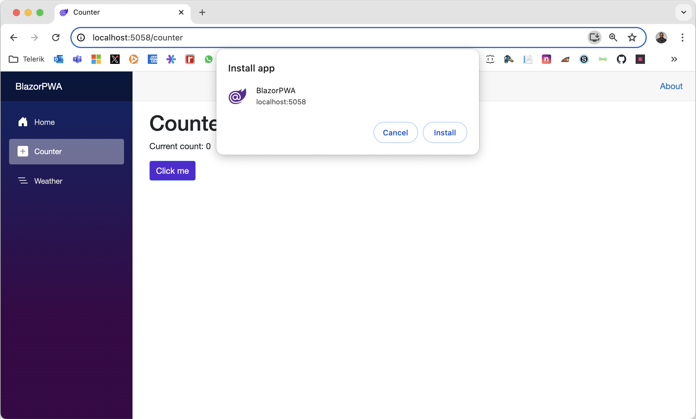
Let's fire up our app. We see the usual Blazor app in the browser, but with the PWA twist. We can install the app locally, be able to pin app icons and see the service workers being wired up. When published, the default service worker will start caching resources. Cache invalidation logic can be shared between web app and when the PWA is bundled as an app meant for deployment to mobile/desktop. And sure enough, our PWA has picked up the .NET purple styling from the swapped custom stylesheet—ThemeBuilder styles now power experiences in PWA form.
Bring Design to Native Apps
Design is pivotal toward having beautifully styled UI—often the first step toward delightful UX. And ThemeBuilder aims to close the designer-developer gap—a versatile design tool that helps create visual UI styles. ThemeBuilder offers an intuitive UX to visualize web UI styles and the end result is often a customized design system, with styles that are ready for developers to light up apps.
The benefits of ThemeBuilder, however, do not need to be confined to web apps—modern frameworks/tools make it easy to bring web goodness to mobile/desktop apps. .NET MAUI is the evolution of modern .NET cross-platform development stack, allowing developers to reach mobile and desktop form factors from a single shared codebase. And Blazor is the free, open-source and much beloved .NET web framework for building modern web apps. Blazor Hybrid apps marry up the two technologies beautifully, allowing Blazor web UI components and styles to be reused within native mobile/desktop apps. PWAs are also great option for web developers to quickly bring web apps to power experiences on mobile/desktop.
Sharing CSS styles between web and native apps is an obvious benefit for designers/developers. No matter what we the approach, ThemeBuilder styles can be easily reused for Blazor Hybrid or PWAs—CSS is happy to style web UI irrespective of the canvas used for rendering. Modern frameworks and tooling enable sharing of web design systems/styles for native apps—developer productivity and code sharing for the win.
Want to help weigh in on the designer-developer gap and learn more about the current state of the industry? Share your experience and take the State of Designer-Developer Collaboration 2024 SurveyProgress just launched. It’s a global survey that aims to shed light on the design handoff process, and the role design systems play in addressing the inherent challenges—and we need your input!

Sam Basu
Sam Basu is a technologist, author, speaker, Microsoft MVP and gadget lover. With a long developer background, he also worked as a Developer Advocacy Manager for advocating modern web/mobile/cloud development platforms on Microsoft/Telerik/Kendo UI technology stacks. His spare times call for travel, fast cars, cricket and culinary adventures with the family.

