
KendoReact Built-in Icon and SVG Icon Collection

Summarize with AI:
The KendoReact icon system offers more than 400 icons in both font and SVG formats with customization options.
Icons are the silent workhorses of a great user experience. They help users navigate interfaces quickly, communicate actions at a glance and add visual appeal to otherwise text-heavy interfaces. Whether it’s a simple “save” icon in a toolbar or a complex set of social media icons in a footer, these small graphical elements play a huge role in creating intuitive user experiences.
The Progress KendoReact UI component library makes working with icons in React applications easy with a built-in collection of more than 400 icons, available as both font icons and SVGs. In this article, we’ll cover how to get started with KendoReact icons and how to customize their appearance.
Both the KendoReact Icon and SvgIcon components are part of the KendoReact Free suite, which means you can use them in your projects without any license or registration requirements!
The React Icon Component
The KendoReact Icon component uses font icons, a time-tested method for rendering icons that’s lightweight and easy to style with CSS. To get started, you’ll need to import the component and include the KendoReact font icon stylesheet from a CDN.
The Icon component is distributed through the @progress/kendo-react-common npm package:
import { Icon } from '@progress/kendo-react-common';
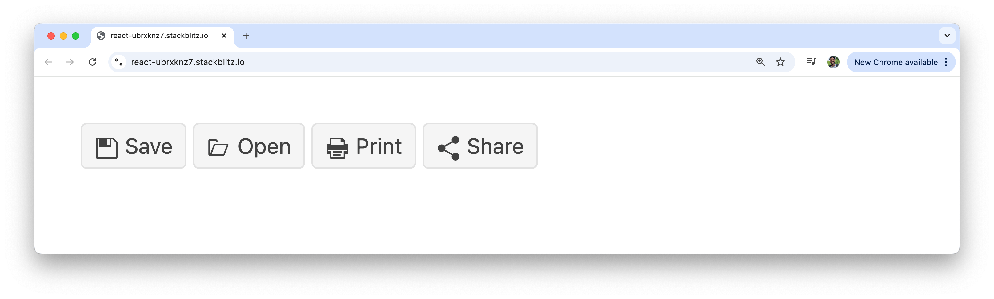
Here’s a basic example of rendering a custom toolbar that displays a set of icons with the help of the Icon component:
import * as React from 'react';
import { Icon } from '@progress/kendo-react-common';
import { Button } from '@progress/kendo-react-buttons';

const App = () => {
  return (
    <div>
      <div className="toolbar">
        <Button>
          <Icon name="save" />
          Save
        </Button>
        <Button>
          <Icon name="folder-open" />
          Open
        </Button>
        <Button>
          <Icon name="print" />
          Print
        </Button>
        <Button>
          <Icon name="share" />
          Share
        </Button>
      </div>
    </div>
  );
};

export default App;
The above code example creates a simple toolbar with familiar actions (save, open, etc.), each marked with an icon. The name prop corresponds to an icon in the KendoReact collection.
Customizing Appearance
The Icon component offers several props to adjust its appearance quickly.
Theme Colors
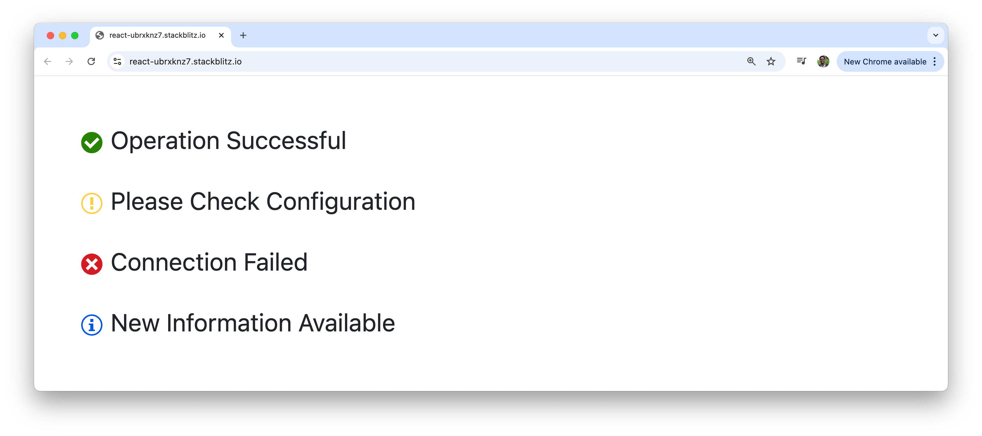
We can easily change the color of icons using the themeColor prop, which aligns with KendoReact theme’s predefined colors for success, warning, error and more.
import * as React from 'react';
import { Icon } from '@progress/kendo-react-common';

const App = () => {
  return (
    <div>
      <div className="status-indicators">
        <p>
          <Icon name="check-circle" themeColor="success" /> Operation Successful
        </p>
        <p>
          <Icon name="exclamation-circle" themeColor="warning" /> Please Check
          Configuration
        </p>
        <p>
          <Icon name="x-circle" themeColor="error" /> Connection Failed
        </p>
        <p>
          <Icon name="info-circle" themeColor="info" /> New Information
          Available
        </p>
      </div>
    </div>
  );
};

export default App;
Being able to change the color of icons is perfect for creating status indicators that users can understand instantly.
Sizing
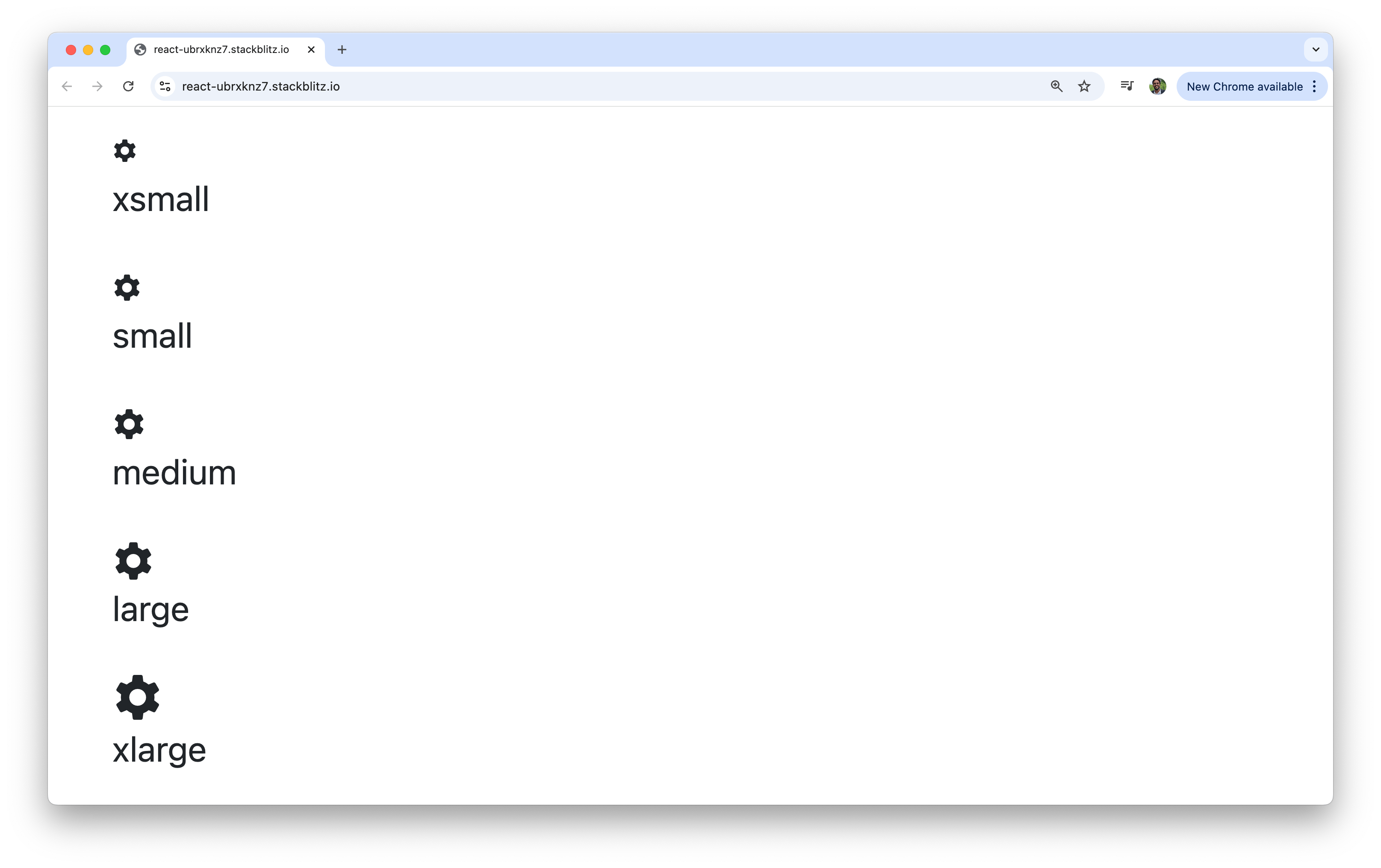
The size prop lets us choose from a range of predefined sizes, enabling consistency across our application.
import * as React from 'react';
import { Icon } from '@progress/kendo-react-common';

const App = () => {
  const sizes = ['xsmall', 'small', 'medium', 'large', 'xlarge'];
  return (
    <div>
      <div className="size-showcase">
        {sizes.map((size) => (
          <span key={size}>
            <Icon name="gear" size={size} />
            <p>{size}</p>
          </span>
        ))}
      </div>
    </div>
  );
};

export default App;
The sizing system ranges from xsmall (12px) to xxxlarge (48px), giving us plenty of flexibility for different use cases. Small icons work well in dense interfaces like data tables, while larger icons are perfect for hero sections or primary call-to-action buttons.
Flipping
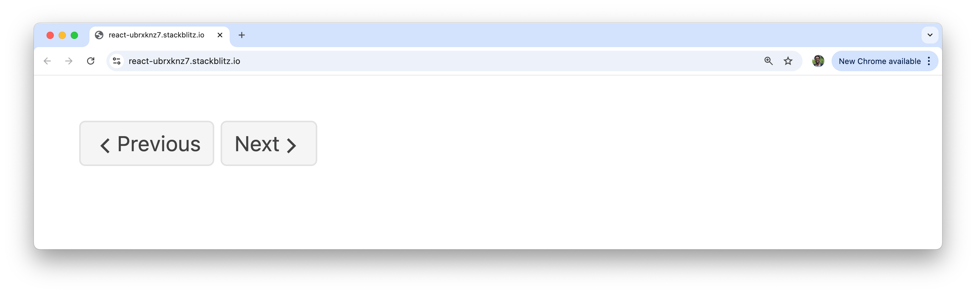
Need to mirror an icon? The flip prop can invert an icon horizontally, vertically or both.
import * as React from 'react';
import { Icon } from '@progress/kendo-react-common';
import { Button } from '@progress/kendo-react-buttons';

const App = () => {
  return (
    <div>
      <div className="navigation">
        <Button>
          <Icon name="arrow-chevron-left" />
          Previous
        </Button>
        <Button>
          Next
          <Icon name="arrow-chevron-left" flip="horizontal" />
        </Button>
      </div>
    </div>
  );
};

export default App;
The above code is an example of how flipping can help create symmetrical navigation elements without needing a separate “right-arrow” icon.
The KendoReact SvgIcon Component
While the Icon component uses font-based icons, the KendoReact library also provides the SvgIcon component for rendering SVG-based icons. SVG icons offer some advantages over font icons, including better accessibility support, more precise rendering at different sizes and the ability to use multiple colors within a single icon.
The SvgIcon component is imported from the same package, but requires importing individual icon definitions:
import * as React from 'react';
import { SvgIcon } from '@progress/kendo-react-common';
import { saveIcon, folderOpenIcon, printIcon, shareIcon } from '@progress/kendo-svg-icons';

const App = () => {
  return (
    <div className="svg-toolbar">
      <button className="toolbar-button">
        <SvgIcon icon={saveIcon} />
        Save
      </button>
      <button className="toolbar-button">
        <SvgIcon icon={folderOpenIcon} />
        Open
      </button>
      <button className="toolbar-button">
        <SvgIcon icon={printIcon} />
        Print
      </button>
      <button className="toolbar-button">
        <SvgIcon icon={shareIcon} />
        Share
      </button>
    </div>
  );
};

export default App;
The main difference in using the SvgIcon component is that instead of using a name prop, we import the specific icon definitions and pass them to the icon prop. This approach offers better tree-shaking benefits since only the icons we actually use are included in our bundle.
The SvgIcon component supports the same size, themeColor and flip props as the font Icon component.
Wrap-up
The built-in KendoReact icon system provides everything you need to add professional, consistent iconography to your React applications. With over 400 icons available in both font and SVG formats with customization options, you can create visually appealing interfaces without the hassle of managing separate icon libraries.
To see the complete list of available icons and explore more configuration options, be sure to check out the Iconography documentation from the Progress Design System Kit!
And to try this all for yourself, get started with KendoReact Free!

Hassan Djirdeh
Hassan is a senior frontend engineer and has helped build large production applications at-scale at organizations like Doordash, Instacart and Shopify. Hassan is also a published author and course instructor where he’s helped thousands of students learn in-depth frontend engineering skills like React, Vue, TypeScript, and GraphQL.
Related Posts
Comments
All articles
Topics
Web MobileMobile
Desktop
Design
Productivity
People
