
Working with the KendoReact Window Component

Summarize with AI:
Equip your React app with floating, resizable container windows for features like tool panels and property setup lists.
Windows are UI components that display content in movable, resizable containers that float above the main application. They’re perfect for creating property panels, tool windows and multi-document interfaces where users need to interact with multiple views simultaneously.
In this article, we’ll take a look at the Progress KendoReact Window component and see how it provides a solution for implementing these floating panels with built-in support for dragging, resizing, minimizing and maximizing.
The KendoReact Window component is part of KendoReact Free, which means you can use it in your projects without any license or registration requirements!
The React Window Component
While both the KendoReact Dialog and Window components are part of the same dialogs package, they serve slightly different purposes.
The Dialog component creates modal overlays that require user interaction before continuing (think confirmation prompts or important alerts). The Window component, on the other hand, creates non-modal panels that users can freely move around, resize and continue working with different parts of the application.
If we need to block interaction until the user responds, we’d use a Dialog. If we want floating panels that users can arrange however they like while multitasking, Window should be our go-to choice.
The KendoReact Window component is distributed through the @progress/kendo-react-dialogs npm package and can be imported directly:
import { Window } from '@progress/kendo-react-dialogs';
Here’s a basic example of how we can use the Window component:
import * as React from 'react';
import { Window } from '@progress/kendo-react-dialogs';
import { Button } from '@progress/kendo-react-buttons';
const App = () => {
const [visible, setVisible] = React.useState(true);
const toggleWindow = () => {
setVisible(!visible);
};
return (
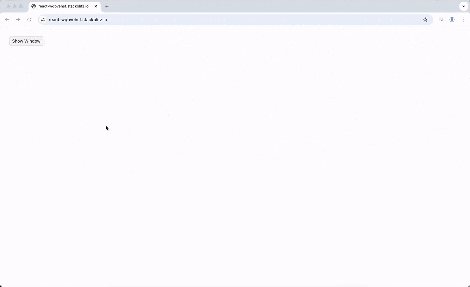
<div>
<Button onClick={toggleWindow}>
{visible ? 'Hide Window' : 'Show Window'}
</Button>
{visible && (
<Window title="My First Window" onClose={toggleWindow}>
<p>This is window content!</p>
<p>Windows can contain any React components.</p>
</Window>
)}
</div>
);
};
export default App;
When we run this code, we’ll see a toggle button that shows or hides a window titled “My First Window.” The window appears in the center of the screen with sample content inside, and clicking the toggle button will make it appear or disappear smoothly.
The Window component’s visibility is controlled through conditional rendering. When we want to show the window, we render it; when we want to hide it, we don’t render it at all. This approach keeps our component tree clean and prevents windows from consuming resources when they’re not needed.
Dimensions and Resizing
A helpful feature of the KendoReact Window component is its flexible sizing system. We can set initial dimensions, control resizing behavior and even define minimum sizes to prevent windows from becoming too small.
Setting Initial Dimensions
To specify the initial size of a window, we can use the initialWidth and initialHeight props:
import { Window } from '@progress/kendo-react-dialogs';
const App = () => {
const [visible, setVisible] = React.useState(true);
return (
<>
{visible && (
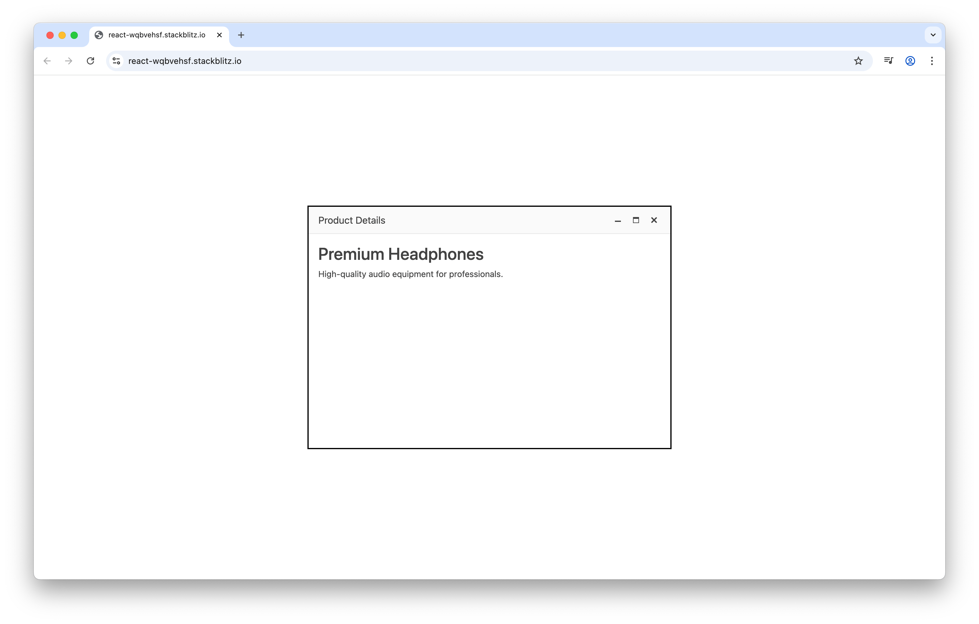
<Window
title="Product Details"
initialWidth={600}
initialHeight={400}
onClose={() => setVisible(false)}
>
<div className="product-content">
<h3>Premium Headphones</h3>
<p>High-quality audio equipment for professionals.</p>
</div>
</Window>
)}
</>
);
};
The above code example results in a “Product Details” window that opens at the specified 600x400 pixel dimensions.
Controlling Resize Behavior
By default, windows can be resized by dragging their edges or corners. We can control this behavior using the resizable prop and set minimum dimensions with minWidth and minHeight:
import * as React from 'react';
import { Window } from '@progress/kendo-react-dialogs';
import { Button } from '@progress/kendo-react-buttons';
const App = () => {
const [visible, setVisible] = React.useState(true);
const [allowResize, setAllowResize] = React.useState(true);
const handleClose = () => {
setVisible(false);
};
return (
<>
{visible && (
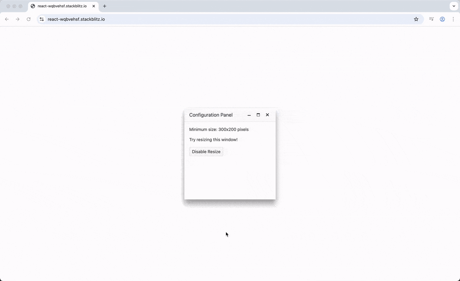
<Window
title="Configuration Panel"
resizable={allowResize}
minWidth={300}
minHeight={200}
onClose={handleClose}
>
<p>Minimum size: 300x200 pixels</p>
<p>Try resizing this window!</p>
<Button onClick={() => setAllowResize(!allowResize)}>
{allowResize ? 'Disable Resize' : 'Enable Resize'}
</Button>
</Window>
)}
</>
);
};
export default App;
In this example, we’ll see a window with a “Disable Resize” button inside. When resize is enabled, we can drag the window edges to make it larger or smaller, but it will stop shrinking once it reaches the minimum 300x200 pixel size.
Positioning and Dragging
Windows need to appear in the right place and be movable so users can arrange their workspace. The Window component provides several options for controlling position and movement.
Initial Positioning
We can set where a window first appears using the initialTop and initialLeft props:
import * as React from 'react';
import { Window } from '@progress/kendo-react-dialogs';
import { Button } from '@progress/kendo-react-buttons';
const App = () => {
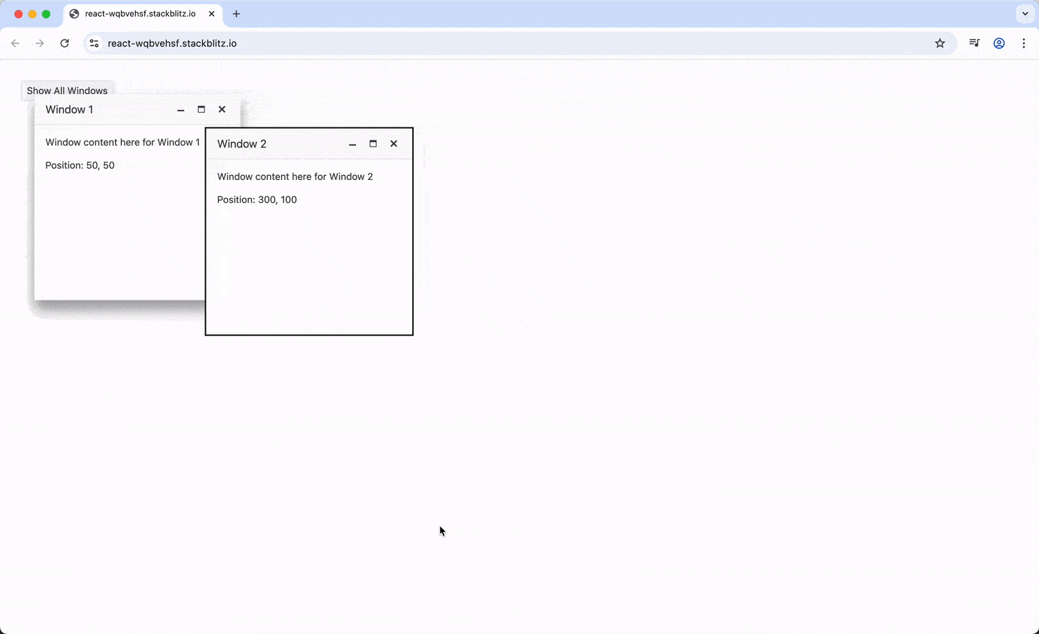
const [windows, setWindows] = React.useState([
{ id: 1, visible: true, left: 50, top: 50 },
{ id: 2, visible: true, left: 300, top: 100 }
]);
const handleClose = (windowId) => {
setWindows(windows.map(window =>
window.id === windowId
? { ...window, visible: false }
: window
));
};
const showAllWindows = () => {
setWindows(windows.map(window => ({ ...window, visible: true })));
};
return (
<>
<Button onClick={showAllWindows}>Show All Windows</Button>
{windows.map(window => (
window.visible && (
<Window
key={window.id}
title={`Window ${window.id}`}
initialLeft={window.left}
initialTop={window.top}
onClose={() => handleClose(window.id)}
>
<p>Window content here for Window {window.id}</p>
<p>Position: {window.left}, {window.top}</p>
</Window>
)
))}
</>
);
};
export default App;
The above example demonstrates two windows opening at different positions. We’ll see “Window 1” appear near the top-left (50, 50) and “Window 2” appear further down and to the right (300, 100). The “Show All Windows” button will restore any closed windows, demonstrating how multiple windows can coexist at predetermined positions.
Window States: Minimize, Maximize and Restore
Modern window systems allow users to minimize windows to save space or maximize them for focused work. The Window component supports these states through the stage prop.
import * as React from 'react';
import { Window } from '@progress/kendo-react-dialogs';
import { Button } from '@progress/kendo-react-buttons';

const App = () => {
  const [visible, setVisible] = React.useState(true);
  const [stage, setStage] = React.useState('DEFAULT');

  const handleStageChange = (e) => {
    setStage(e.stage);
  };

  const handleClose = () => {
    setVisible(false);
  };

  return (
    <>
      {visible && (
        <Window
          title="Document Editor"
          stage={stage}
          onStageChange={handleStageChange}
          onClose={handleClose}
        >
          <div className="editor-toolbar">
            <Button onClick={() => setStage('MINIMIZED')}>
              Minimize
            </Button>
            <Button onClick={() => setStage('FULLSCREEN')}>
              Maximize
            </Button>
            <Button onClick={() => setStage('DEFAULT')}>
              Restore
            </Button>
          </div>
          <textarea
            className="editor-content"
            style={{ width: '100%', height: '150px', resize: 'none' }}
            placeholder="Start typing your document..."
          />
        </Window>
      )}
    </>
  );
};

export default App;
Running the above code shows a “Document Editor” window with a toolbar containing Minimize, Maximize and Restore buttons. Clicking “Minimize” shrinks the window to just its title bar, “Maximize” expands it to fill the screen and “Restore” returns it to standard size.
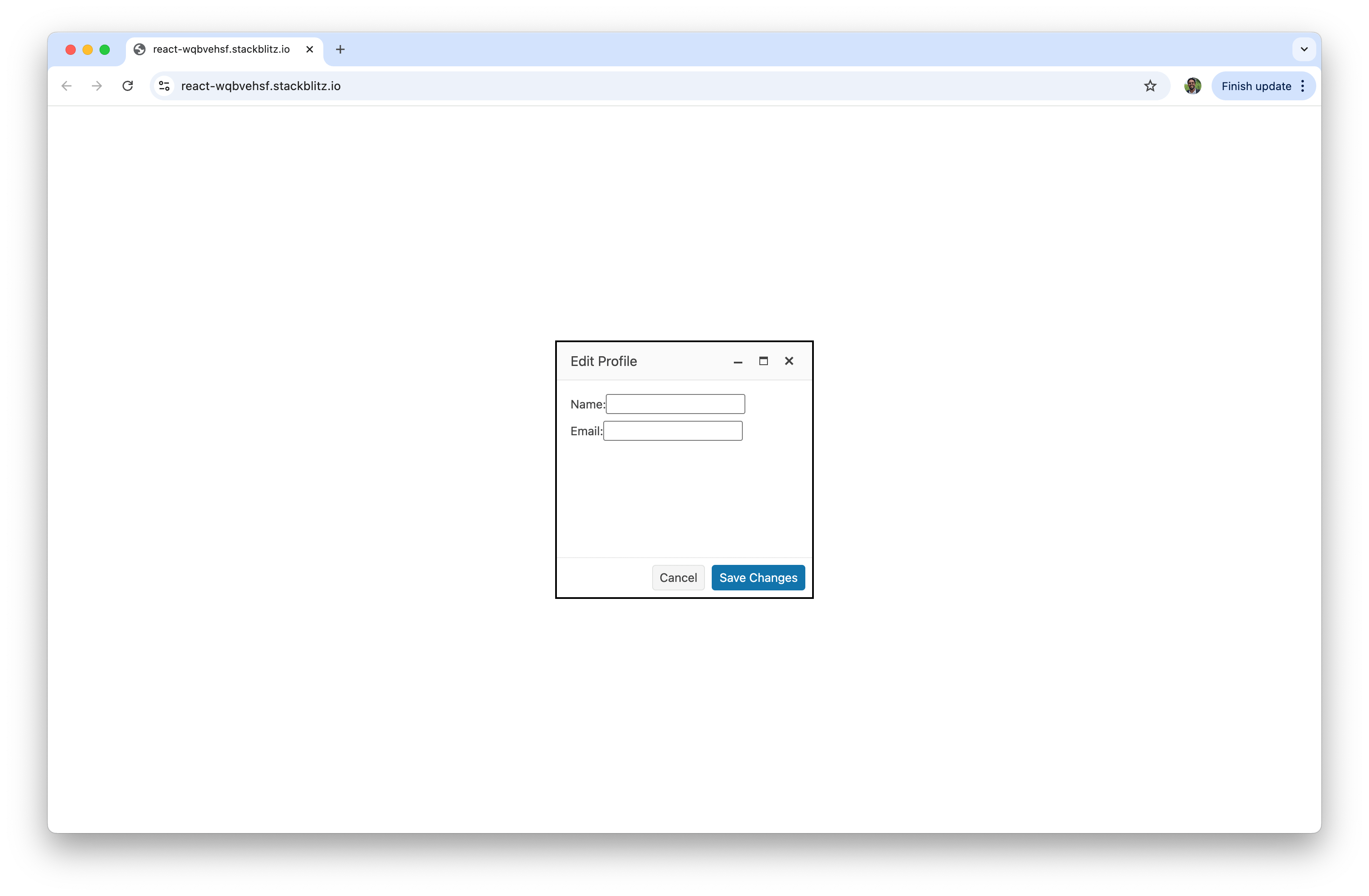
Adding Action Buttons
Windows often need action buttons for saving, canceling or performing other operations. The Window component provides the WindowActionsBar component for this purpose:
import * as React from 'react';
import { Window, WindowActionsBar } from '@progress/kendo-react-dialogs';
import { Button } from '@progress/kendo-react-buttons';

const App = () => {
  const [visible, setVisible] = React.useState(true);
  const [formData, setFormData] = React.useState({ name: '', email: '' });

  const handleSave = () => {
    // Save logic here
    console.log('Saving:', formData);
    setVisible(false);
  };

  const handleInputChange = (field, value) => {
    setFormData(prev => ({ ...prev, [field]: value }));
  };

  return (
    <>
      {visible && (
        <Window title="Edit Profile" onClose={() => setVisible(false)}>
          <div className="form-content">
            <label>
              Name:
              <input
                type="text"
                value={formData.name}
                onChange={(e) => handleInputChange('name', e.target.value)}
              />
            </label>
            <label>
              Email:
              <input
                type="email"
                value={formData.email}
                onChange={(e) => handleInputChange('email', e.target.value)}
              />
            </label>
          </div>
          <WindowActionsBar layout="end">
            <Button onClick={() => setVisible(false)}>
              Cancel
            </Button>
            <Button themeColor="primary" onClick={handleSave}>
              Save Changes
            </Button>
          </WindowActionsBar>
        </Window>
      )}
    </>
  );
};

export default App;
In the above code example, we’ll notice Cancel and Save Changes action buttons situated at the bottom of the window.
Wrap-up
The KendoReact Window component provides everything we need to create windowing interfaces in React applications. From simple modal dialogs to complex multi-document interfaces, its combination of built-in functionality and customization options makes it suitable for a wide range of applications.
Don’t forget, you can try out this component for yourself with KendoReact Free.

Hassan Djirdeh
Hassan is a senior frontend engineer and has helped build large production applications at-scale at organizations like Doordash, Instacart and Shopify. Hassan is also a published author and course instructor where he’s helped thousands of students learn in-depth frontend engineering skills like React, Vue, TypeScript, and GraphQL.
Related Posts
Comments
All articles
Topics
Web MobileMobile
Desktop
Design
Productivity
People
