JavaScript Charts: Comparing D3 to Kendo UI for Data Visualization

Summarize with AI:
We examine some of the differences in concepts and styles between using the D3 library and using the Kendo UI library to create a simple bar chart.
I recently was tasked with creating a couple of charts using the D3 library for a course I was taking. Naturally I asked if I could use Kendo UI's charts instead, as I'm familiar with them, but the course called for D3 specifically. So, for fun I tried to create a chart in D3 and Kendo UI at the same time just to see the differences.
D3 and Kendo UI are just two of the ways you can create charts in a web app, and options range from simply drawing shapes on the screen to using sophisticated charting components. Both D3 and Kendo UI are popular and both will get the job done. The similarities end there, however, and the two represent very different approaches, with very different features.
D3
D3 stands for Data-Driven Documents and it is a JavaScript library for creating dynamic and interactive data visualizations. It was first released in 2011 and includes a very flexible and powerful set of features to help you build up various graphical data visualizations.
Kendo UI
Kendo UI is a set of JavaScript libraries that includes a large array of components ranging from data grids and charts to schedulers, dropdowns and even buttons. Kendo UI was originally developed by the Telerik company, which is now a part of Progress. Kendo UI is a commercial library and there are versions available that support the Angular, React, and Vue frameworks as well as basic jQuery environments. The Kendo UI chart components include a wide range of popular chart types including bar, pie, line and others.
Getting Started
My goal here is to use both tools to implement the same chart using both libraries. The chart I want to implement (drawn here in Excel, to be neutral) is:
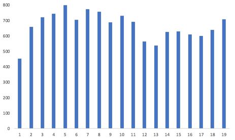
In addition, to show off how to do some basic animation, let's also add in tool tips so that when you mouse over one of the bars you see the value for that bar displayed.
This means we need to do three basic things:
- Draw the basic bars that reflect the individual data values
- Draw the X and Y axis and display labels
- Create tooltips for the chart
Rather than describe either library in further detail, let's just get started and see what they look like.
File Setup
The first thing we need to do is to include both of these libraries. For the sake of simplicity and portability, I'll load everything from the net instead of assuming you have downloaded the libraries. We'll start by adding two CSS libraries that the Kendo UI library will use. Next we add in the jQuery library that Kendo UI also uses. Then we link in the actual Kendo UI library. Finally, we include a link to the D3 library.
<!-- stylesheets for the Kendo UI library -->
<link rel="stylesheet" href="https://kendo.cdn.telerik.com/2018.2.620/styles/kendo.common-bootstrap.min.css">
<link rel="stylesheet" href="https://kendo.cdn.telerik.com/2018.2.620/styles/kendo.bootstrap.min.css">
<!-- jQuery library -->
<script src="https://ajax.googleapis.com/ajax/libs/jquery/3.3.1/jquery.min.js"></script>
<!-- the Kendo UI library -->
<script src="https://kendo.cdn.telerik.com/2018.2.620/js/kendo.all.min.js"></script>
<!-- the d3 library -->
<script src="https://d3js.org/d3.v4.min.js"></script>
We will also use the same data set for both charts, which is:
var data = [454, 660, 721, 746, 808, 704, 775, 756, 688, 733, 693, 564, 537, 628, 630, 611, 600, 640,694, 708 ];The Markup
There is very little that we need to do in HTML beyond putting in a placeholder for each chart, and specifying the size of the chart area.
<h2>D3 Chart</h2>
<svg id="chart1" width="600" height="300"></svg>
<hr />
<h2>Kendo UI Chart</h2>
<div id="chart2" style="width:600px;height:300px"></div>
Creating a Basic D3 Chart
Now for the fun part! We'll start with the D3 chart first. There are several things we need to do. Aside from identifying where to put the chart, we need to define the x and the y scales, do some housekeeping for size and placement, and then add the data to the chart area. Here is the code for this.
function drawDChart() {
  var svg = d3.select("#chart1");
  var margin = 5;
  var width = + svg.attr("width") - 30;
  var height = + svg.attr("height") - margin - 40;
  var y = d3.scaleLinear()
    .domain([0, 800])
    .range([height, 0]);
  var x = d3.scaleLinear()
    .domain([0, data.length])
    .range([0, width - 20]);
  var g = svg.append("g")
    .attr("transform", "translate( 0, " + margin + " )");
  g.append("g")
    .attr("transform", "translate( 55, 0 )")
    .selectAll("rect")
    .data(data)
    .enter().append("rect")
    .attr("width", (width / data.length - 15))
    .attr("height", function (d) { return height - y(d); })
    .attr("x", function (d, i) { return x(i) + 5; })
    .attr("y", function (d) { return y(d); })
    .attr("fill", function (d, i) { return "steelblue" });
};
In the first line, we select the chart which has the id of "chart1". The next few lines establish the height and width of the chart based on the dimensions we specified in the HTML code, minus some margins and allowing room for axis.
The next two sections establish the scales of the two axis. These will be used to translate the actual data values into coordinates on the chart. I've hard-coded the "800" as the upper limit for the Y scale. In a real usage we'd want to find the maximum in the data to be displayed and then round up. In this case, the largest value is 775 and I rounded up to 800 because we don't want our chart to stop at 775 as that would look odd. The X axis is scaled by the number of values in our data set. In the next section we nudge the chart a bit in the display area.
Now we get to the meat of the D3 section. Here we tell D3 what data we are going to use, and specify the basic elements of each bar in the chart. We tell it the width of each bar, we tell it the height of the bar (taking the data value and scaling it). We tell it where to place each bar, specifying the X and the Y values using the scales that we specified earlier. Finally, I told it to color each bar with "steelblue" just because I like blue.
Notice in the middle that we "enter" the new information. This is part of a basic concept of D3. There are three things you can do with a chart: enter, update, and exit. Enter takes new data and adds it to an existing chart – it adds new bars to the chart. Update changes values for existing bars. Exit removes elements (bars) from the chart. We don't need to go into that in detail here, but just know it's a concept you need to become familiar with if you are going to do anything at all complicated with D3.
With the code that we have specified so far, this is what we get:
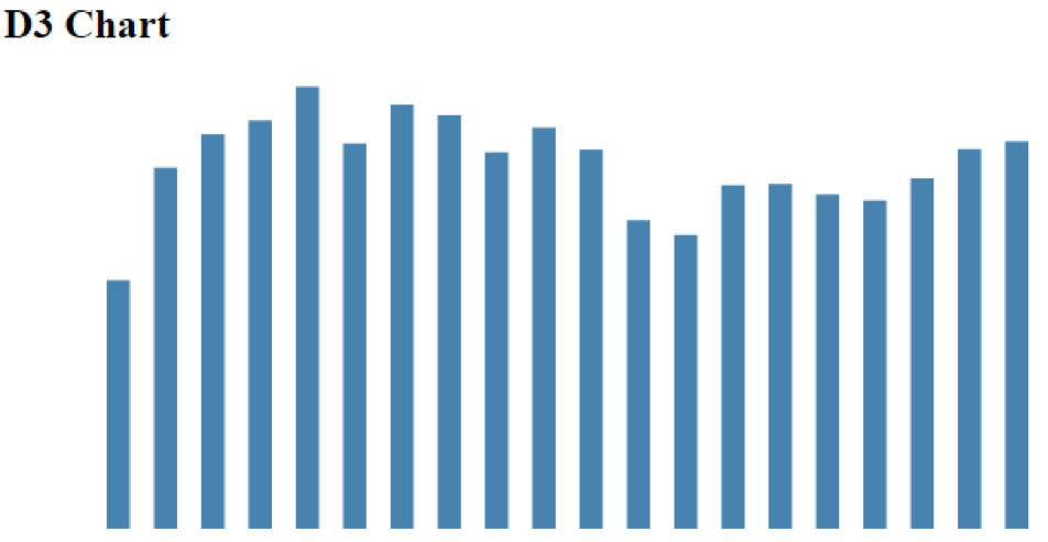
Note that there are no axis because we haven't specified any yet, it's just a set of bars.
Kendo UI Chart
Now on to drawing the same chart with Kendo UI. This is really complicated (I'm joking). Basically all we have to do is tell it what type of chart and what the data is. The code for this is:
function drawKChart() {
  $("#chart2").kendoChart({
    seriesDefaults: {
      type: "column"
    },
    series: [{
      data: data,
      color: "steelblue"
    }]
  });
}
Not much more to say about it here. This gives us the chart:
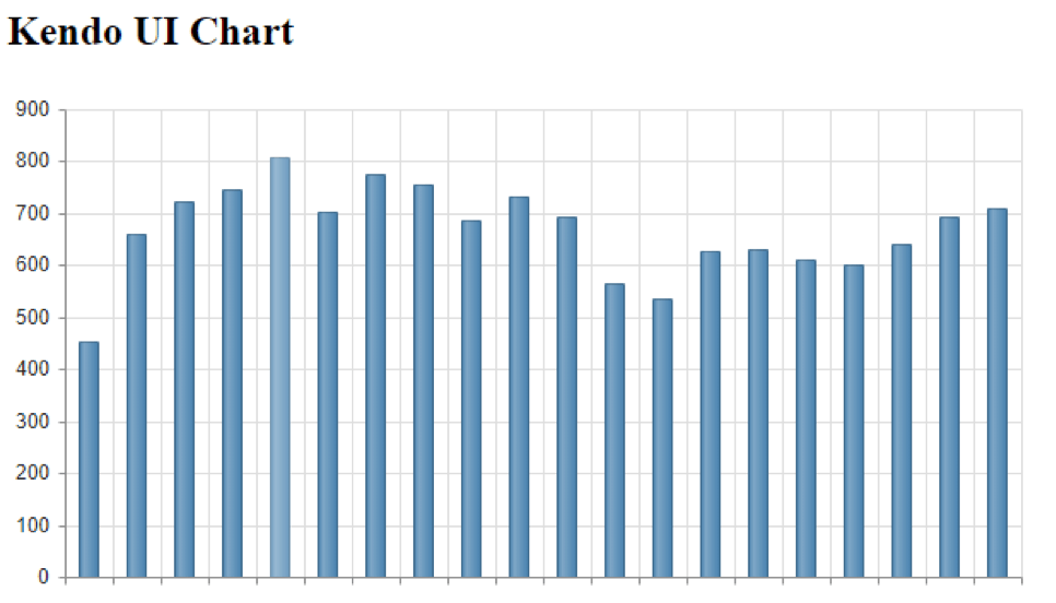
You will see a few differences right off. Note that we did not have to tell the Kendo UI chart what our maximum Y axis should be. It looks at the data, rounds up, and picks a reasonable range to use. Likewise we didn't tell it anything about the X axis – it just counted the number of data points and scaled here accordingly. While it did not draw an X axis with labels, because we didn't give it any, it did at least draw the axis lines. It also took the "steelblue" I specified and added some shading to make it look a little more interesting.
Finally, it added grid lines. This is a good example of the different approach between the two libraries. D3 does what I tell it and only what I tell it. It assumes that if I want grid lines, I'll tell it to use grid lines. Kendo UI assumes that I want to draw a useful and pleasing chart. So it makes assumptions about what I am going to want. I can turn off the grid lines, but the default is that I'll probably want them, so instead of having to add them (D3), with Kendo UI I'd have to disable them. Different approach.
Making it Work
And because I always hate when people give partial examples that I can't run, I will also list the last piece of my program that I need to actually run these two functions, which is:
$(document).ready(function () {
  drawDChart();
  drawKChart();
});
This just waits until the document is ready and then runs the two chart functions. Now you have the whole code.
Next Steps
Let's go a step further and first of all turn off those grid lines so that our two charts match. This is done easily in the Kendo UI code by adding two more sections to the kendoChart. These will turn off both horizontal and vertical grid lines to match the D3 chart, and also force the Y axis to use 800 as it's max value instead of the 900 it picked. This also matches what we told our D3 chart.
categoryAxis: {
  majorGridLines: {
    visible: false
  }
},
valueAxis: {
  max: 800,
  majorGridLines: {
    visible: false
  }
}
Adding the Axis
The next thing missing is the Y axis on our D3 chart. We didn't have to tell Kendo UI to add a Y axis, it did that automatically. Again, Kendo UI does what it thinks we'll need in a chart, D3 does only what we tell it. While we're at it, let's add in an X axis on both charts. To add both axis on the D3 chart, we just need to add in the code:
// create the y axis
g.append("g)
  .attr("transform", "translate( 40, 0 )")
  .call(d3.axisLeft(y));
// create the x axis
g.append("g")
  .attr("transform", "translate( 40," + height + " )")
  .call(d3.axisBottom(x));
This is pretty simple. We just tell D3 where we want it placed with translate, and then just tell it to add the axis and give it the data.
On the Kendo UI side we already have the Y axis, and the lines for the X axis, we just need the labels. For this we just add some data to the CategoryAxis section we put in before to give us:
categoryAxis: {
  categories: [1,2,3,4,5,6,7,8,9,10,11,12,13,14,15,16,17,18,19,20],
  majorGridLines: {
    visible: false
  }
}
This gives us two very close charts. There are a few minor details I could tweak to make them exactly alike, but this is close enough.
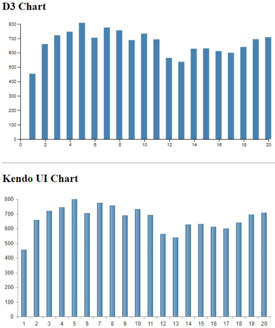
Tool Tips
One last thing I'll add to both charts is a set of tool tips to give us data details when we hover over any bar. This will highlight how we add animation.
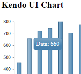
For the Kendo UI chart, all we need to do is add the following section to our chart code:
tooltip: {
  visible: true,
  template: "Data: #= value #"
}
And we get this:
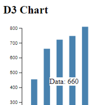
On the D3 side, of course, we need a little more information. First we need to add a section defining exactly how the tool tip will look. This is done with the code:
// define the tooltips parameters
var ttip = d3.select("body")
  .append("div")
  .style("position", "absolute")
  .style("z-index", "10")
  .style("visibility", "hidden")
  .style("background", "white")
And then we need to actually add the action to the chart section by adding on:
// set the tooltip
.on("mouseover", function (d, i) {
  .ttip.style("visibility", "visible" )
  .style("left",(d3.event.pageX)+"px")
  .style("top",(d3.event.pageY)+"px")
  .html("Data: "+d)
});
.on("mouseout", function() { ttip.style("visibility", "hidden" ) });
Both of these are pretty straightforward. This code says that when we mouse over a column, display the tooltip at a specific location. The final line in that section is similar to the one on the Kendo UI side where we have a chance to provide a template for what exactly gets displayed in the tool tip. For the D3 chart this gives us:
The whole code for this example is available for you to check out on GitHub.
Conclusion
Both D3 and Kendo UI are widely used and it's not fair to say that one is better than the other. They are at different levels of abstraction and they serve different purposes. D3 lets you have detailed control over every aspect of the visualization. Kendo UI lets you control many parameters as well, but makes a number of assumptions about what you want to see. You can make D3 do everything that Kendo UI automatically does, but you need to explicitly tell it to do each individual thing. And where D3 requires you to do some level of programming for each new feature, for Kendo UI these are just additional parameters you can set.
If you need to get a job done and actually deliver a web app on schedule, and you need support in case you get stuck or something goes wrong, then a commercial library like Kendo UI is your best bet. If you are doing something truly unusual that requires extreme customization, or are working on a class project, or some other non-commercial application and you enjoy just playing with code, then D3 is a good fit. Both options are certainly better than drawing individual rectangles!
For more information, check out:

John Willoughby
John loves technology and because he just doesn’t get enough during the day, he also writes apps for fun as a hobby. He has worked in various software development and product marketing roles at both hardware and software companies. John has a Bachelor's in Electrical Engineering (Computer Design) and is in the middle of his Master's in Computer Science. When not actually sitting in front of a monitor he enjoys playing guitar.
