
An Introduction to Zustand

Summarize with AI:
Learn about state management library Zustand and see a practical UI demo using the Progress KendoReact Switch component to toggle a global theme.
State management in React applications has evolved over the years. While Redux dominated the landscape for a long time, developers have been seeking simpler, more lightweight alternatives that don’t sacrifice power for convenience.
According to the recent State of React 2024 survey, Zustand has emerged as a growing favorite with 42% usage, up from 28% in 2023. In this article, we’ll cover what makes Zustand appealing, how to set it up, and a practical UI demo using the Progress KendoReact Switch component to toggle a global theme.
Zustand
Zustand is a small state management library that provides a simple, hook-based API for managing global state in React applications. Unlike Redux, which requires actions, reducers and more boilerplate code, Zustand lets you create stores with just a few lines of code while still being powerful enough to handle complex state scenarios.
Why Choose Zustand Over Other Solutions?
Before diving into how Zustand works, let’s understand why you might choose it over other state management solutions. Compared to React’s built-in useState and useContext hooks, Zustand offers better performance since components only rerender when the specific state they subscribe to changes.
Compared to Redux, Zustand offers a smaller learning curve, making it easier to understand and implement.
That said, you should stick with useState and useContext for simple applications with minimal state sharing needs!
Creating Your First Store
To get started with Zustand, first install it in our React project:
npm install zustand
Once installed, we can immediately start creating stores and using them in our components.
The core concept in Zustand is the store, a hook that contains your state and the functions to update it. Let’s create a simple example using a theme toggle feature with the React Switch component from the Progress KendoReact UI library.
We’ll install the KendoReact Switch component from the @progress/kendo-react-inputs package:
npm install @progress/kendo-react-inputs
Now, we’ll create a simple theme store:
import { create } from 'zustand';

const useThemeStore = create((set) => ({
  isDarkMode: false,
  toggleTheme: () => set((state) => ({ isDarkMode: !state.isDarkMode })),
  setTheme: (isDark) => set({ isDarkMode: isDark }),
}));
In this example, we’re creating a store that manages a theme state. The create function takes a function that receives a set function, which we use to update the store’s state. Our store contains:
isDarkMode: A boolean state indicating whether dark mode is enabledtoggleTheme: A function that flips the current theme statesetTheme: A function that sets the theme to a specific value
Using the Store in Components
We can now create a component that uses our theme store with the KendoReact Switch:
import React from 'react';
import { Switch } from '@progress/kendo-react-inputs';
import { useThemeStore } from './store';
const ThemeToggle = () => {
const { isDarkMode, toggleTheme } = useThemeStore();
return (
<div style={{
padding: '20px',
backgroundColor: isDarkMode ? '#333' : '#fff',
color: isDarkMode ? '#fff' : '#333',
borderRadius: '8px',
margin: '20px'
}}>
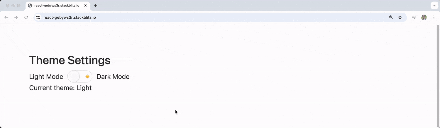
<h3>Theme Settings</h3>
<div style={{ display: 'flex', alignItems: 'center', gap: '10px' }}>
<span>Light Mode</span>
<Switch
checked={isDarkMode}
onChange={(event) => toggleTheme()}
onLabel="🌙"
offLabel="☀️"
/>
<span>Dark Mode</span>
</div>
<p>Current theme: {isDarkMode ? 'Dark' : 'Light'}</p>
</div>
);
};
export default ThemeToggle;
The component destructures isDarkMode and toggleTheme from our store and uses the theme state to style the container conditionally. The KendoReact Switch component is used to toggle between light and dark modes with sun and moon emojis.
Creating a More Complex Example
Let’s build a more comprehensive example that demonstrates more of Zustand’s capabilities. We’ll create a user preferences store that manages multiple settings:
import { create } from 'zustand';

const usePreferencesStore = create((set, get) => ({
  // State
  user: {
    name: 'Guest',
    email: '',
  },
  settings: {
    notifications: true,
    autoSave: false,
    darkMode: false,
    language: 'en',
  },

  // Actions
  updateUser: (userData) => set((state) => ({
    user: { ...state.user, ...userData }
  })),

  toggleSetting: (settingKey) => set((state) => ({
    settings: {
      ...state.settings,
      [settingKey]: !state.settings[settingKey]
    }
  })),

  updateSettings: (newSettings) => set((state) => ({
    settings: { ...state.settings, ...newSettings }
  })),

  resetPreferences: () => set({
    user: { name: 'Guest', email: '' },
    settings: {
      notifications: true,
      autoSave: false,
      darkMode: false,
      language: 'en',
    }
  }),

  // Computed values
  getDisplayName: () => {
    const state = get();
    return state.user.name || 'Anonymous User';
  },
}));
This store demonstrates a more complex structure with nested state objects for user data and settings. We define multiple actions to handle different types of updates and include a computed value using the get function.
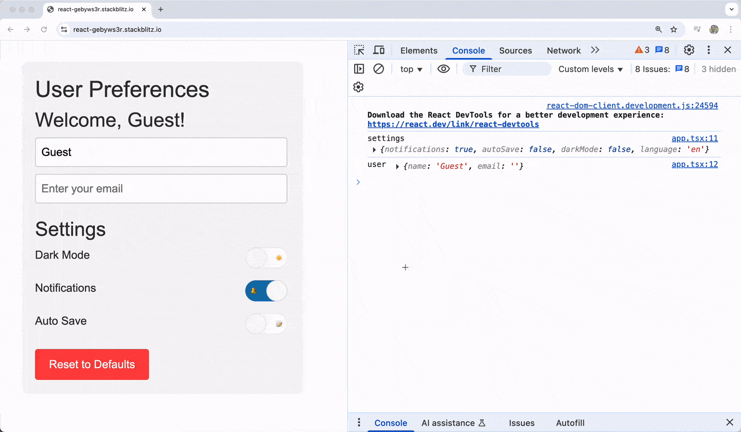
We’ll now create a comprehensive settings panel component with the help of the KendoReact Switch component:
import React from 'react';
import { Switch } from '@progress/kendo-react-inputs';
import { usePreferencesStore } from './store';

const SettingsPanel = () => {
  const {
    settings,
    user,
    toggleSetting,
    updateUser,
    resetPreferences,
    getDisplayName
  } = usePreferencesStore();

  return (
    <div style={{
      padding: '20px',
      maxWidth: '400px',
      backgroundColor: settings.darkMode ? '#2d2d2d' : '#f5f5f5',
      color: settings.darkMode ? '#fff' : '#333',
      borderRadius: '8px',
      fontFamily: 'Arial, sans-serif'
    }}>
      <h2>User Preferences</h2>

      {/* User Info Section */}
      <div style={{ marginBottom: '20px' }}>
        <h3>Welcome, {getDisplayName()}!</h3>
        <input
          type="text"
          placeholder="Enter your name"
          value={user.name}
          onChange={(e) => updateUser({ name: e.target.value })}
          style={{
            padding: '8px',
            borderRadius: '4px',
            border: '1px solid #ccc',
            width: '100%',
            marginBottom: '10px'
          }}
        />
        <input
          type="email"
          placeholder="Enter your email"
          value={user.email}
          onChange={(e) => updateUser({ email: e.target.value })}
          style={{
            padding: '8px',
            borderRadius: '4px',
            border: '1px solid #ccc',
            width: '100%'
          }}
        />
      </div>

      {/* Settings Section */}
      <div style={{ marginBottom: '20px' }}>
        <h3>Settings</h3>

        <div style={{ marginBottom: '15px' }}>
          <div style={{ display: 'flex', justifyContent: 'space-between', alignItems: 'center' }}>
            <label>Dark Mode</label>
            <Switch
              checked={settings.darkMode}
              onChange={() => toggleSetting('darkMode')}
              onLabel="🌙"
              offLabel="☀️"
            />
          </div>
        </div>

        <div style={{ marginBottom: '15px' }}>
          <div style={{ display: 'flex', justifyContent: 'space-between', alignItems: 'center' }}>
            <label>Notifications</label>
            <Switch
              checked={settings.notifications}
              onChange={() => toggleSetting('notifications')}
              onLabel="🔔"
              offLabel="🔕"
            />
          </div>
        </div>

        <div style={{ marginBottom: '15px' }}>
          <div style={{ display: 'flex', justifyContent: 'space-between', alignItems: 'center' }}>
            <label>Auto Save</label>
            <Switch
              checked={settings.autoSave}
              onChange={() => toggleSetting('autoSave')}
              onLabel="💾"
              offLabel="📝"
            />
          </div>
        </div>
      </div>

      <button
        onClick={resetPreferences}
        style={{
          padding: '10px 20px',
          backgroundColor: '#ff4444',
          color: 'white',
          border: 'none',
          borderRadius: '4px',
          cursor: 'pointer'
        }}
      >
        Reset to Defaults
      </button>
    </div>
  );
};

export default SettingsPanel;
For the sake of brevity, the code examples in this article use inline styles rather than separate stylesheets or styled-components.
The component destructures multiple pieces of state and actions from the store and uses conditional styling based on the dark mode setting. The component connects three KendoReact Switch components to toggle different preferences with emoji labels.
Understanding State Updates
One of Zustand’s strengths is how it handles state updates. The set function automatically merges the new state with the existing state at the top level, similar to React’s setState. However, for nested objects, we would need to handle the merging ourselves:
// This works for top-level properties
set({ isDarkMode: true });

// For nested objects, we need to spread
set((state) => ({
  settings: {
    ...state.settings,
    darkMode: true
  }
}));
We can also replace the entire state by passing true as the second parameter:
set(newState, true); // This replaces the entire state
Store Organization and Best Practices
Here are some good practices to keep in mind when working with Zustand stores in a large application.
1. Single Store vs. Multiple Stores
Zustand doesn’t enforce any particular pattern, but it’s preferable to:
- Use a single store for related state that might need to interact.
- Split into multiple stores for completely independent features.
// Good: Related user state in one store
const useUserStore = create((set) => ({
  profile: null,
  preferences: {},
  updateProfile: (data) => set((state) => ({ profile: { ...state.profile, ...data } })),
  updatePreferences: (prefs) => set({ preferences: prefs }),
}));

// Good: Separate store for unrelated shopping cart state
const useCartStore = create((set) => ({
  items: [],
  total: 0,
  addItem: (item) => set((state) => ({
    items: [...state.items, item],
    total: state.total + item.price
  })),
}));
2. Store Slicing
For larger applications, we can also split our store into slices:
const createUserSlice = (set, get) => ({
  user: null,
  setUser: (user) => set({ user }),
  clearUser: () => set({ user: null }),
});

const createSettingsSlice = (set, get) => ({
  settings: { theme: 'light', notifications: true },
  updateSettings: (newSettings) => set((state) => ({
    settings: { ...state.settings, ...newSettings }
  })),
});

const useAppStore = create((...a) => ({
  ...createUserSlice(...a),
  ...createSettingsSlice(...a),
}));
3. Actions Outside the Store
We can also define actions outside the store if we prefer:
const useCounterStore = create(() => ({
  count: 0,
}));

// External actions
export const increment = () =>
  useCounterStore.setState((state) => ({ count: state.count + 1 }));

export const decrement = () =>
  useCounterStore.setState((state) => ({ count: state.count - 1 }));

export const reset = () =>
  useCounterStore.setState({ count: 0 });
Wrap-up
Zustand represents a shift toward simplicity in React state management without sacrificing flexibility. Its hook-based API feels natural to React developers, while its performance characteristics and minimal boilerplate make it an excellent choice for both small projects and large applications.
For more information on Zustand and the KendoReact Switch component, be sure to check out the official documentation for these utilities:
The KendoReact Switch is part of KendoReact Free—free to use, including in production, no sign-up or license required.

Hassan Djirdeh
Hassan is a senior frontend engineer and has helped build large production applications at-scale at organizations like Doordash, Instacart and Shopify. Hassan is also a published author and course instructor where he’s helped thousands of students learn in-depth frontend engineering skills like React, Vue, TypeScript, and GraphQL.
Related Posts
Comments
All articles
Topics
Web MobileMobile
Desktop
Design
Productivity
People
