How to Use a Vue ListView UI Component in Your Web App

Summarize with AI:
A ListView allows you to define a custom template to display a list of items, using either remote or local data. Learn how to easily use one in your web apps.
In my last post we learned about the ButtonGroup component in Kendo UI for Vue, and in this post, you will learn how to use the ListView component.
The ListView allows you to define a custom template for displaying a list of items. The data items can come from a local data source or a remote data source such as an API. It is possible to render a list of items in Vue using the v-for attribute. However, the Kendo UI ListView component comes with additional features. When using remote data, resources can be created, retrieved, updated and deleted without having to write request handlers. Requests are taken care of by a DataSource component just by setting its attributes. Additionally, the list can be paginated using a Pager component.
First, we will see how to use the ListView with local data. Then we will build a list from a remote data source, add pagination, and add edit and delete functionality to each item.
Creating a ListView from Local Data
We begin by initializing a Vue project using the webpack-simple template. Next, we will install Kendo UI, the Material theme, and the ListView Vue package using the following commands.
npm install --save @progress/kendo-ui
npm install --save @progress/kendo-theme-material
npm install --save @progress/kendo-listview-vue-wrapper
In our main.js file, we will import these packages. From the listview-vue-wrapper package, we will import the Pager, ListView, and ListViewInstaller. Our components will be registered globally using the ListViewInstaller and added to the component list.
import Vue from 'vue'
import App from './App.vue'
import '@progress/kendo-ui'
import '@progress/kendo-theme-material/dist/all.css'

import { Pager,
        ListView,
        ListViewInstaller } from '@progress/kendo-listview-vue-wrapper'

Vue.use(ListViewInstaller)

new Vue({
  el: '#app',
  components: {
    Pager,
    ListView
  },
  render: h => h(App)
})
In App.vue we will delete all of the markup and include the ListView in the template.
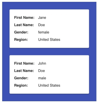
In the script, we will add a data source and template to the component’s data and bind them to the ListView. The data source is bound to the ListView via the data-source attribute. The template is bound via the template attribute. Last, we replace the styles with the styles for our ListView.

<template>
  <div id="app">
    <kendo-listview :data-source="dataSource" :template="template">
    </kendo-listview>
  </div>
</template>

<script>
export default {
  name: 'app',
  data () {
    return {
      dataSource: [
        {
          name: 'Jane',
          surname: 'Doe',
          gender: 'female',
          region: 'United States'
        },
        {
          name: 'John',
          surname: 'Doe',
          gender: 'male',
          region: 'United States'
        }
      ],
      template: `
      <div class="card">
        <div class="card-body">
          <span>First Name:</span> #:name#<br>
          <span>Last Name:</span> #:surname#<br>
          <span>Gender:</span> #:gender#<br>
          <span>Region:</span> #:region#<br>
        </div>
      </div>
      `,
    }
  }
}
</script>

<style>
#app {
  width: 50%;
  min-width: 360px;
  margin: 0 auto;
  font-family: 'helvetica';
}

.k-listview {
 background-color: #3f51b5;
}

.card {
  background: #fff;
  font-size: 16px;
  width: 75%;
  min-width: 286px;
  margin: 2em auto;
  padding: 1.25em;
  border-radius: 4px;
  box-shadow: 0 3px 1px -2px rgba(0,0,0,0.2), 0 2px 2px 0 rgba(0,0,0,0.14), 0 1px 5px 0 rgba(0,0,0,0.12);
}

.card-body span {
  width: 100px;
  display: inline-block;
  font-weight: bold;
}
</style>
Using Remote Data
Our remote data will be structured the same as our local data. The API we will be using comes from the site uinames.com. To get started, we will install the DataSource Vue wrapper, import the package in main.js, register the component globally, and add it to the component list.
npm install --save @progress/kendo-datasource-vue-wrapper
import { DataSource, DataSourceInstaller } from '@progress/kendo-datasource-vue-wrapper'

Vue.use(DataSourceInstaller)

new Vue({
  el: '#app',
  components: {
    Pager,
    ListView,
    DataSource
  },
  render: h => h(App)
})
Next, we add the data source component to our app template. We must specify the URL of the request and the data-type in the attributes. We are retrieving data so we will use the transport-read-url attribute to set our URL. We will specify the data type is JSON in the transport-read-data-type attribute. We also need to add a page-size attribute for pagination to work. You can set other request types and define the schema in your data source attributes. Our API returns an array of objects so there is no need to configure the schema.
The following DataSource component is added to the template.
<kendo-datasource ref="dataSource"
:transport-read-url="'https://uinames.com/api/?amount=20®ion=united+states'"
:transport-read-data-type="'json'"
:page-size="4">
</kendo-datasource>
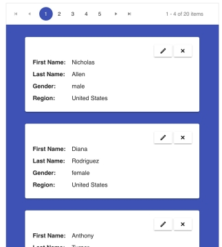
The Pager component splits the list into pages. The pager component is bound to a DataSource component via its data-source-ref attribute. The value is the value of the ref attribute given to the DataSource component. The following component is placed in our template right before the ListView:
<kendo-pager :data-source-ref="'dataSource'">The listview component must also be bound to a DataSource component. The data-source attribute will be replaced with data-source-ref and be equal to the value of the DataSource component’s ref attribute.
The is the updated listview component.
<kendo-listview :data-source-ref="'dataSource'" :template="template"></kendo-listview>
Editing and Deleting
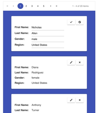
Edit and delete functionality can be easily added to our app. To edit, you add an edit button with the class k-edit-button to your list template. Then, define an edit template in your data. The edit template should have an update and cancel button. You can create an update button by adding the class k-update-button to an element. You create a cancel button by adding the class k-cancel-button to an element. Next, you add the attribute edit-template to the listview component and set it equal to the edit template you defined.
There is no need to write an event handler. Clicking on the edit button will automatically put the component in edit mode. Clicking the update button will commit the changes, and clicking the cancel button will discard any changes that were made. To delete an item, you only need to add a button to the template that has the class k-delete-button. The following is the updated template with the edit and delete button added to the header of the card.
      <div class="card">
        <div class="card-header">
          <div class="card-controls">
            <button class="k-button k-edit-button"><span class="k-icon k-i-edit"></span></button>
            <button class="k-button k-delete-button"><span class="k-icon k-i-close"></span></button>
          </div>
        </div>
        <div class="card-body">
          <span>First Name:</span> #:name#<br>
          <span>Last Name:</span> #:surname#<br>
          <span>Gender:</span> #:gender#<br>
          <span>Region:</span> #:region#<br>
        </div>
      </div>
The edit template will display the name of each field and an input to enter its new value. The input should have a data-bind and name attribute equal to the field name. This is our new edit template:
      <div class="card">
        <div class="card-header">
          <div class="card-controls">
            <a class="k-button k-update-button"><span class="k-icon k-i-check"></span></a>
            <a class="k-button k-cancel-button"><span class="k-icon k-i-cancel"></span></a>
          </div>
        </div>
        <div class="card-body">
          <div>
            <label>First Name:</label>
            <input type="text" class="k-textbox" data-bind="value:name" name="name">
          </div>
          <div>
            <label>Last Name:</label>
            <input type="text" class="k-textbox" data-bind="value:surname" name="surname">
          </div>
          <div>
            <label>Gender:</label>
            <input type="text" class="k-textbox" data-bind="value:gender" name="gender">
          </div>
          <div>
            <label>Region:</label>
            <input type="text" class="k-textbox" data-bind="value:region" name="region">
          </div>
        </div>
      </div>
Next, the edit-template attribute is added to the ListView component.
<kendo-listview
  :data-source-ref="'dataSource'"
  :template="template"
  :edit-template="editTemplate">
</kendo-listview>
Finally, here are the additional styles.
.card-body span, .card-body label {
  width: 100px;
  display: inline-block;
  font-weight: bold;
}
.card-header {
  height: 2.5em;
}
.card-controls {
  float: right;
}

This is the link to the final project: https://github.com/albertaw/kendoui-listview
Summary
First, we created a ListView component by defining our data items locally. We created a template for the items that we bound to the component with the template attribute. Next, we saw how to create a listview using data from an API. All data handling was configured in the DataSource component and we added pagination using the pager component. Last, we added the ability to edit and delete cards.
In the next post, we will continue working with the DataSource component to create a Grid.
Resources
- Kendo UI Vue Docs and Demos
- Vue.js Webpack-Simple Template
- Project Repo
- Vue.js Webpack-Simple Template
- ListView Overview
- DataSource Overview
- Pager Overview
Try it for Yourself
Want to start taking advantage of the more than 70+ ready-made Kendo UI components, like the Grid or Scheduler? You can begin a free trial of Kendo UI for Vue today and start developing your apps faster.
Angular, React, and jQuery Versions
Looking for UI component to support specific frameworks? Check out Kendo UI for Angular, Kendo UI for React, or Kendo UI for jQuery.

Alberta Williams
Alberta is a software developer and writer from New Orleans. Learn more about Alberta at github.com/albertaw.
