How to Use a jQuery Grid UI Component in Your Web App

Summarize with AI:
Learn how to use the Kendo UI jQuery Grid to provide powerful tabular data viewing, manipulating, and editing features to your app.
In the next few episodes, we are going to take a look at the Kendo UI jQuery Grid component. The Grid is a table that lets you navigate and edit data sets. The data set could be things like customer information or inventory for a store or financial records.
It is important to note that this is a sophisticated data grid, and not a layout grid. Grids like the Bootstrap grid are great for layout, but not very good for data. The Kendo UI Grid provides sophisticated features like sorting, filtering, hierarchy, data import, printing from the grid, exporting to Excel, and more. There are over 100 different parameters that can be used to control the grid behavior, and while we won't cover all of them here, we will give you a taste of the power of the Kendo UI Grid and show some of the more important features.
Basic Kendo UI jQuery Grid
The easiest way to create a Kendo UI Grid is to start with a regular HTML Table, and then add the Kendo UI Grid to it. We'll cover creating a Kendo UI Grid from scratch without using an HTML table after this, but first we'll look at the "add on" approach. It is unlikely that you will use the HTML table approach for a new app, but you might have existing apps that use tables and you just want to add the extra feature that the Kendo UI Grid can provide without re-writing the whole app.
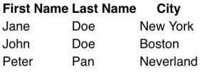
The <thead> element defines the column headers and the <tbody> element defines the table content. Rows are defined with a tr element. A <th> element is a cell inside the column header and a <td> element is a cell inside the table body. Without any styling, the table will bold column headers and position the table cells in line with the columns. This is an example of an HTML table that hasn't been styled:

Using the same table, you can create a jQuery datagrid component that comes styled out of the box according to your theme. The header has background color to distinguish it from the body, borders are added separate rows, and there is styling for the hover state. This is an example of the previous table initialized as a Kendo UI Grid:

<table id="grid">
  <thead>
    <tr>
      <th>First Name</th>
      <th>Last Name</th>
      <th>City</th>
    </tr>
  </thead>
  <tbody>
    <tr>
      <td>Jane</td>
      <td>Doe</td>
      <td>New York</td>
    </tr>
    <tr>
      <td>John</td>
      <td>Doe</td>
      <td>Boston</td>
    </tr>
    <tr>
      <td>Peter</td>
      <td>Pan</td>
      <td>Neverland</td>
    </tr>
  </tbody>
</table>

<script>
  $(document).ready(function() {
    $('#grid').kendoGrid();
  });
</script>
Customizing the Grid Component
Now let's move on to looking at how to create a grid directly using the Kendo UI Grid without an HTML table. We will replace the <table> element with a <div> element, and the data is configured via the columns and dataSource options of the API. The columns can be defined as an array of strings that link the header fields to the fields in the data source. In which case, the field name will also be used as the title of the column. Alternatively, the field and title can be defined separately as an object. The data from our table rows are placed in the dataSource as an array of objects. Here is the updated code:
<div id="grid"></div>
<script>
  $(document).ready(function() {
    $('#grid').kendoGrid({
      columns: [
        { field: 'first', title: 'First Name' },
        { field: 'last', title: 'Last Name' },
        { field: 'city', title: 'City' }
      ],
      dataSource: [
        { first: 'Jane', last: 'Doe', city: 'New York' },
        { first: 'John', last: 'Doe', city: 'Boston' },
        { first: 'Peter', last: 'Pan', city: 'Neverland' }
      ]
    });
  });
</script>
Fields in the jQuery grid can also be made editable by adding the option editable: true. When editing is enabled, clicking on a cell will convert it into a text field. You can also enable sorting by adding the option sortable: true. When sorting is enabled, tapping the header will sort the table by that column and tapping again will reverse the sort order.
Conclusion
A table organizes a collection of data in a way that makes it easier for users to understand and navigate the information. However, the Kendo UI Grid component is more than just a table. The table element is static. The Grid is dynamic and interactive. It is possible to edit data, add data, remove data and sort data. In this post, you only saw an example of editing the data when its cell is tapped. You can also use an inline button to edit records and toolbar commands to edit the table. In the next post related to the jQuery Grid, we will dive deeper into the different ways you can edit.
Try out the Grid for Yourself
Want to start taking advantage of the Kendo UI jQuery Grid, or any of the other 70+ ready-made Kendo UI components, like the Charts or Scheduler? You can begin a free trial of Kendo UI today and start developing your apps faster.
Angular, React, and Vue Versions
Looking for UI component to support specific frameworks? Check out Kendo UI's Angular Grid, React Grid, or Vue Grid.
Resources

Alberta Williams
Alberta is a software developer and writer from New Orleans. Learn more about Alberta at github.com/albertaw.
