How to set Pivot Grids with Charts in your WinForms applications
Summarize with AI:
As I briefly mentioned in my recent blog article “11 Awesome Features of RadPivotGrid for WinForms”, one of the coolest features packed in RadPivotGrid is its seamless integration with RadChartView. It enables you to provide your end-users with an intuitive and easy way to graph their Pivot Tables data. Taking advantage of the basic chart types, they can make comparisons, visualize trends and patterns with a click, thus easily extracting insights helping them take better, informed decisions to support their business objectives. In the following tutorial, I am going to dive deeper into some basic scenarios of pivot grid with charts integration, showing you how to apply various customizations so you can meet any customer requirement.
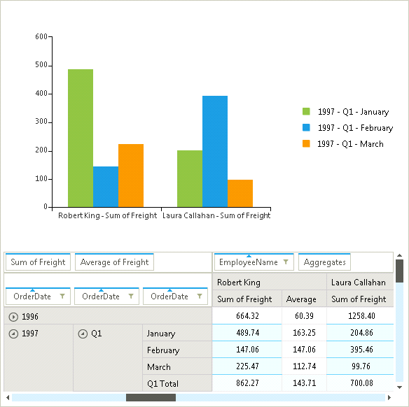
First things first. To visualize your pivot data in RadChartView, all you need to do is to set the chart’s DataSource to the pivot grid instance:
Let’s now explore what the powerful API provides ”out of the box” and how you can employ it to serve your will.
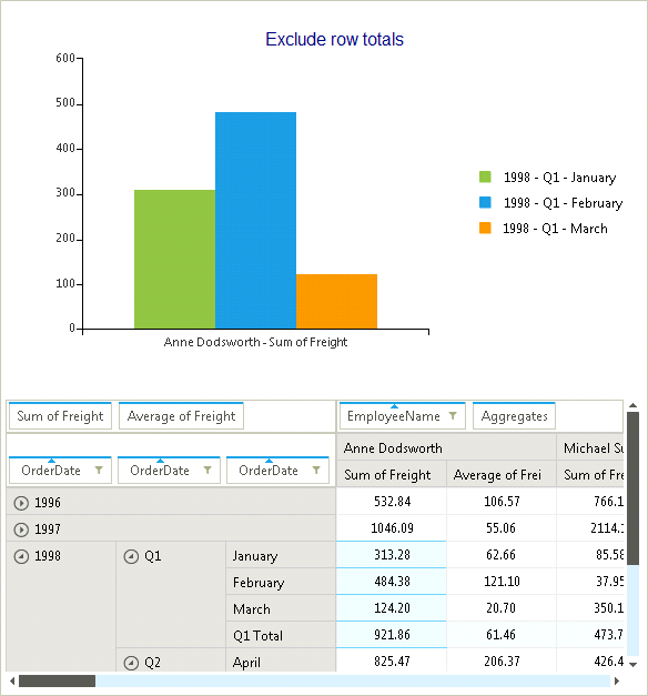
In the following selection, one might not want to display the row sub total value in the chart as it will be basically a sum of the other selected values:
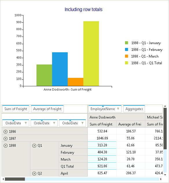
This code snippet will remove the totals from the equation:
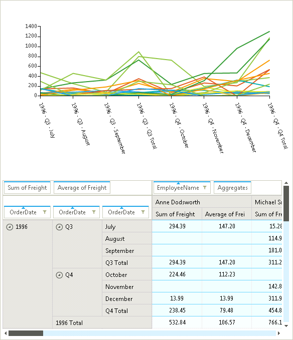
You can also prevent the inclusion of the column grand total in your line chart as it will be meaningless when you try to compare its values:
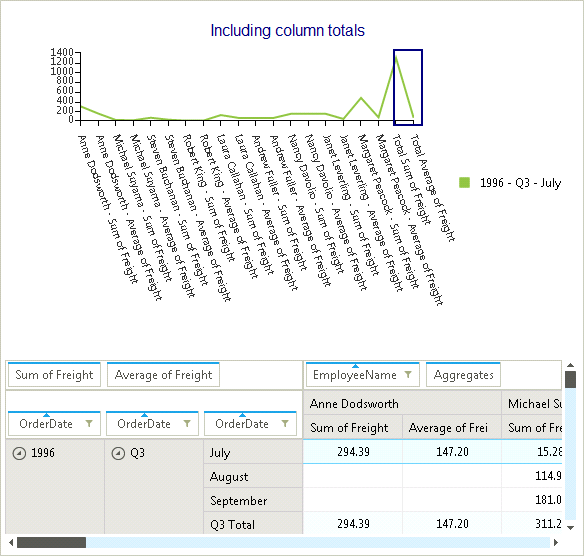
So this code snippet will help here:
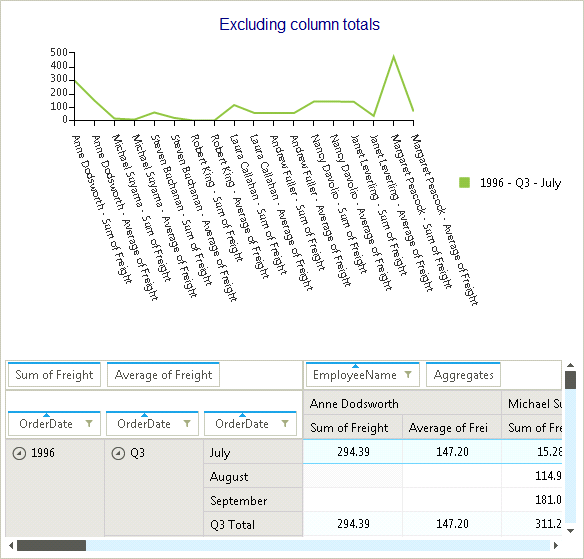
As you can see on the second screen shot, the series’ values are more readable due to the excluded total values.
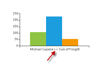
To change the delimiter that separates the group names, you should just introduce the desired symbols to the GroupNameDelimiter property:
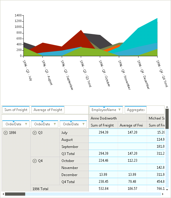
Here is an example of how to change the series type and adjust the axes rotation angle:
Well, that’s all folks. Now you can easily arm your end-users with a customized graphical view of their Pivot Tables data so they can make better decisions in a timely manner. If you liked this tutorial, please leave us a note in Comments and say what other tutorials you would like to see from us.
Happy coding!
First things first. To visualize your pivot data in RadChartView, all you need to do is to set the chart’s DataSource to the pivot grid instance:
this.radChartView1.DataSource = this.radPivotGrid1;Let’s now explore what the powerful API provides ”out of the box” and how you can employ it to serve your will.
PivotGridChartDataProvider
This is the object that makes the magic happen. PivotGridChartDataProvider handles the data binding between RadPivotGrid and RadChartView, so the charts can be populated with data. This object exposes various properties that will help you customize the output presentation.Row and Column totals
You can determine whether the SubTotals and/or the GrandTotals will be included in the visualized data.In the following selection, one might not want to display the row sub total value in the chart as it will be basically a sum of the other selected values:
This code snippet will remove the totals from the equation:
this.radPivotGrid1.ChartDataProvider.IncludeRowSubTotals = false;this.radPivotGrid1.ChartDataProvider.IncludeRowGrandTotals = false;You can also prevent the inclusion of the column grand total in your line chart as it will be meaningless when you try to compare its values:
So this code snippet will help here:
this.radPivotGrid1.ChartDataProvider.IncludeColumnSubTotals = false;this.radPivotGrid1.ChartDataProvider.IncludeColumnGrandTotals = false;As you can see on the second screen shot, the series’ values are more readable due to the excluded total values.
Series
You can change the generated series types to one of the categorical types: Bar, Line or Area. In addition, there is a property allowing you to easily determine what the series axis will display – row or column values:this.radPivotGrid1.ChartDataProvider.GeneratedSeriesType = Telerik.WinControls.UI.GeneratedSeriesType.Line;this.radPivotGrid1.ChartDataProvider.SeriesAxis = Telerik.Pivot.Core.PivotAxis.Columns;Selection
The provider allows you to determine whether the chart will display the entire pivot dataset or just the selected cells. Furthermore, when selection mode is used you can extend the update interval with custom value:this.radPivotGrid1.ChartDataProvider.SelectionOnly = true;this.radPivotGrid1.ChartDataProvider.DelayUpdate = true;this.radPivotGrid1.ChartDataProvider.DelayAmount = 500;
Delimiter
To change the delimiter that separates the group names, you should just introduce the desired symbols to the GroupNameDelimiter property:this.radPivotGrid1.ChartDataProvider.GroupNameDelimiter = ">>";Events
There are two events that allow you to modify the settings of the generated series or use custom series. The SeriesCreating is fired when a series is being created and it allows you to replace the series instance with a custom one if needed. The UpdateCompleted event is fired when all series have been generated so that you can apply any final settings to them.Here is an example of how to change the series type and adjust the axes rotation angle:
void ChartDataProvider_SeriesCreating(object sender, SeriesCreatingEventArgs e){ e.Series = new LineSeries();}void ChartDataProvider_UpdateCompleted(object sender, EventArgs e){ foreach (var axes in radPivotGrid1.ChartDataProvider.ChartView.Axes) { if (axes.AxisType == AxisType.First) { axes.LabelFitMode = AxisLabelFitMode.Rotate; axes.LabelRotationAngle = 60; } }}Well, that’s all folks. Now you can easily arm your end-users with a customized graphical view of their Pivot Tables data so they can make better decisions in a timely manner. If you liked this tutorial, please leave us a note in Comments and say what other tutorials you would like to see from us.
Happy coding!

About the Author
Nikolay Diyanov
Nikolay Diyanov Diyanov is the Product Manager of the Native Mobile UI division at Progress. Delivering outstanding solutions that make developers' lives easier is his passion and the biggest reward in his work. In his spare time, Nikolay enjoys travelling around the world, hiking, sun-bathing and kite-surfing.
Find him on Twitter @n_diyanov or on LinkedIn.
Related Posts
Comments
Comments are disabled in preview mode.
