How to Design Pricing Tables That Convert Better

Summarize with AI:
By the time a prospective user reaches the pricing table, they’ve done most of their research. By creating pricing tables that are attractive in design, easy to use, and helpful in the decision-making process, you can get more users to convert than abandon the process when they're so close to the end.
When it comes to selling products, pricing is a simple enough matter. Customers typically only have one price to consider in their decision-making process. That’s not the case when it comes to recurring services and memberships.
When a brand offers multiple pricing options, it’s so they can offer varying degrees of value and features to their customers. But what’s the best way to present this information to prospects? In other words, how do you design your pricing table so that you maximize conversions?
In this post, we’re going to look at some design principles and UX laws that can help us flesh out which best practices to follow when designing pricing tables.
How to Design a High-Converting Pricing Table
Pricing table design can get tricky. Depending on how many pricing tiers you have and how many features are included in each one, you may be juggling a lot of information.
To sort out the best way to present this information, we’re going to look at how the human brain reacts to what it sees. This will enable you to design a pricing table that’s attractive, easy to use and converts well.
1. Create Clearly Defined Regions for Each Plan
The Law of Common Region states the following:
Elements and information contained within a boundary are assumed to be part of the same group.
One way to do this would be to create one large table with dividing lines between each of the pricing tiers. This is something we commonly see in feature comparison tables, like this one on the SurveyMonkey website:
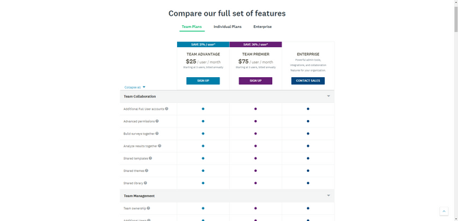
The problem with this design, however, is that it forces users to take a bird’s-eye approach to comparing features. That’s fine when it’s as simple as a dot vs. no dot (or a checkmark vs. an X). It’s easier to visualize what types of features and which ones specifically you get with this type of feature comparison table.
If you want users to focus on each plan one at a time, though, you need to give them more pronounced boundaries. The pricing table for Zoho CRM is a good example of this:
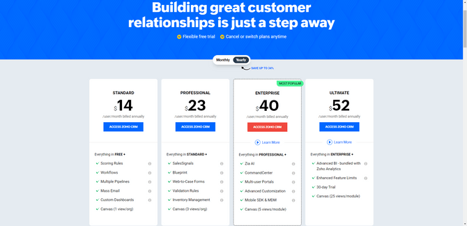
The darker background provides a nice contrast for the white pricing tables. In addition, there’s abundant room between each of the tiers. Prospective users should have no trouble at all visually isolating one plan at a time and focusing on its details before moving onto the next one.
2. Use Hierarchy to Determine Sizing
The principle of visual hierarchy states the following:
The organization, sizing and spacing of UI elements on a page imply the order in which the user should consume the data.
In other words, bigger, more prominent components should be viewed first as they’re the most important—and the human brain inherently understands this.
Just be careful about overdoing it with how many different sizes you use within your pricing table. There’s usually a ton of information packed into a pricing table, so you don’t want varying sizes to create visual overload.
Here’s a simple example from Buffer that does this well:
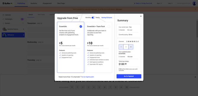
There are two pricing tiers—one for Essentials and one for Essentials + Team Pack. When you look at this pricing table, your eyes are instantly drawn to the following elements and in this order:
- Price
- Plan name
- Plan description
- Features breakdown
Even though they’re not placed in that order from the top-down, your eyes will naturally want to go to the biggest element in the table first. It will then follow a more natural reading pattern downwards, starting with the plan’s name because of the hierarchy baked into the design.
Universal Studios is another one that uses size to control what users focus on first:
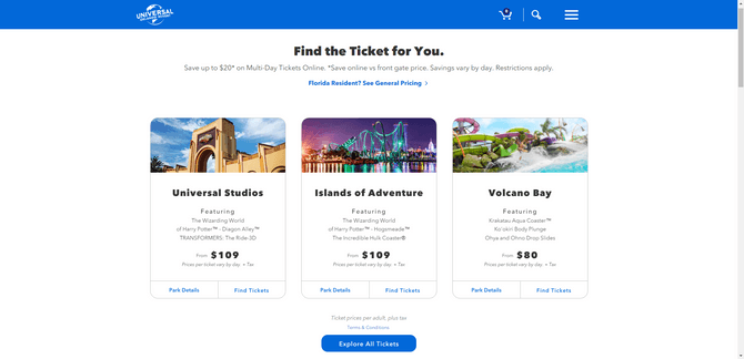
Although the starting price for each ticket appears near the bottom of each ticket option, it’s styled using the same font and size as the header in the price block (i.e., the park name). Even if the user is compelled to start reading from the top, their eyes will inherently pick up on what the price is before they get too far. It’s difficult to ignore it.
Sizing isn’t the only way to draw attention to the most important elements in a pricing table. You could also use color. Just be careful about depending on color to highlight the most important information as it could pose an issue for visually impaired users.
3. Make Your Preferred Tier Stand Out
The Von Restorff Effect states the following:
Within a group of similar objects, the one that stands out will be the most memorable.
When it comes to pricing tables, you want every pricing plan to be seen as valuable. That said, there’s usually going to be one tier that the brand wants to steer users toward. You can use a number of selling points to make this one tier the most attractive. You could label it as the “Most Popular” or a “Top Seller.” You could also dub it the “Best Value.”
Once you’ve settled on what that selling point is, you’ll need to design that tier so that it stands out from the ones that are similarly designed.
There are different ways to play around with this design principle. One option is to add a different style border around it. You can see an example of this in the Zoho example from earlier. The Enterprise plan has a dashed border while the others have no defined border other than the white edges running up against the gray background.
Another way in which the Enterprise tier stands out is by the neon green “Most Popular” ribbon in the top-right corner. You don’t need to pair the ribbon with a stylized outline in order for this to be effective.
That said, when you do see ribbons used in pricing table design, they’re usually accompanied by another differentiator. For instance, Forbes uses three differentiators to make its Annual plan stand out:
- Color
- Size
- Ribbon
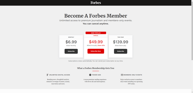
Color can never be a sole differentiator as it can create accessibility issues for some users. That said, there are other differentiating design choices here, which makes the use of color OK. The Annual plan stands out from the others by size (making the Annual tier wider and taller than the other two) and a “Most Popular” ribbon.
QuickBooks’s Pricing page does something similar, though it doesn’t take it to such an extreme:
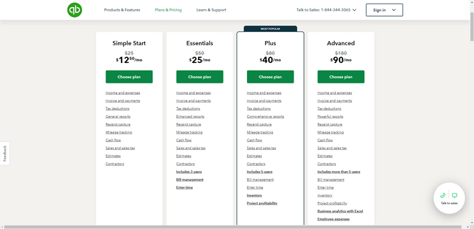
A dark gray border is placed around the Plus plan. In addition, a “Most Popular” ribbon is affixed to the top of the tier. Alone, these two differentiators will draw users’ attention to the Plus plan.
That said, you can also see here how white space can make one plan stand out from the other. These product tiers include a full list of features. So, naturally, the more expensive plans are going to have longer lists of features, which should draw users’ attention to them. Even if they hadn’t planned on spending that much, the sheer curiosity of what they’re missing out on will lure them over.
4. Create Separate Pricing Tables When Needed
Hick’s Law states the following:
As the number and complexity of choices increases, so too does the time it takes users to make a decision about them.
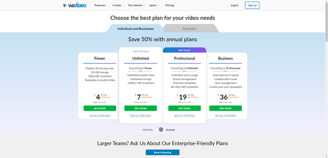
This UX law is relevant for companies that offer more than a small handful of pricing plans. We commonly see this with SaaS companies like WeVideo where they offer a set of plans based on who the end user is.
In this screenshot we see that there are four plans available for individuals and businesses:
These aren’t the only plans that WeVideo offers. There are also plans available for educators who need video creation and editing software:
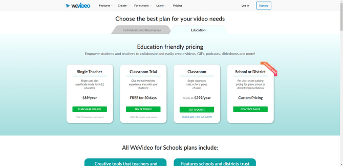
While the Pricing page has the room to add more pricing tiers, it wouldn’t make sense to place all eight pricing plan options next to each other.
For starters, it would be pretty difficult for users to compare more than three or four plans at once. Secondly, it isn’t logical to present education-specific plans next to ones tailored to individuals or small businesses.
The plan types aren’t priced the same way (i.e., monthly vs. yearly), so that would cause an issue with comparison. They also aren’t related. Placing all of the plans on the same page would make it seem like every user could equally weigh the options when, really, they’d just waste their time considering irrelevant plans.
Breaking up your pricing tables into multiple ones when you have different types or different audiences is a good idea. You don’t necessarily need to create separate pages for them either, as this example shows. All you need to do is include a prominent tab or toggle so users can easily choose the view that pertains to what they need.
5. Limit How Many Features Appear in Each Pricing Tier
Miller’s Law states the following:
On average, people can only hold between five and nine items in their working memory at any given time.
This is one of the reasons why pricing tables should be broken up and organized by plan or user type. Giving users too many options to consider at once (especially if some of them are irrelevant) will only make it more difficult for them to focus on and remember the ones they’re really interested in.
This is also useful when it comes to how many features you present in your pricing table. In some cases, this won’t be relevant—like for theme parks, newspaper subscriptions, etc. But for SaaS products with dozens of features, it certainly is.
So what you can do is limit how many features that prospective users see in your pricing table. One way to handle this is to include the most popular or valuable features in the list for each plan.
Another option is to build upon the features of the previous tier. So rather than duplicate each feature across each plan (which is redundant and unnecessary anyway), there will be a line that explains that everything in the previous plan is included in this one plus everything else that follows.
That’s what Eventbrite does on its organizer Pricing page:
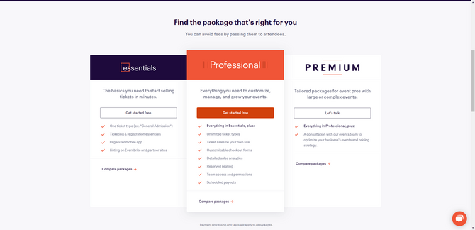
In addition to cleaning out the redundancies that appear when pricing tables list the same features across each plan, Eventbrite also limits how many features are initially visible to prospective organizers. The Essentials plan lists four features, Professional lists seven and Premium lists one.
The “Compare packages” link at the bottom of each tier gives users the ability to explore all of the features and compare the plans’ feature sets side by side:
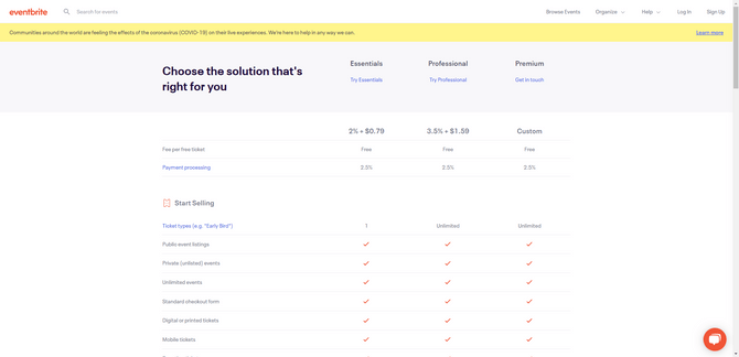
On this page, the feature is only listed out once along the left side of the table. The table then uses a checkmark or long dash to indicate whether the feature is included. The clean and concise design of this table makes it easy for users to quickly compare which features are included and which aren’t in each pricing plan.
Wrap-up
There’s no room for sloppy design or dark patterns when it comes to pricing tables. If prospective users have reached this stage, then they’re nearly ready to convert. So your design shouldn’t give them any reasons to jump ship.
By keeping basic design principles in mind, you’ll be able to design pricing tables from your target users’ point of view. By seeing it through their eyes (and from their brains), you’ll create something that is attractive and usable, and which simplifies the final decision-making process for them.

Suzanne Scacca
A former project manager and web design agency manager, Suzanne Scacca now writes about the changing landscape of design, development and software.

