How to Achieve Chrome-like Tabs with Tabbed Form in WinForms applications

Summarize with AI:
This post will introduce you to the Tabbed Form control and its features, and we'll see how to achieve tabbed navigation in your WinForms application.
We introduced the Telerik UI for WinForms RadTabbedForm in the R1 2019 version of the controls. I hope that by now you have played with it and seen how handy it can be in so many scenarios. In this blog post I will try to explain some of the scenarios the control handles and later go over the features in more depth.
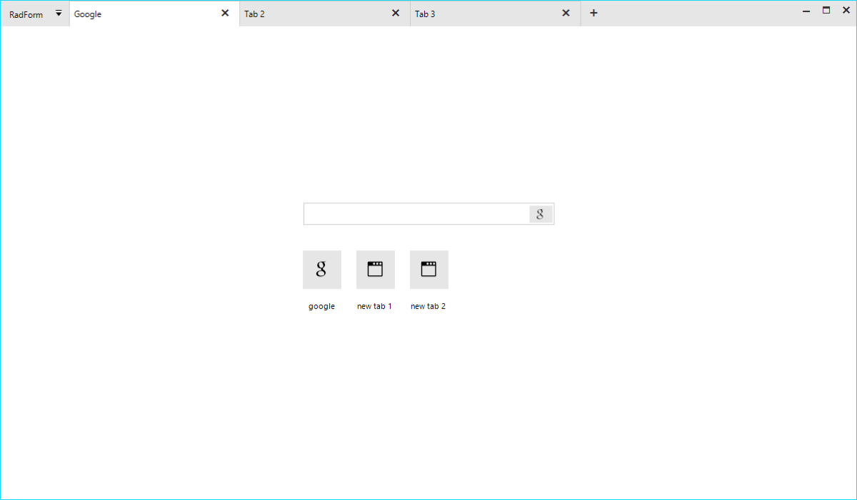
Where to Use Tabbed Form?
The idea to organize the different views of an application in separate tabs is not new. The Microsoft TabControl and our own RadPageView have been around for quite some time. Although powerful, these controls serve a more limited purpose. Imagine, that you want to implement a tabbed UI which will serve as a top-level container of the entire application. The page view and MS tab control are not suitable for this as they are bound to the form they were added to and the pages or tabs cannot be dragged and dropped. Actually, a dock control can better serve you, yet if you want to achieve an end-user experience like what people are seeing in the modern browsers, it is still not good enough.
The RadTabbedForm is specifically built to handle this scenario. The application content can be organized and separated in different tabs where each tab is responsible for a different part of the application. The tabs are located inside the form's title bar just like in browsers (Chrome, Edge etc.) and they can be reordered or moved away to a separate window. This is extremely useful in big applications visualizing data. Instead of switching from one tab to another, the end user could simply drag the tab out thus creating a new form. The tabs would then be in two separate windows and the user could easily view both contents simultaneously. RadTabbedForm offers great flexibility and freedom which will be appreciated by the people using your application.
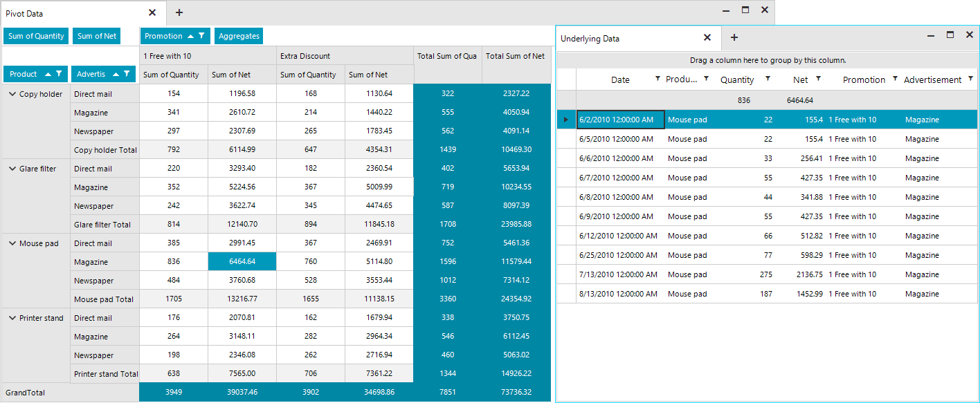
The screenshot below shows two tabs with the second tab being detached in a separate form. The first tab displays a RadPivotGrid and the second one shows a breakdown of the grouped and aggregated data behind the selected cell in the pivot from the first tab.
Architecture and Features
The RadTabbedForm represents a form host of the RadTabbedFormControl. The form control is responsible for creating and manipulating the tabs in the title bar, the panels associated with each tab holding their content and the drag-drop service. Basically, most of the functionality and API is defined inside the RadTabbedFormControl, which is exposed by the form's TabbedFormControl property. The control is packed with many features and its look can be completely customized by simply setting a couple of properties. The form is built on top of TPF consisting of many light-weight visual elements. The Structure article in the documentation provides information on the more important building blocks of the control.
Full Design Time support
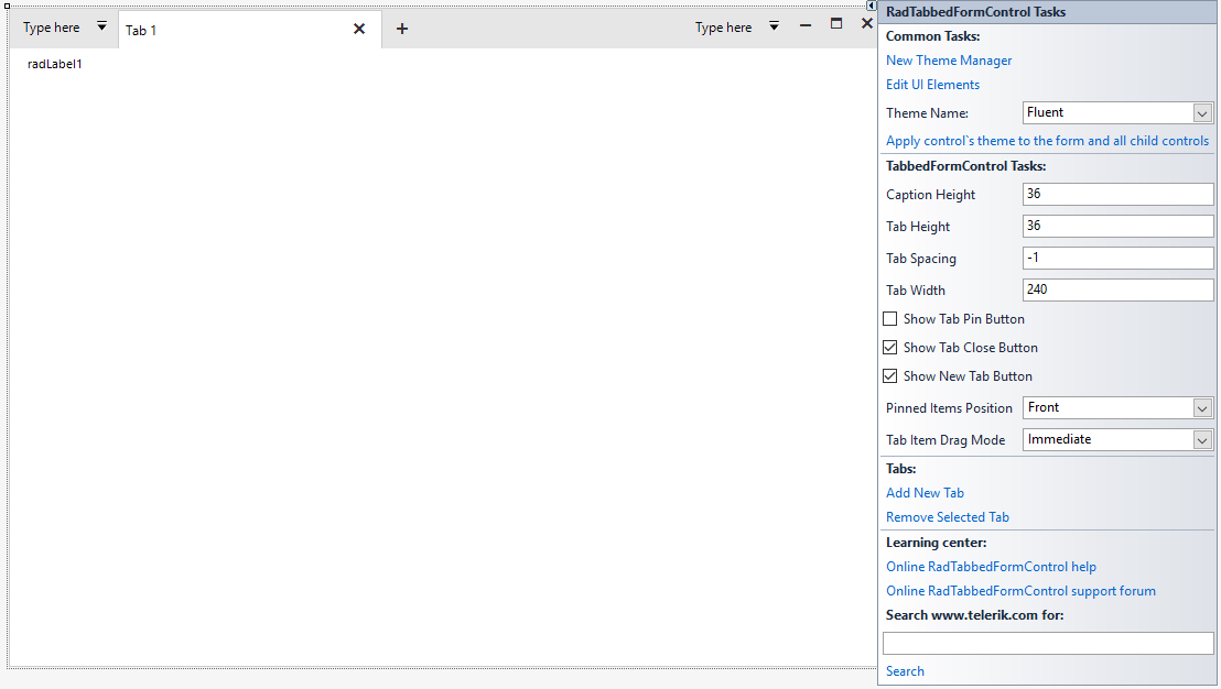
Tabs can be added in the designer of Visual Studio. Each tab will create a panel where all the other controls can be added.
RadTabbedForm with the Fluent Theme in the Visual Studio Designer
Title Bar Support
It was really challenging to implement all the features inside the form's non-client area. I am happy to say that we managed to achieve everything which was planned.
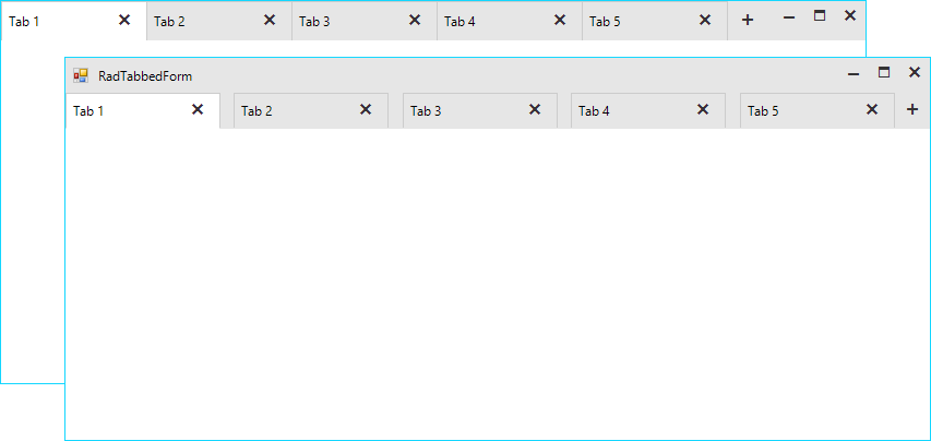
- Settings: The title bar’s height is not fixed, and it can be adjusted via the CaptionHeight property. The tabs height and the space between them is also adjustable. We have decided to leave no space between
the tabs, however, if your end users would need such you can increase the tab spacing. For example, with the following settings you can increase the height of the entire title bar and have the tabs displayed under the top-part where the form`s
icon and system buttons are located. This way you will have a bigger part of the non-client area empty which will allow the users to move the form easily.
this.ShowIcon =true;this.TabbedFormControl.ShowText =true;this.TabbedFormControl.CaptionHeight = 65;this.TabbedFormControl.TabHeight = 32;this.TabbedFormControl.TabWidth = 180;this.TabbedFormControl.TabSpacing = 12;
- Standard Windows Title Bar Style: What does it mean? Basically, it means that we can paint the tabs inside the default Windows title bar as it is painted by the operating system. This will vary from one Windows version to another
and it will also depend on the chosen Windows theme. This behavior is controlled by the AllowAero property of the form. Setting the property to false would force our themes and the control will adjust the title bar to match the theme of the tabbed
control. In some situations, it might be necessary to match the standard Windows look so the AllowAero property has you covered:
this.AllowAero =true;
Standard Windows 10 Title Bar Style
Drag and Drop
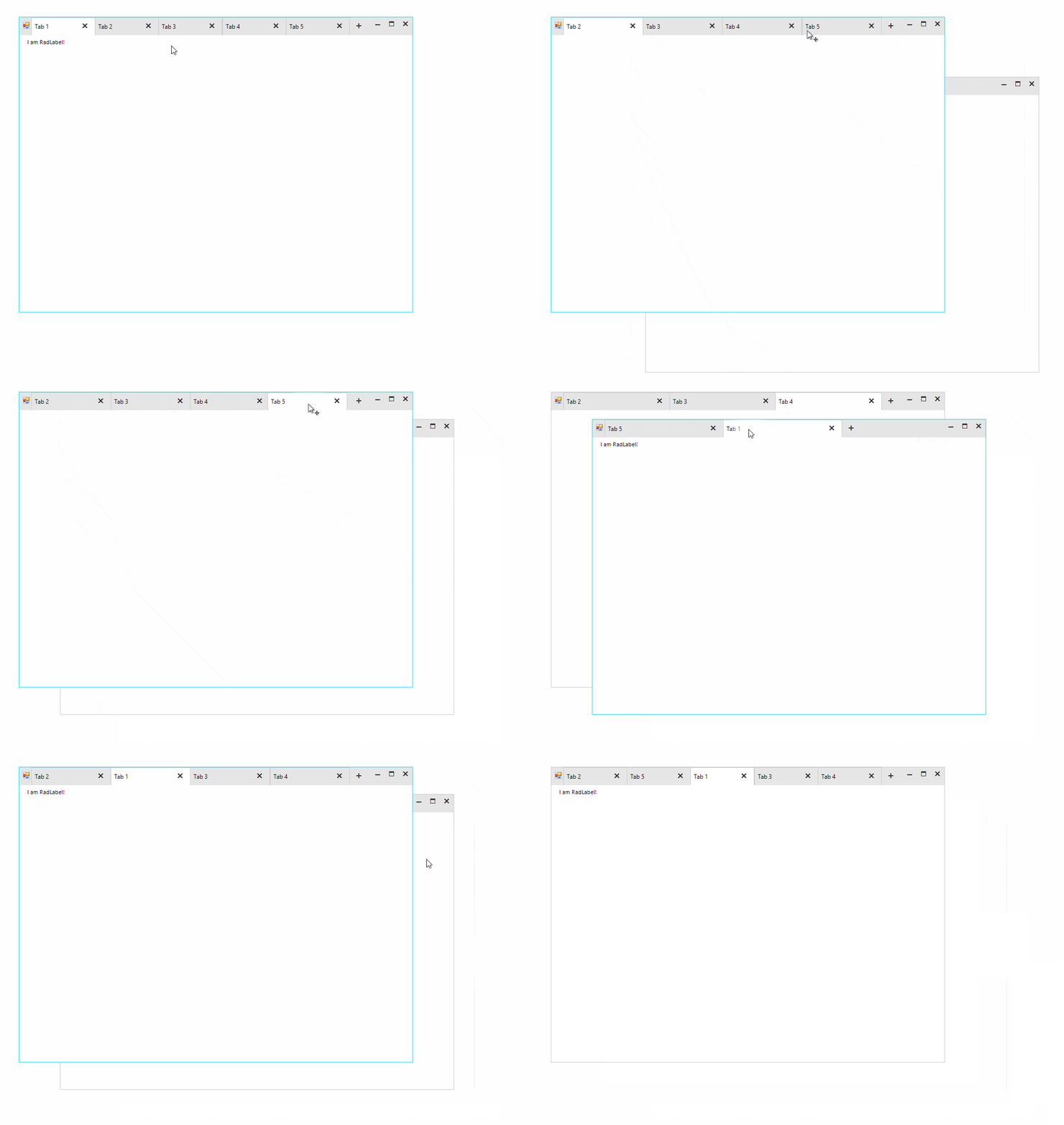
The tabs can be reordered inside the title bar. It is also possible to drag them out to create a separate form. The tab content including all the added controls will be moved to the new form. This operation can be repeated numerous times over and the tab be moved from one form to another.
Quick Actions
Various elements like buttons, check boxes, drop-down buttons etc. can be added before and/or after the tabs.
this.TabbedFormControl.LeftItems.Add(new RadButtonElement { Text = "button1" }); //adds items before the tabs
this.TabbedFormControl.RightItems.Add(new RadButtonElement { Text = "button2" }); //adds items after the tabs
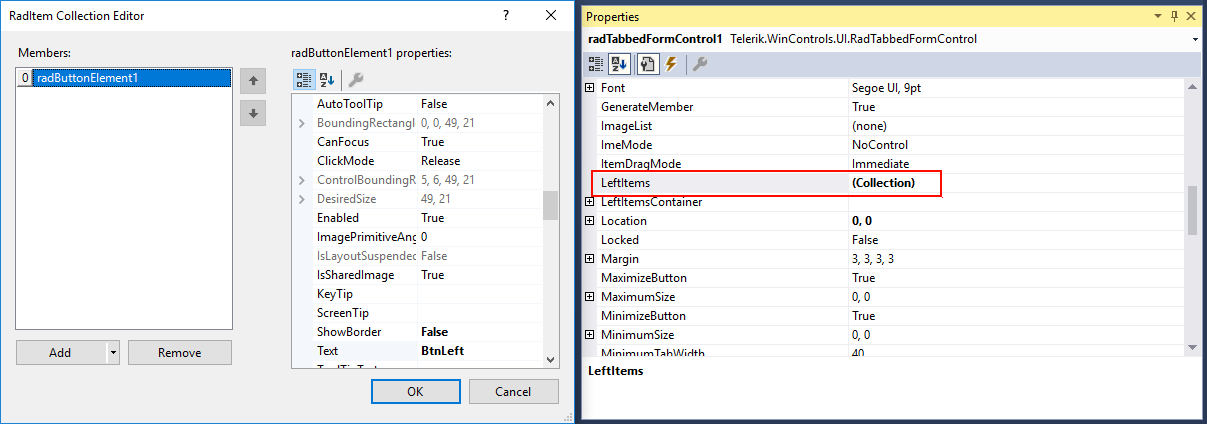
These elements can be also added in the Visual Studio designer.

The LeftItems and RightItems collections are also exposed in the property grid of the designer and the elements can be edited in the collection editor.
Navigation
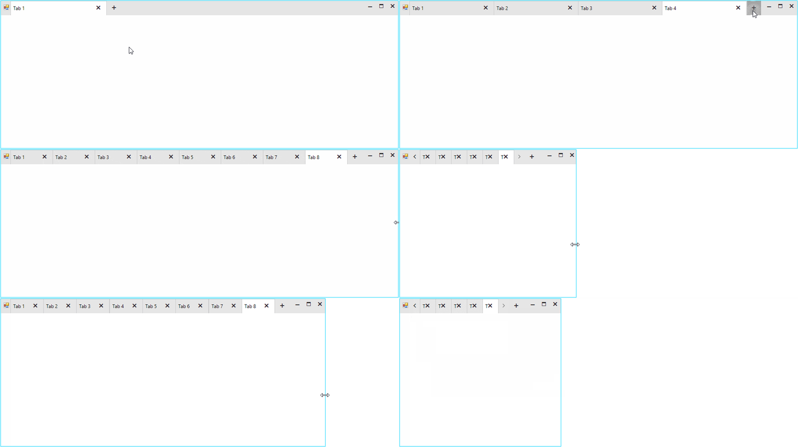
The tabbed control also has a built-in navigation. The navigation buttons will appear automatically, whenever the tabs cannot fit entirely in the available width. The tabs always have an equal width and it can be controlled with the TabWidth and MinimumTabWidth properties. The layout is smart enough and if the tabs count is increased to a point that they cannot fit in the title bar with their specified width, the widths of all tabs will be decreased equally. The layout will decrease the widths of the tabs until it reaches the specified MinimumTabWidth value. At that moment the navigation buttons will become visible.
Pinned Items
Tabs can be pinned to the left or right side of the title bar. When unpinned, the tab will return to its last position.
this.TabbedFormControl.Tabs[0].Item.IsPinned = true;
Context Menu
The tabbed control also has a built-in context menu which is fully localizable.

The items displayed in the menu can be customized in the RadTabbeFormControl.ContextMenuOpening event.
private void TabbedFormControl_ContextMenuOpening(object sender, RadTabbedFormControlItemConextMenuOpeningEventArgs e)
{
    if (e.TabItem.Text == "Tab 1")
    {
        //remove first item
        e.ContextMenu.Items[0].Visibility = ElementVisibility.Collapsed;
    }
    else if (e.TabItem.Text == "Tab 2")
    {
        //disable the context menu
        e.Cancel = true;
    }
}
Getting Started
There are two ways to add a RadTabbedForm to your Visual Studio project:
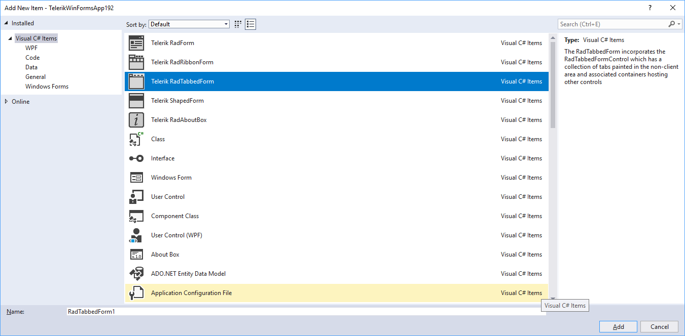
- VSX extensions: Assuming that you have our Visual Studio extensions installed, you can create a new tabbed form by simply adding a new item to the project.
- RadFormConverter: Simply drag and drop the component from the Visual Studio tool box and convert the current form to a RadTabbedForm.
Once you have the form added to the project you can start building the UI. Tabs can be added via the RadTabbedFormControl's smart tag. The smart tag also exposes the most important properties of the control. You can also check our Demo application and the two RadTabbedForm examples. Please also don't miss the documentation as it provides detailed information on the features and API of the control.
Try It Out and Share Your Feedback
We'd love to hear what your thoughts are on the new control. Please leave a comment below or write in the forums. If you have an idea for the next great feature you can also submit it on our feedback portal.
You can learn more about the Telerik UI for WinForms suite via the product page. It comes with a 30-day free trial, giving you some time to explore the toolkit and consider how it can help you with your current or upcoming WinForms development.

Hristo Merdjanov
Hristo joined the company in 2014 after graduating from Telerik Academy. He has been part of the WinForms team ever since. Hristo is passionate about the native technologies and WinForms in particular. Besides programming Hristo loves travelling, especially to the beach. He is also a keen tennis player.

